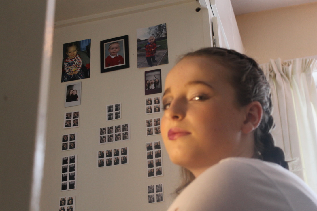
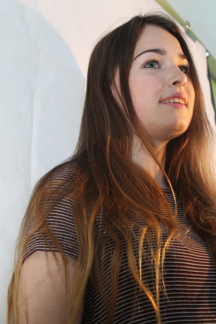
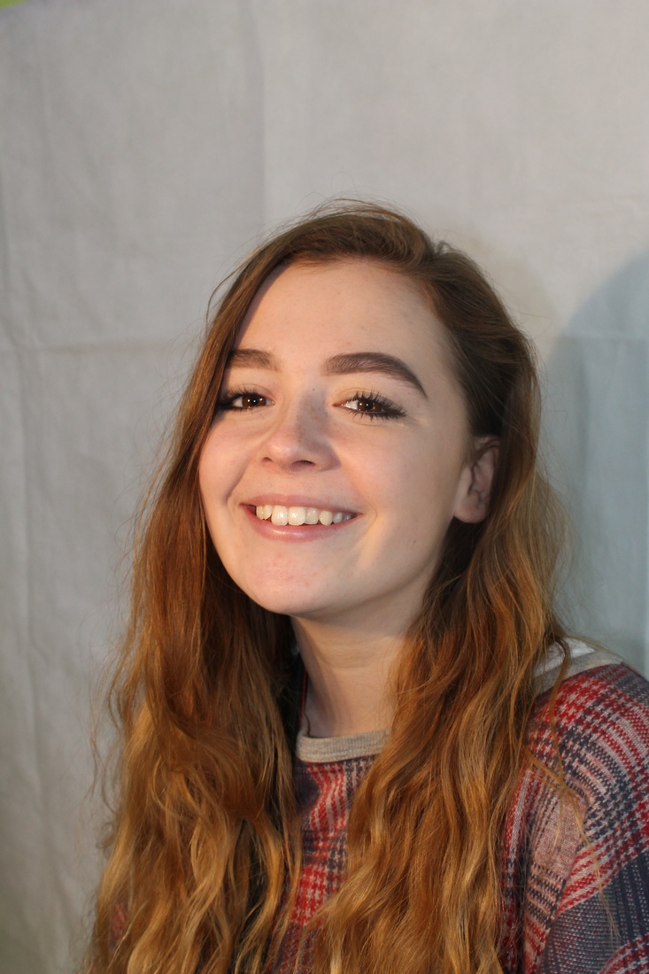
My First Ideas...
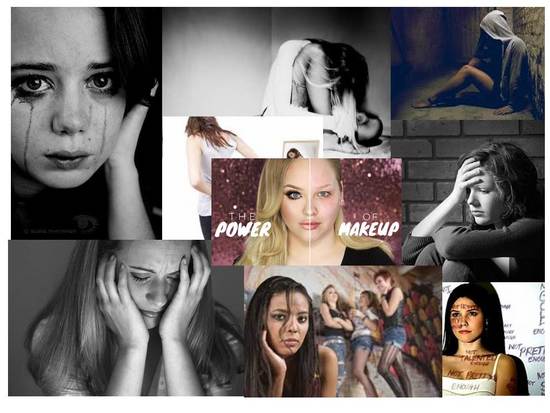
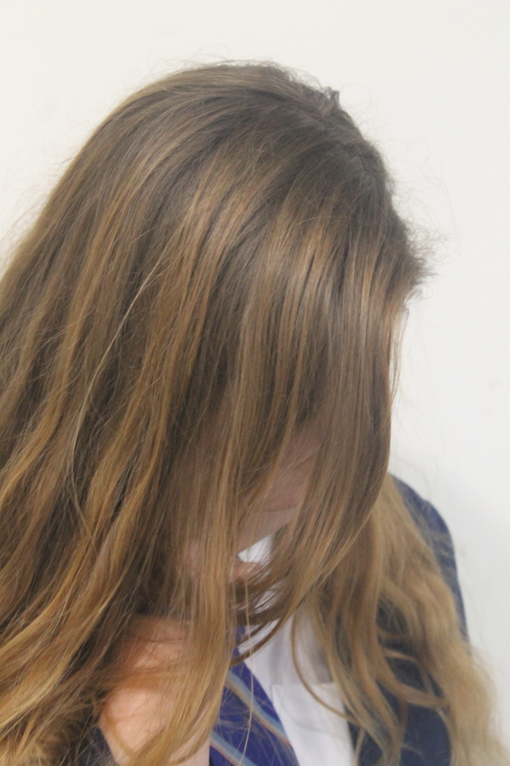
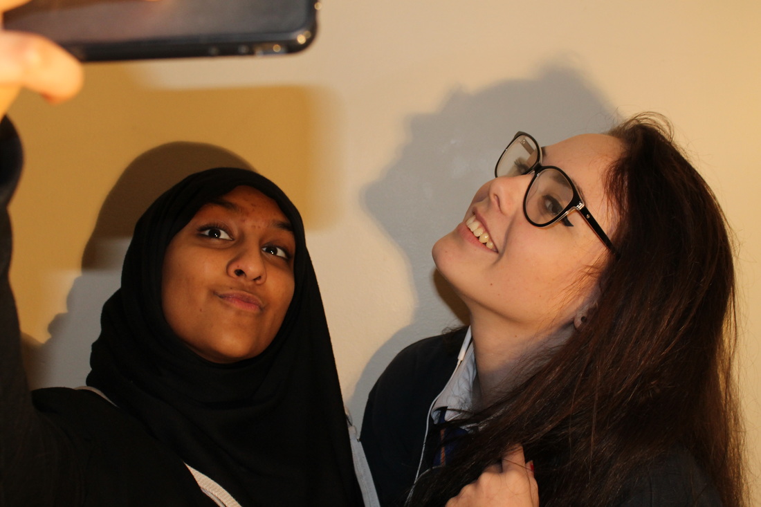
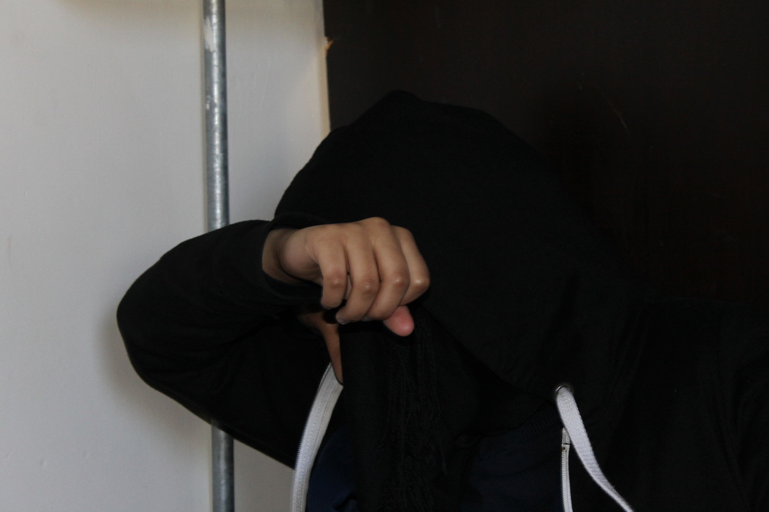
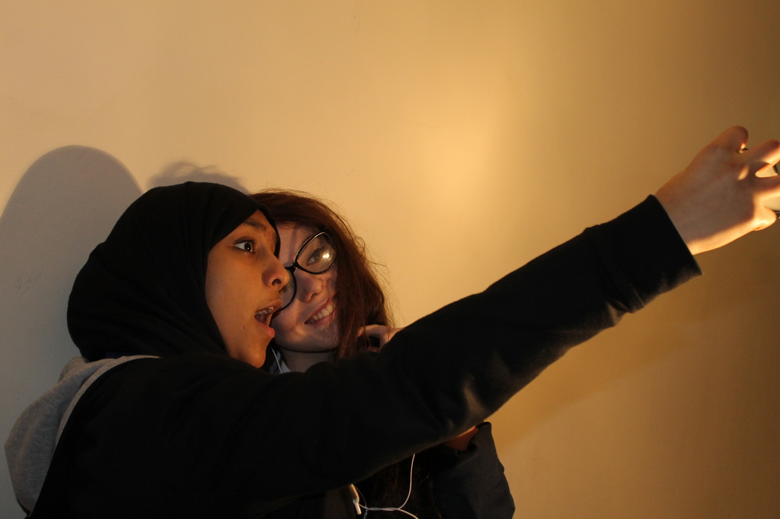
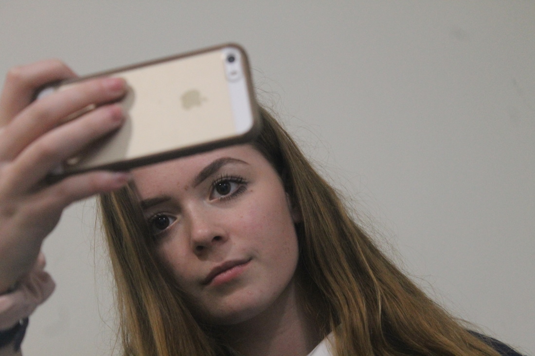
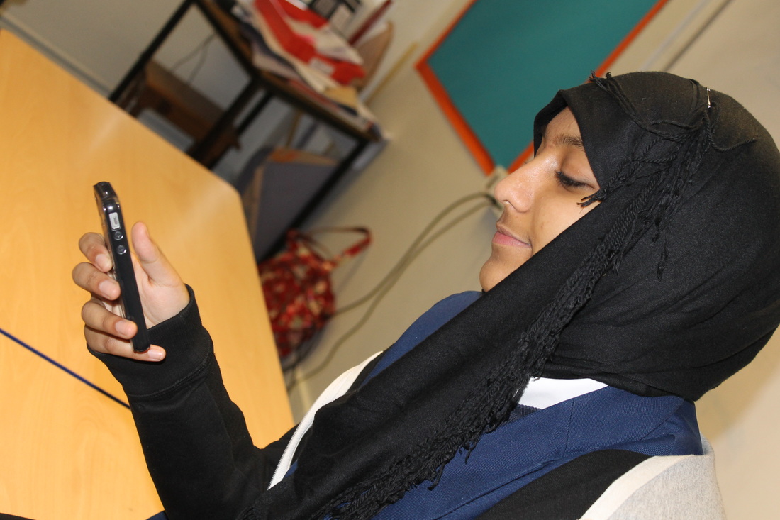
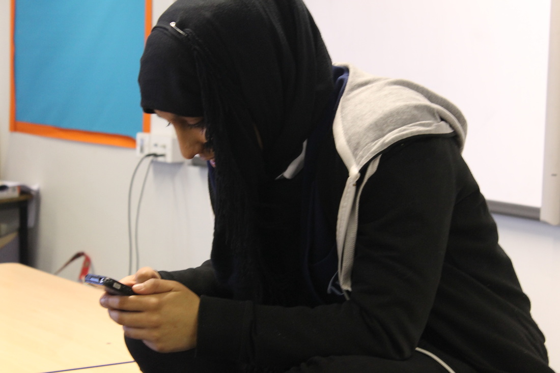
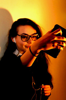
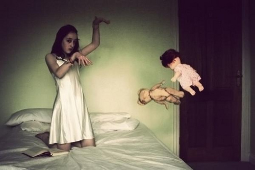
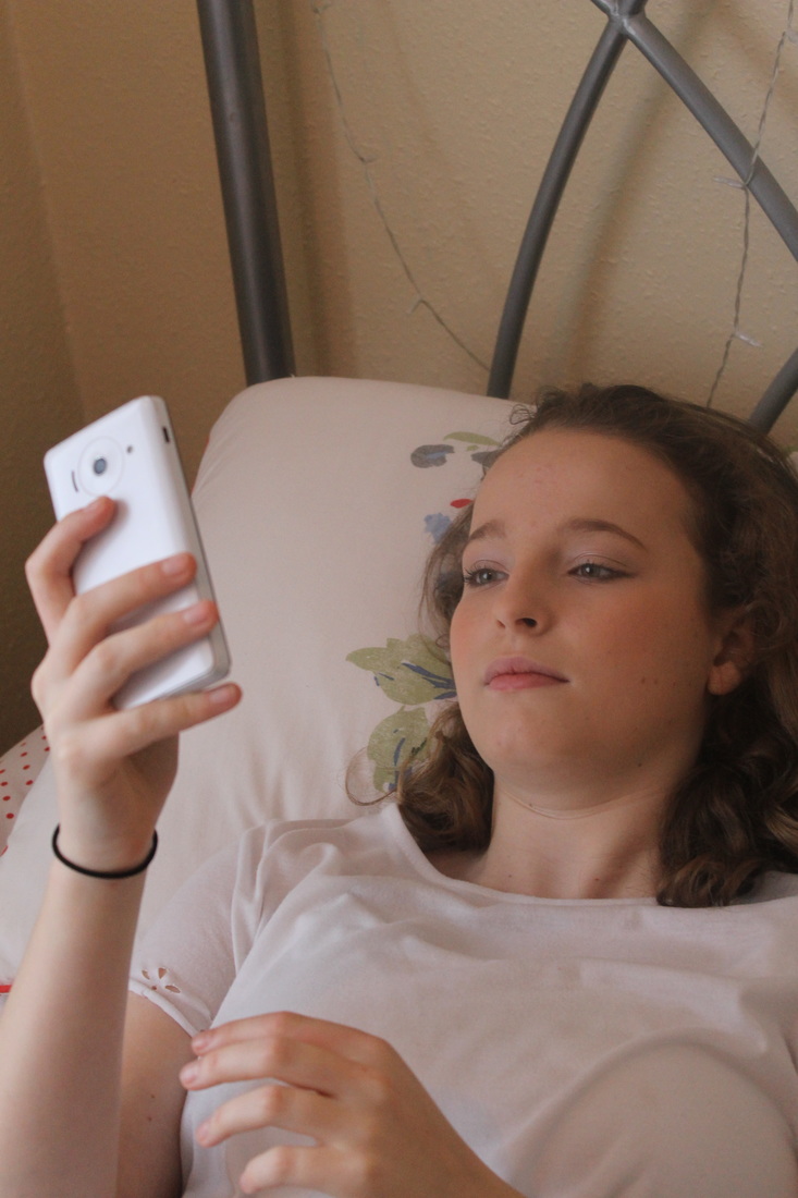
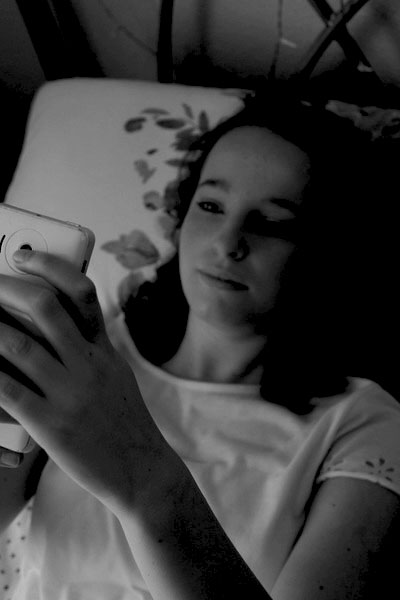
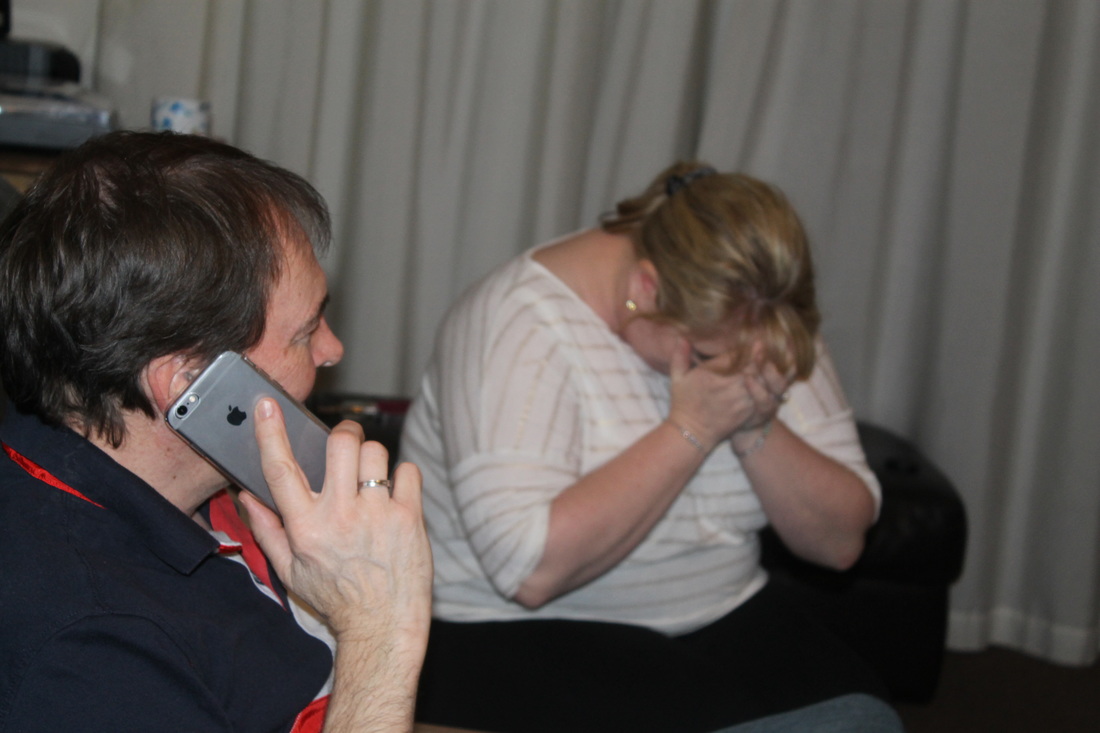
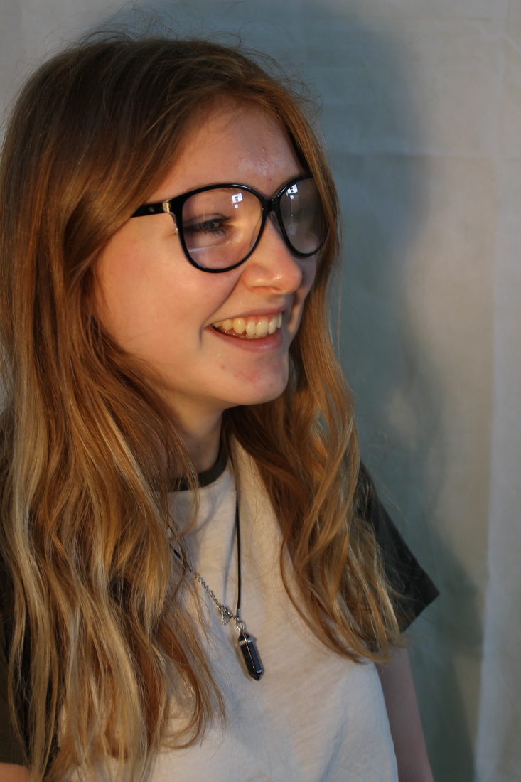
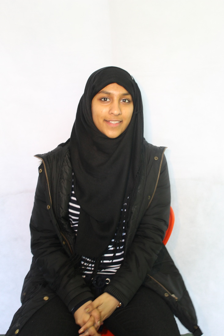
For my Independent Project and Final Exam I chose to produce a response to 'Diary' and base my project around the emotions and experiences that teenage girls go through. I feel that this topic will be interesting to photograph and capture and in some ways challenge me to explore my own emotions, and others and portray them in a realistic way. I also have an idea to capture a typical teenage activity, them taking a selfie but behind the phone they could be showing their emotions; I feel that this could again be challenging but can also increase the reality of the project.
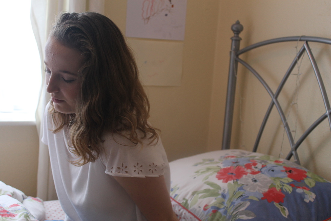
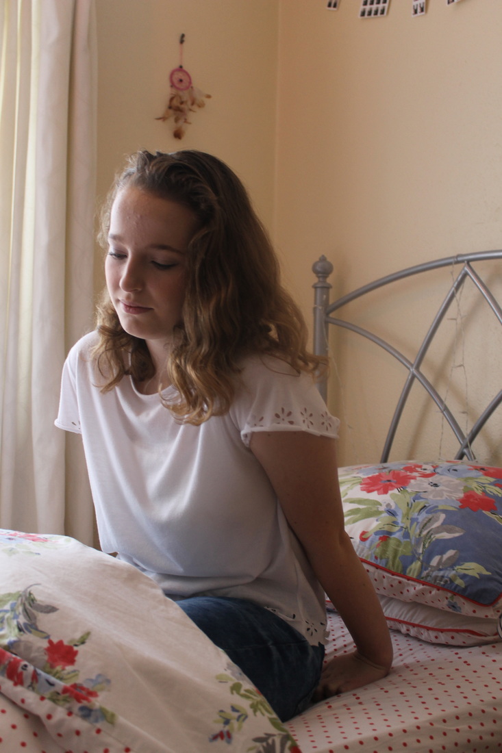
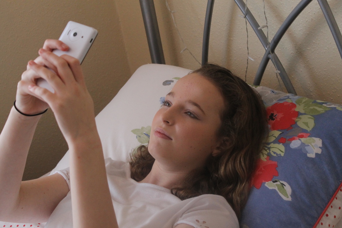
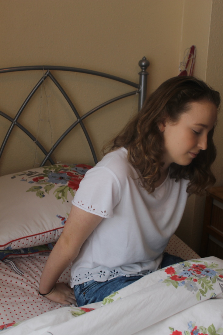
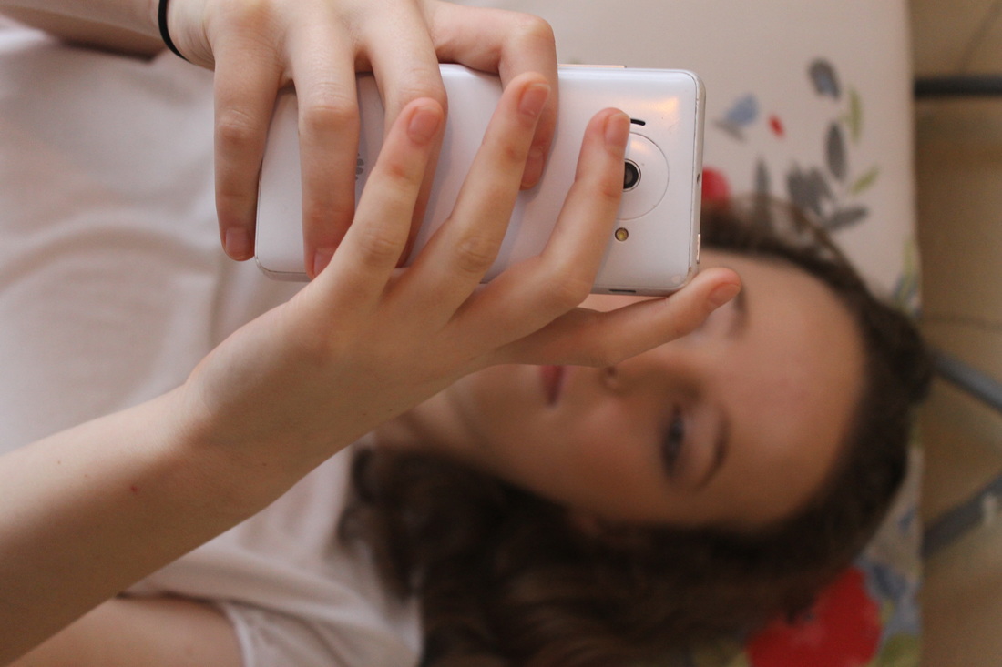
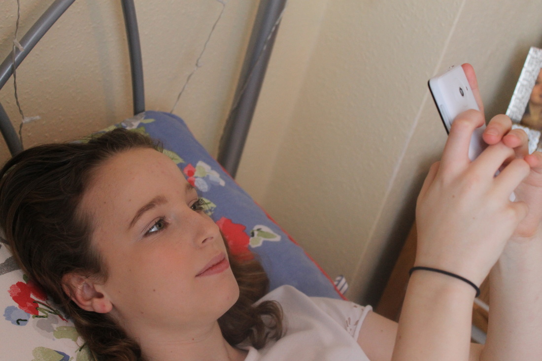
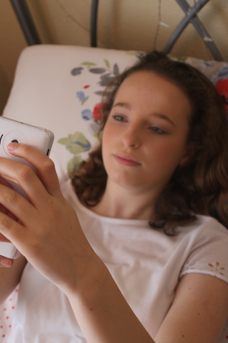
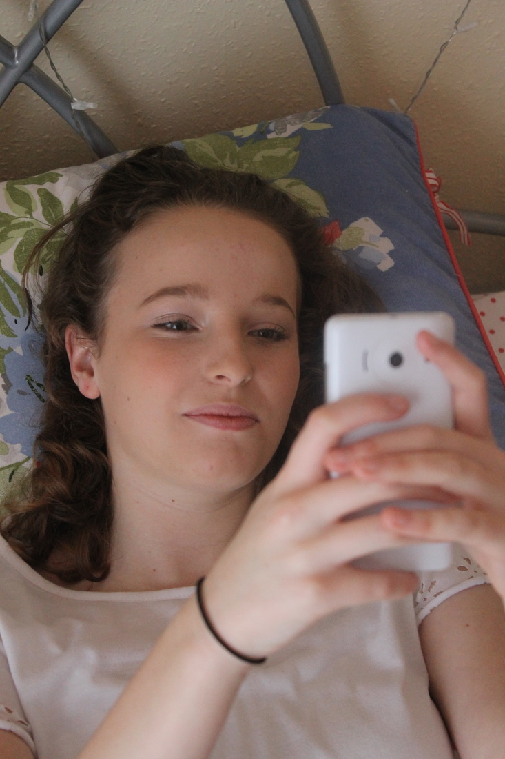
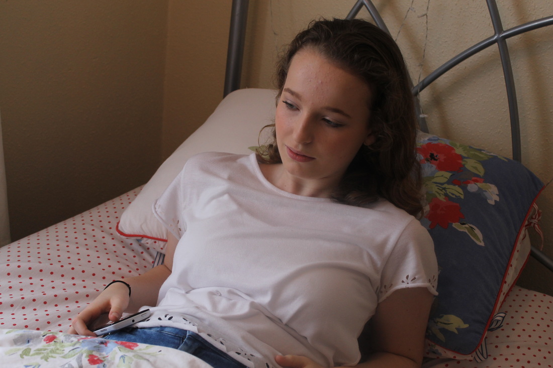
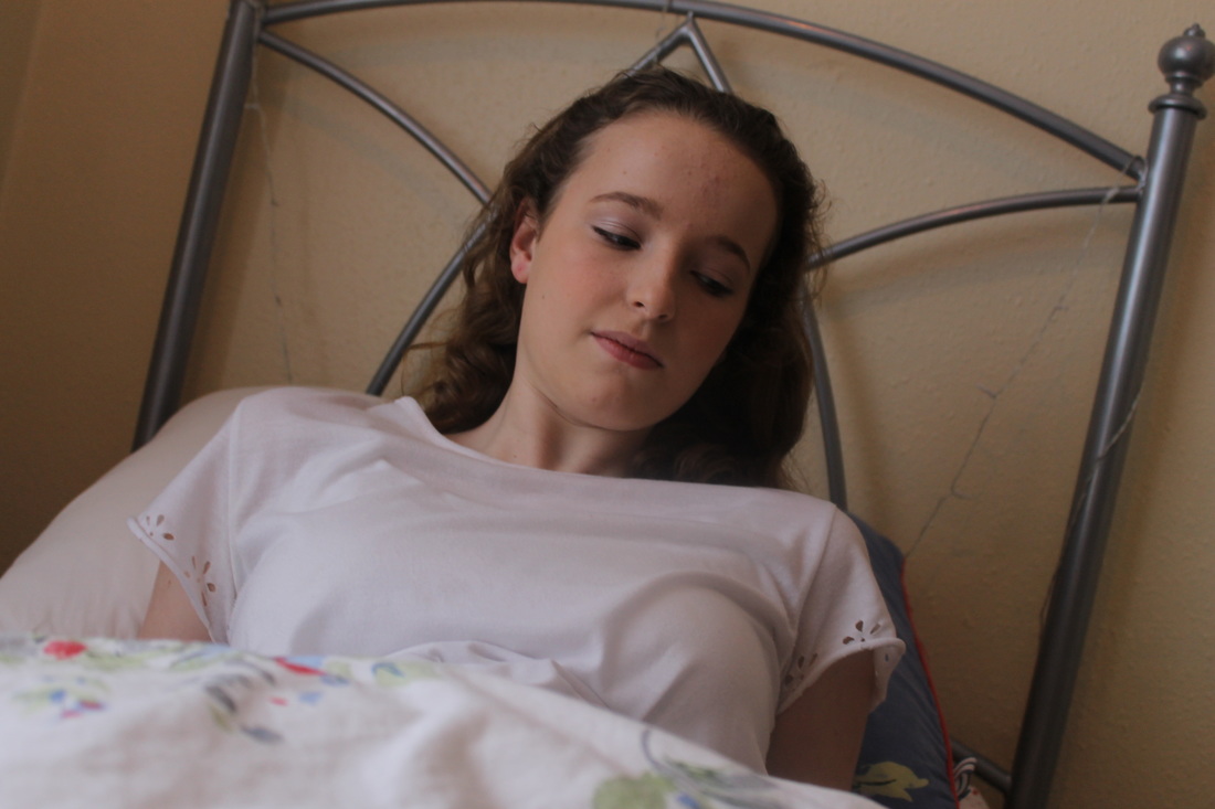
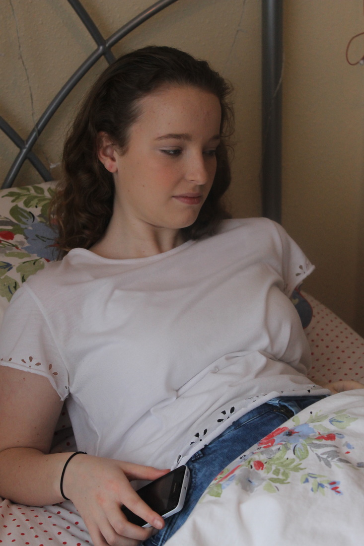
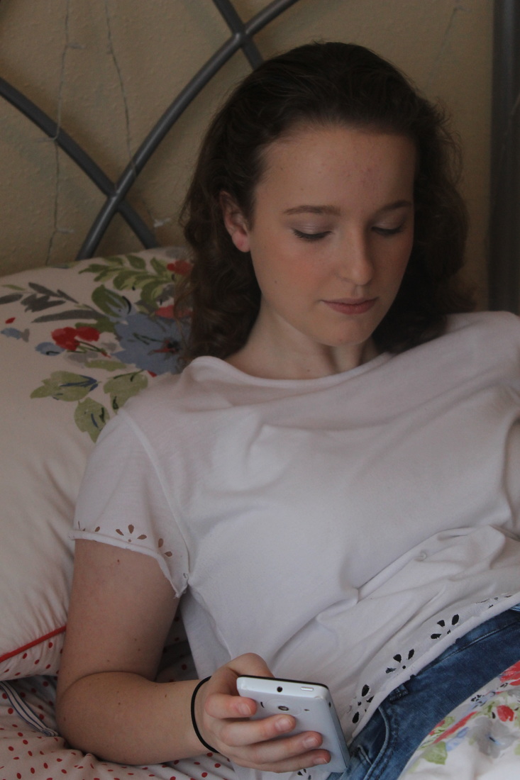
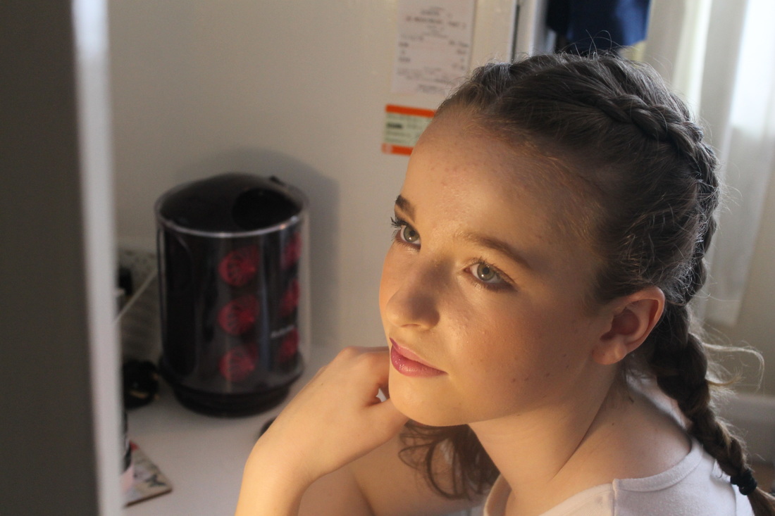
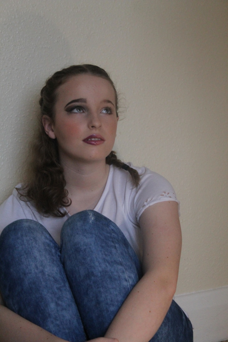
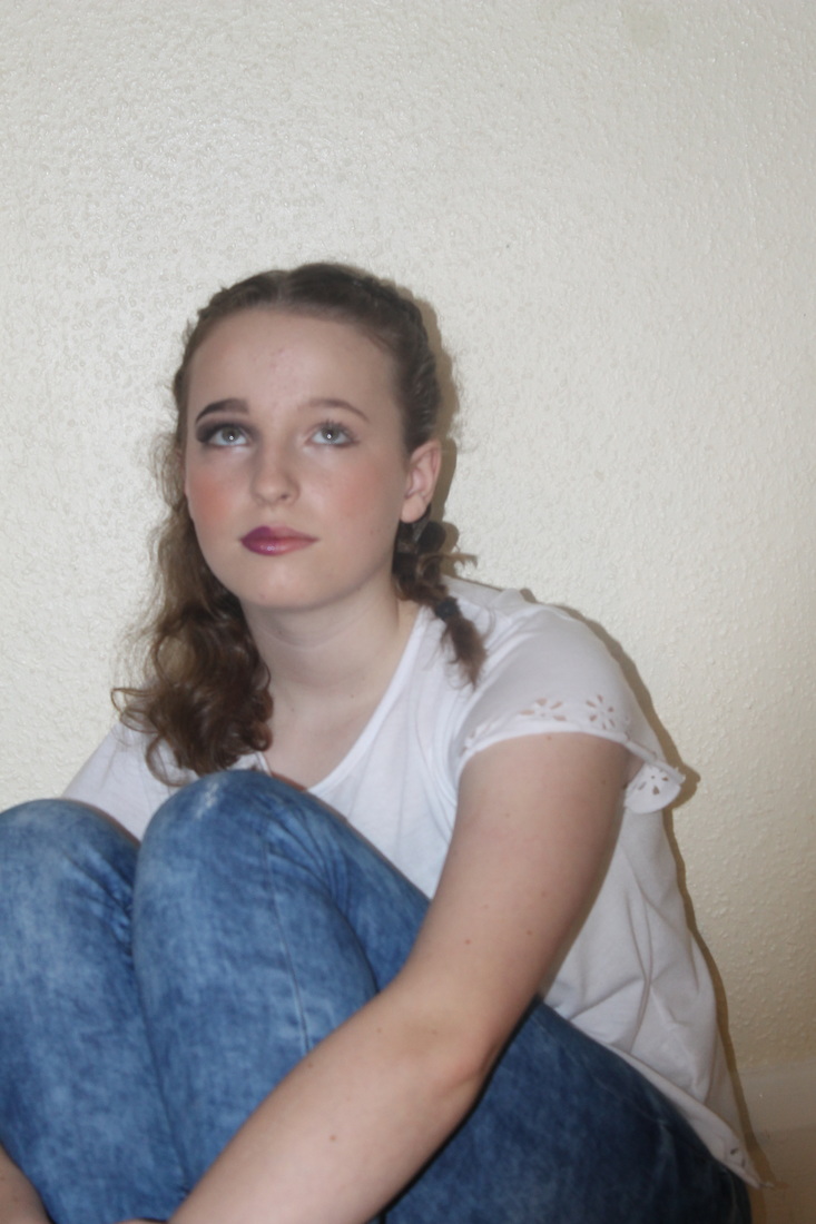
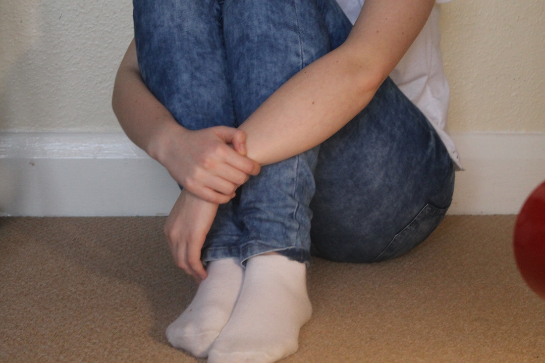
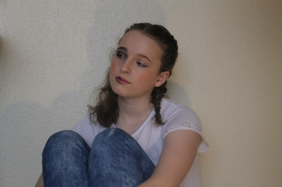
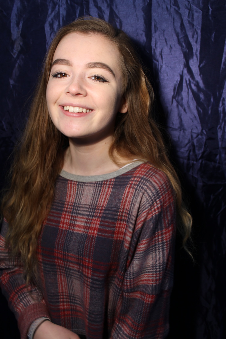
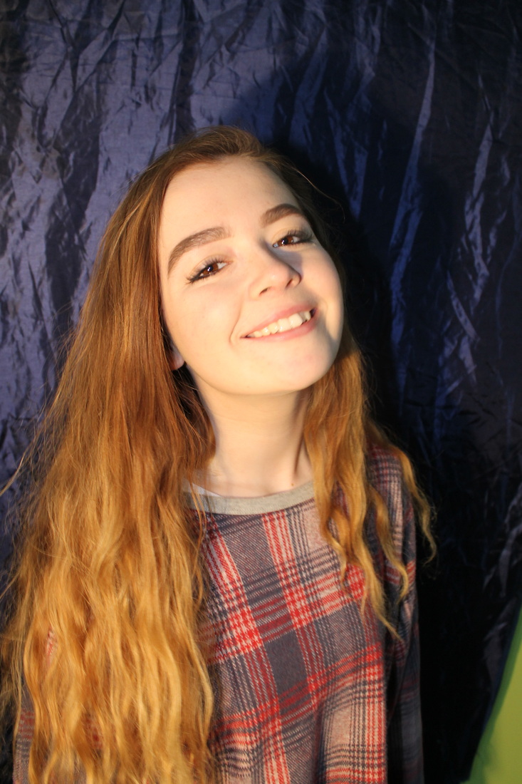
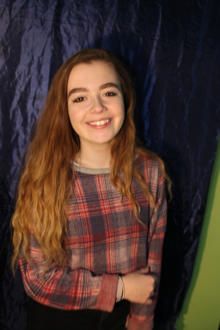
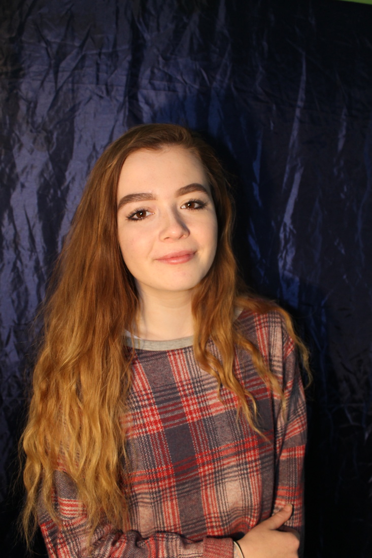
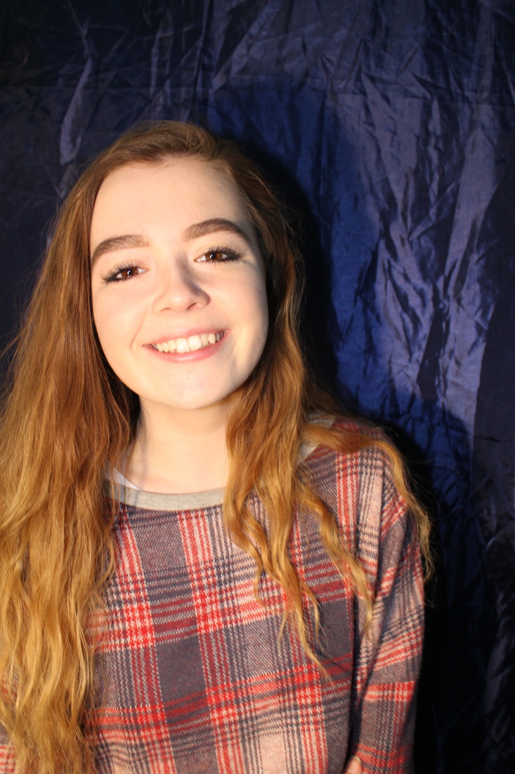
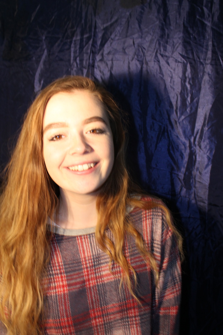
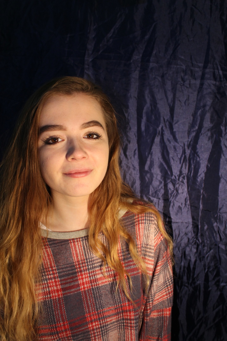
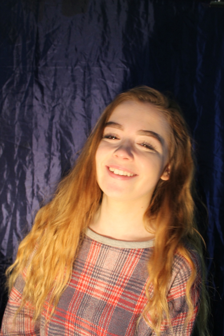
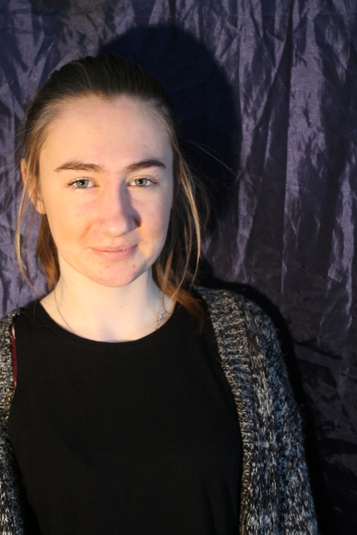
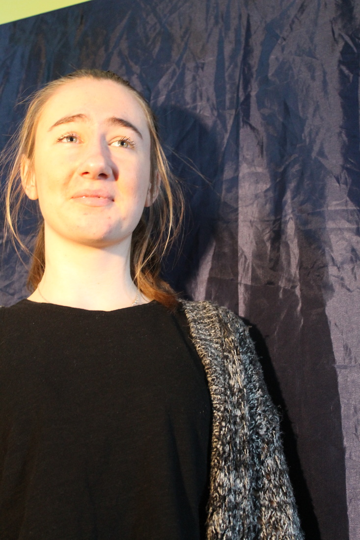
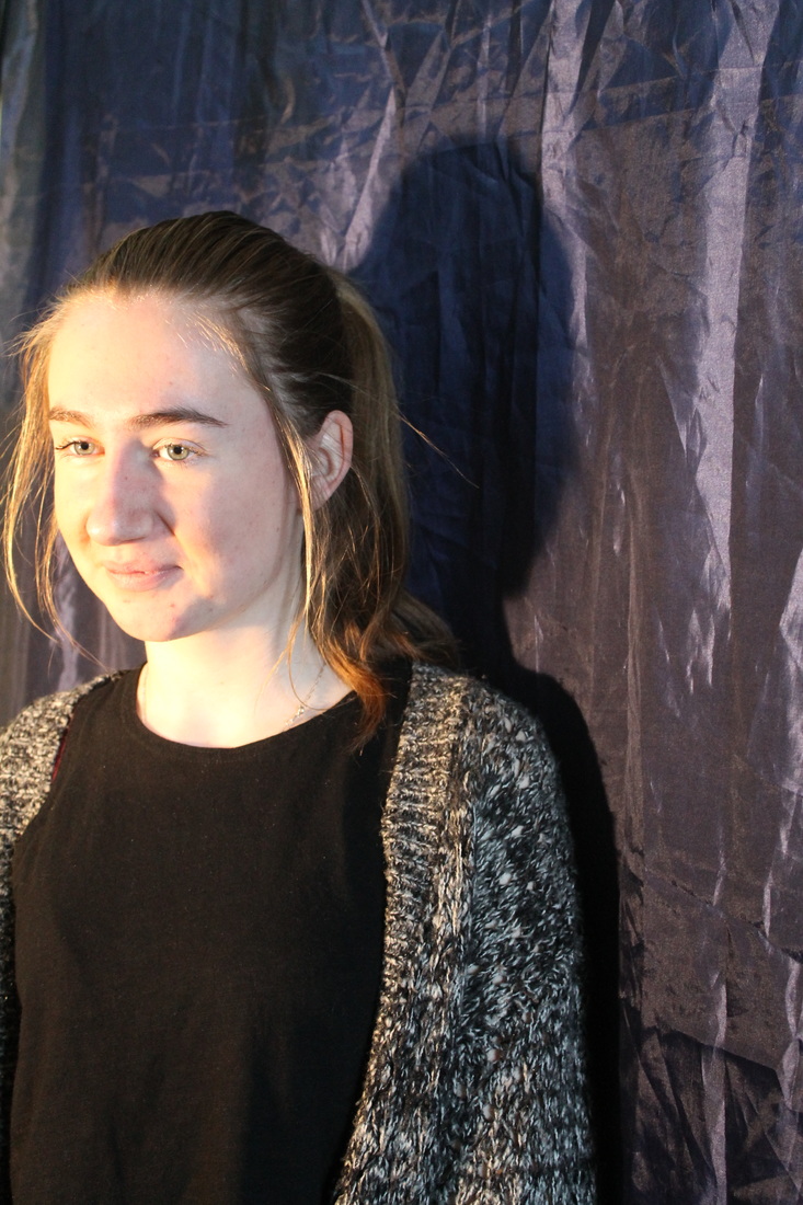
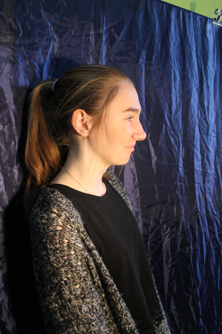
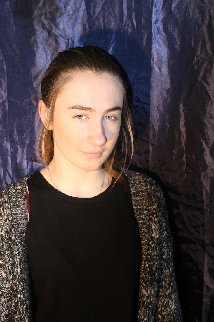
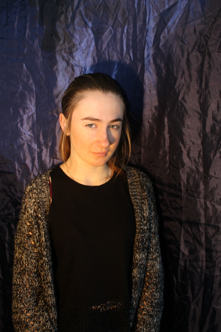
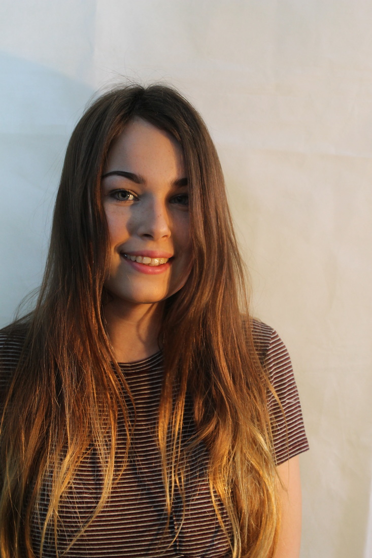
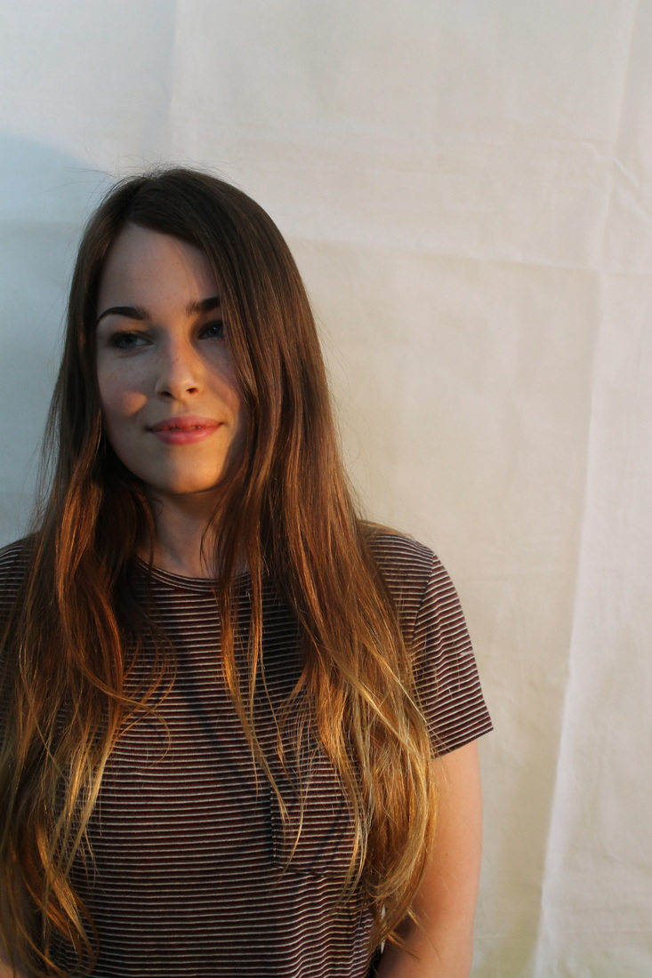
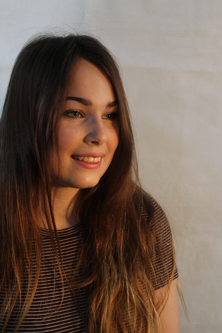
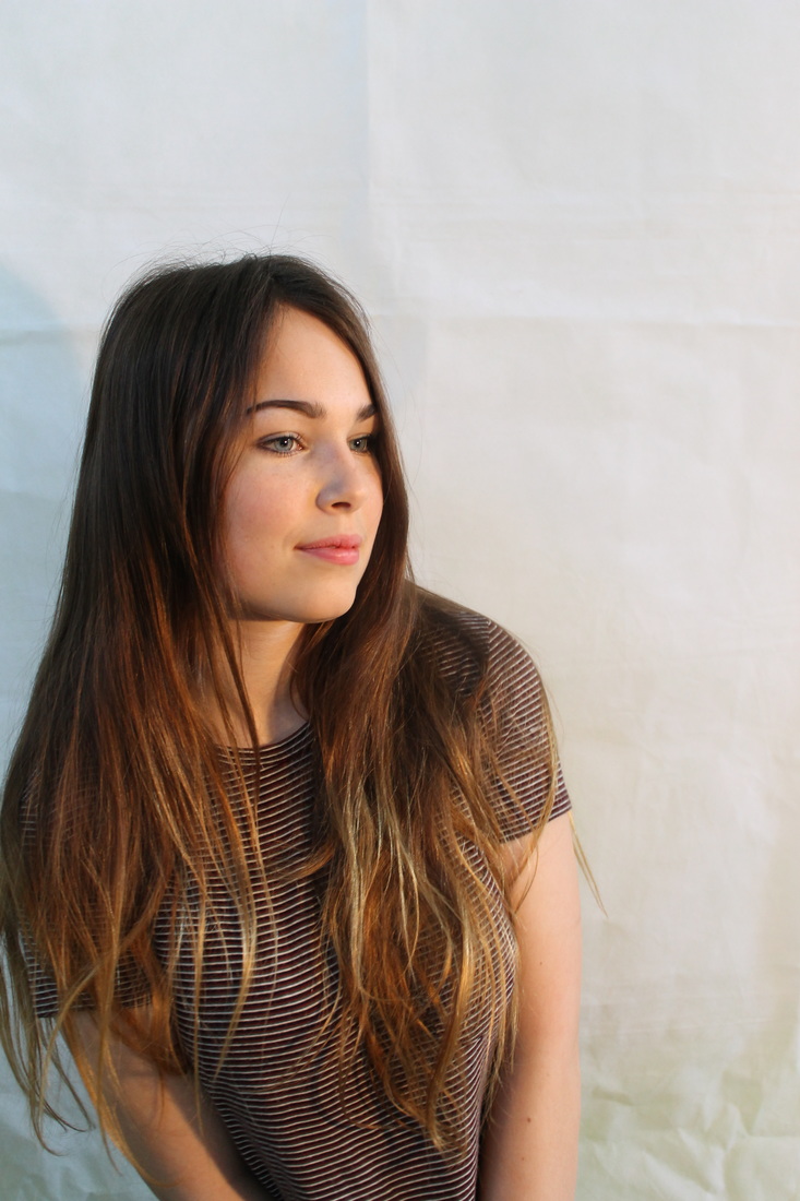
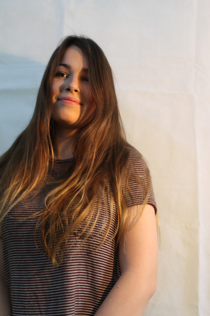
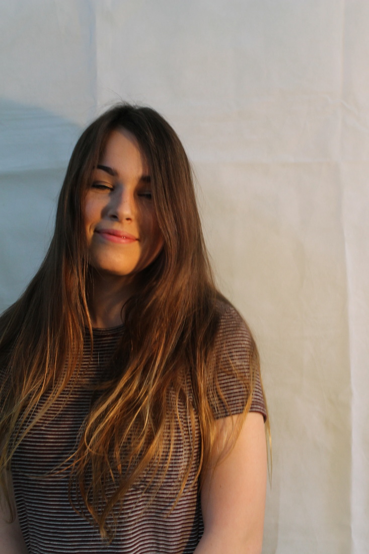
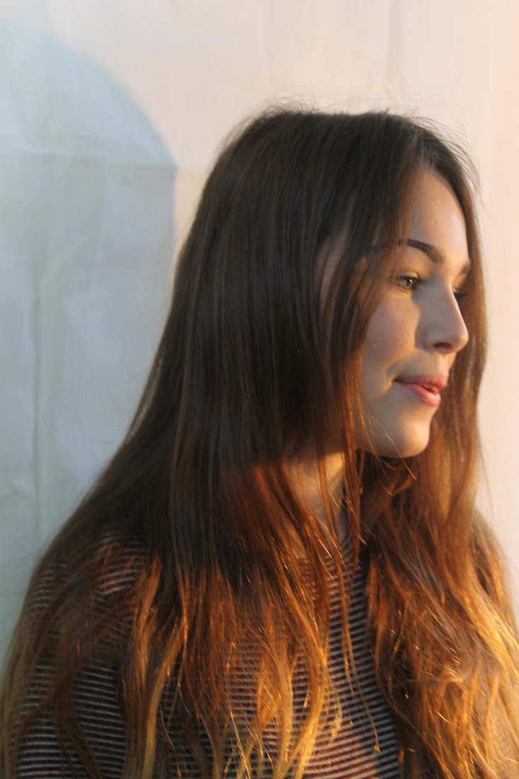
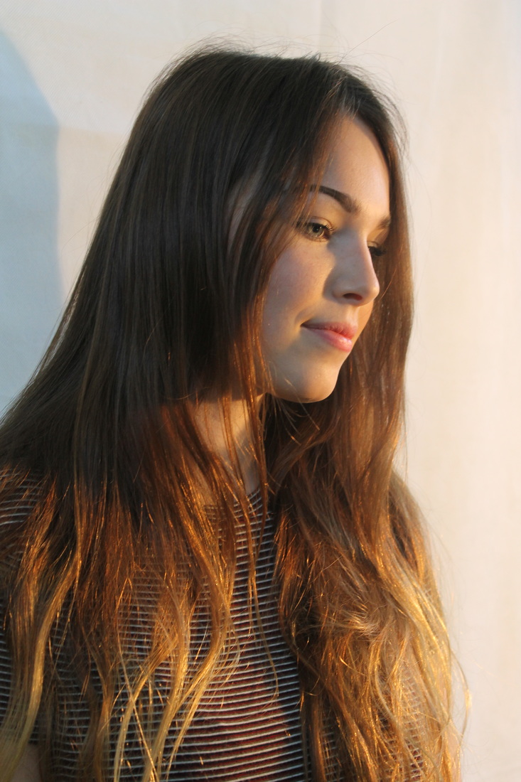
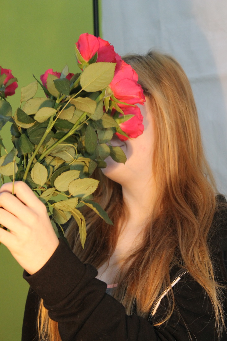
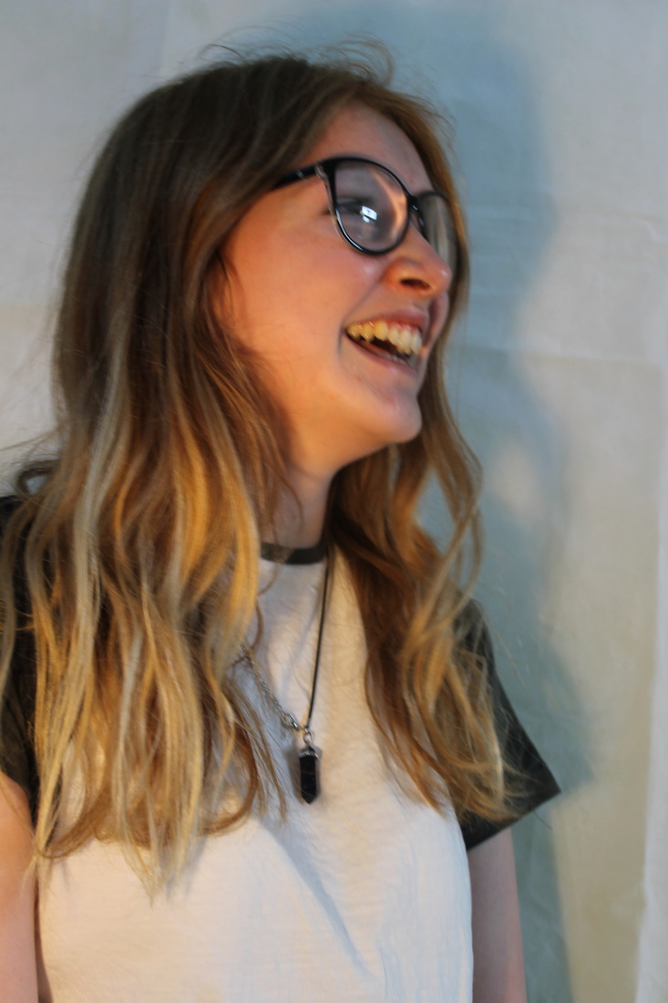
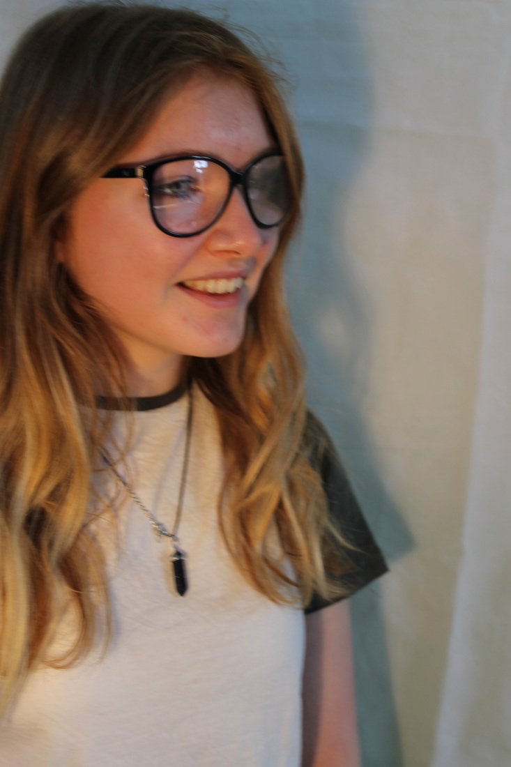
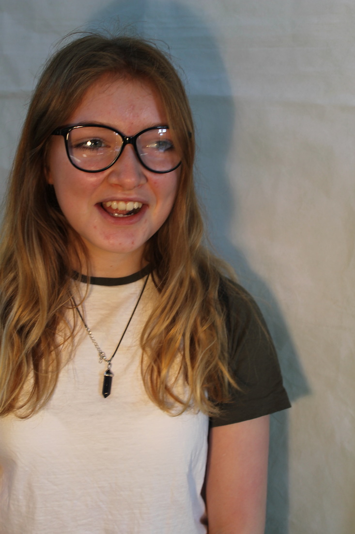
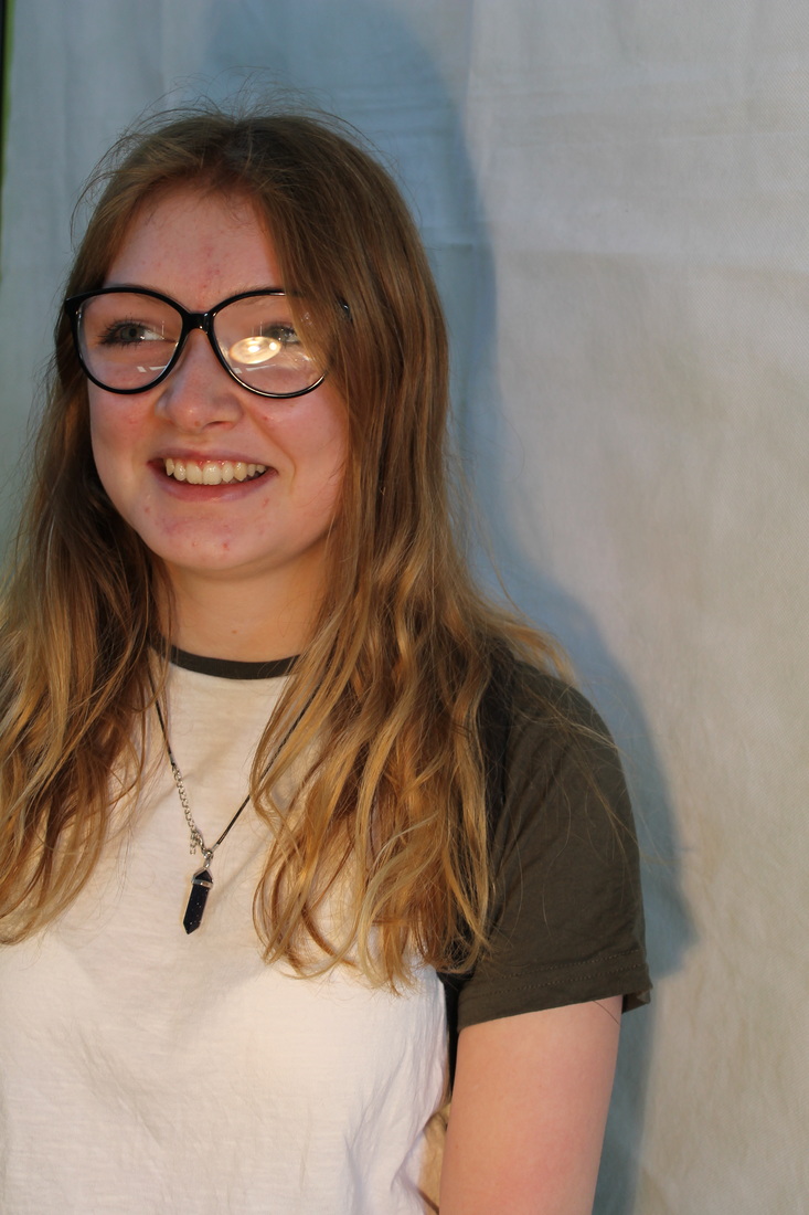
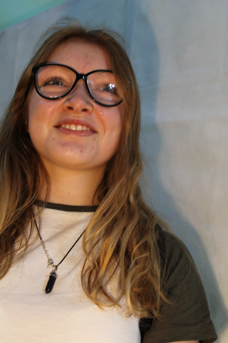
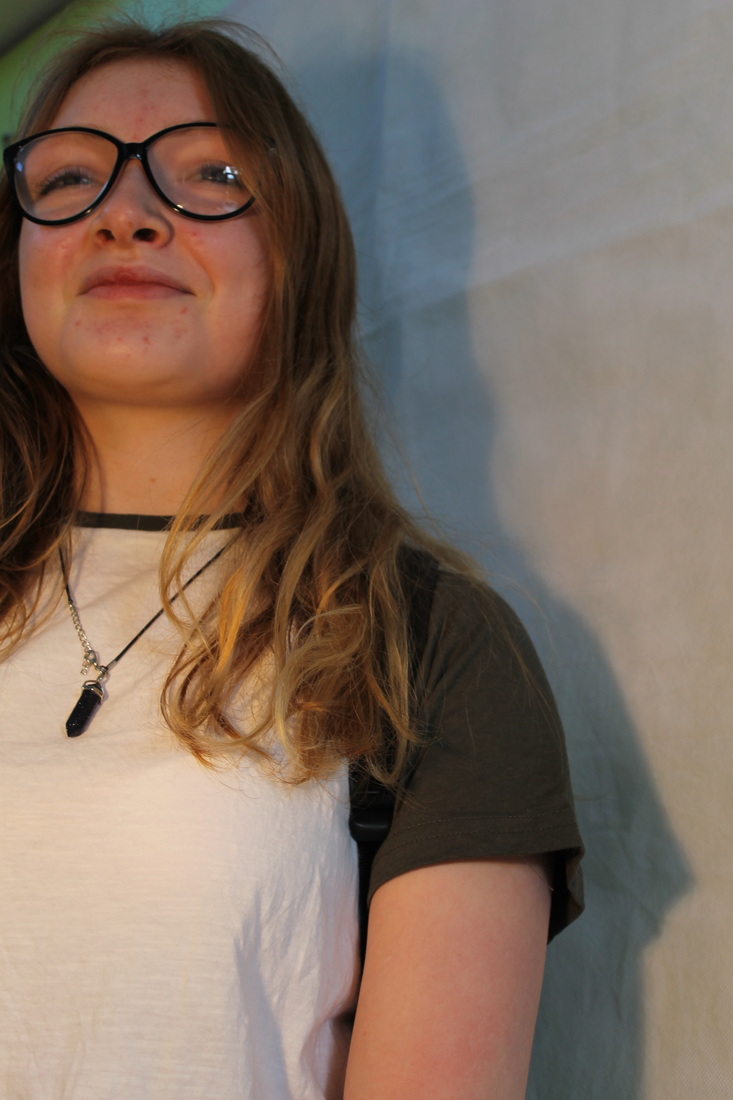
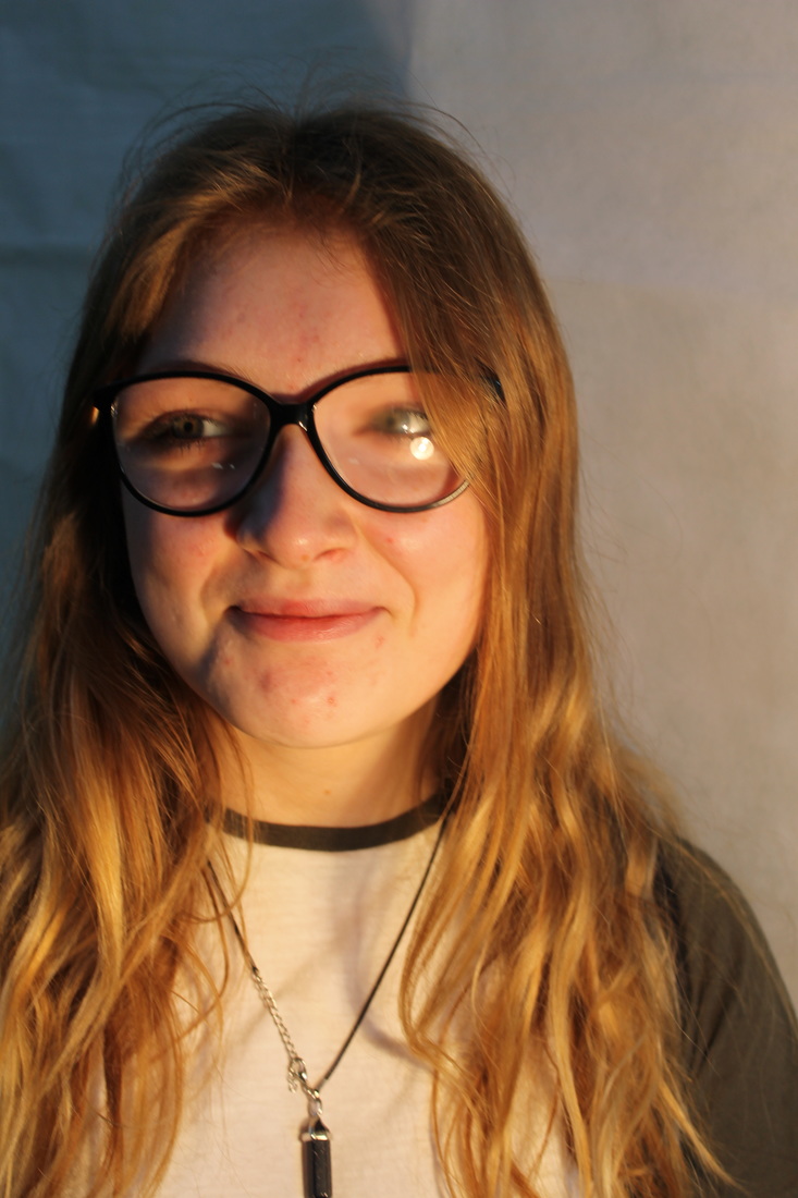
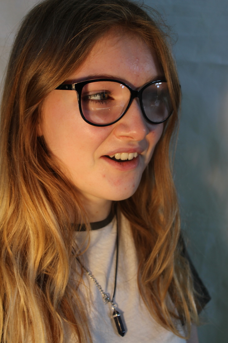
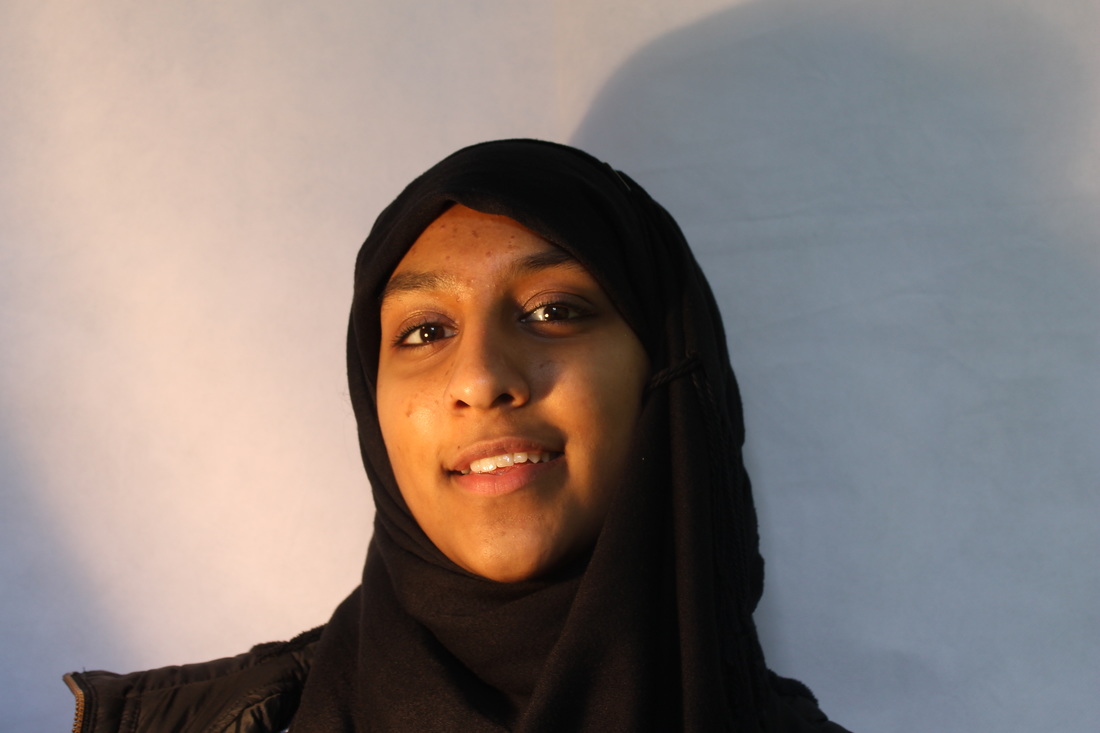
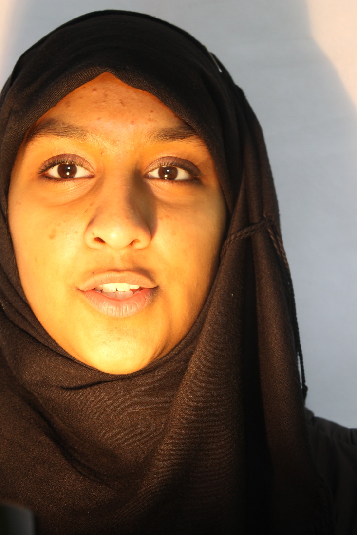
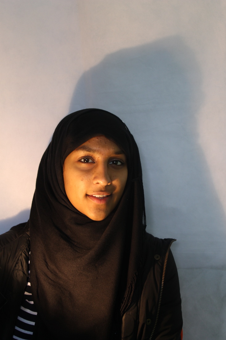
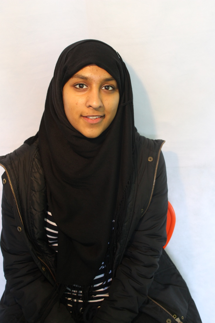
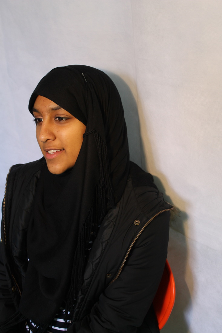
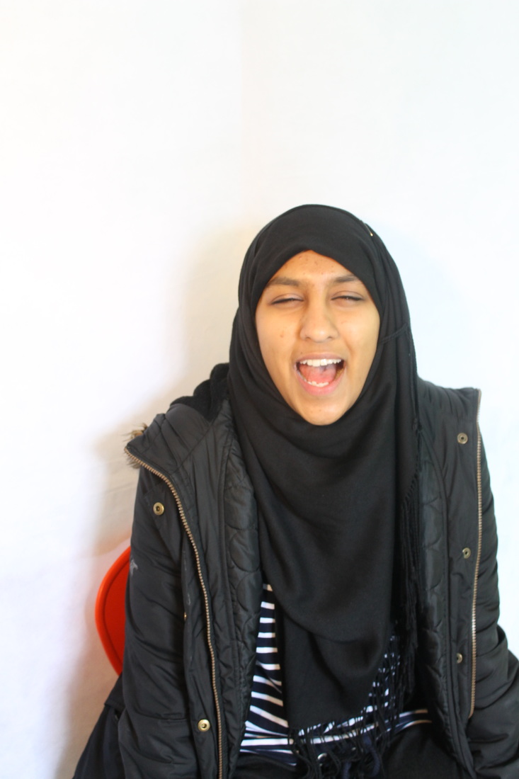
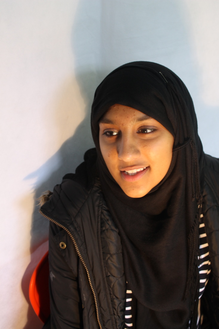
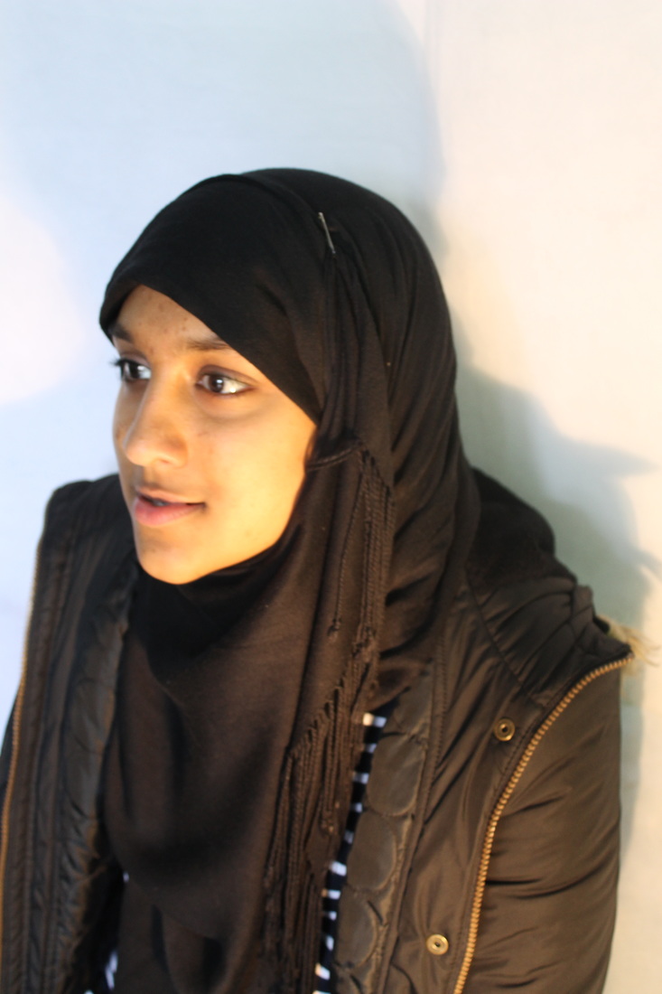
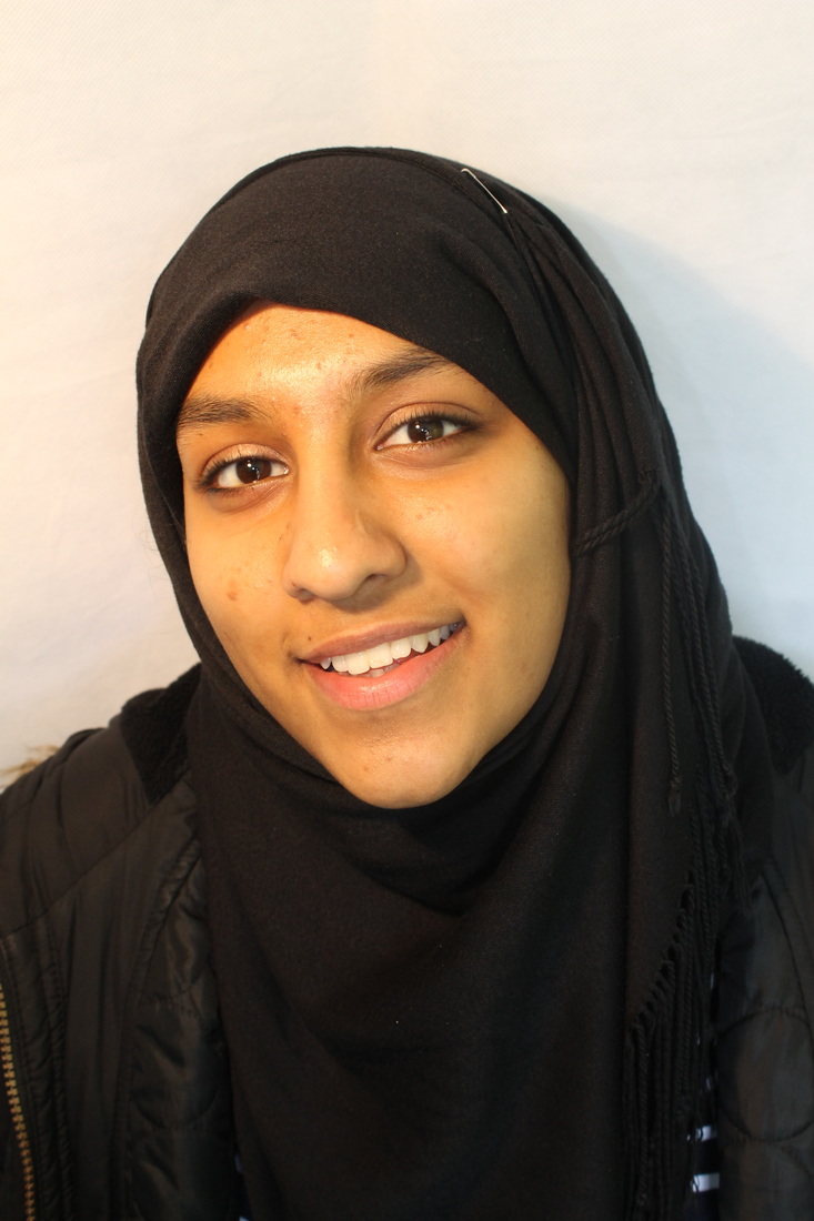
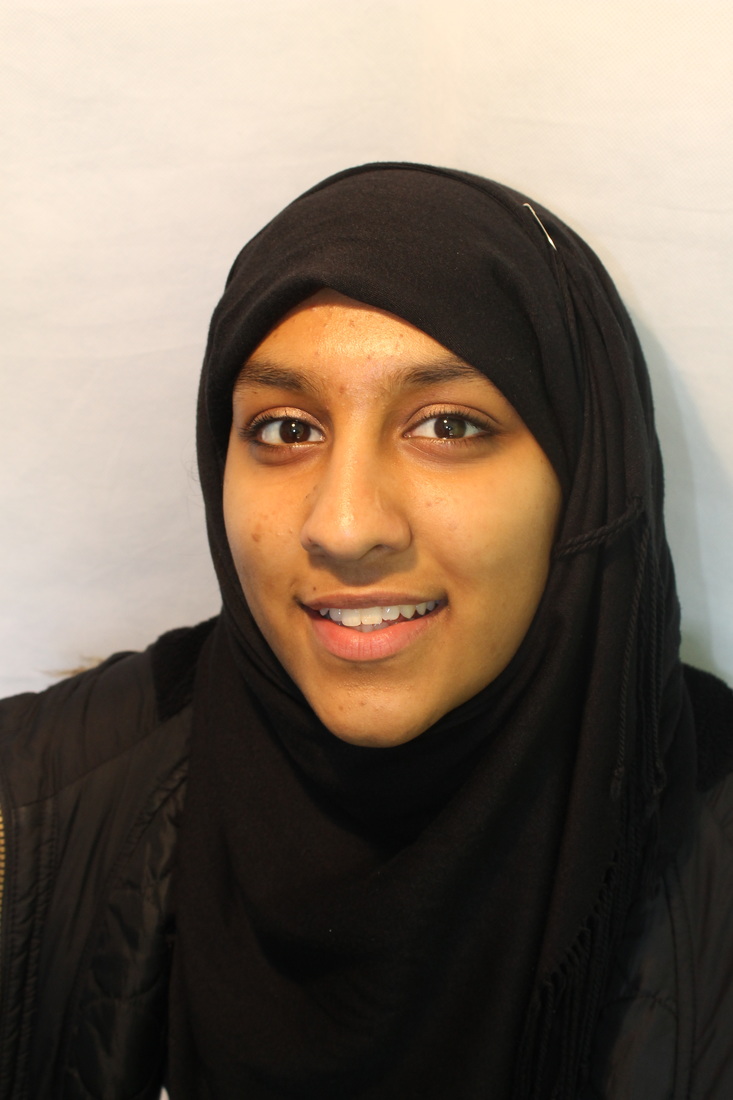
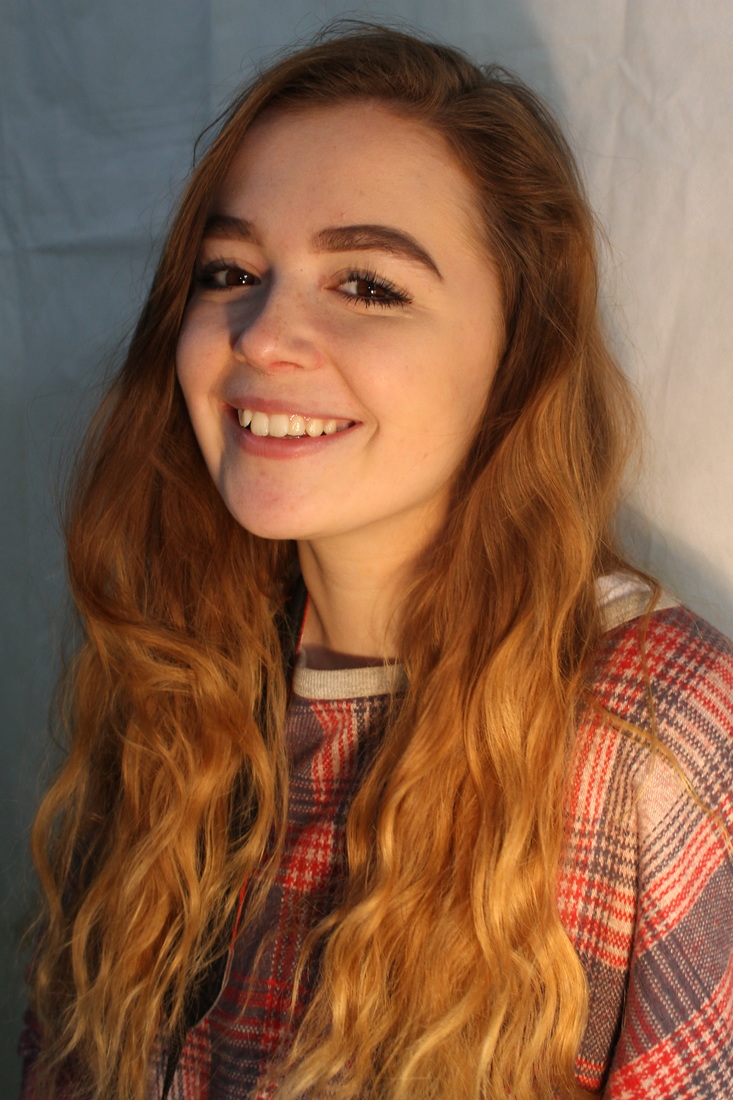
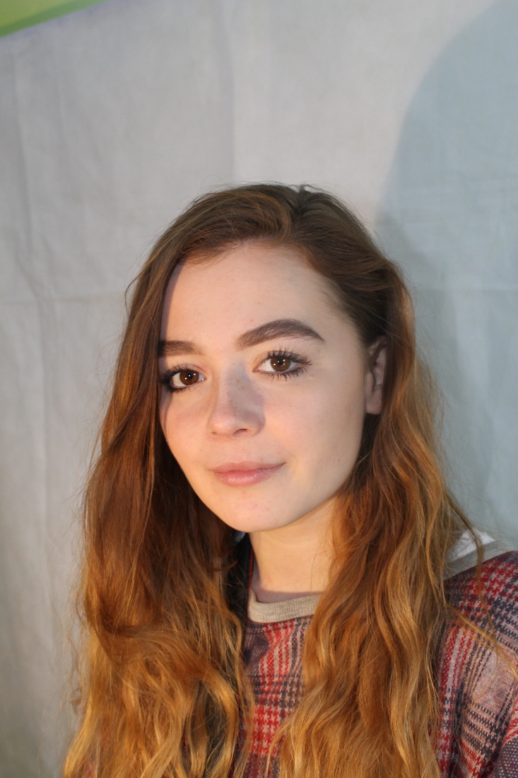
Intitial Idea Photoshoot...
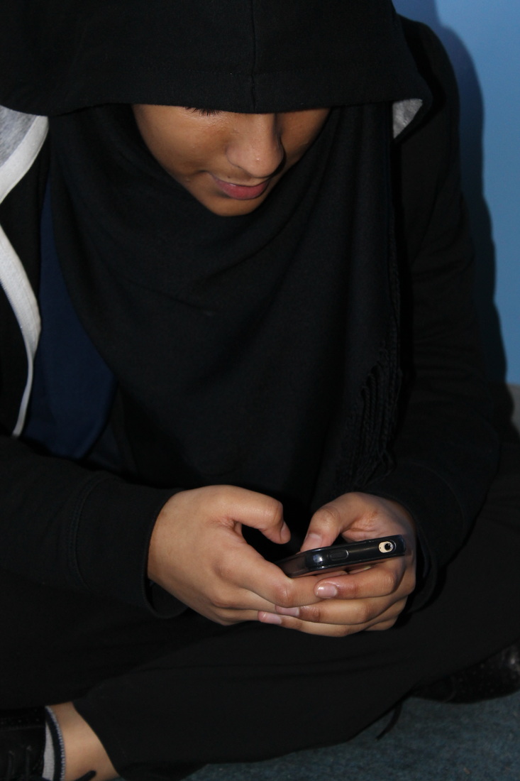
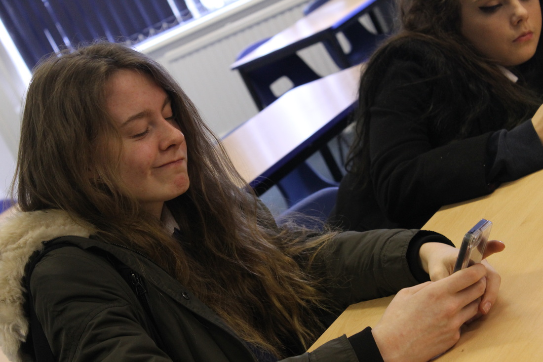
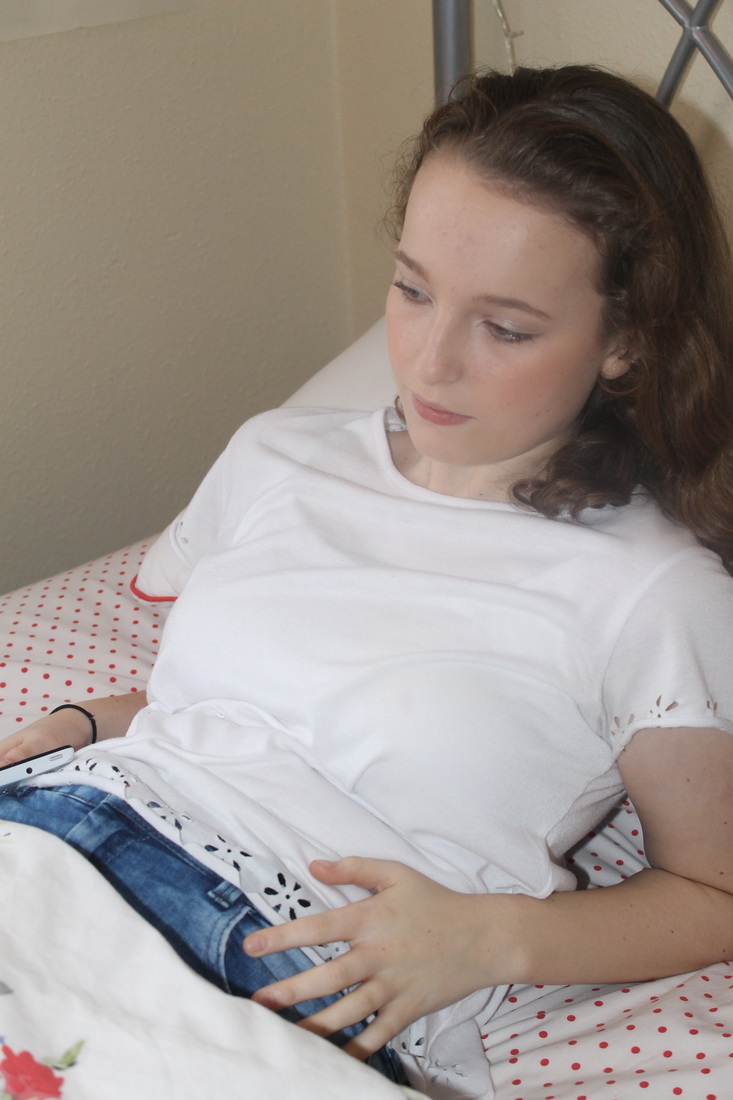
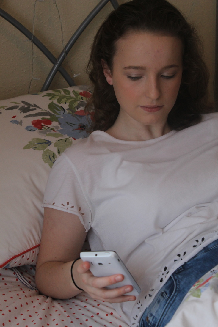
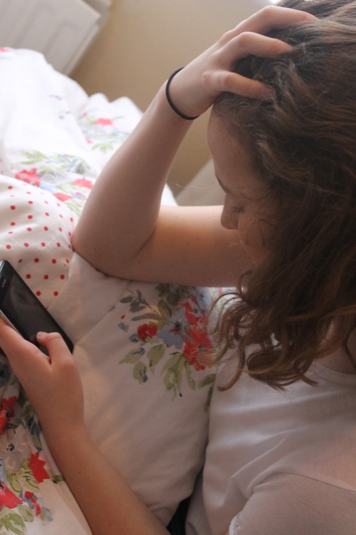
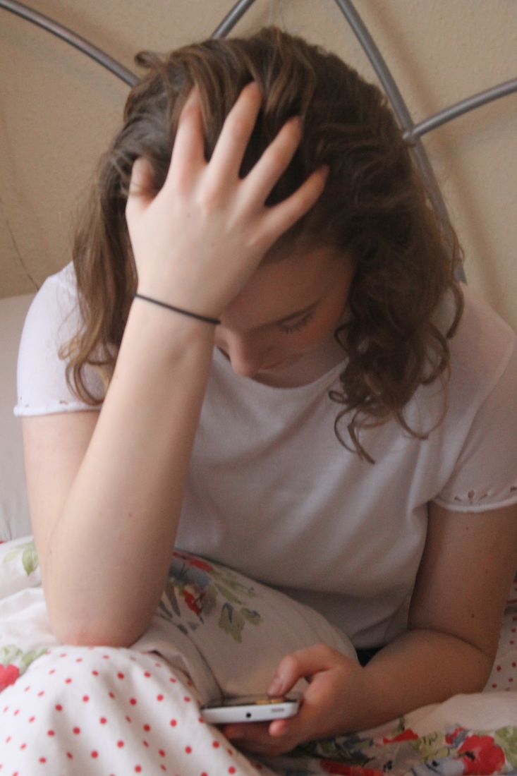
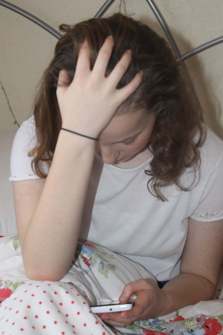
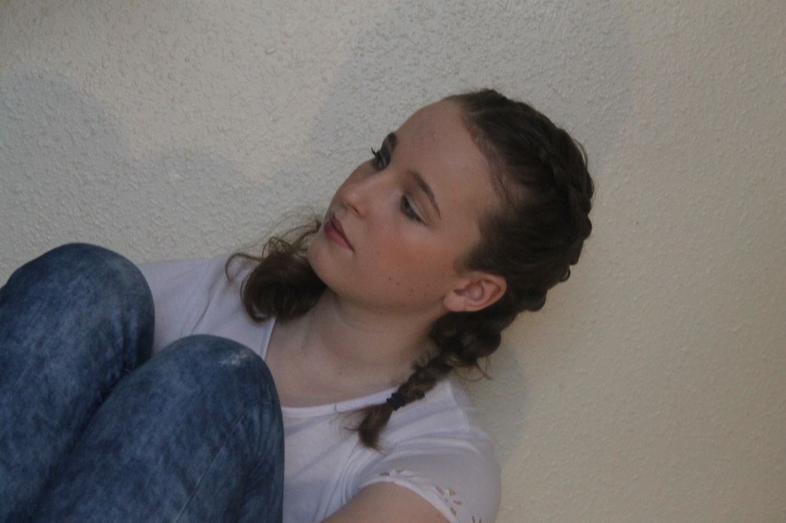
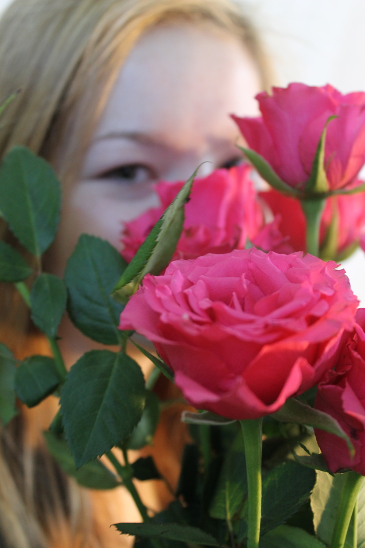
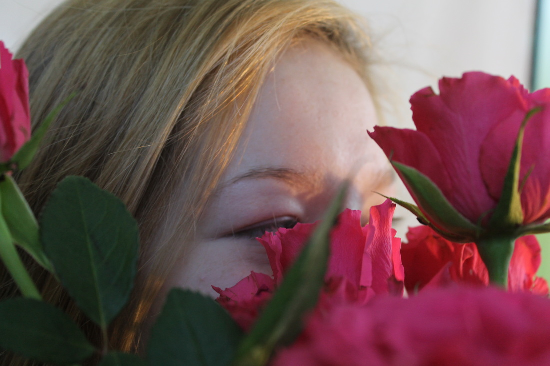
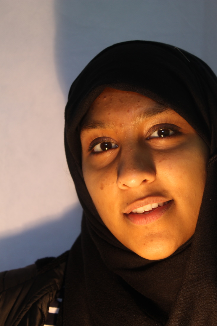
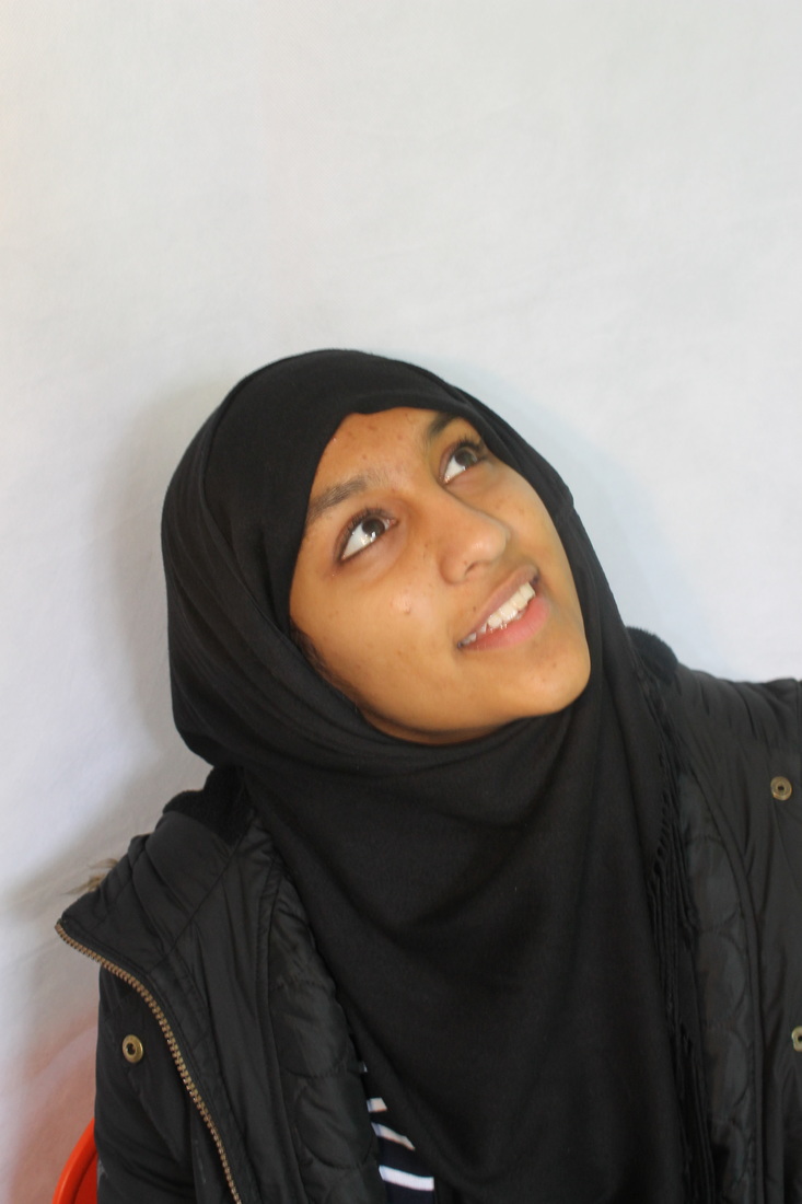
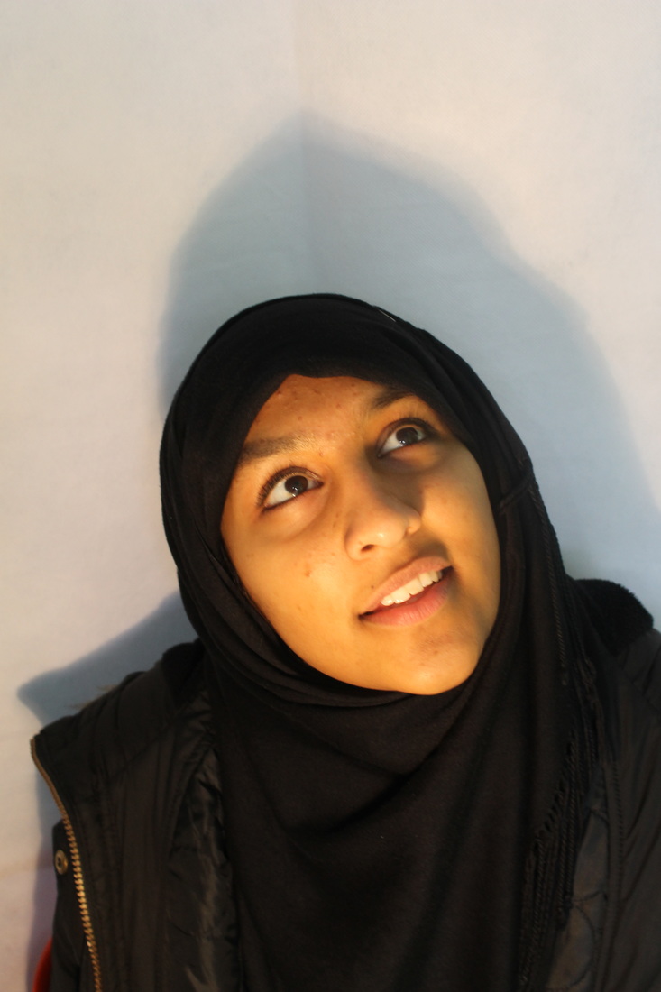
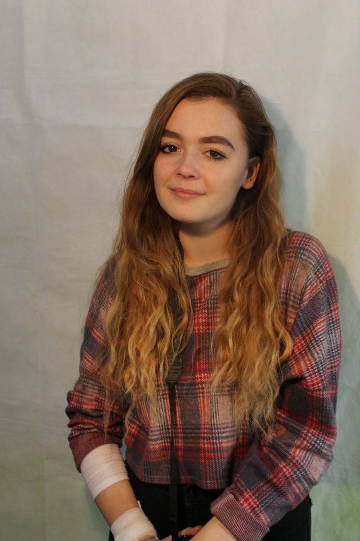
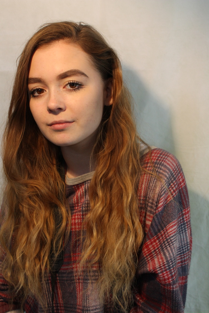
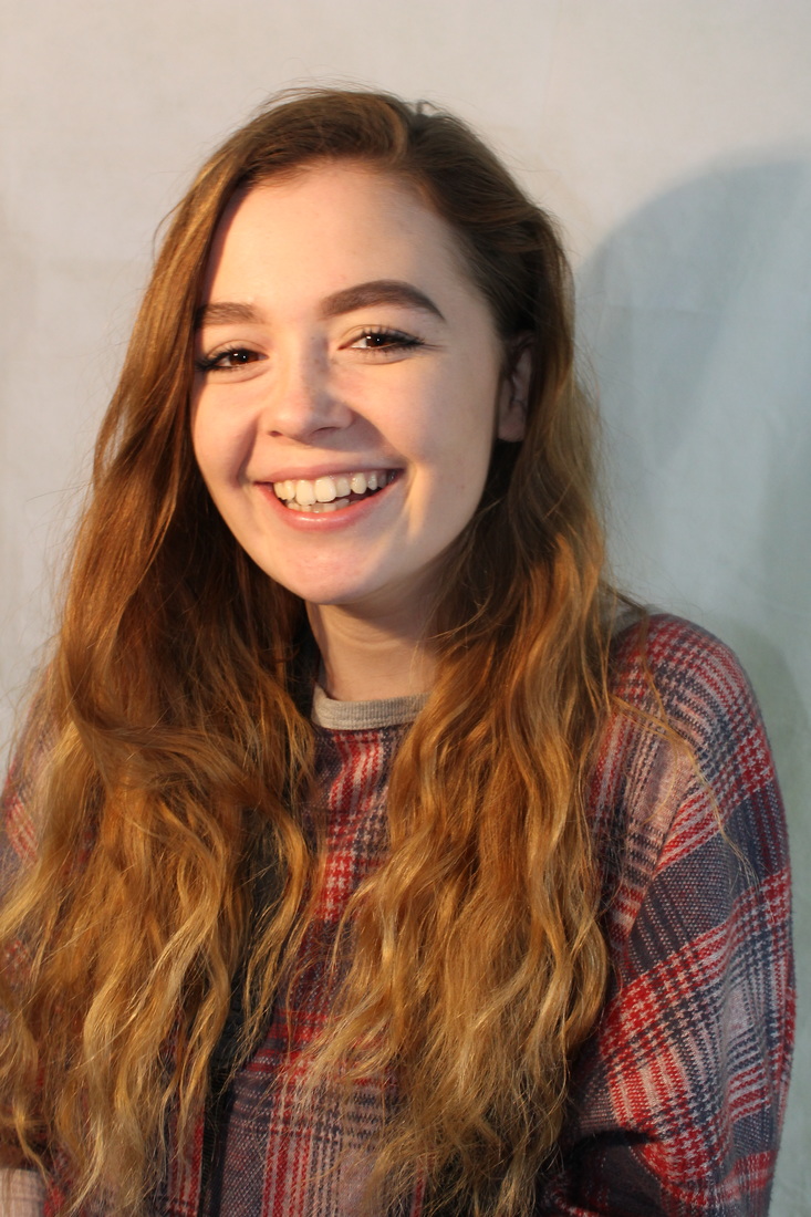
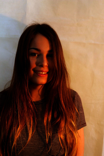
My two favourites...
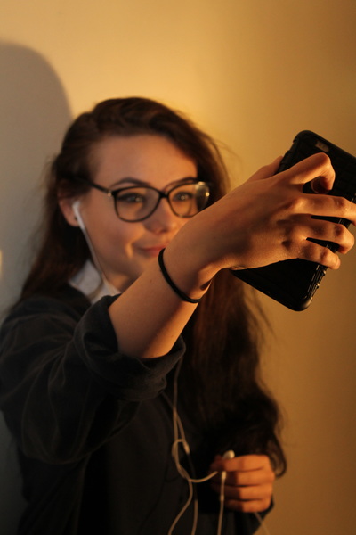
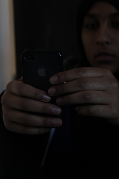
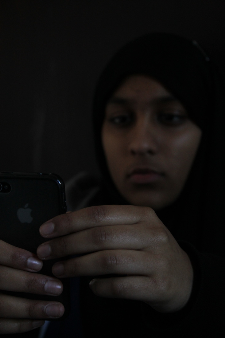
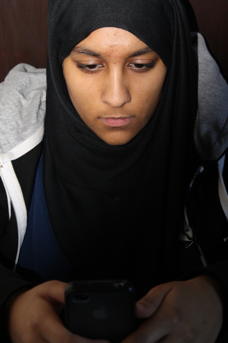
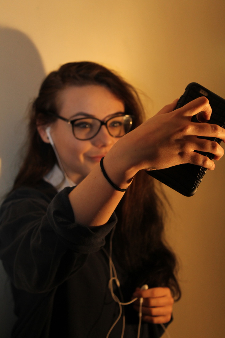
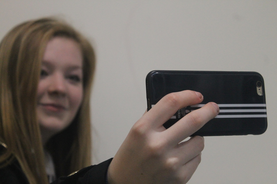
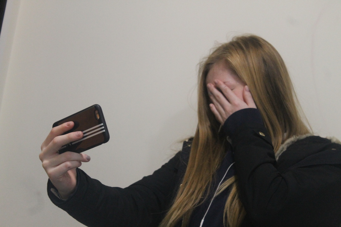
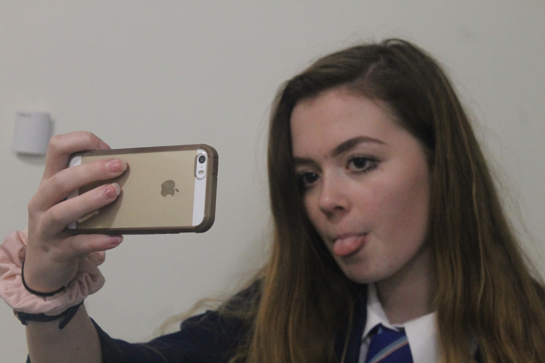
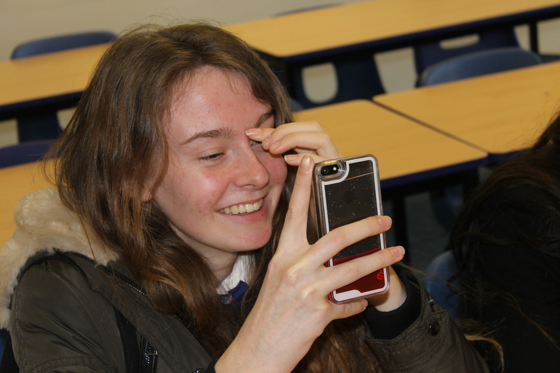
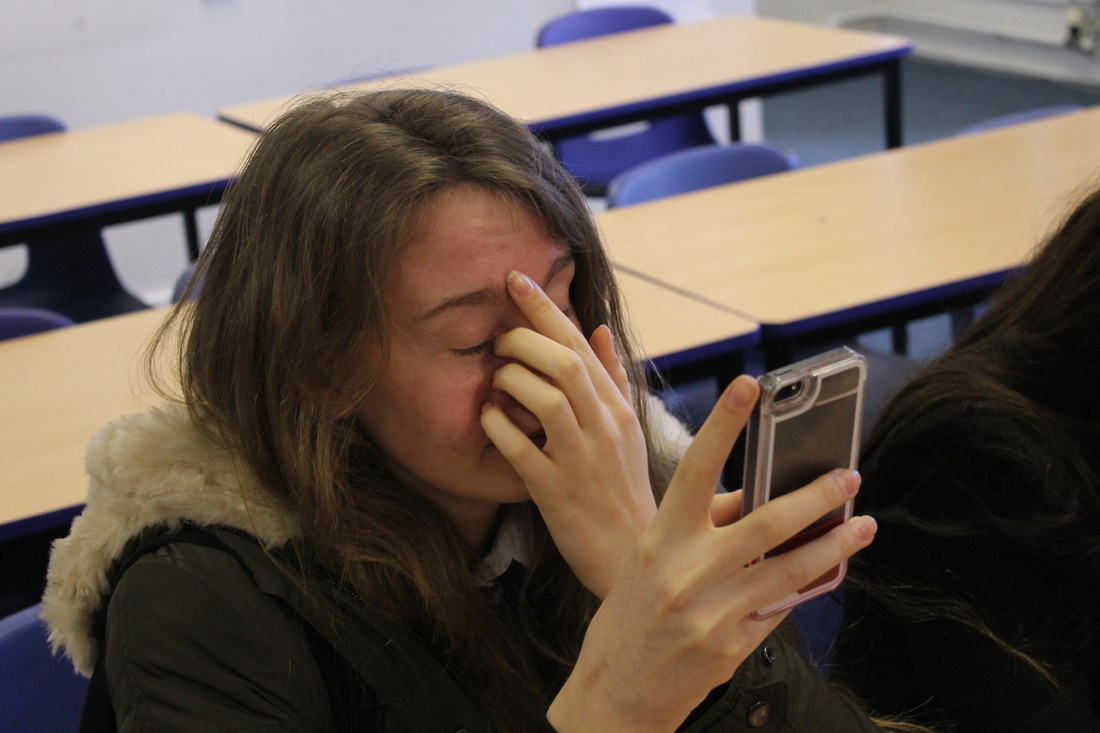
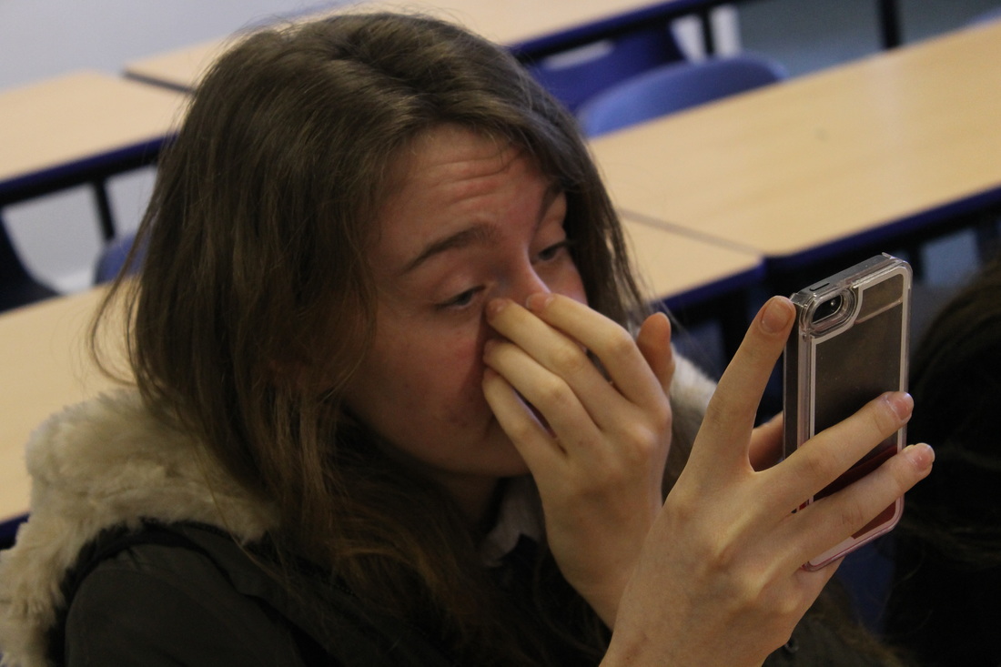
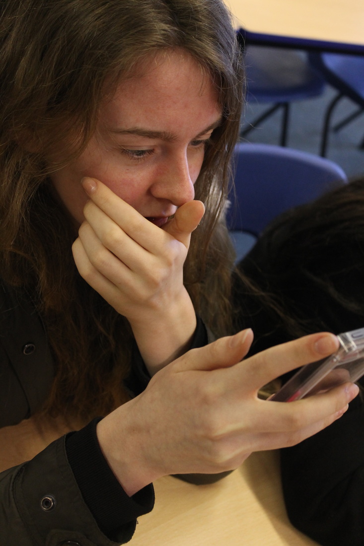
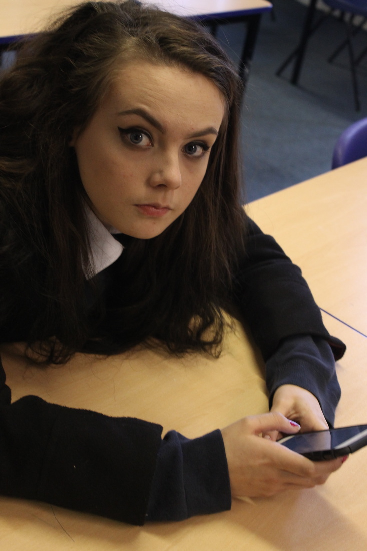
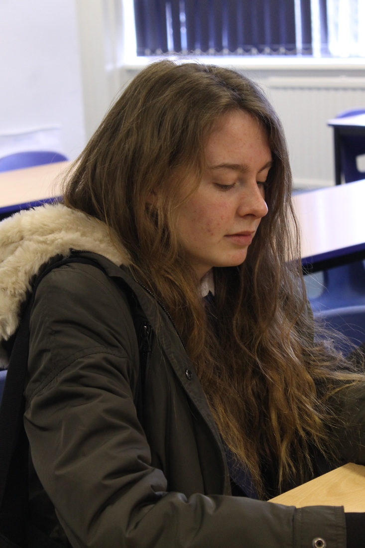
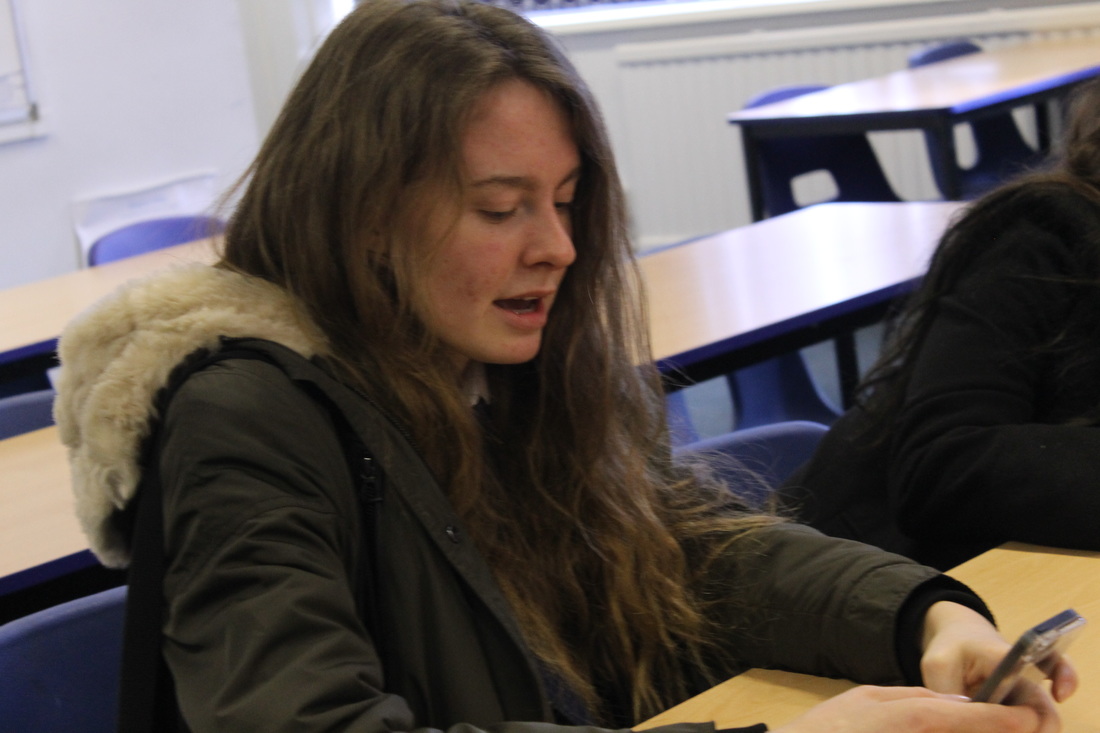
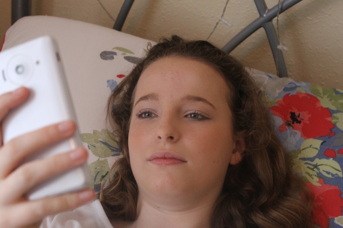
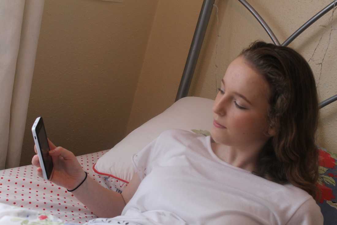
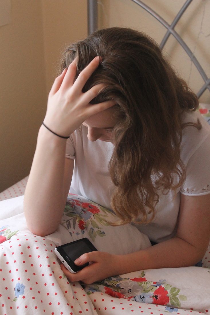
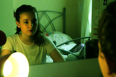
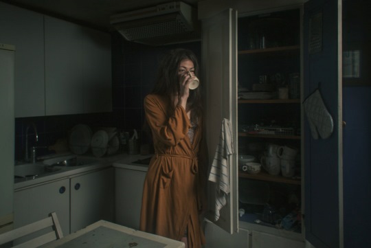
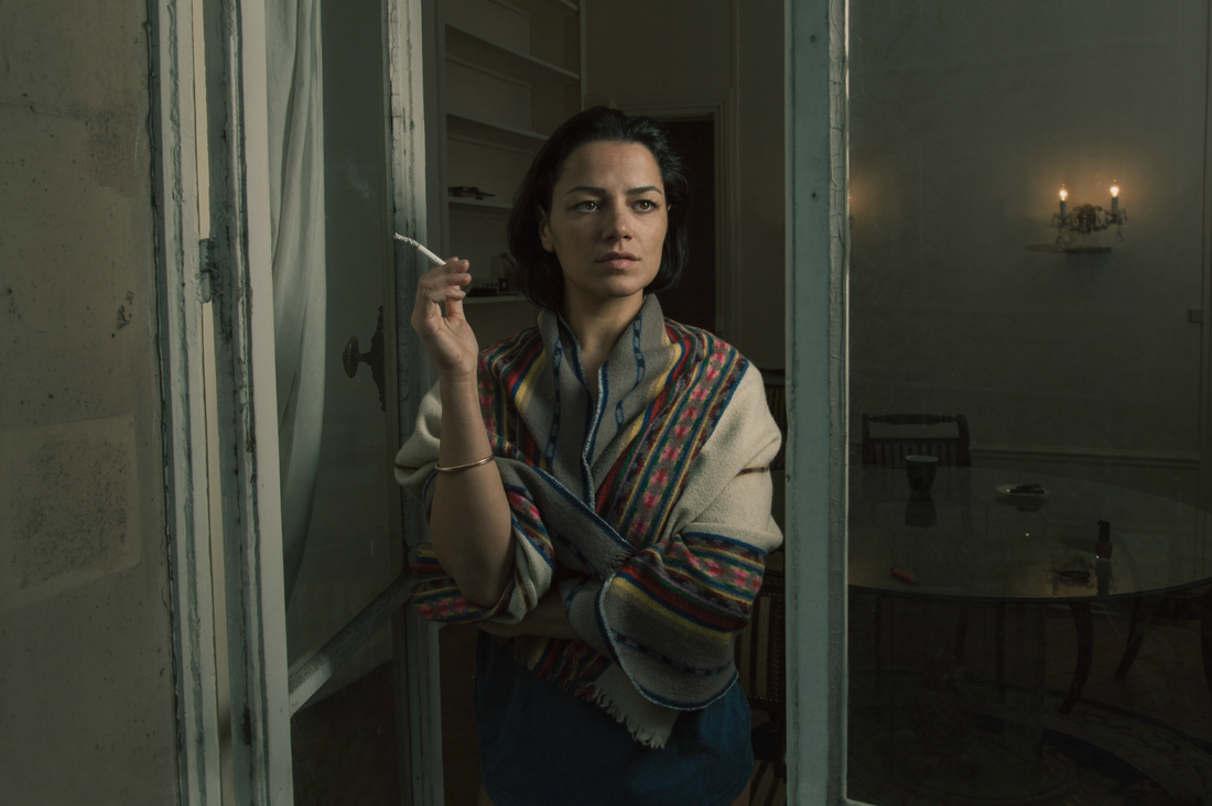
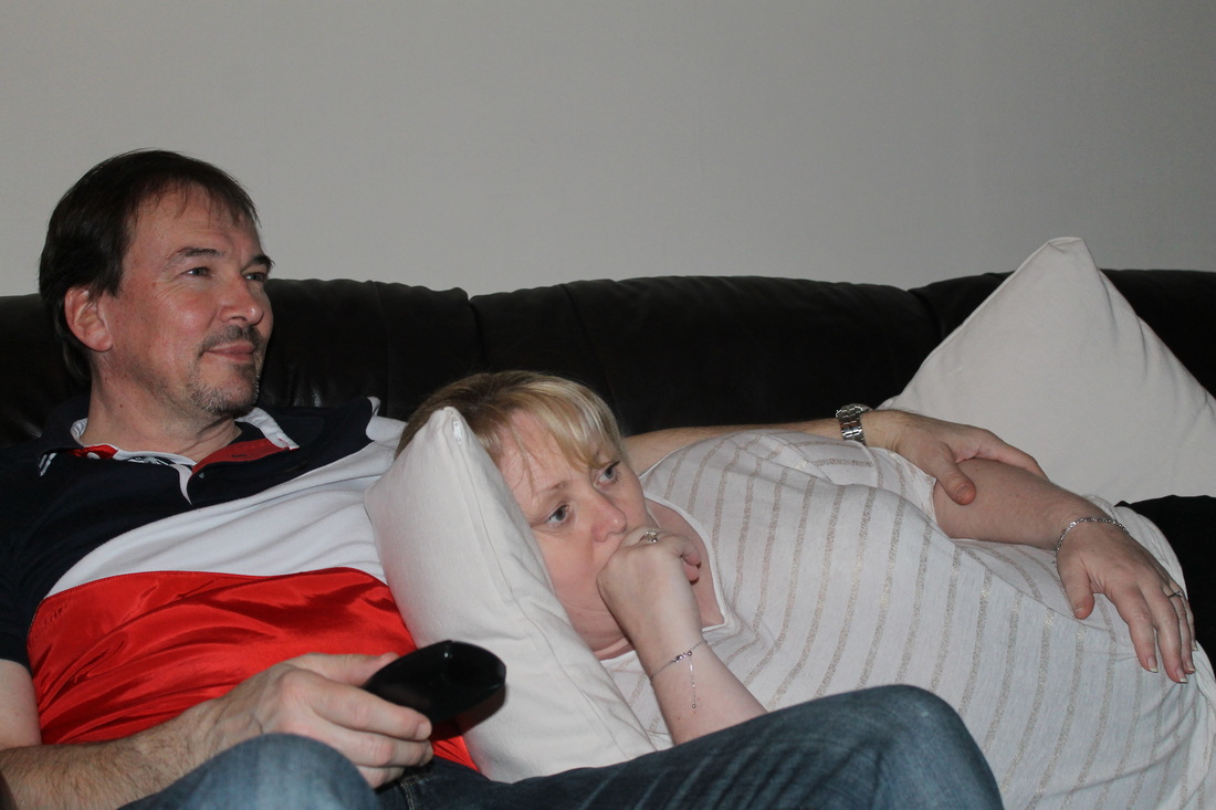
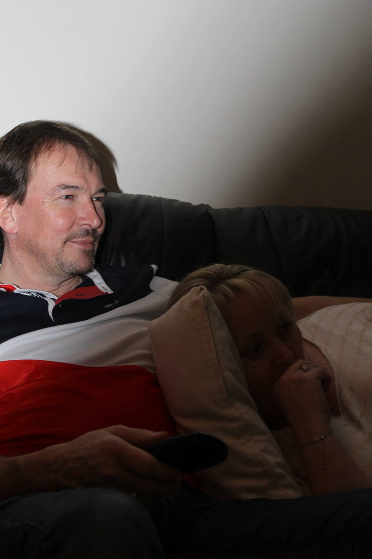
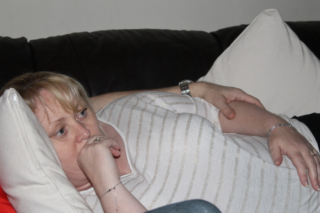
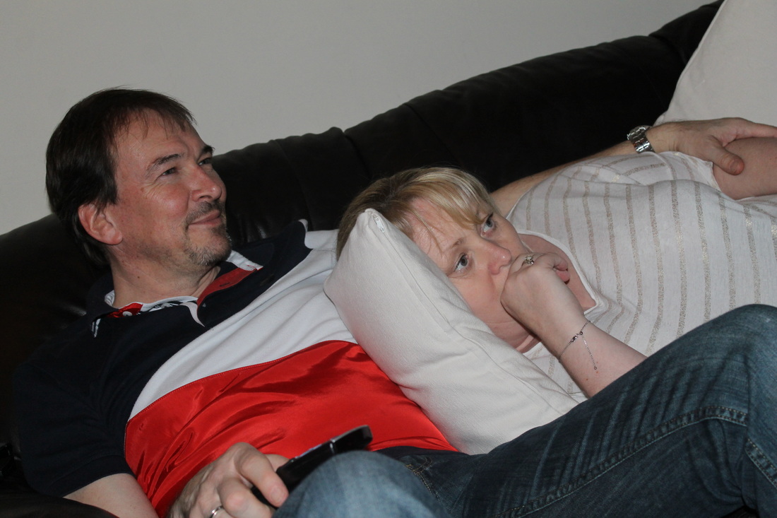
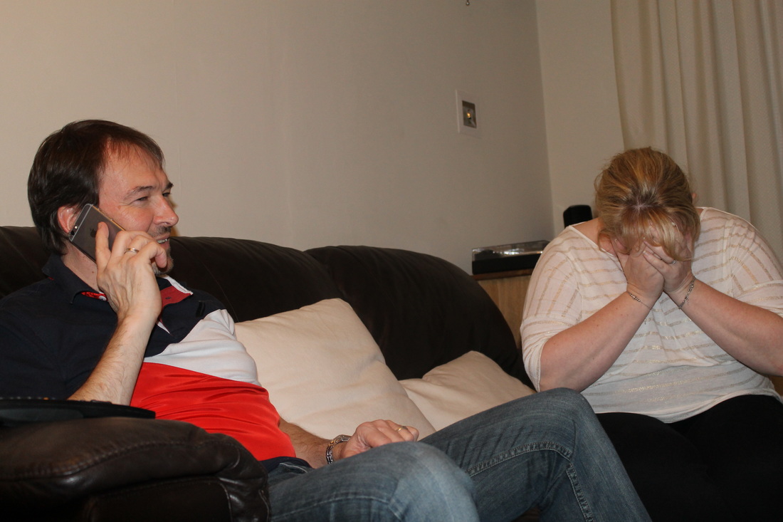
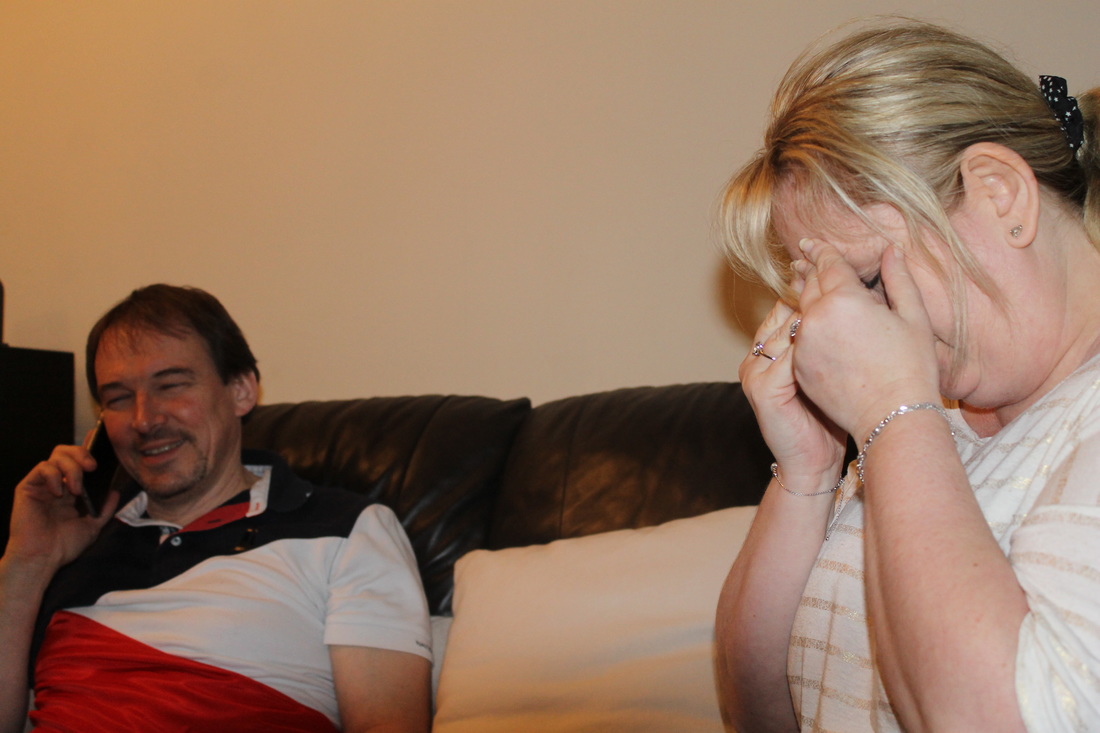
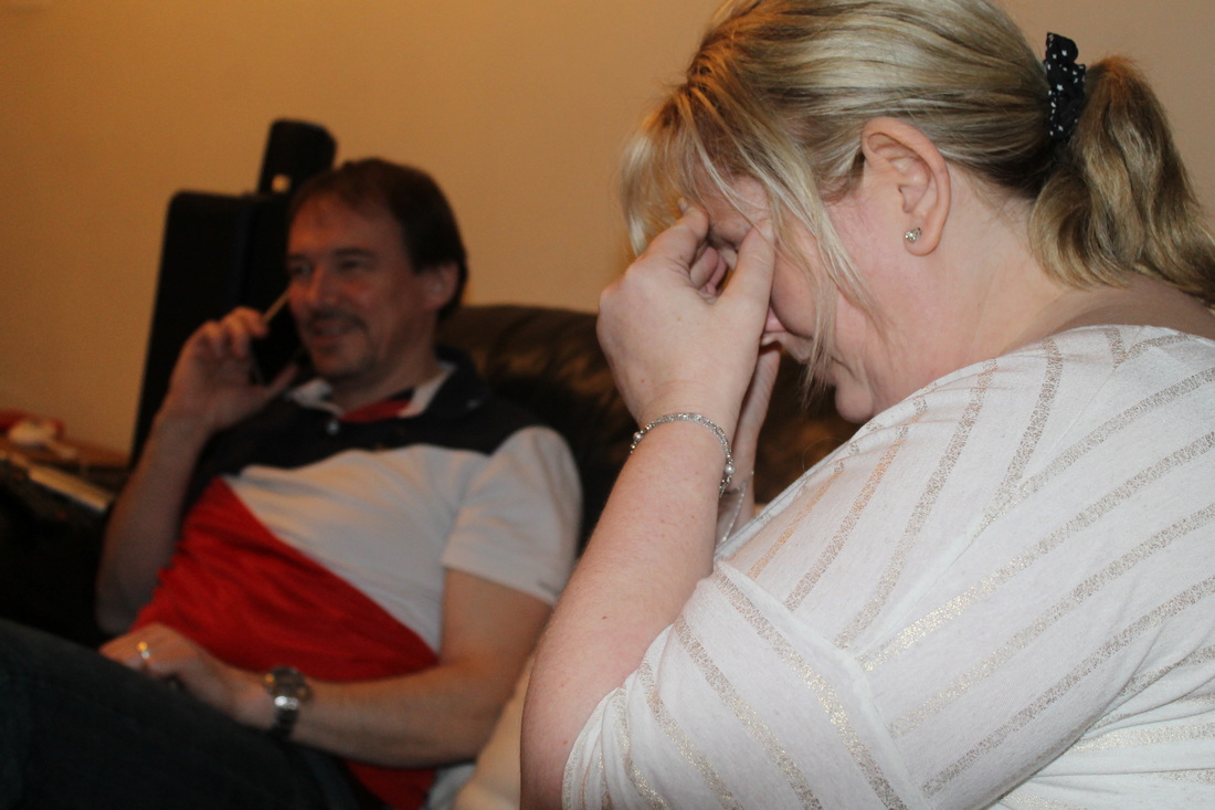
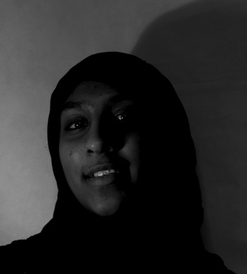
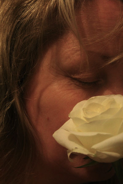
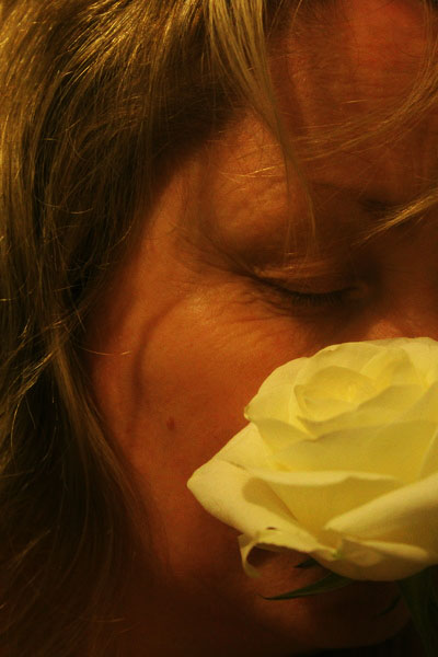
From my first photoshoot I think that these two are my favourites due to the contrast of lighting between the two, the first photograph shows the happier emotions a teenage girls experiences. I particularly like the way the girl is slightly out of focus and brings the eye to the phone she is holding, while taking a selfie; she is capturing these emotions which most teenagers do and shows part of my initial idea for this project. The second photograph shows the sad emotions and again is linked to a phone, most teenagers are heavily influenced by their phones and often influence their emotions from social media, I again like how the focus is on the phone and on the girls hands. This photo is a direct comparison to the first due to its dark feel to it and the monochrome style to it.
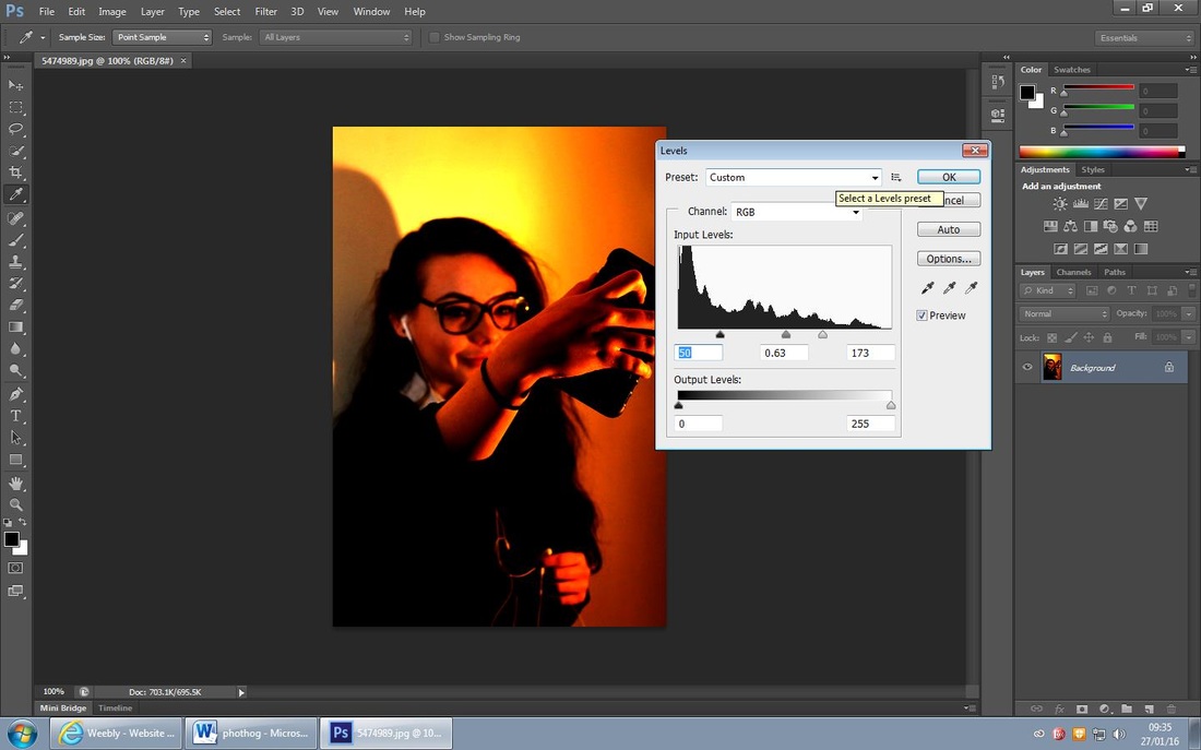
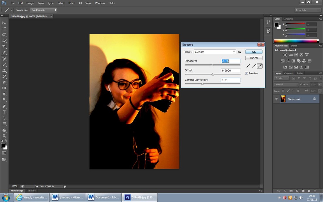
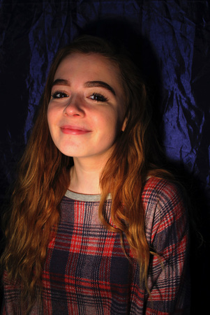
Edits...
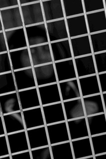
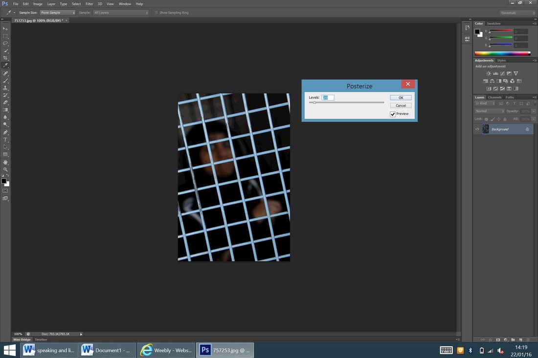
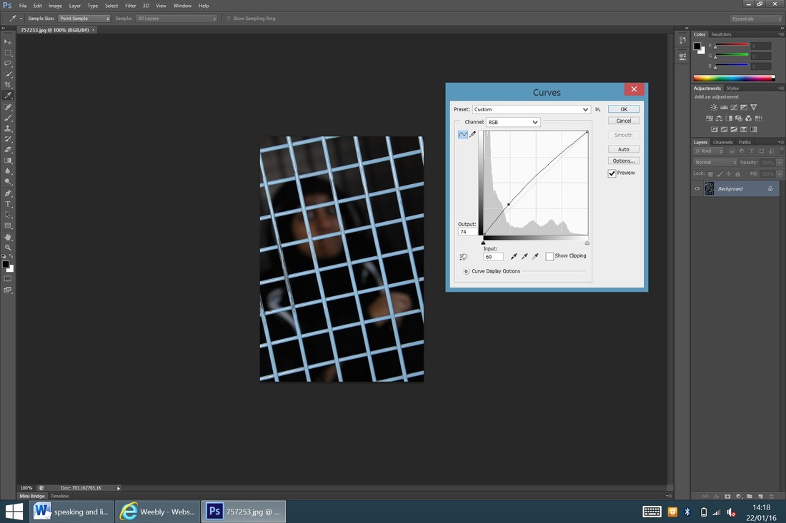
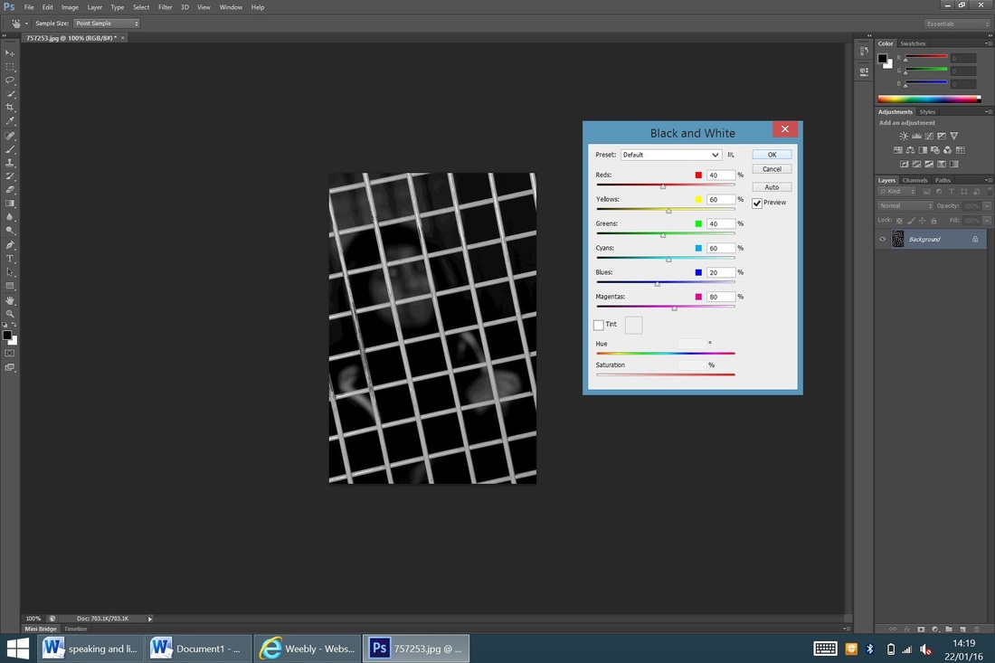
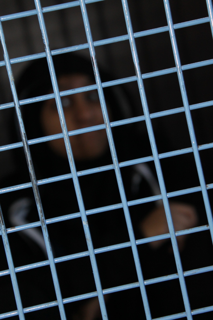
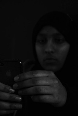
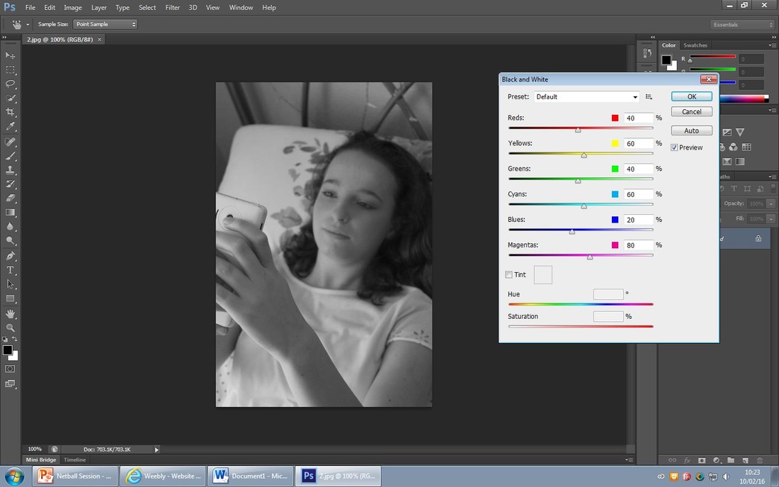
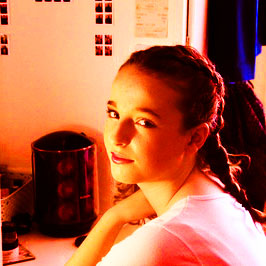
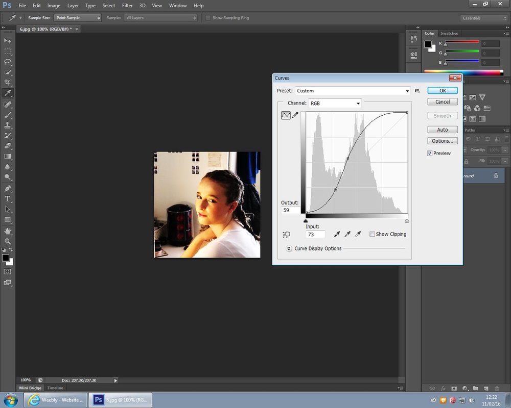
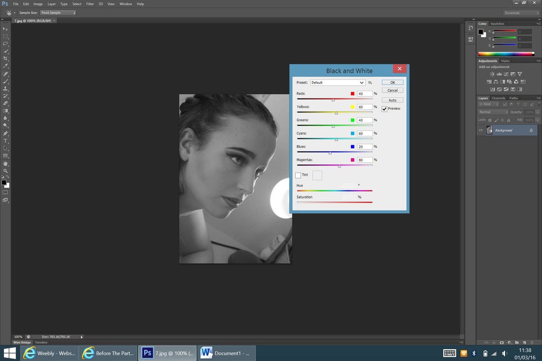
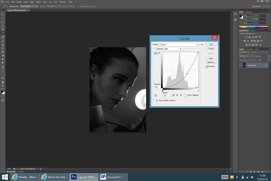
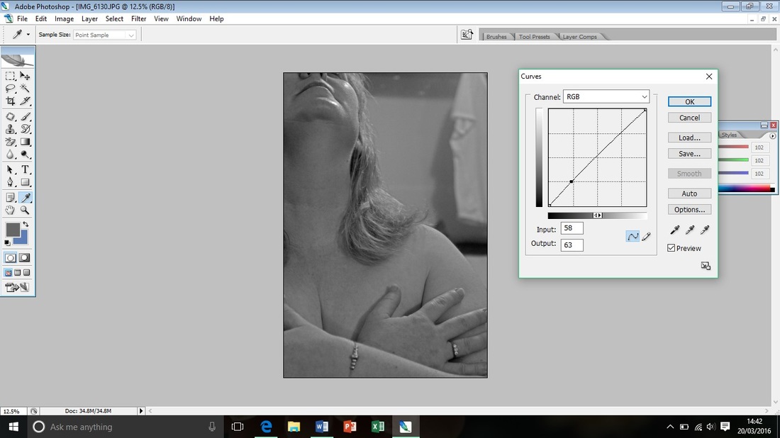
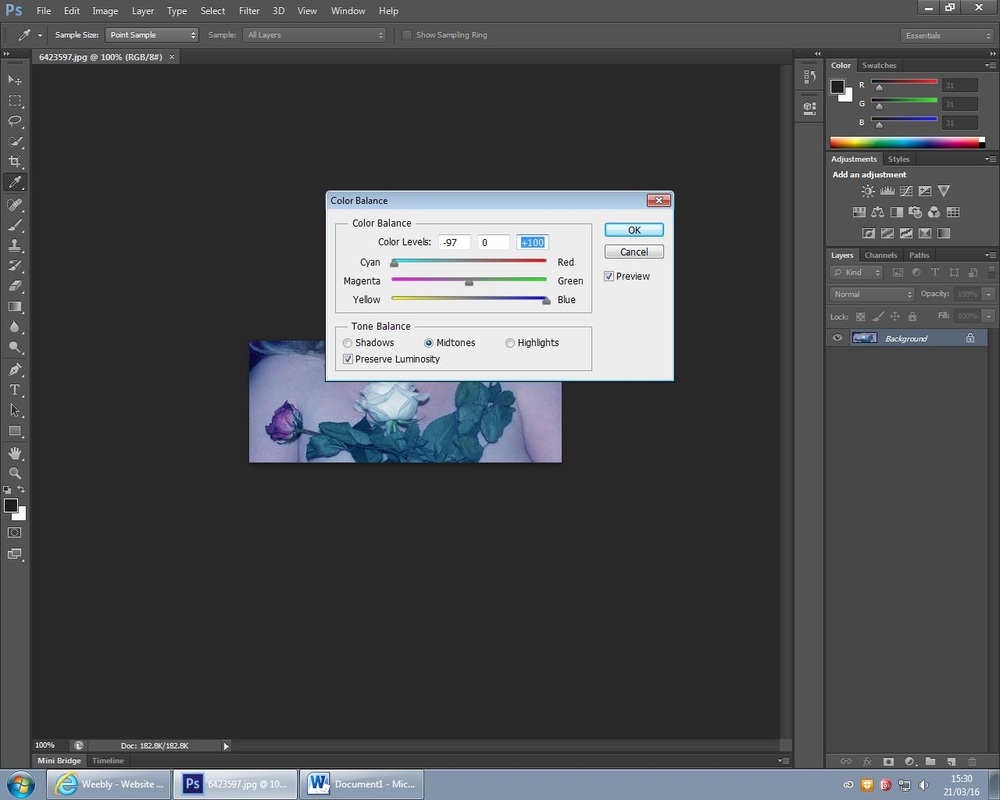
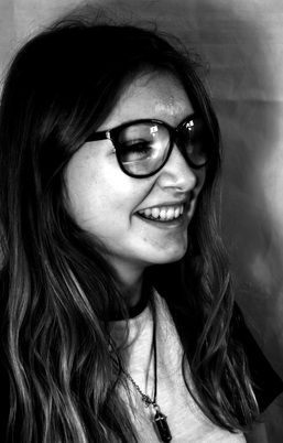
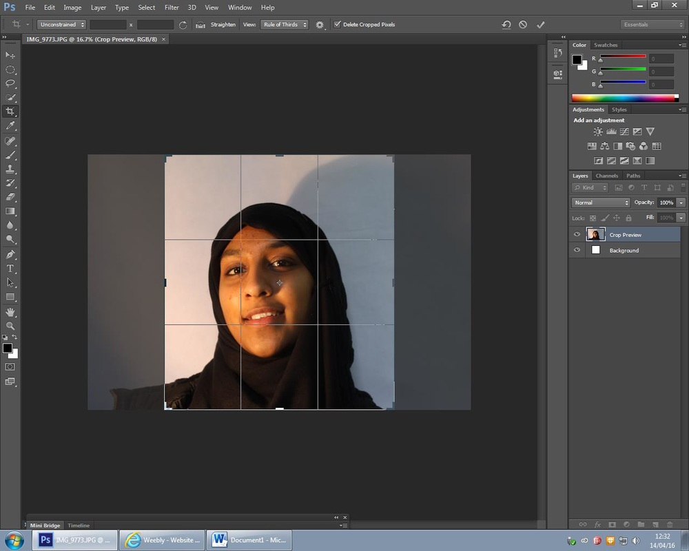
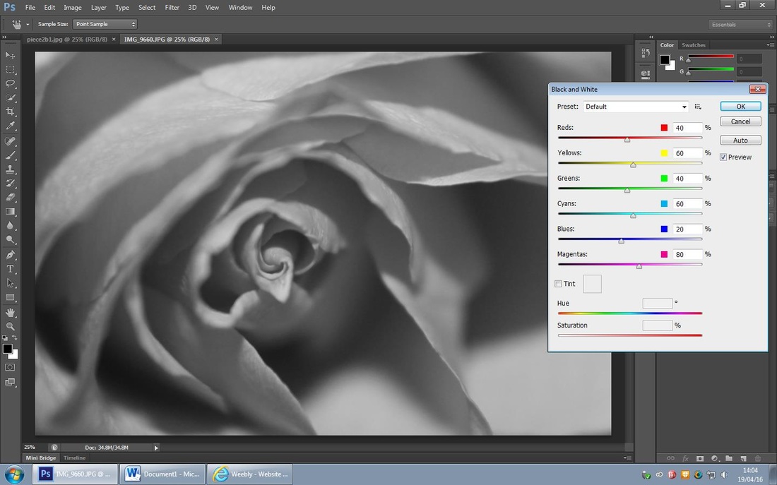
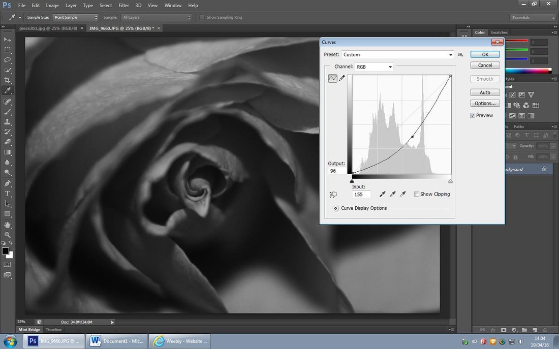
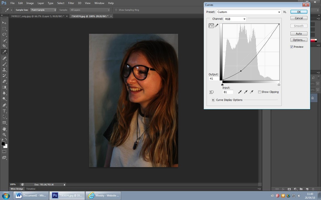
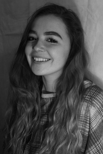
For this edit I decided to create a dark effect on the photo and emphasis the crosses across the picture. Firstly I 'posterized' the photo up to 50% to create a matte effect on the photo, I then used the 'curve tool' to emphasis the dark area of the photo and focus on the bars across the girl in the background. I then changed it to 'black and white' to make the photo darker.
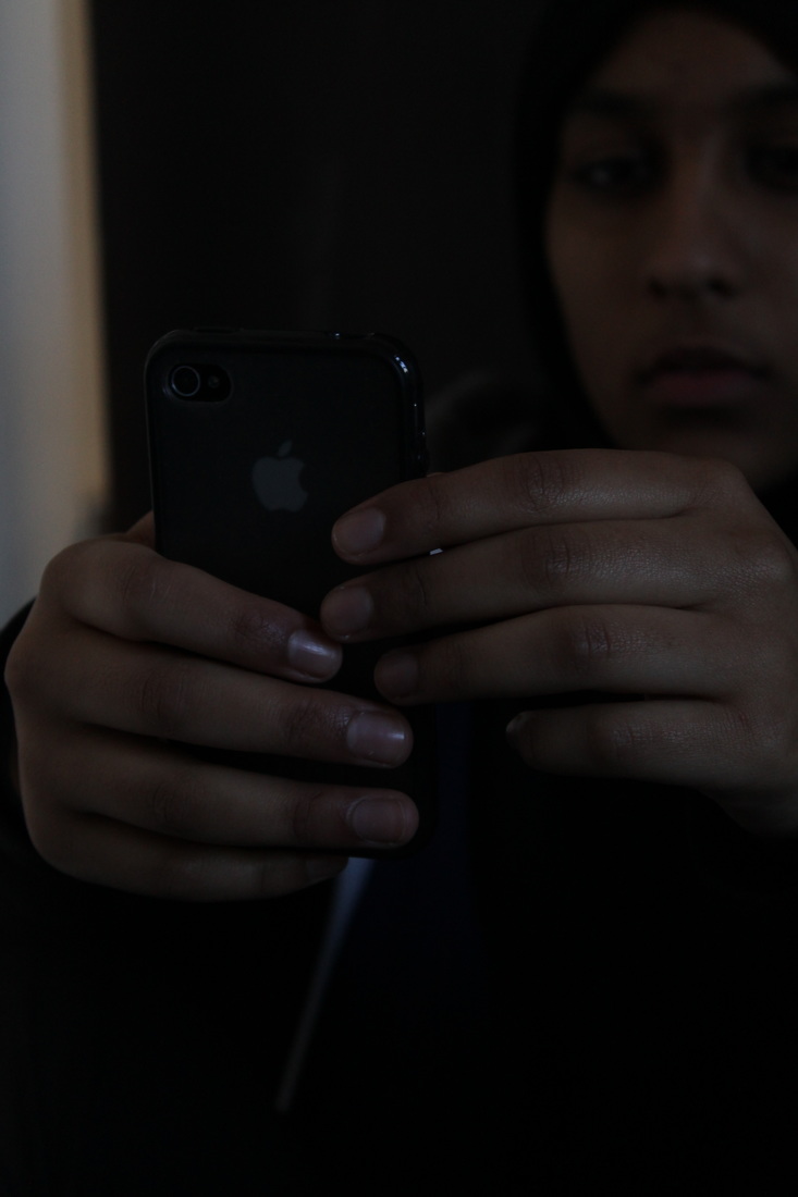
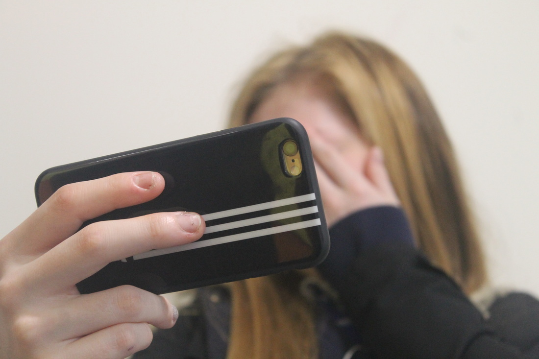
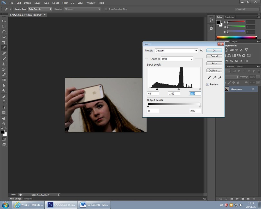
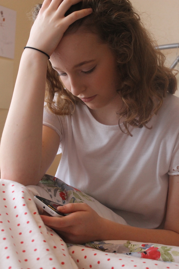
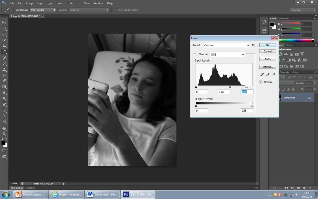
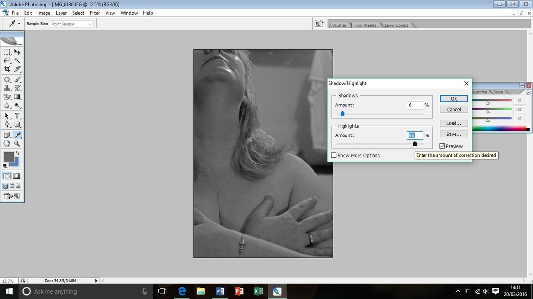
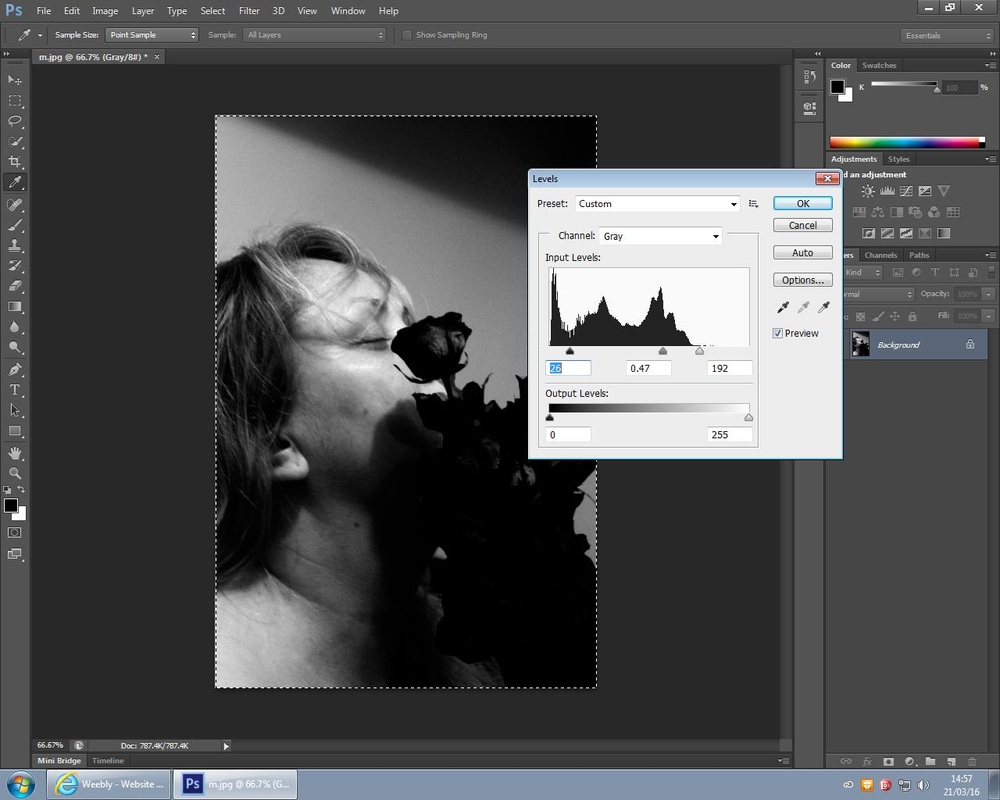
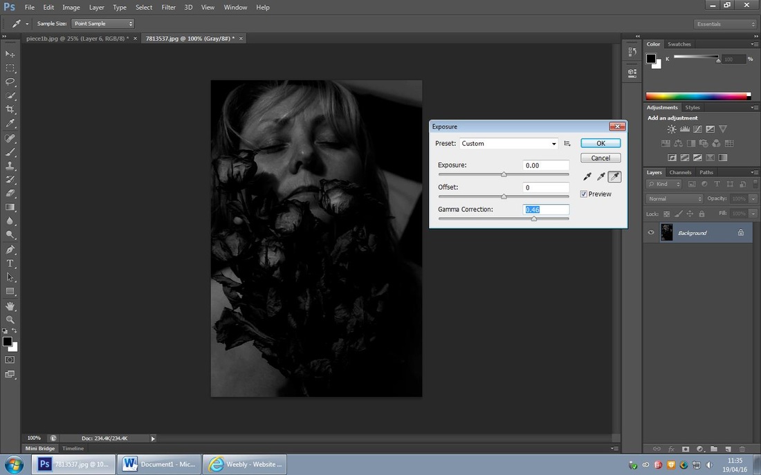
For this edit I increased the 'gramma correction' and increased it up to 10% and then adjusted the 'levels' and darkened the left of the photo to enhance the hands that are the main focus of this photo. I then turned it 'black and white'. This photo is focused on her hands to emphasis the effects a mobile phone and how the social media on it effects most teenagers lives.
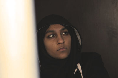
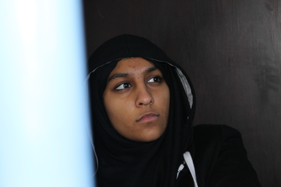
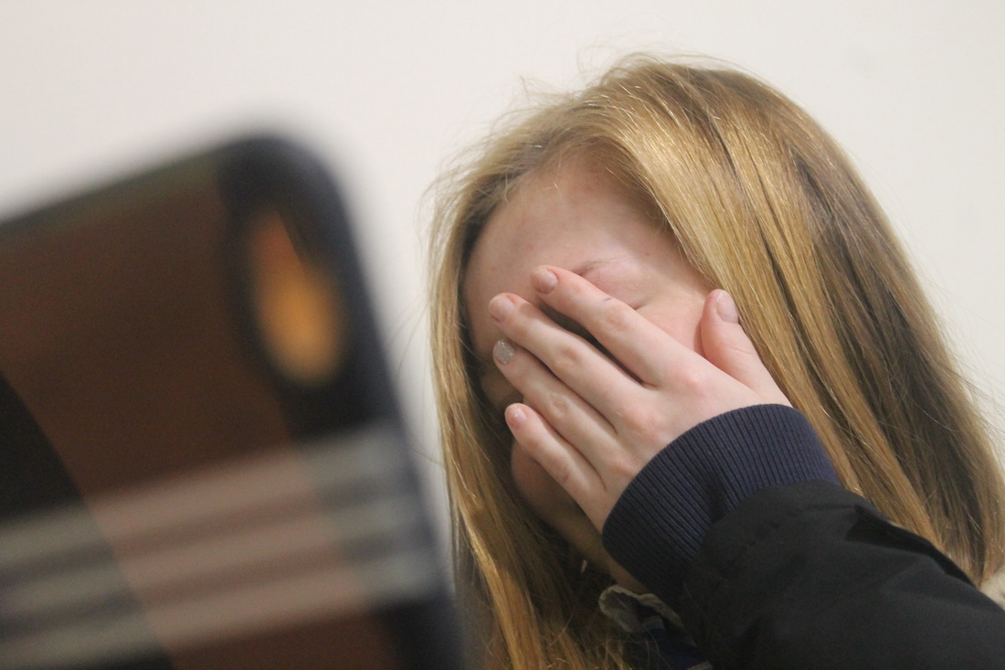
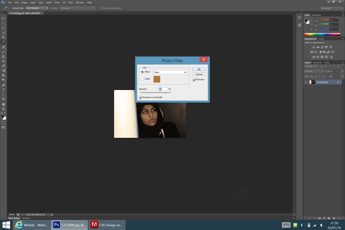
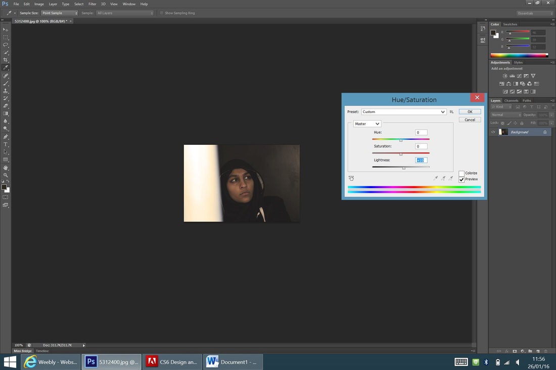
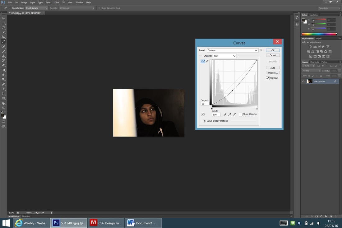
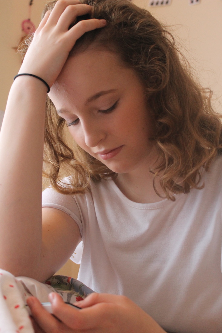
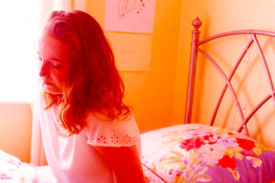
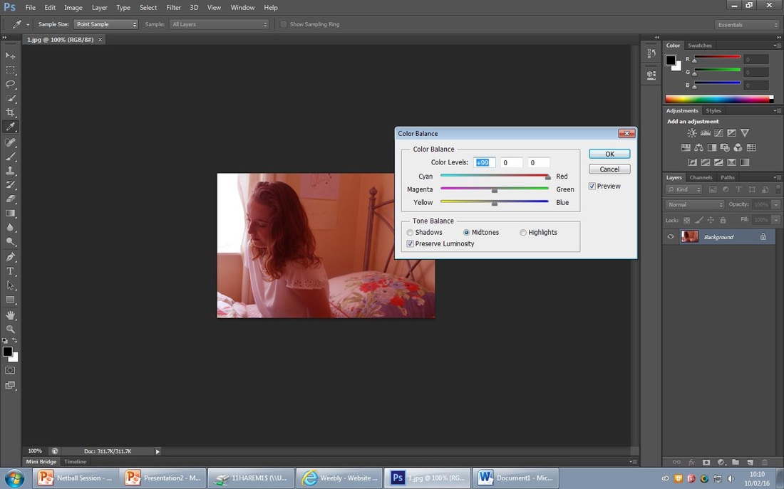
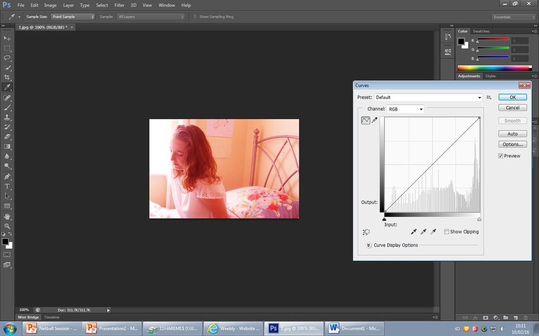
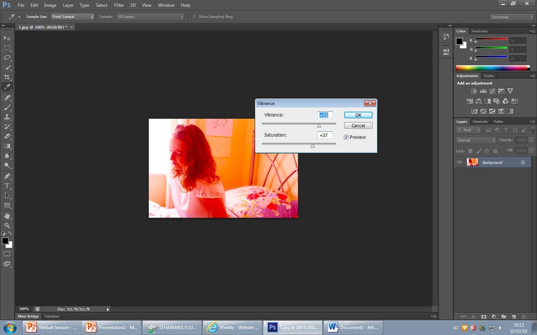
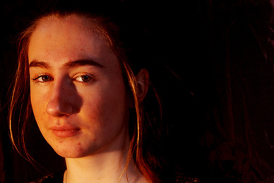
For this edit I decided to make it a warm photograph that is subtle, firstly I changed the photo to 'sepia' and increased its density to 60%, I then increased the 'contrast' to 35% and then increased the 'brightness' to 20%; I used these two steps to highlight the pole to the left of the photo and make the girls stand out. I then used the 'curve tool' and darkened the right of the photo to create a contrast across the picture. This photo shows a lot by not showing much emotion. The focus of this photo is the girl looking very serious and deep in thought; like many teenage girls do when worried or anxious.
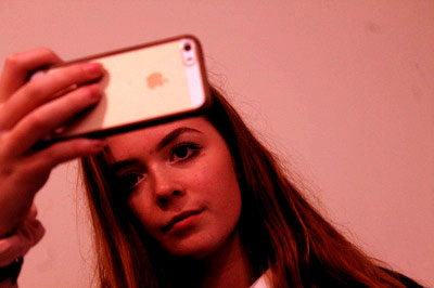
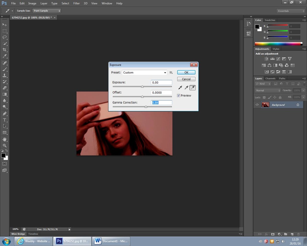
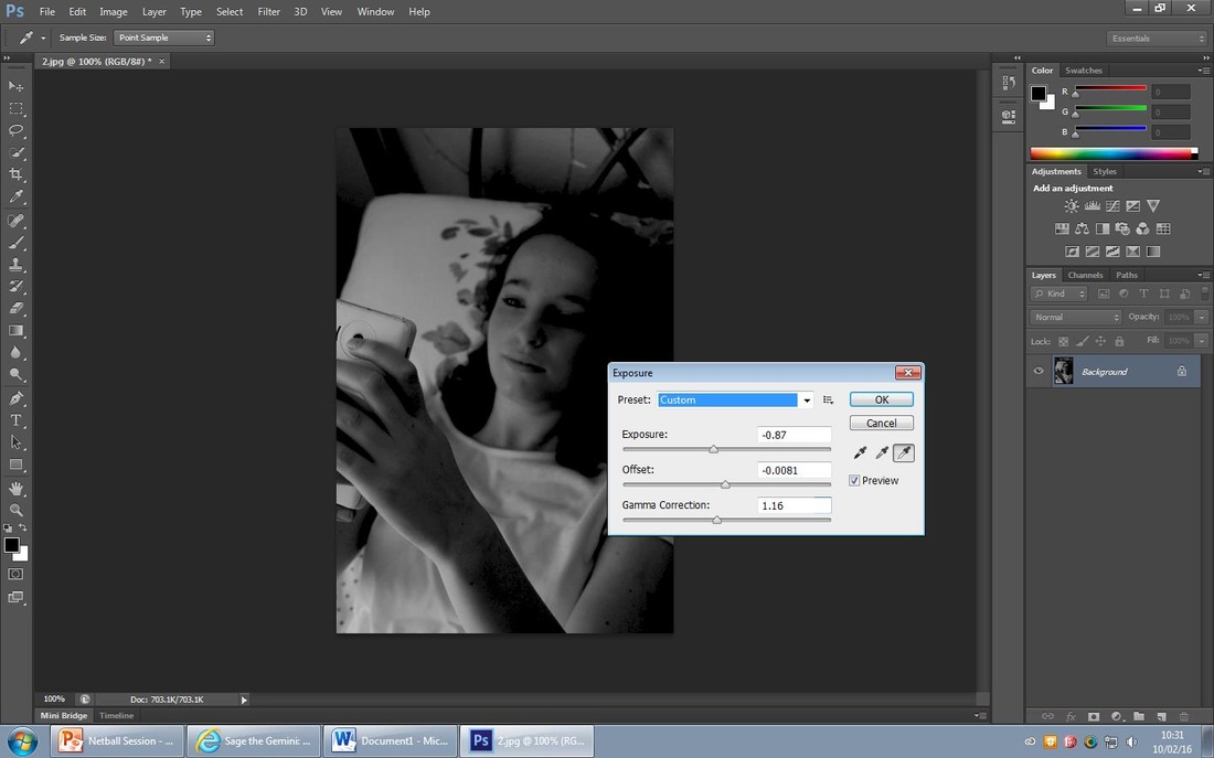
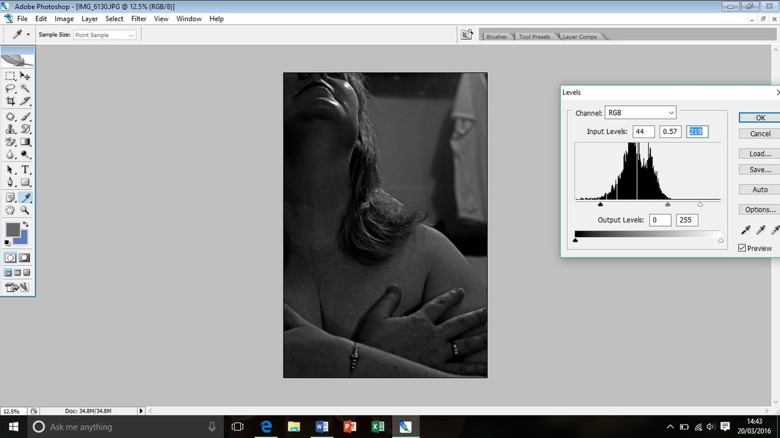
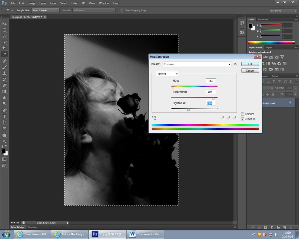
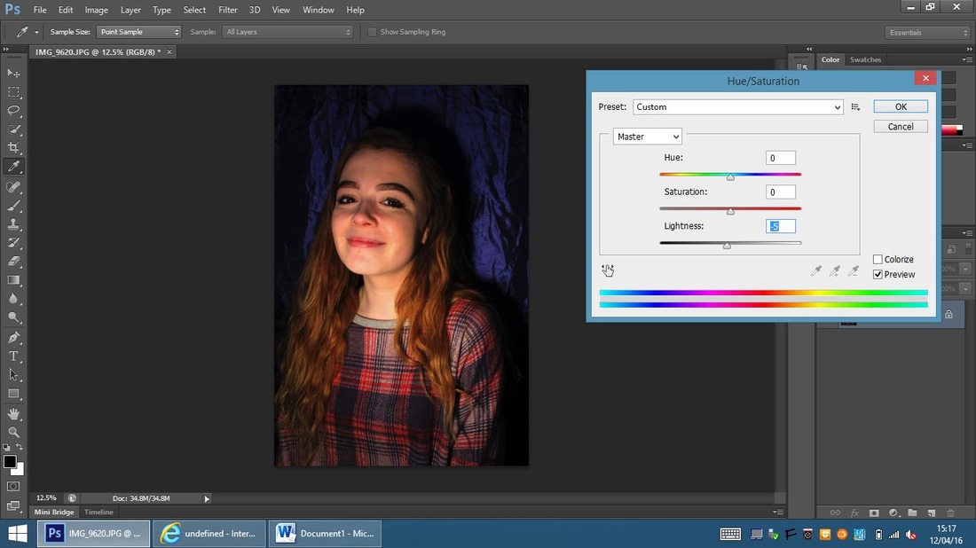
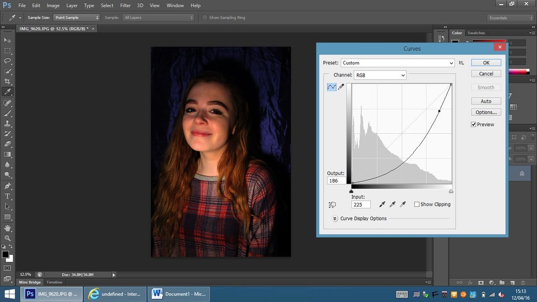
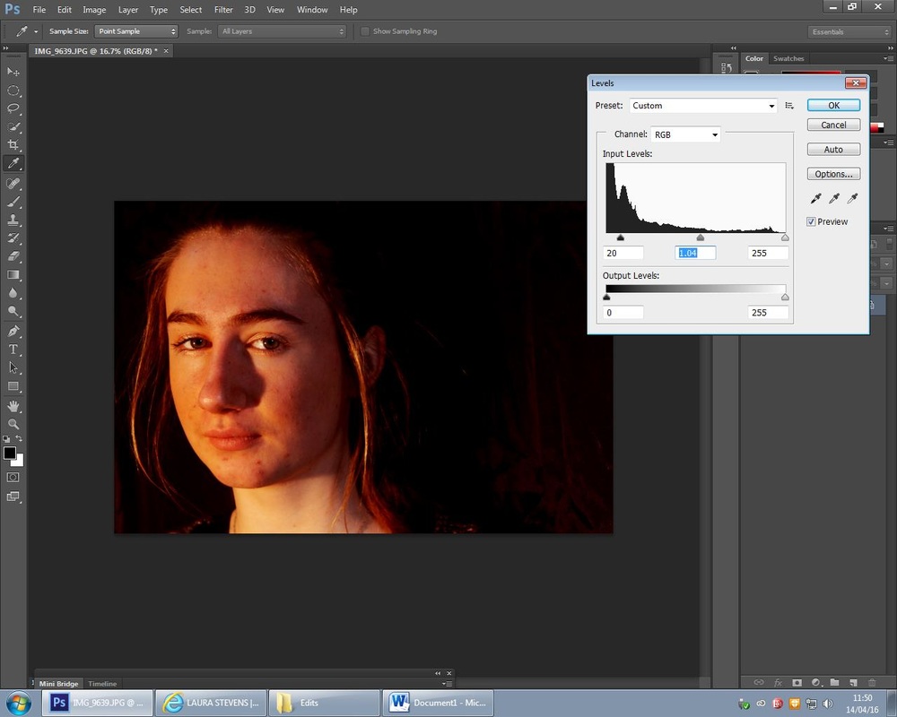
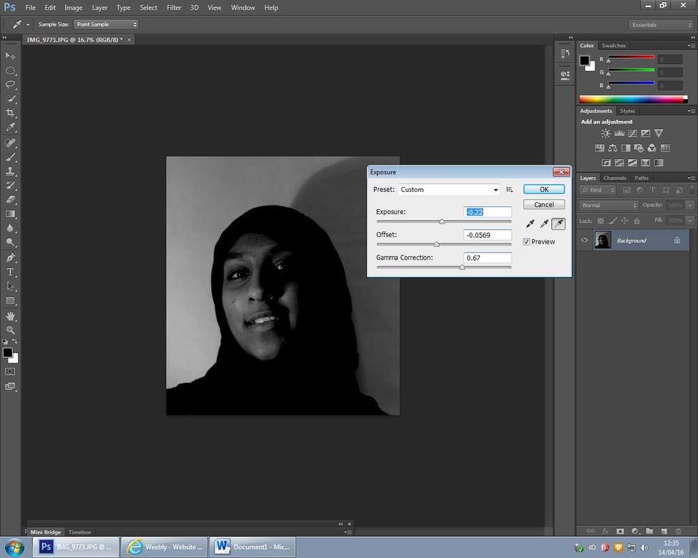
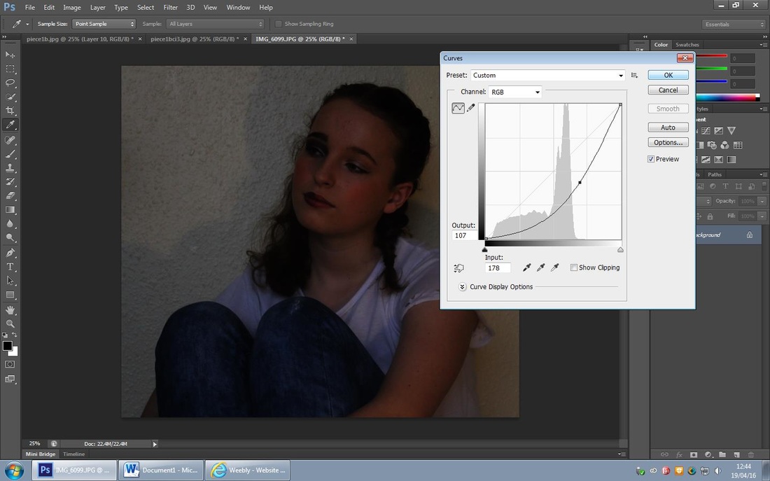
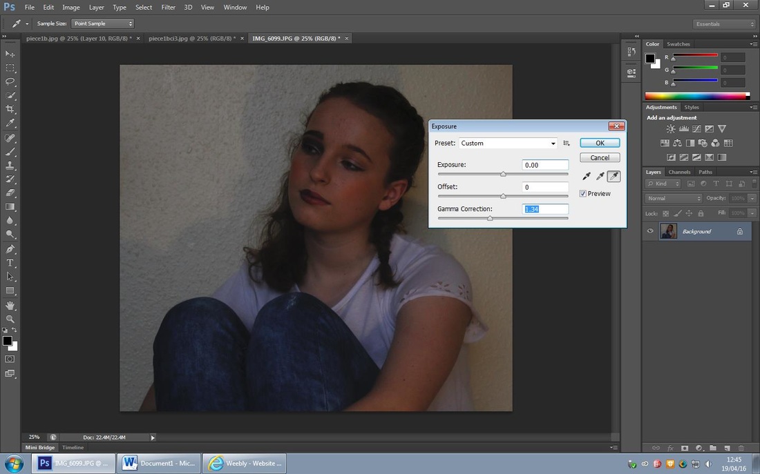
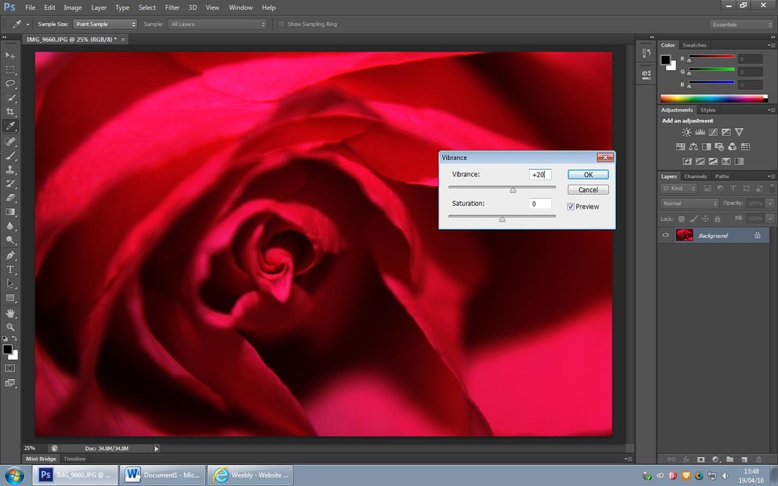
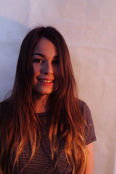
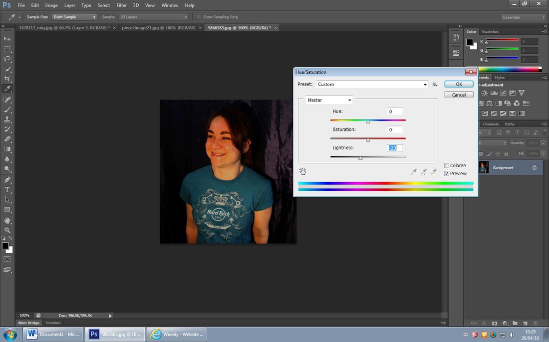
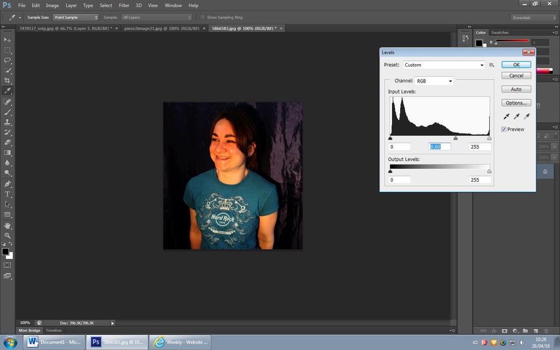
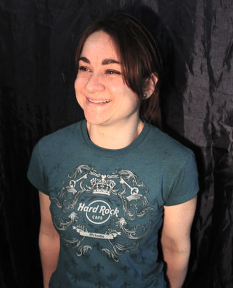
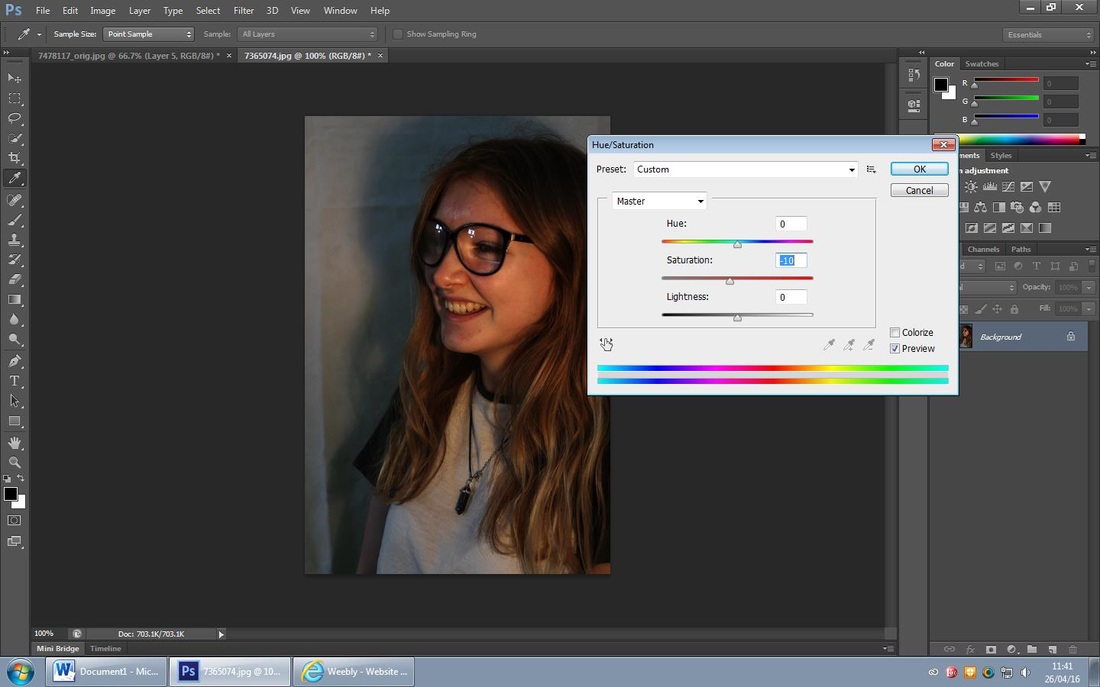
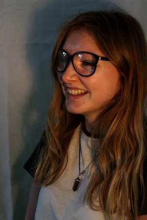
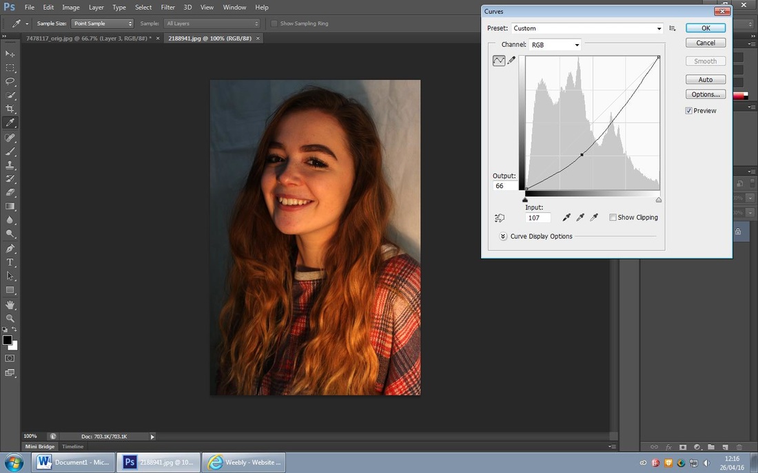
For this edit I wanted to create depth in the photo and give it a different hue, I firstly adjusted the 'levels' and darken the left of the photo and lighten the rest. I then decided it was too dark for the original photo lighting and then adjusted the 'gramma correction' and increased the 'exposure' by 5%. This photo now looks better quality and the colours look more balanced. I LOVE JAMES
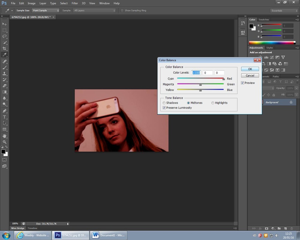
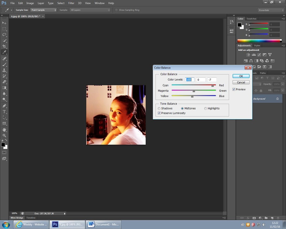
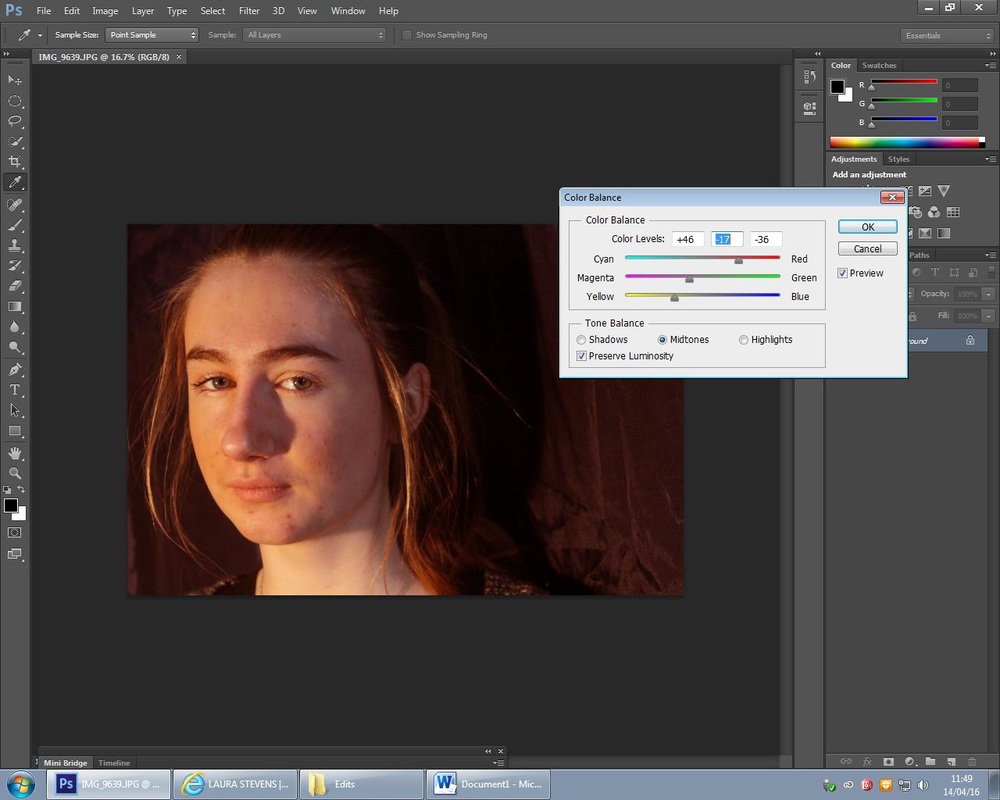
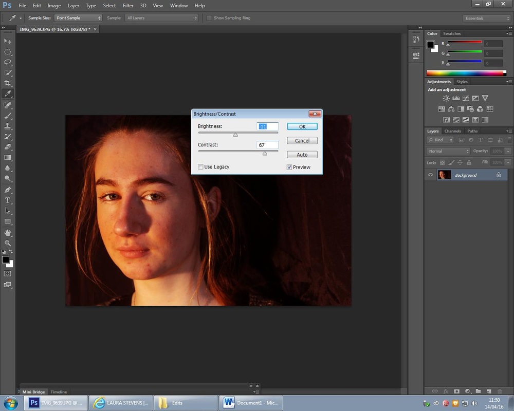
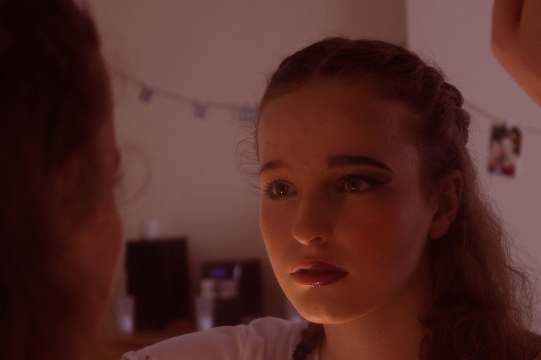
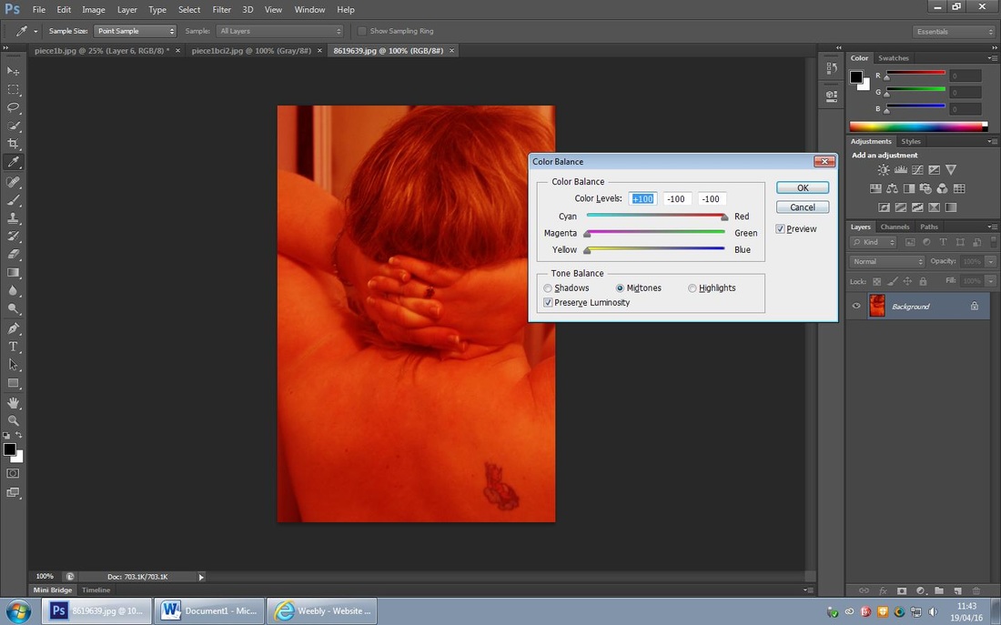
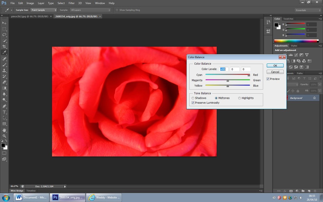
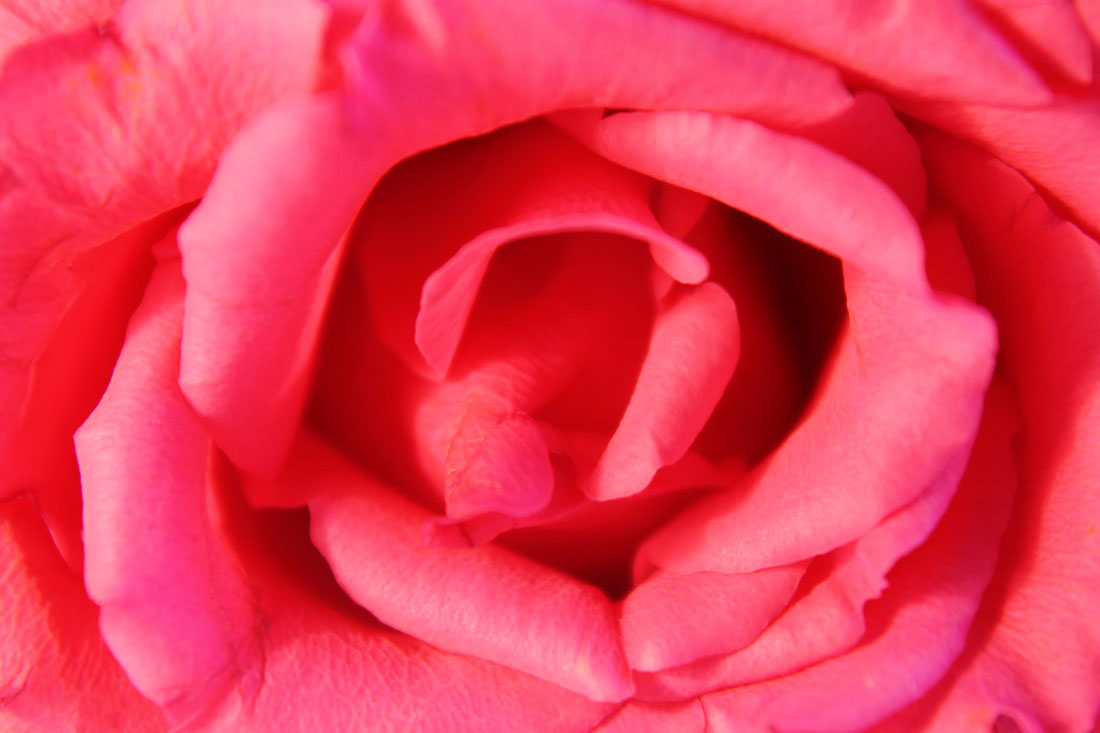
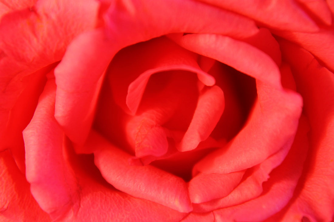
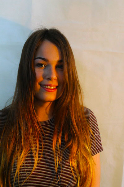
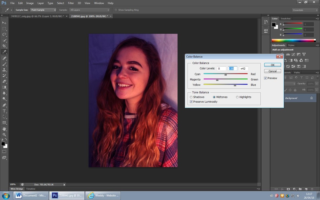
For this edit I adjusted the 'levels' to darken the left of the picture an lighten the right of it. I chose to adjust the colouring and change it to red to represent the anger that's built up inside of the girl, I then increased the 'gramma correction' to make the girl stand out beside the phone and make her the focal point. The idea for this photo was to represent the anger that teenage girls in particular go through.
Nan Goldin

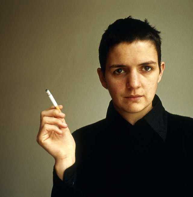
Nan Goldin is an American Photographer who is well known for deep and meaningful photography that is mainly based on LGBT community and public figures. Her work attracted me because of the angles that they are taken at and the messages the photos give. I like that it is mostly based on women (like my project) and I hope to use he as my main inspiration for it, Her photography has a lot of colours and hues that attract the eye and allow the viewer to look at it in more depth.
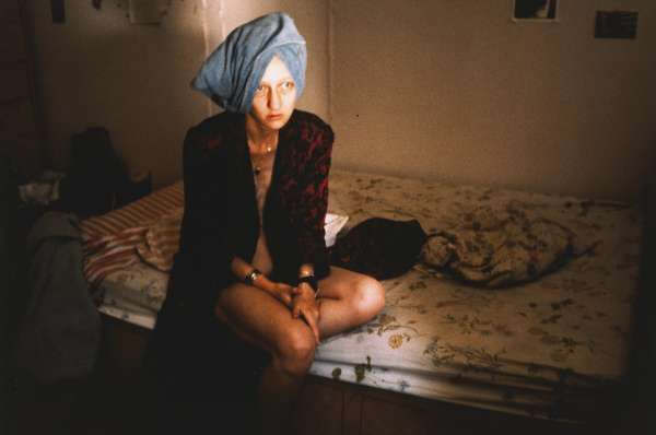
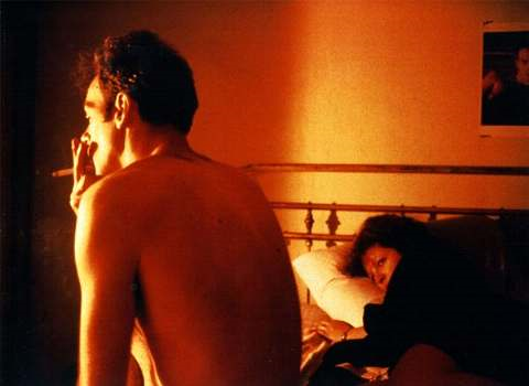
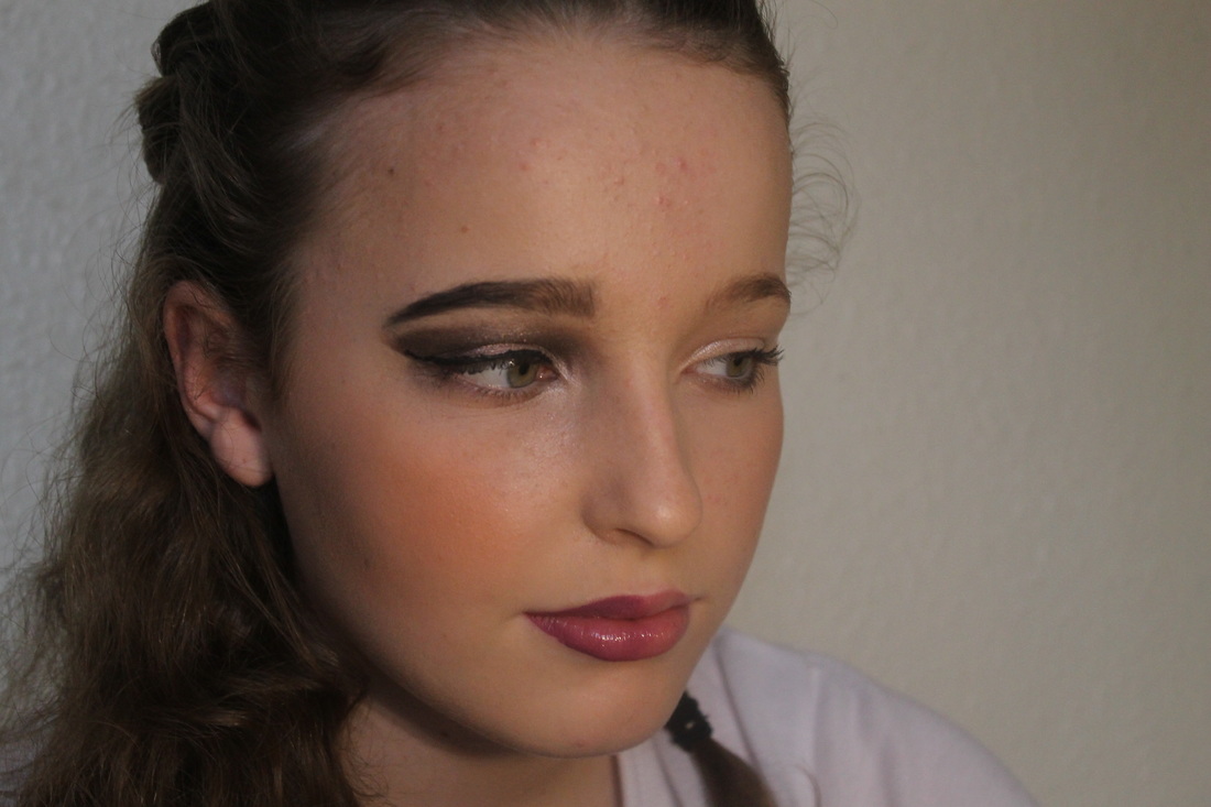
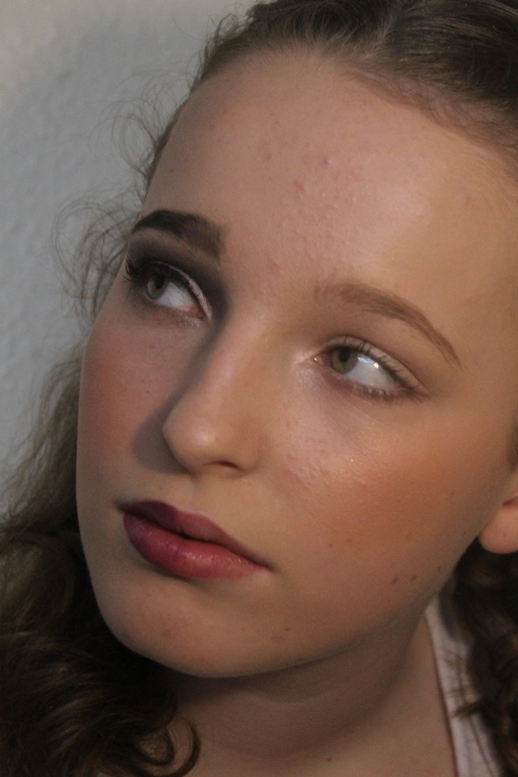
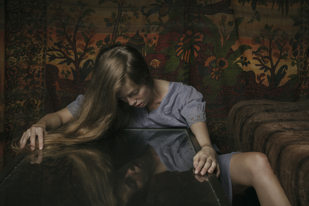
My Favourite Photo from Nan Goldin's Work
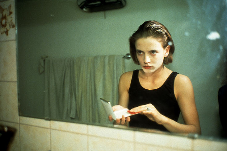
I like this photo of her work in particular due to its simplicity yet its meaning in my mind. In my opinion this photo says a lot because of the expression the woman has on her face as she seems depressed and deep in thought. The fact that she is holding a cup gives the photo a regularity to the photo whereas the girl isn't. I also like the fact that she's half dressed which entices the viewer to explore the photo more and take more of an interest.
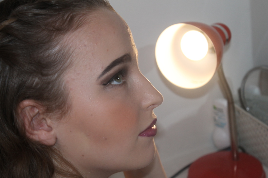
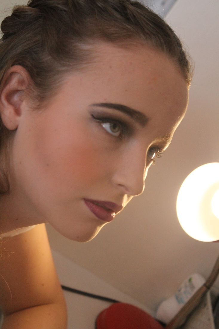
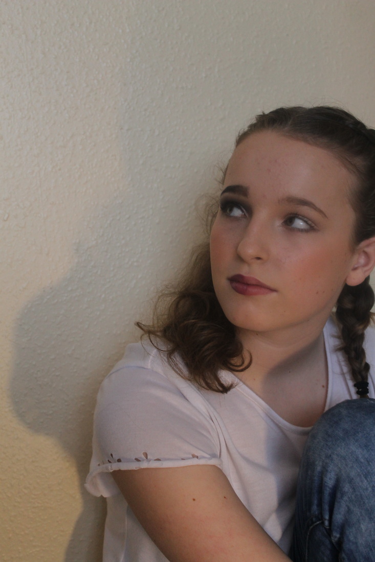
My Interpretation of Nan Goldin's Work...
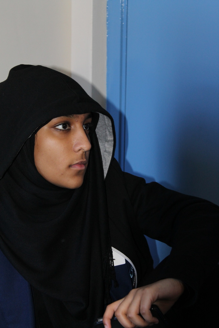
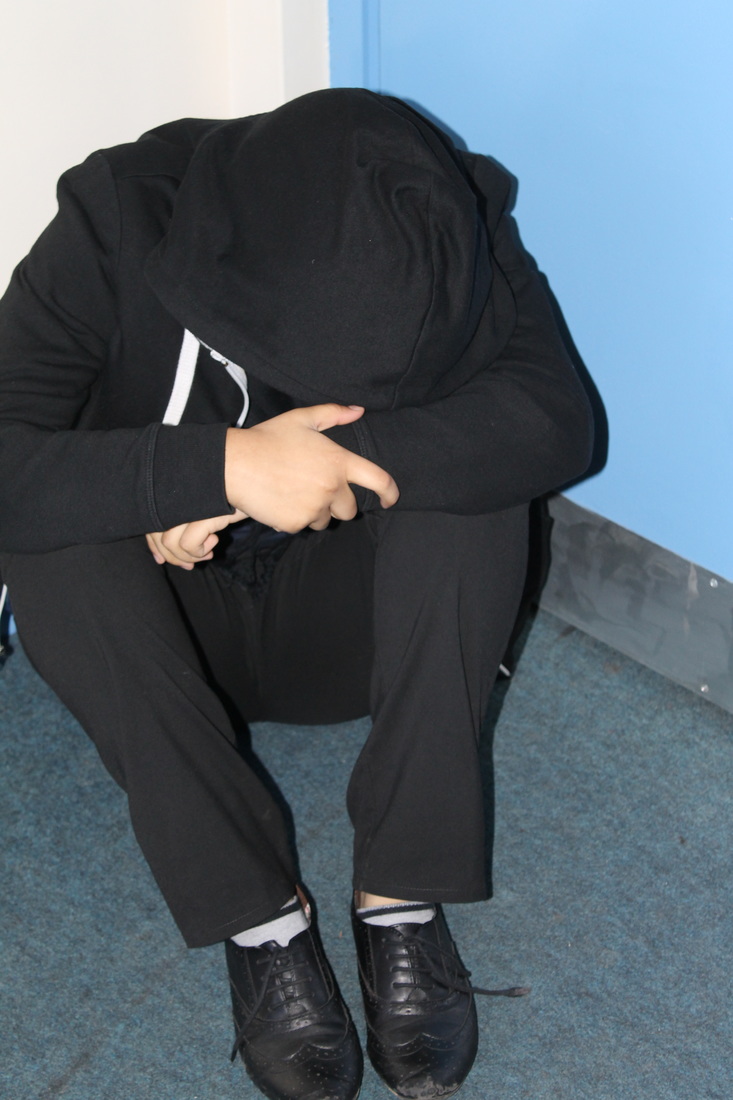
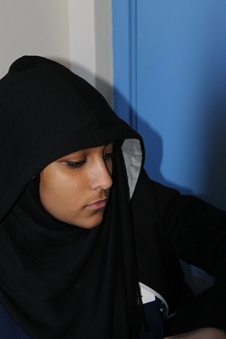
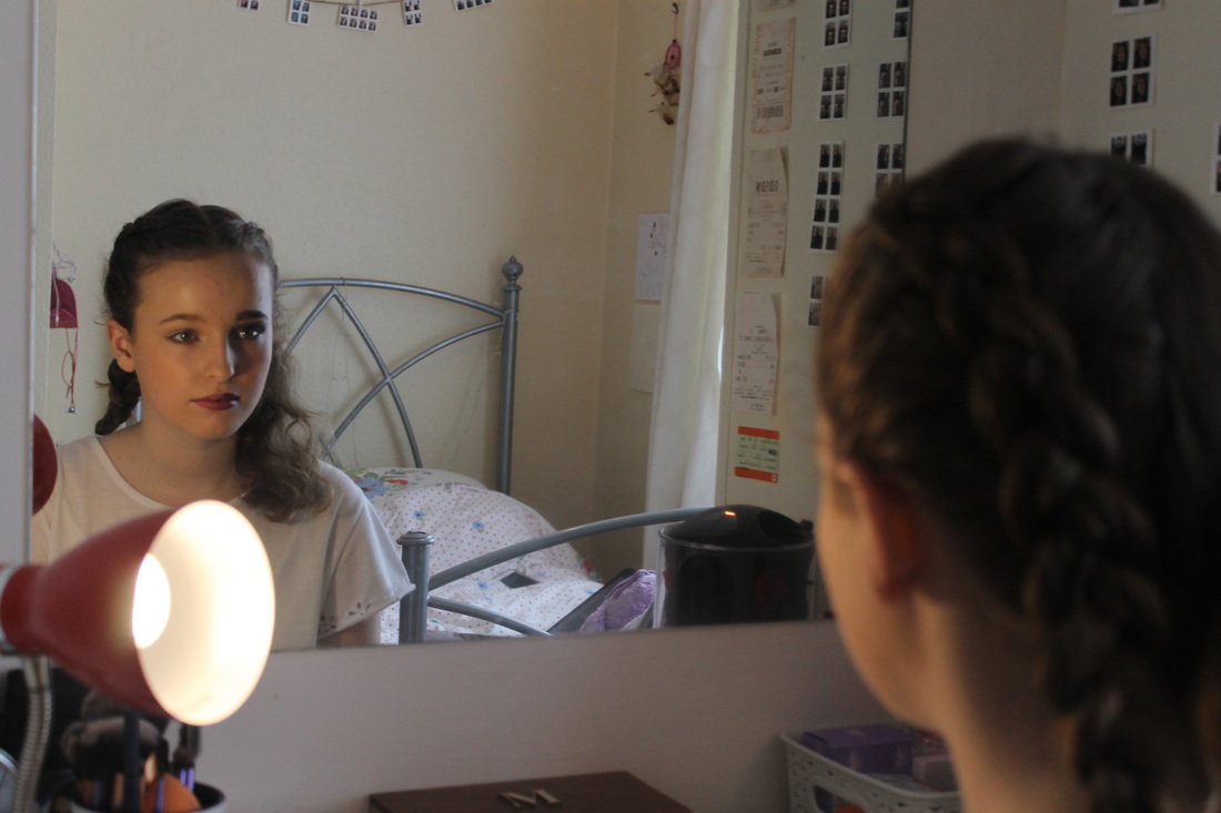
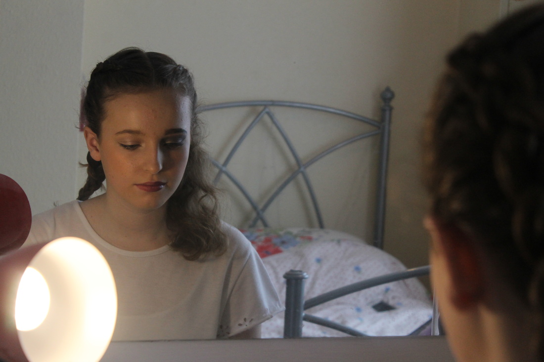
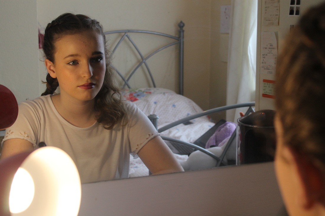
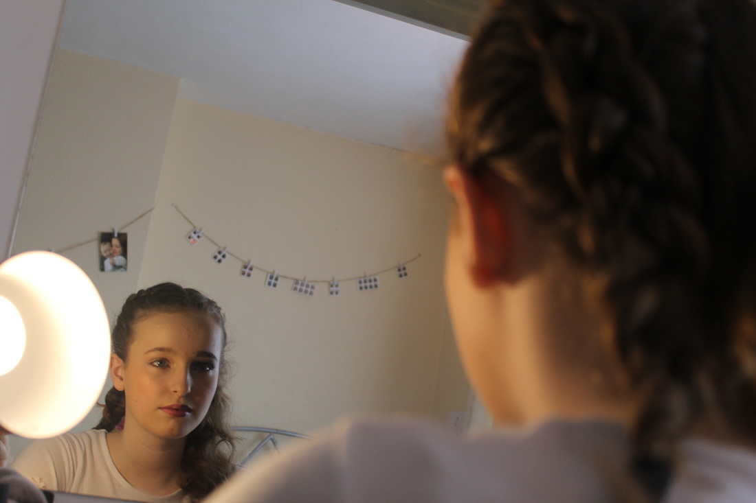
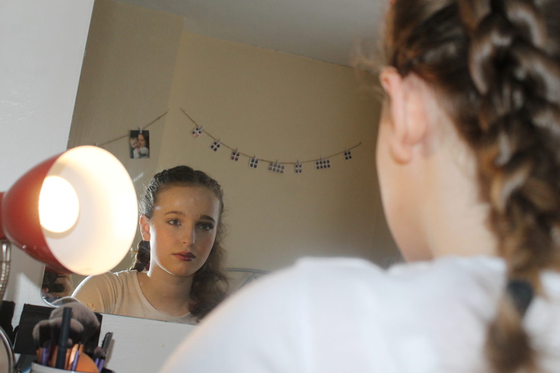
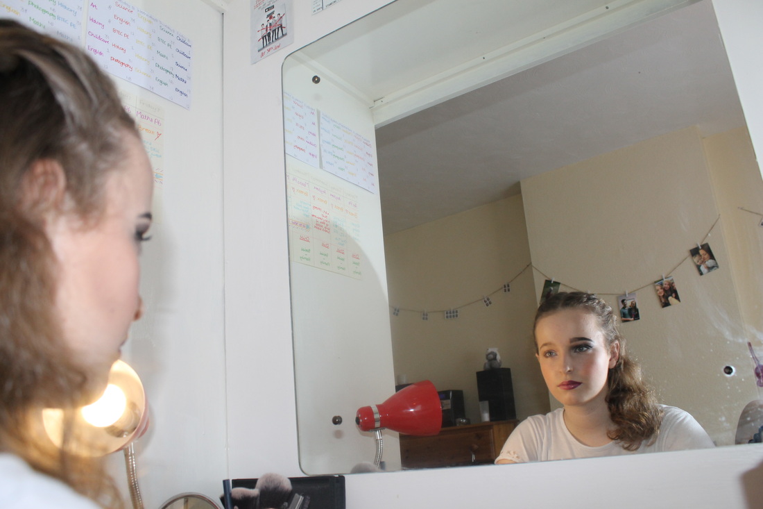
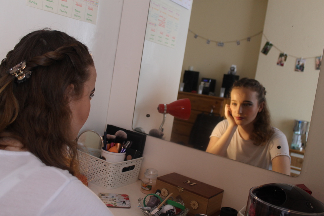
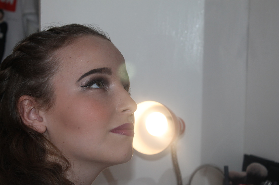
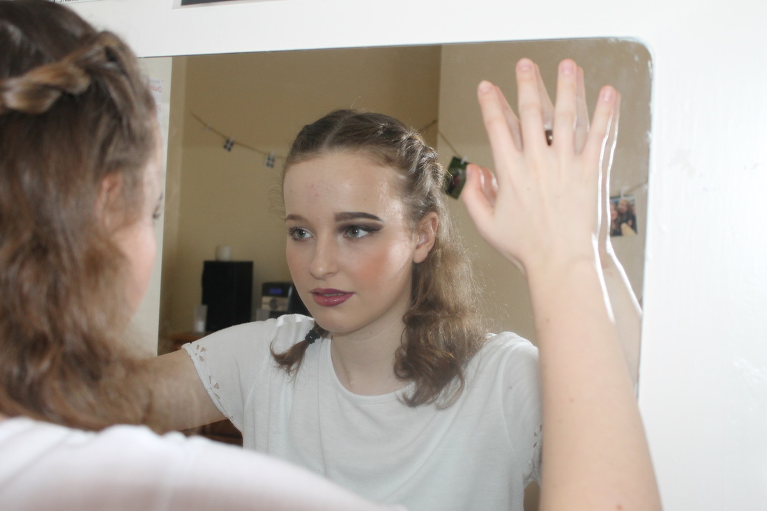
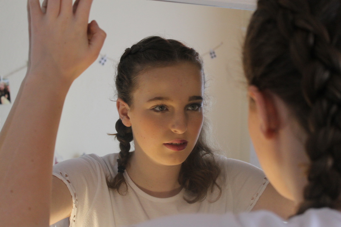
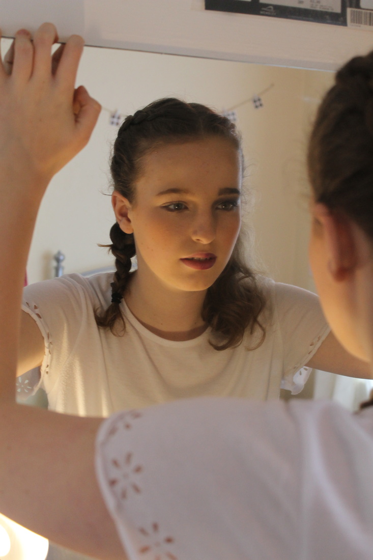
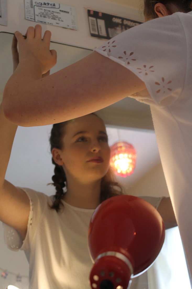
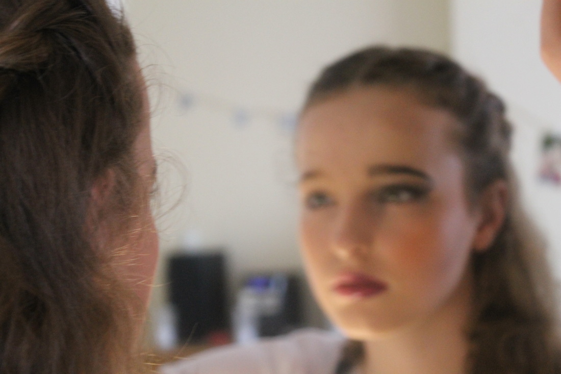
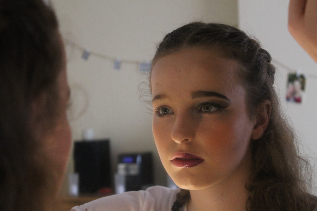
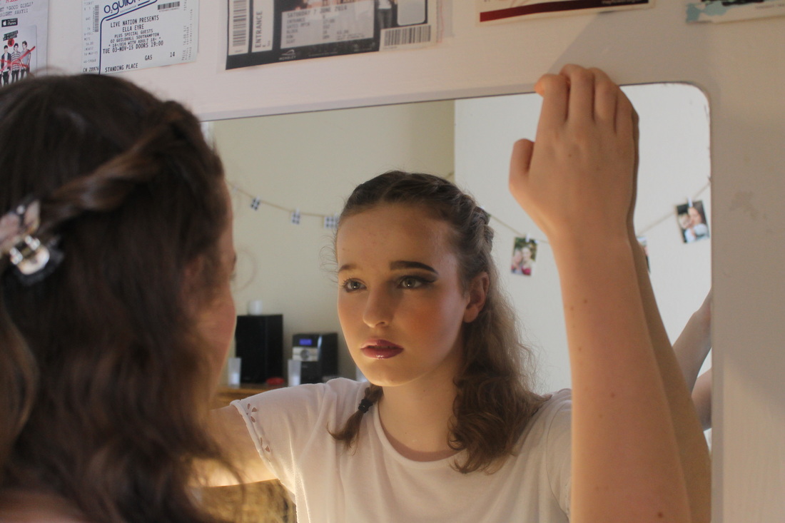
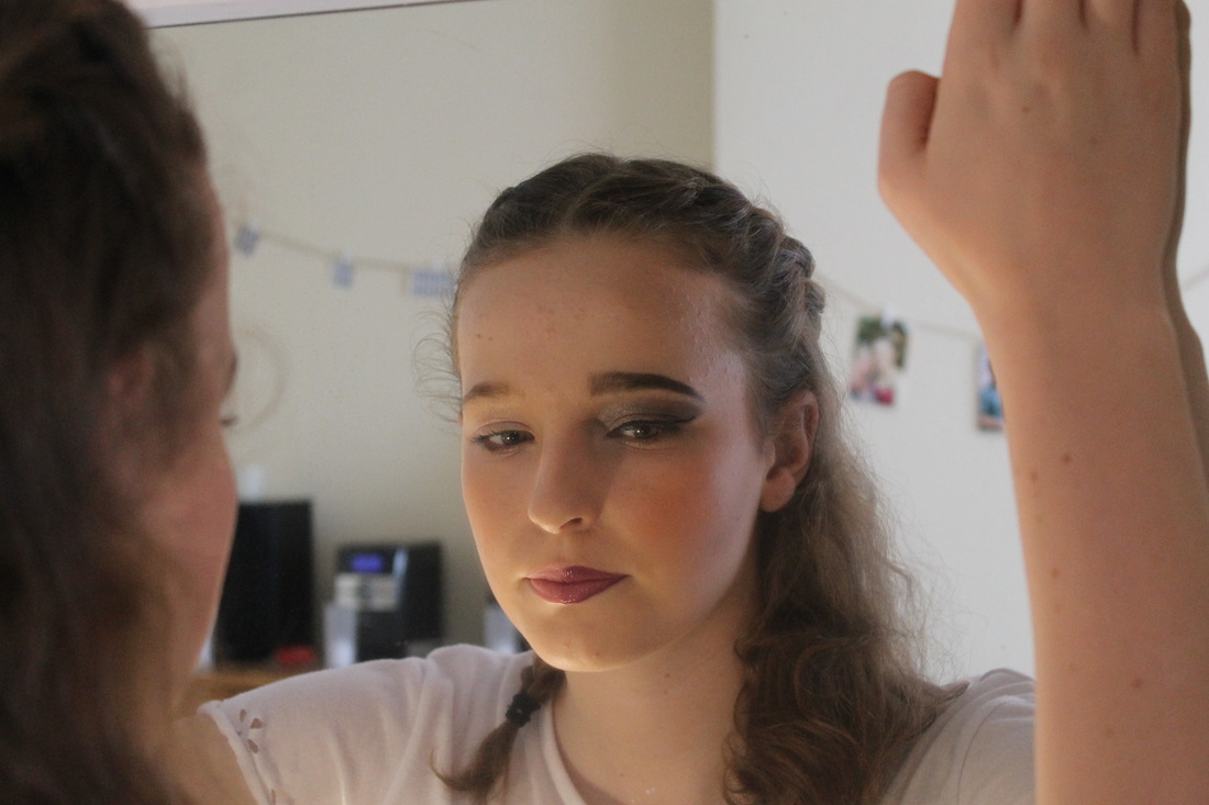
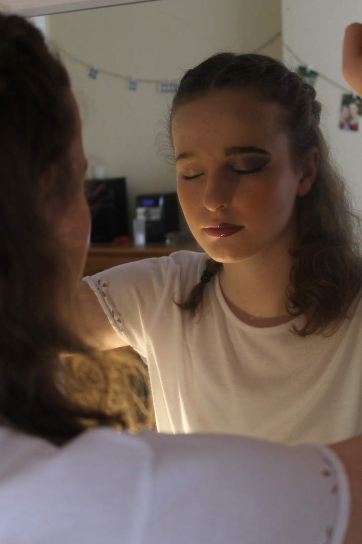
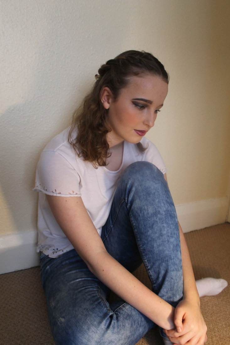
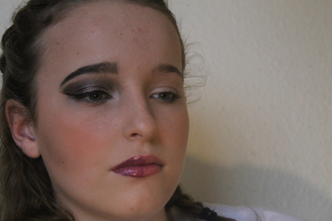
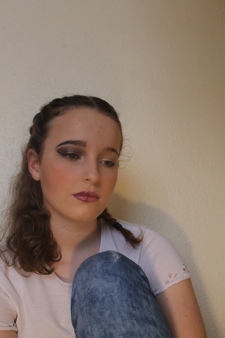
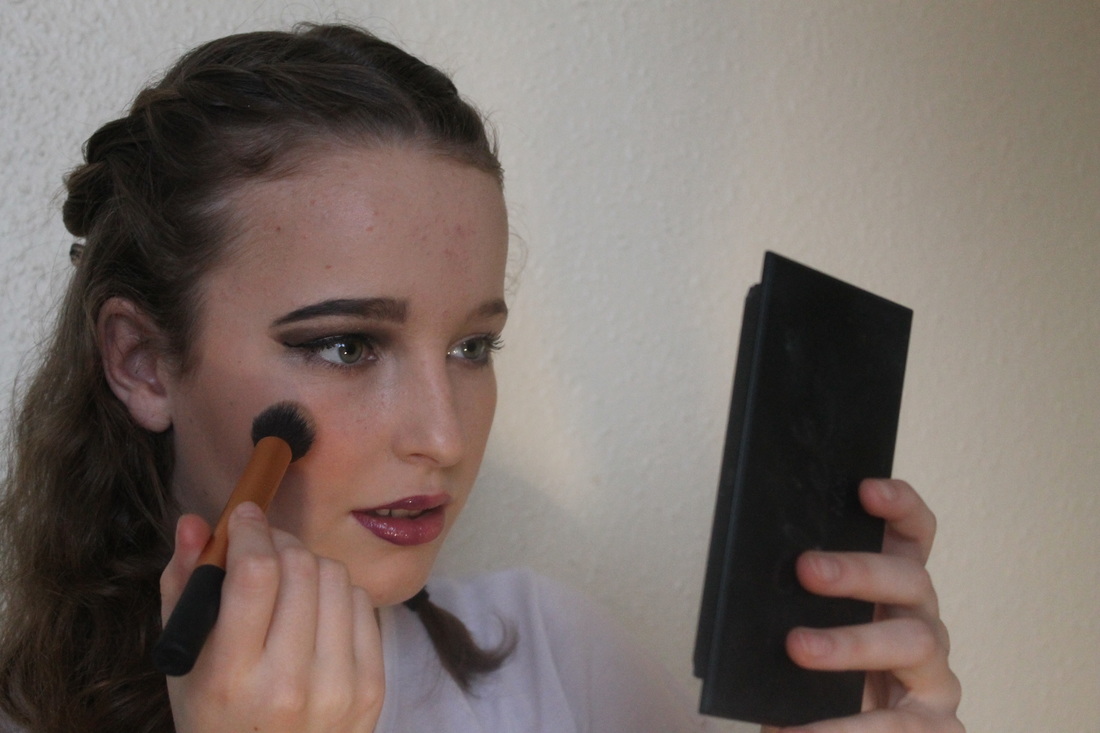
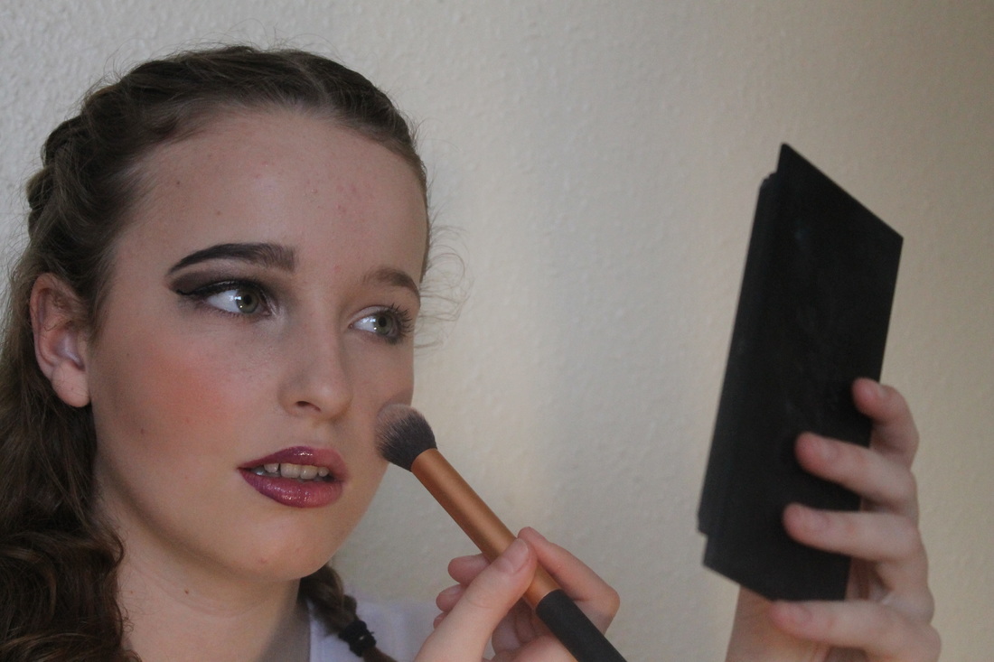
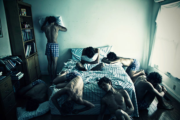
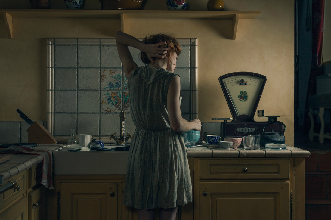
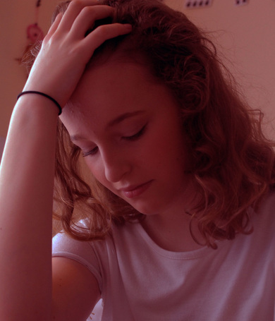
For this photoshoot I chose to do it in a diary form from the moment a girl wakes up and gets ready for an ordinary day, I also used makeup to interpret Goldins work as in my opinion makeup plays a big part in a girls routine; including mine. At the start of the photoshoot I asked the girl modelling for me to pose as if shed just woken up and starting to think about her day, I then included the girl going onto her phone (like most teenagers do when they wake up) and reading some hurtful comment on social media and reacting to them. You can see her emotions clearly from behind the phone and I feel that teenagers in general can relate to this feeling and understand it. I relied on natural day light for this first part to increase the realistic feel to the photos.
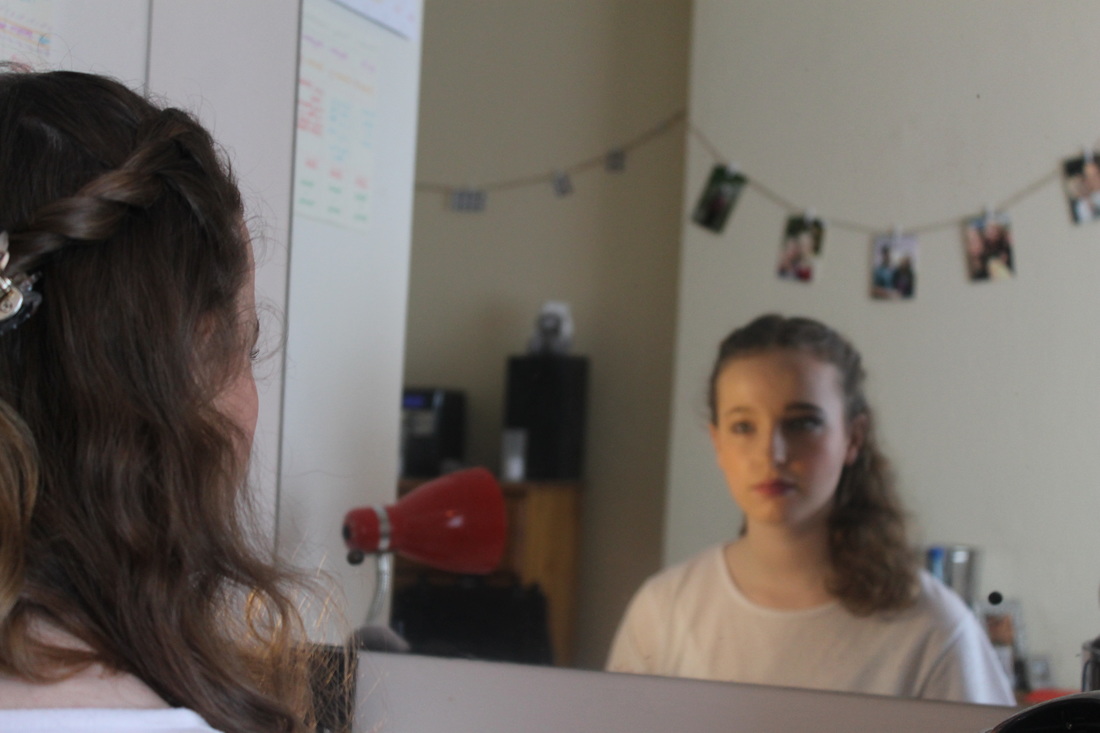
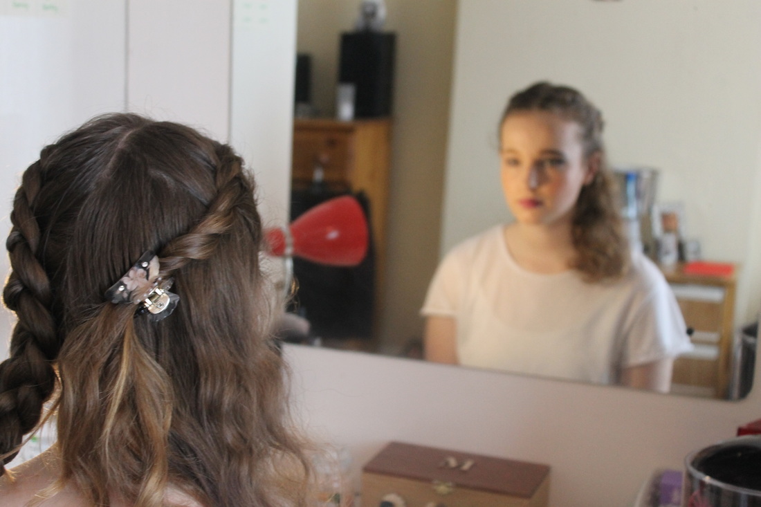
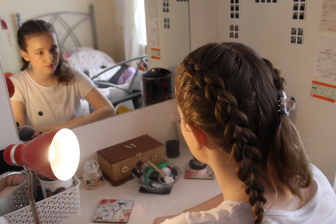
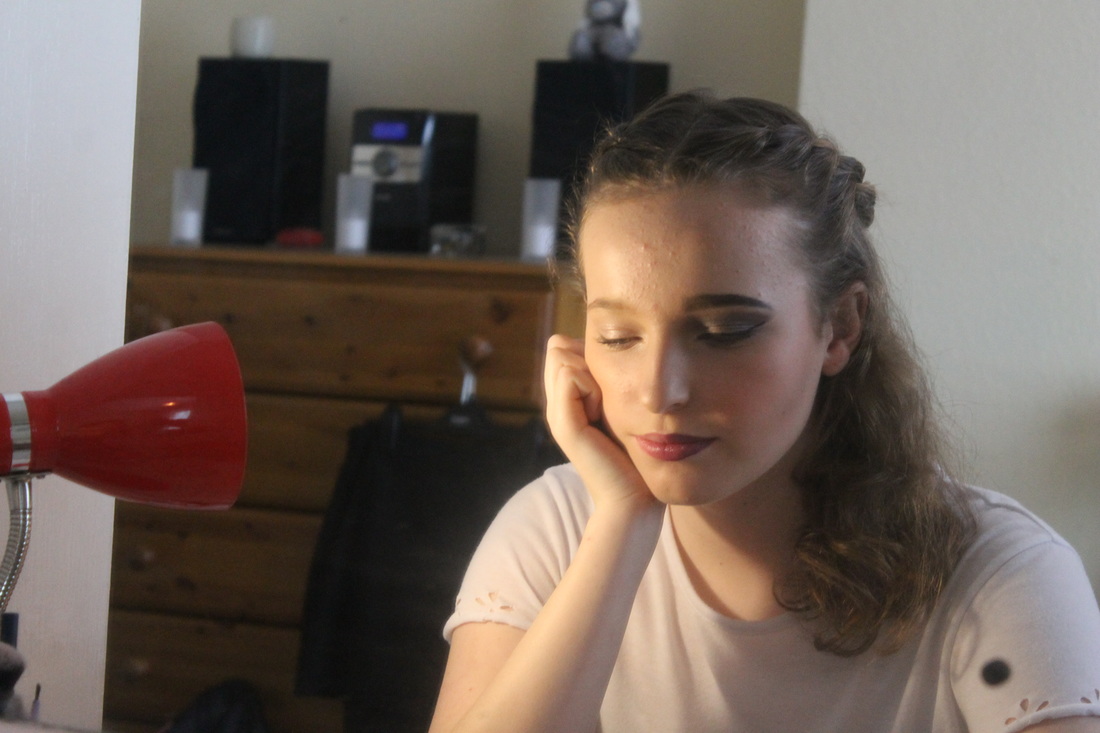
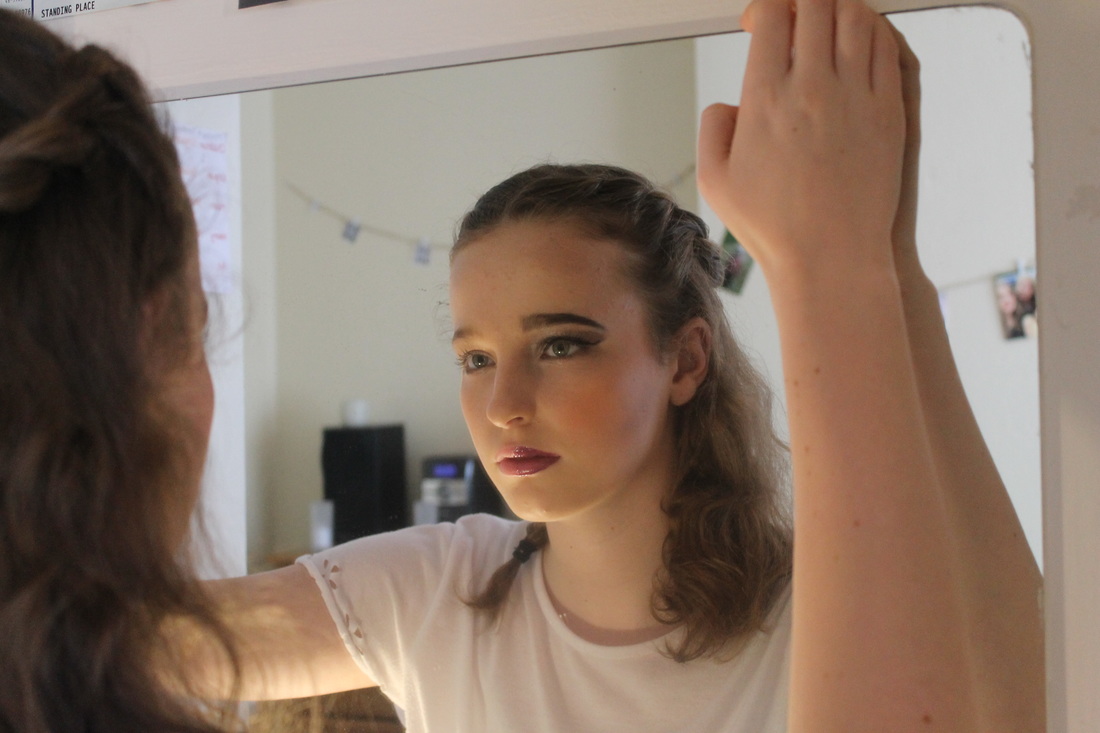
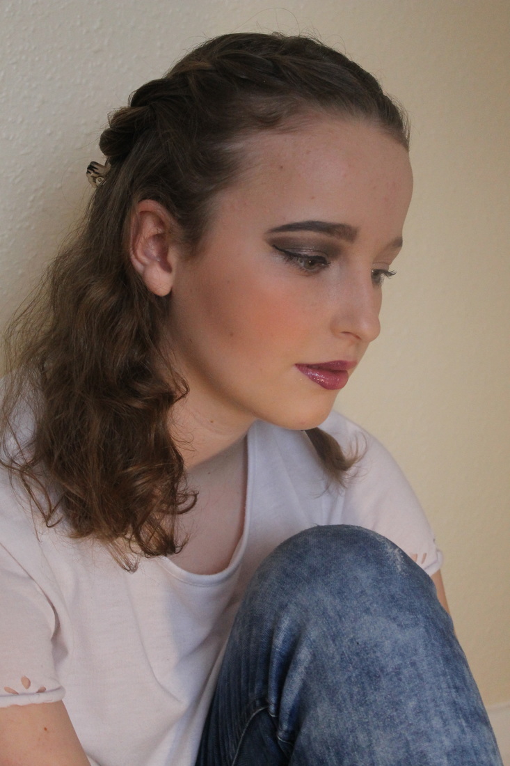
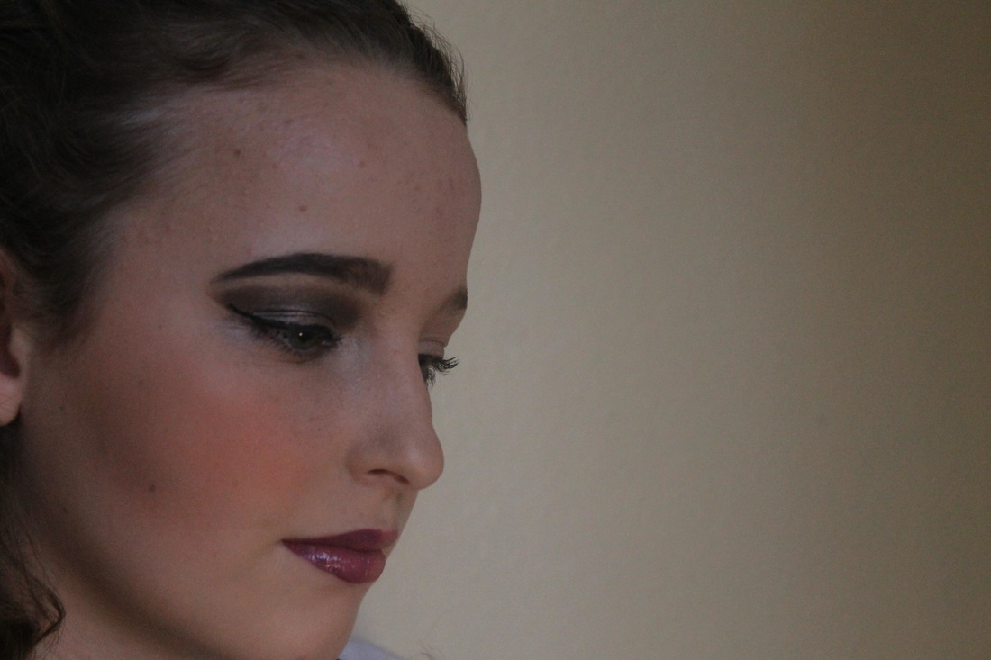
For the second part of my photoshoot leading on from the first, I decided to make it about how when a girl puts on her makeup for the day she feels pressured to be what society wants her to look like and how the standards are so high. I then did the girls makeup with half of her face natural and the other half of what society wants. As you can see the two halves are vastly different and one side is more extreme than the other, I like the fact that I've used makeup to portray what society wants a female to look like and how it can effect a girls self esteem. I used a strong lamp to create contrast of the sides of the face as it wanted to emphasis the differences of how we want to look and we 'need' to look.
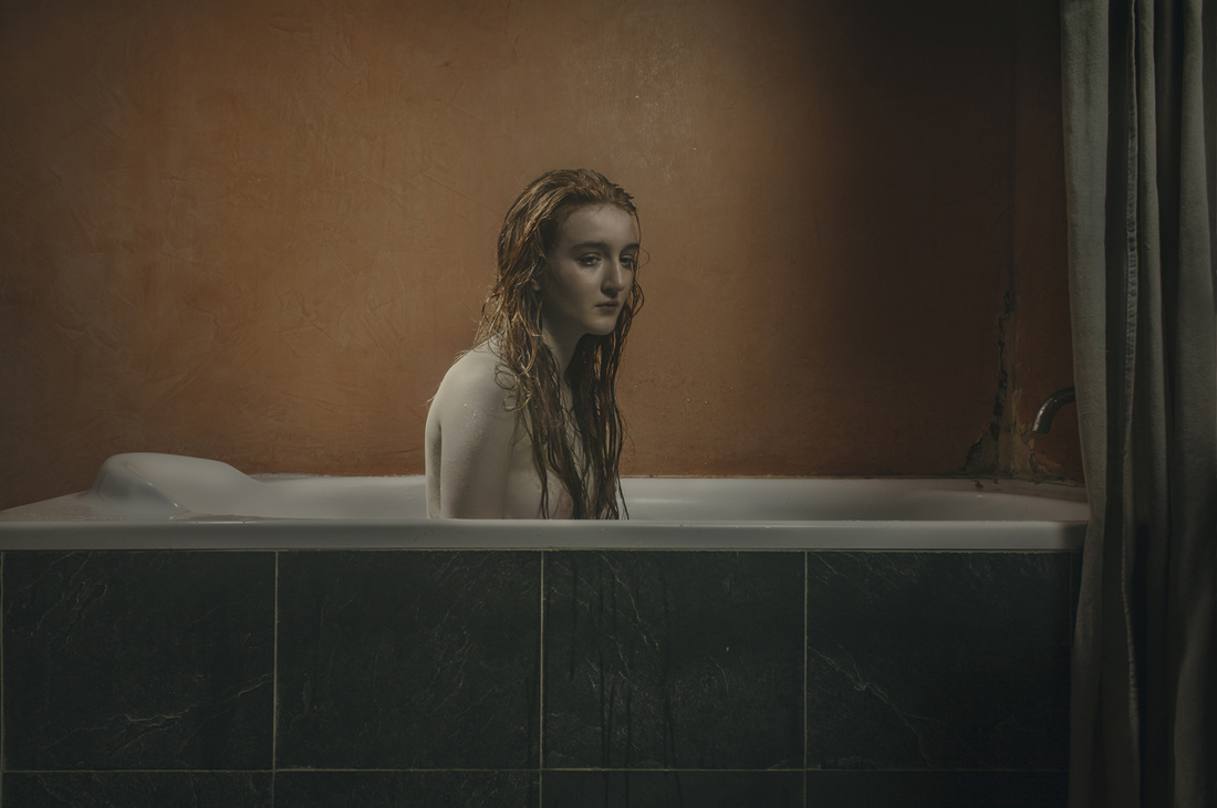
For the entire photoshoot I decided to take the photographs in my bedroom to make it more in the style of Nan Goldin, her work is very realistic and has an ordinary feel to it.
For the second part of my photoshoot leading on from the first, I decided to make it about how when a girl puts on her makeup for the day she feels pressured to be what society wants her to look like and how the standards are so high. I then did the girls makeup with half of her face natural and the other half of what society wants. As you can see the two halves are vastly different and one side is more extreme than the other, I like the fact that I've used makeup to portray what society wants a female to look like and how it can effect a girls self esteem. I used a strong lamp to create contrast of the sides of the face as it wanted to emphasis the differences of how we want to look and we 'need' to look.
For the entire photoshoot I decided to take the photographs in my bedroom to make it more in the style of Nan Goldin, her work is very realistic and has an ordinary feel to it.

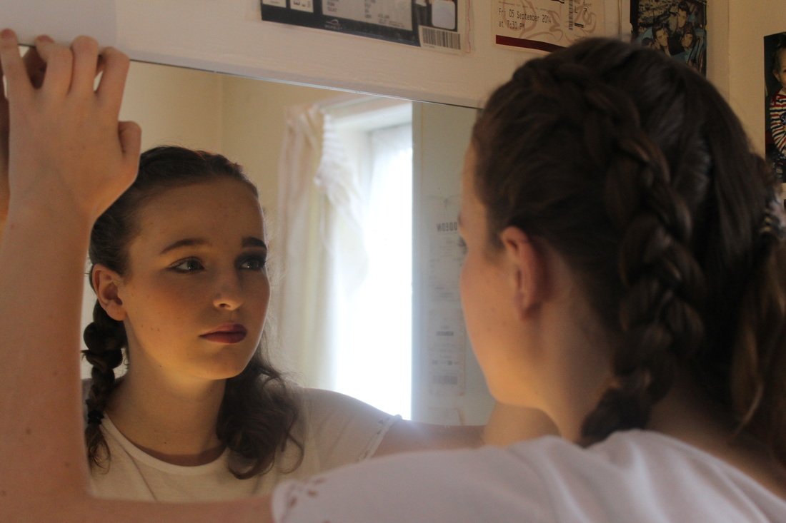
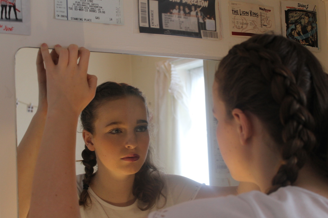
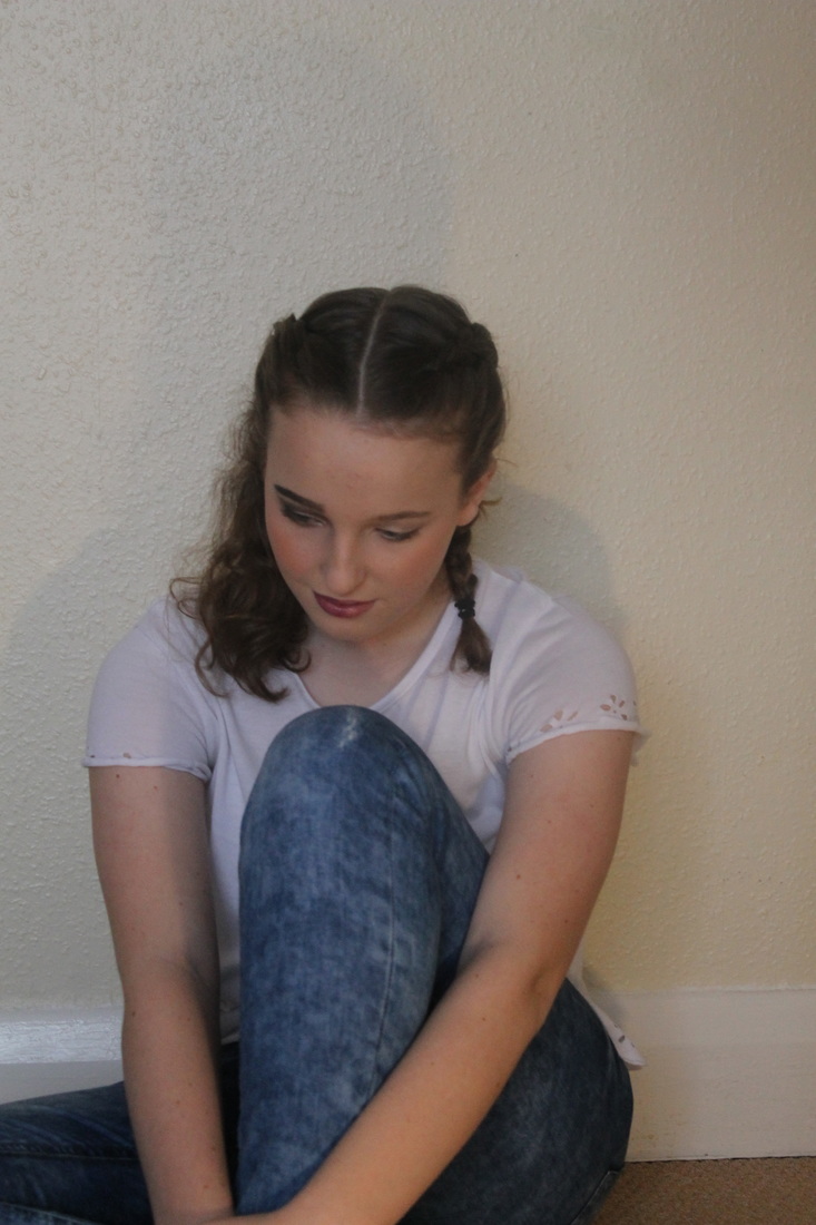
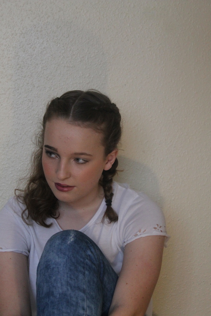
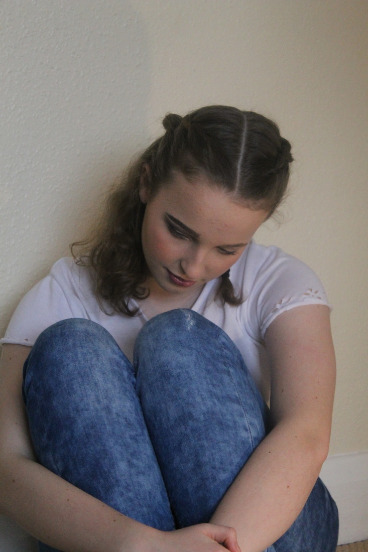
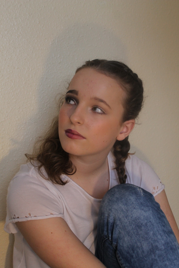
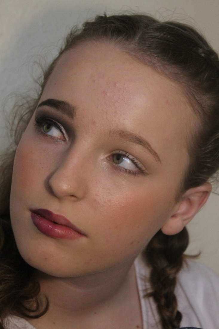
My Favourite Photos, in a shorter Diary form...
Edits in the style of Nan Goldin...
For this edit I decided to duplicate one of my favourite pieces of Goldins work, I liked the abnormal colours that attract the eye. I changed the 'colour mixer' to red to enhance the photo and make it pop, I then used the 'curve tool' to make the girl the highlight oft he photo and make it the lightest part of the photo, and then make the rest of it the darker part. I then used the 'gradient map' tool to invert the lighter part even more and really emphasise the red.
For this edit I turnt the photo to 'black and white' to show the emotion of depression, I then changed the 'levels' and darkened the entire picture- in particular the right side of it. Lastly, I increased the 'exposure' to make the phone the focus point of the photo.
I chose to duplicate one of Goldins photos, I liked this one due to the unusual colour and contrast between the face and the background, I firstly changed change to colour of the photo to intense green, I then adjusted the 'levels' to make the girls face lighter to emphasis the natural makeup look. I then increased the 'contrast' to +60.
For this edit I decided to again use unusual colours and high contrast, I think this gives a classic Nan Goldin look and I really like it. I firstly cropped the photo to crop out the unnecessary parts. I then adjusted the 'curves' to again lighten the girls face and darken her hair, I then turnt the photo into a red/ orange tone to make it more like Goldins work.
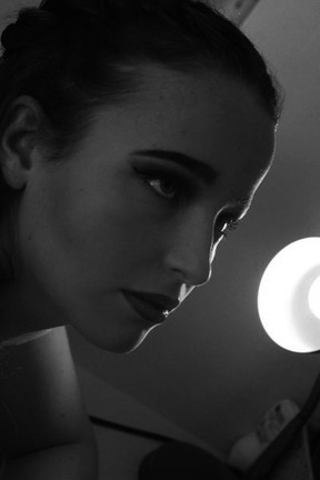
For this edit I chose to recreate my favourite piece of Nan Goldins work, I really liked the angle of this photo with the lamp in the back so I decided to enhance this light on her face. To make this enhancement I turned the photo 'black and white' as a base layer and then used the 'curve tool' to lighten the area by the lamp; I then increased the 'contrast' to 20% to highlight the light on her face even more.
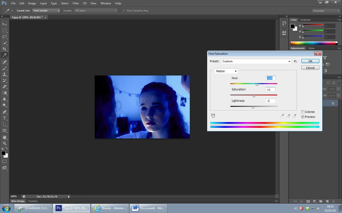
Again this edit is inspired by Goldin's work, I firstly increased the 'Hue/Saturation' and increased the Blue by 13% to enhance the blue tones in the photo. I then enhanced the Blue hue by using the 'levels' tool and darkened the heavy make up side of her face.
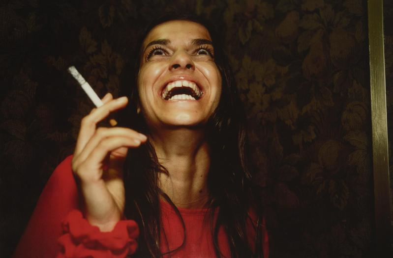
Christian Hopkins
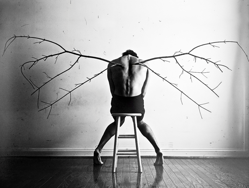
Christian Hopkins is a photographer based on his own experiences, he experienced Clinical Depression at the age of 20 and shows his experience with depression through his photography. I was attracted to his work due to the 'deep feel to them that I think I can duplicate in my work. Instead of using a male model as that isn't my projects intention; id instead use female model and represent her emotions in a different way and use Photoshop to edit the colours to make them more feminine.
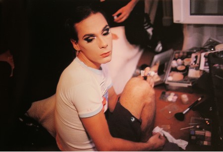
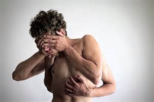
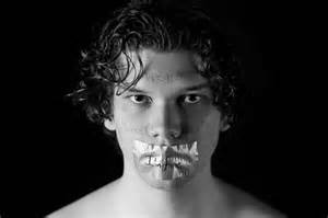
My Favourite Photo of Christian Hopkins Work...

Kliknij tutaj, aby edytować.
My Interpretation of Christopher Hopkins Work...
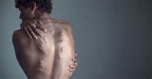
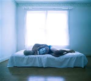
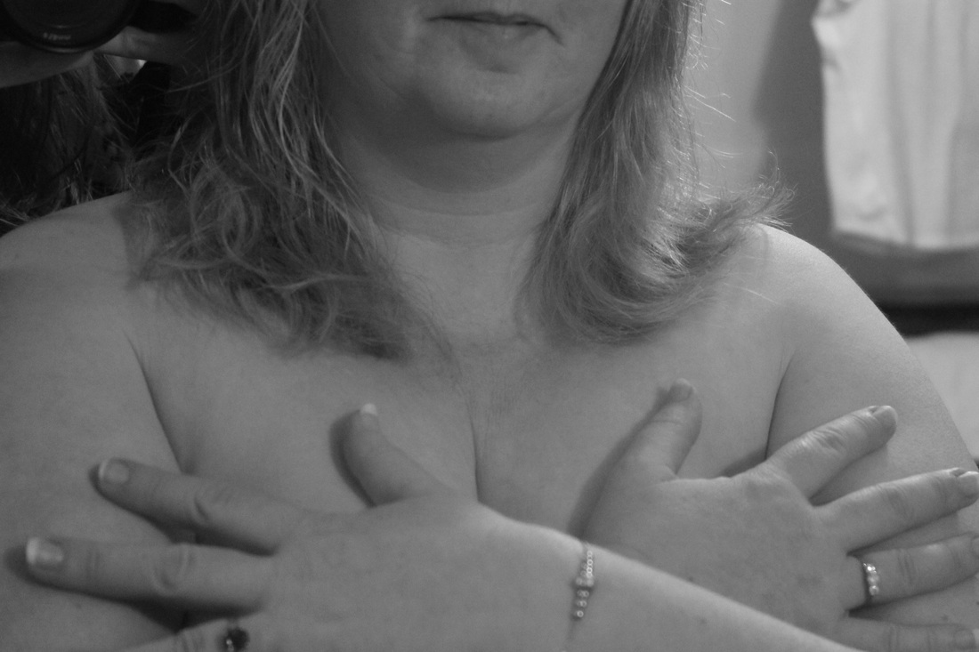
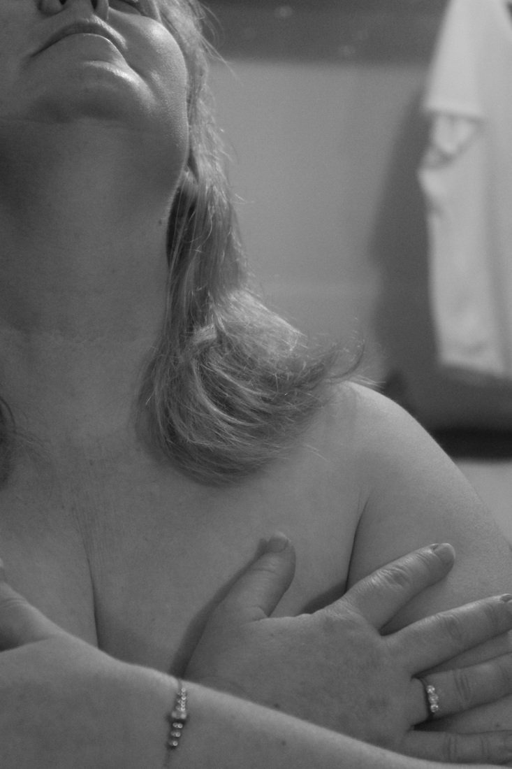
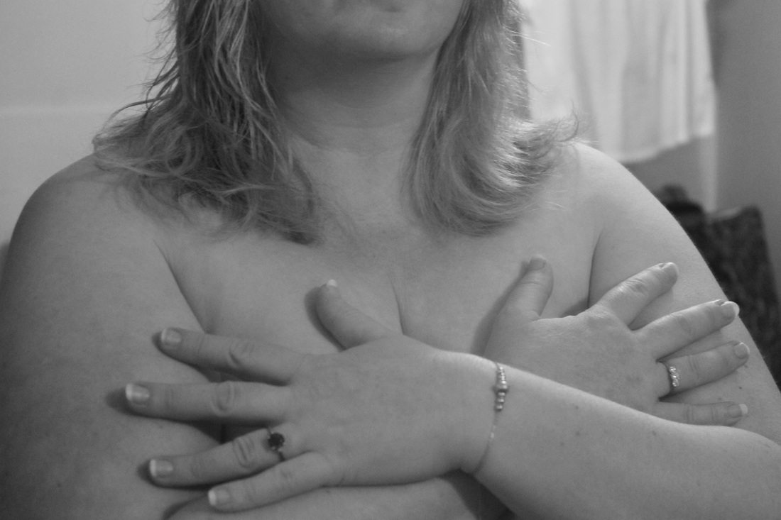
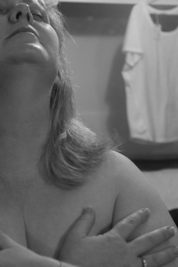
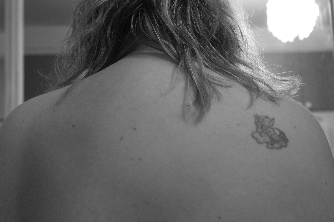
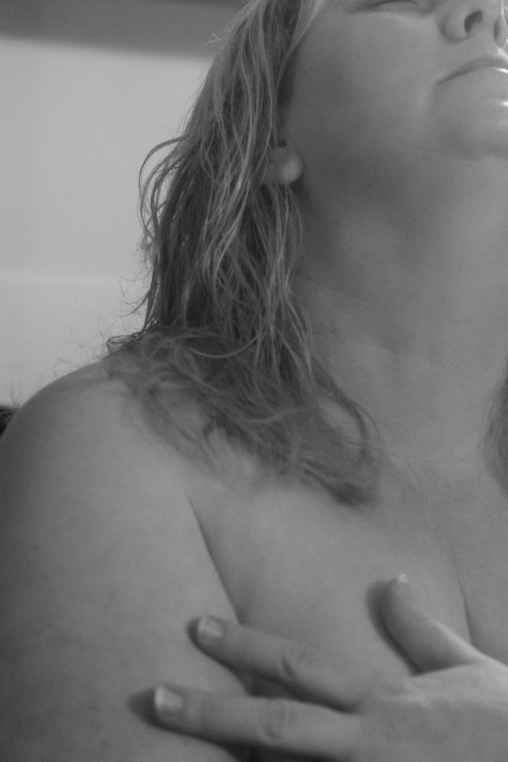
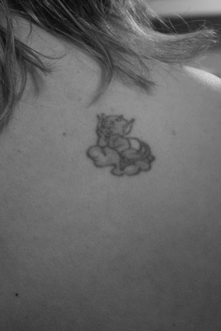
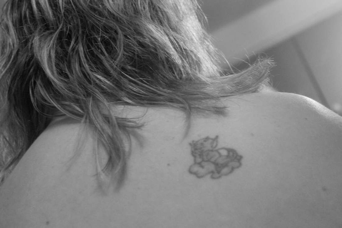
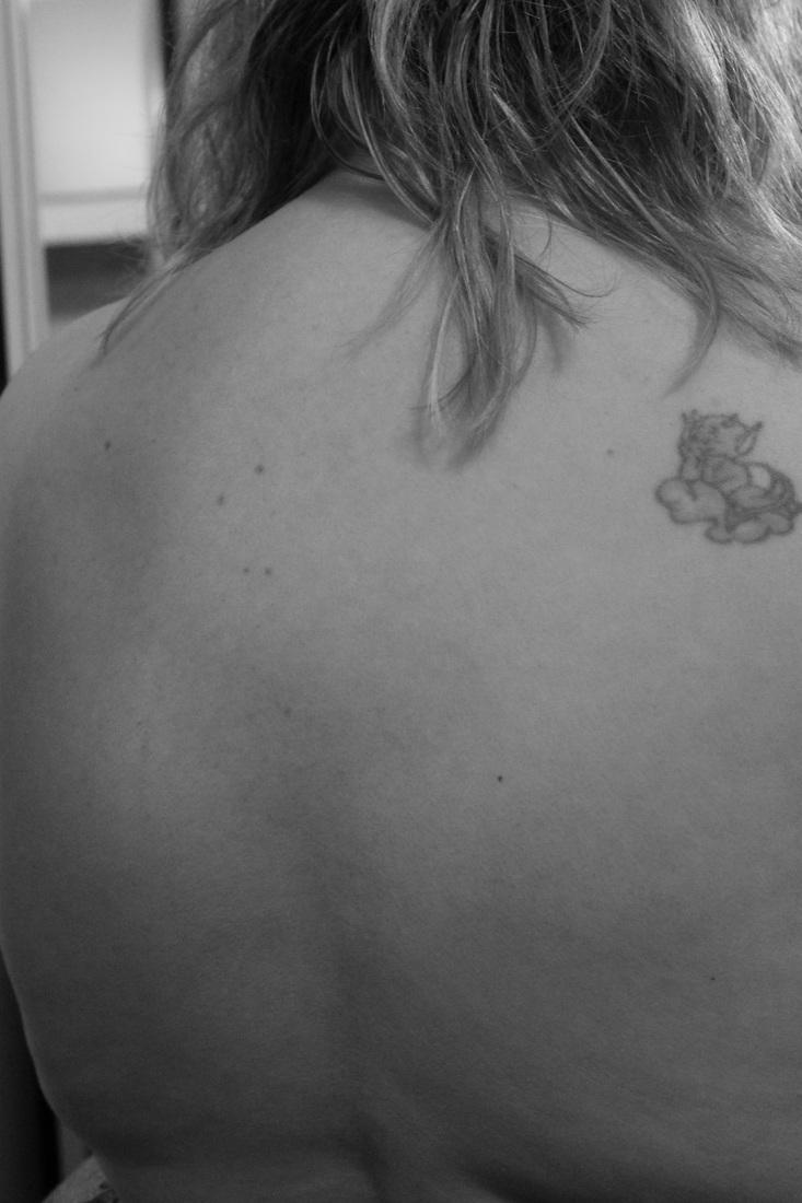
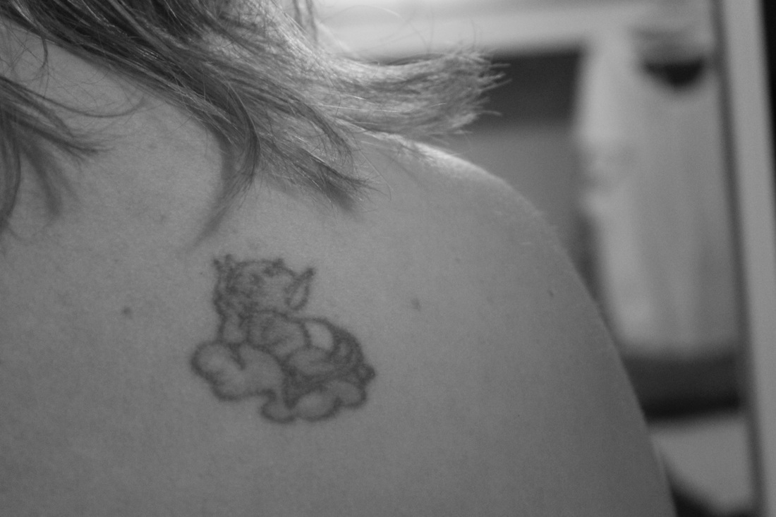
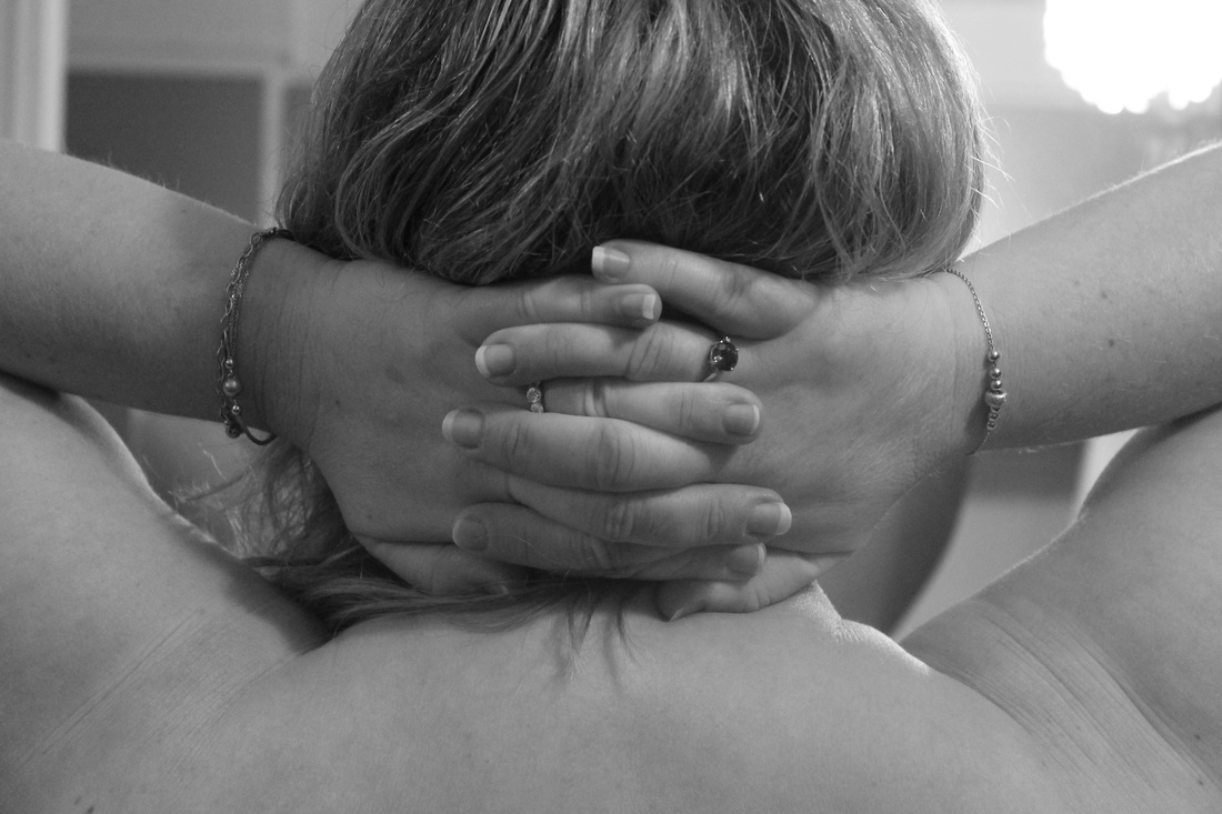
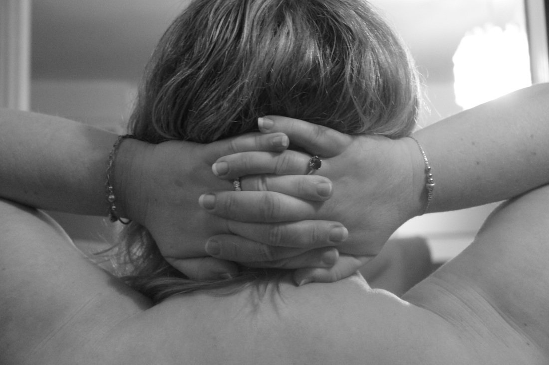
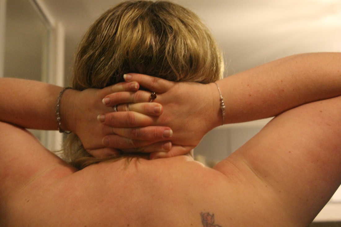
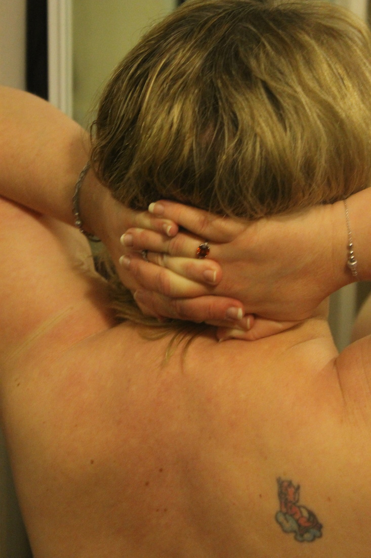
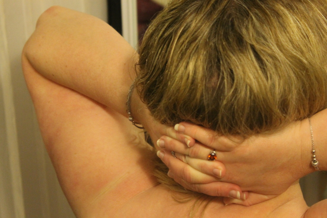
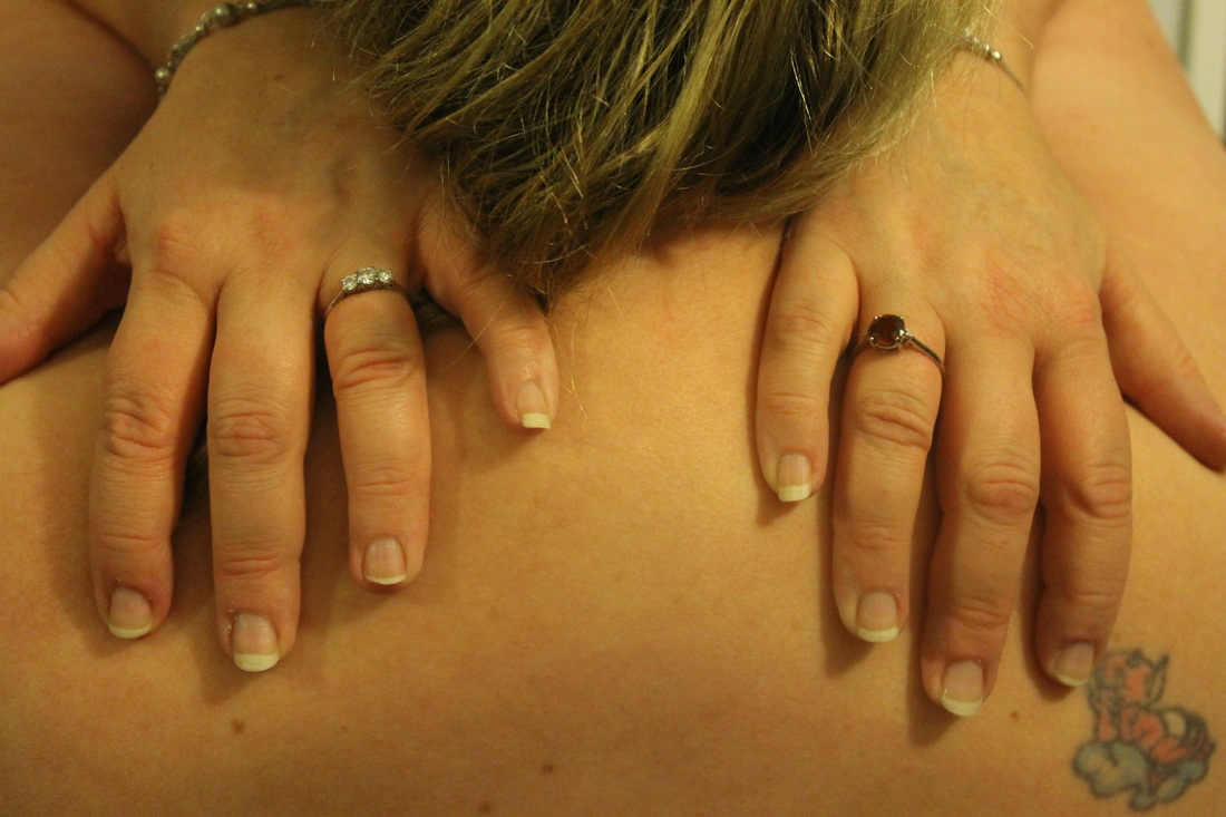
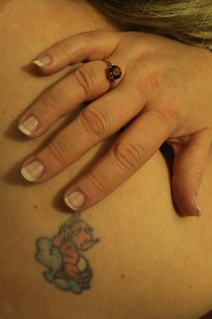
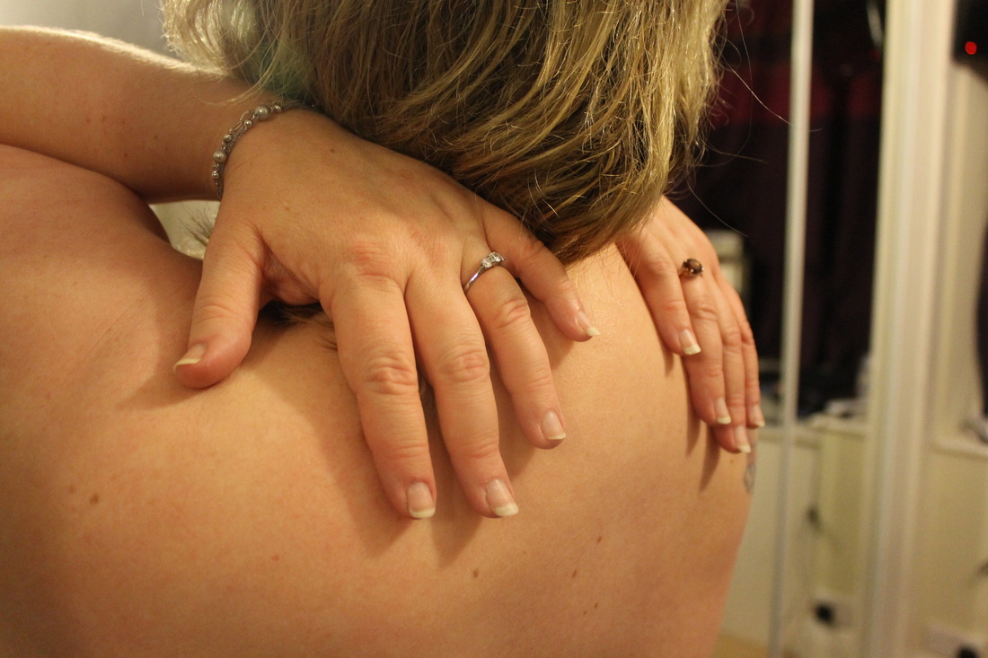
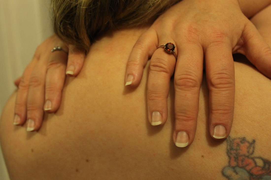
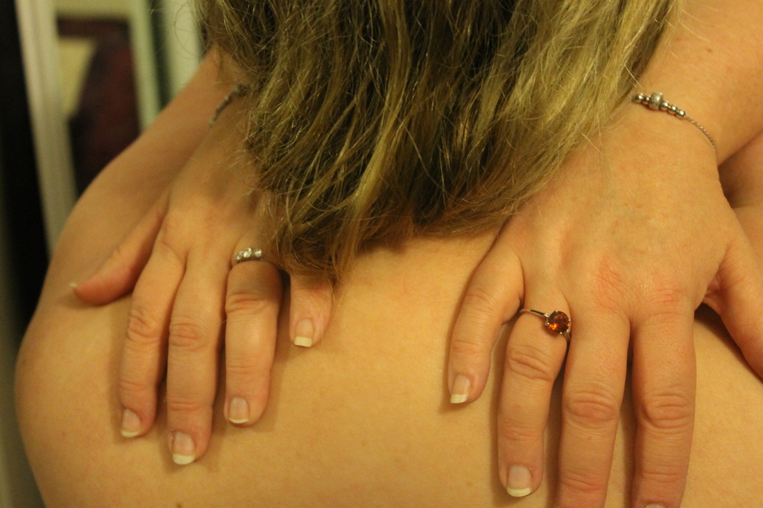
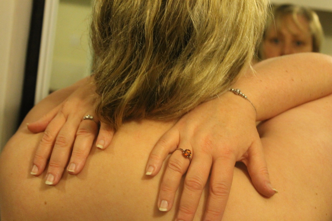
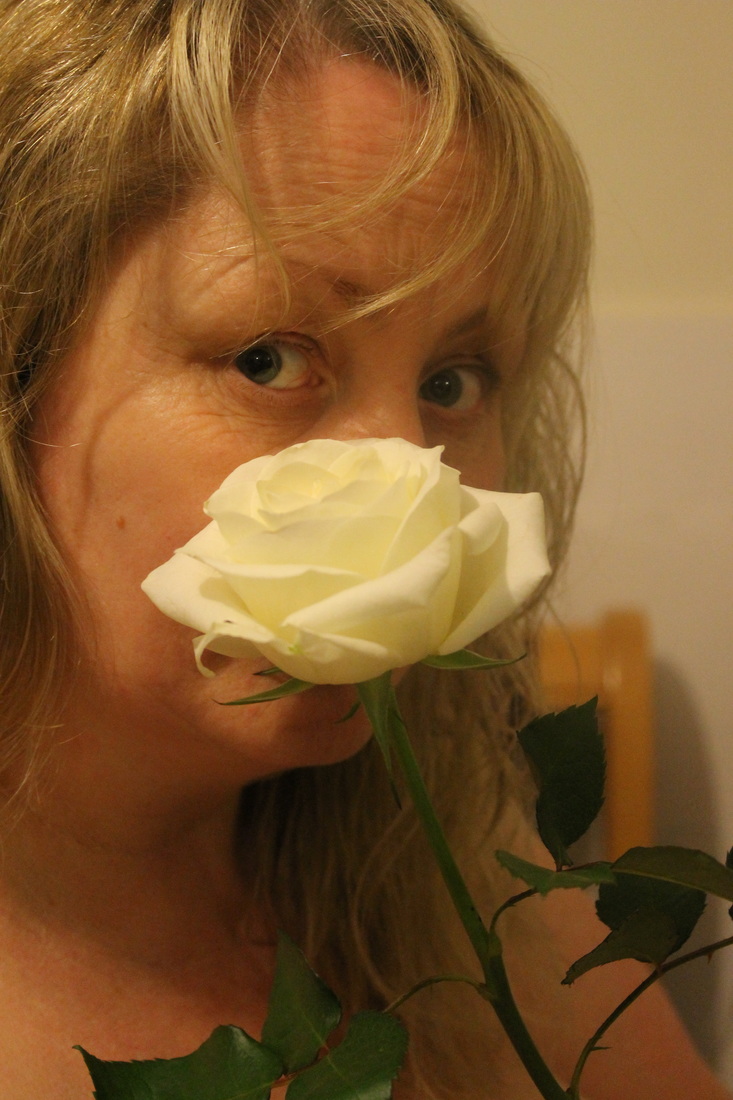
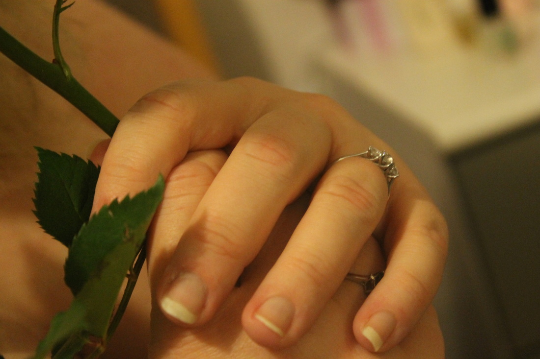
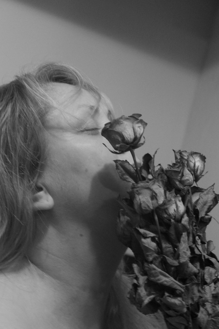
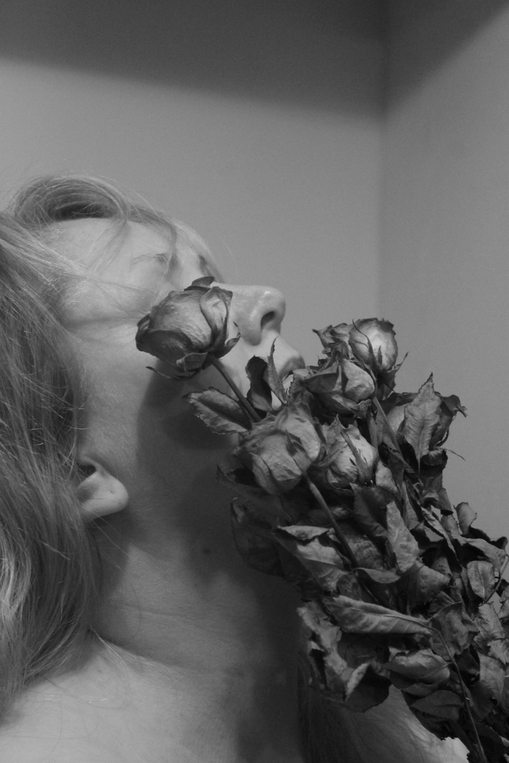
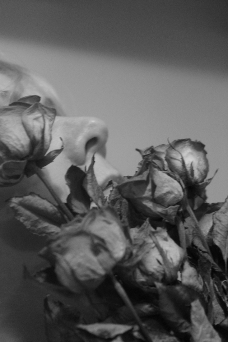
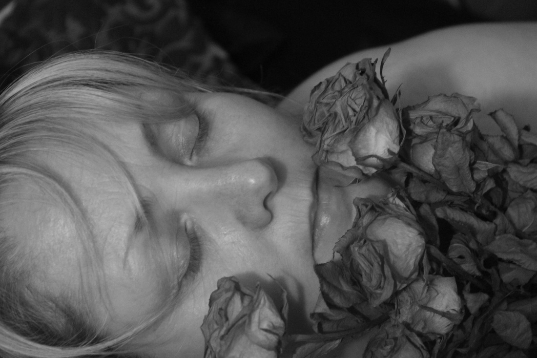
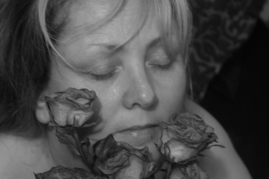
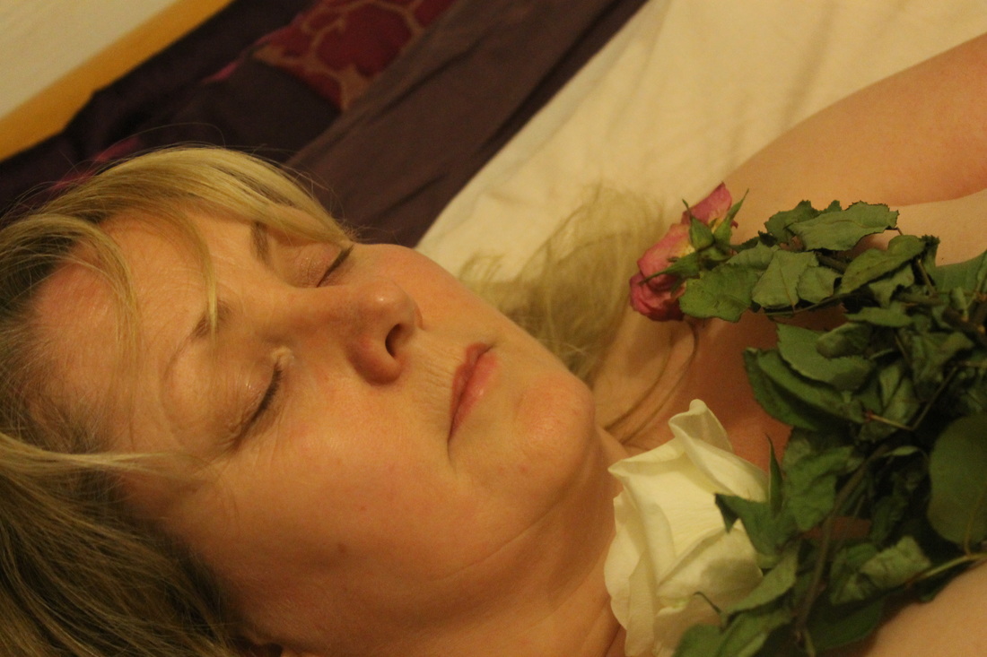
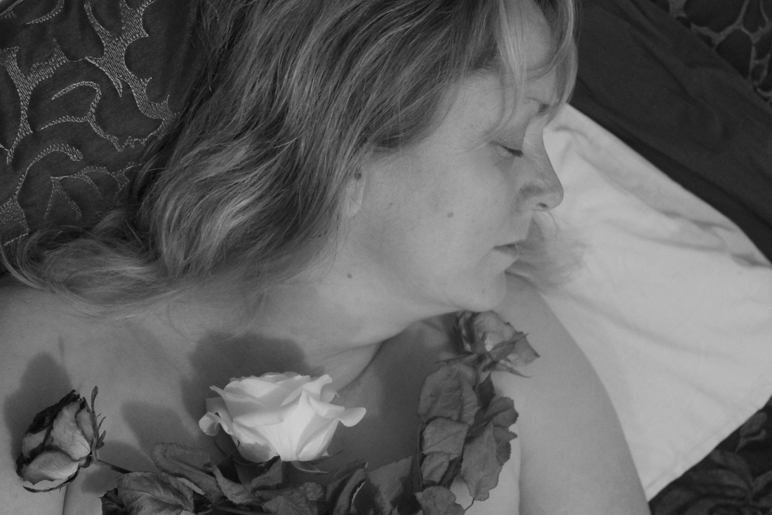
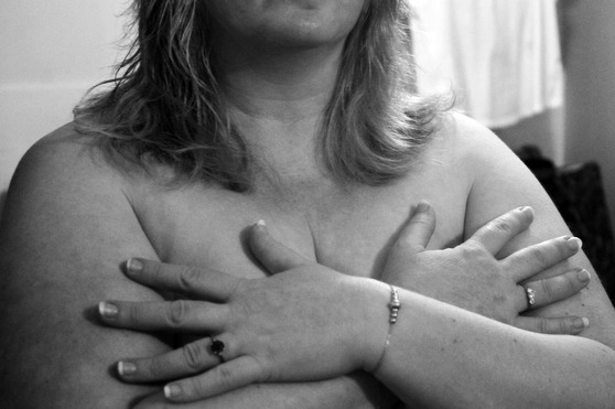
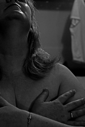
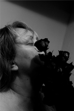
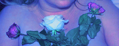
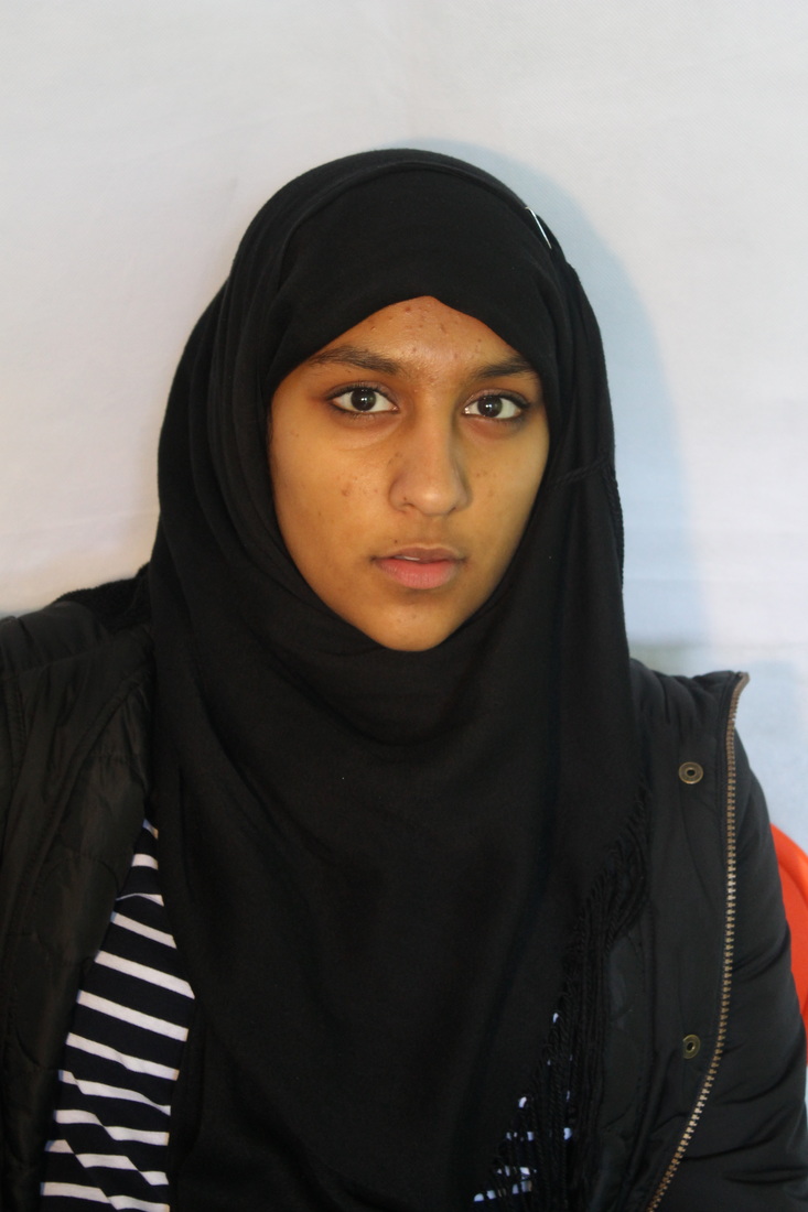
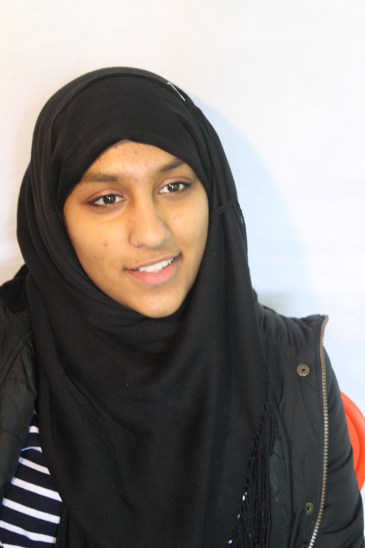
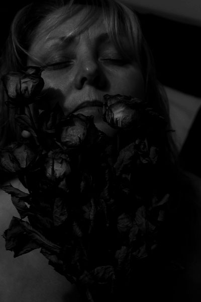
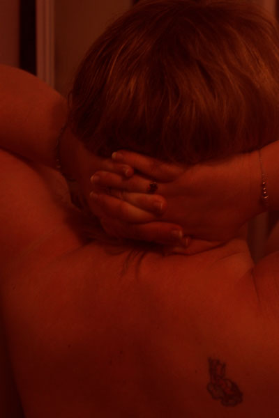
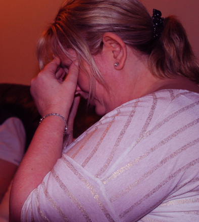
I based this photoshoot on a woman getting over a heartbreak and letting go of the past and embarking on a new beginning, I chose to use a woman instead of a teenage girl for this shoot as I felt a lot of woman can relate to the subject of 'heartbreak'. As the photoshoot progressed I wanted to begin with the woman crossing her hands over her chest to represent the heartache and pain she would be feeling, also it can resemble her heart feeling locked away and she no longer trusts anyone. I then photographed the woman's back as I felt that it was a blank canvas that symbolises a new start, however the woman has a devil tattoo which I thought could represent her ex lover who broke her heart and can symbolise the ex lover coming back into her life and her mind and not going away. I then photographed the woman grabbing her head with her hands to represent the mental pain of being heartbroken and how it can affect every aspect of her life, I then followed that by taking photos of her hands gripping her back. Her ring on her left hand has a clear diamond on it that symbolises an angel (possibly letting go); whereas on her right she has a deep red garnet that, alongside her tattoo, represents the devil (not letting go).
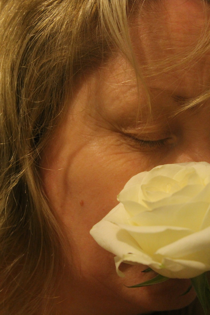
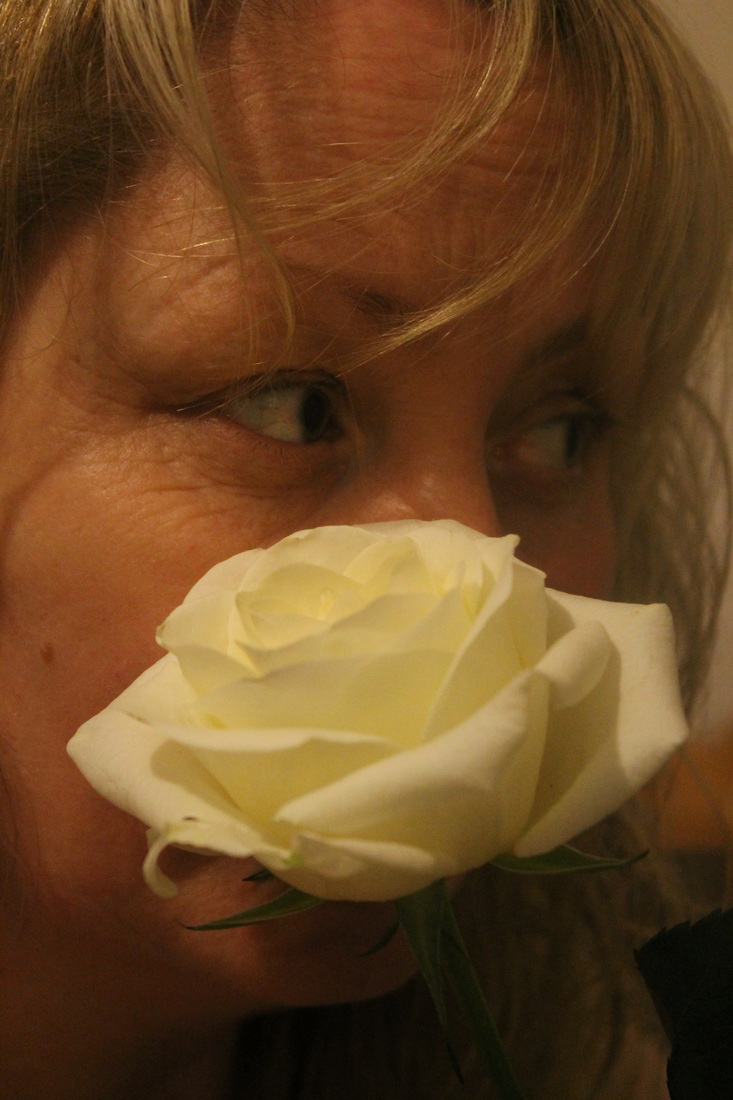
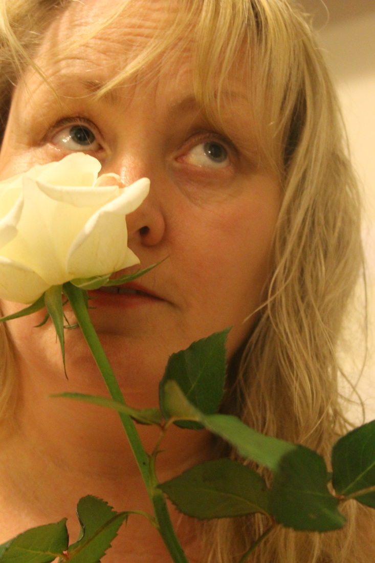
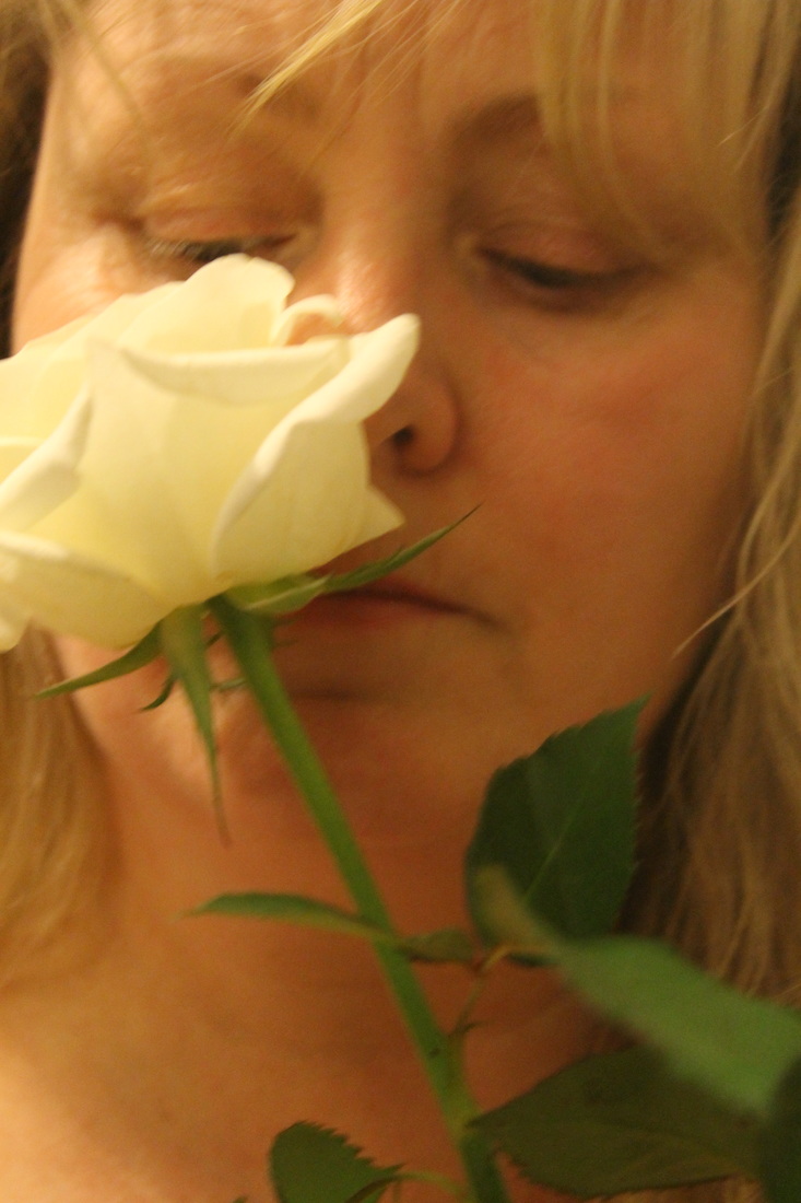
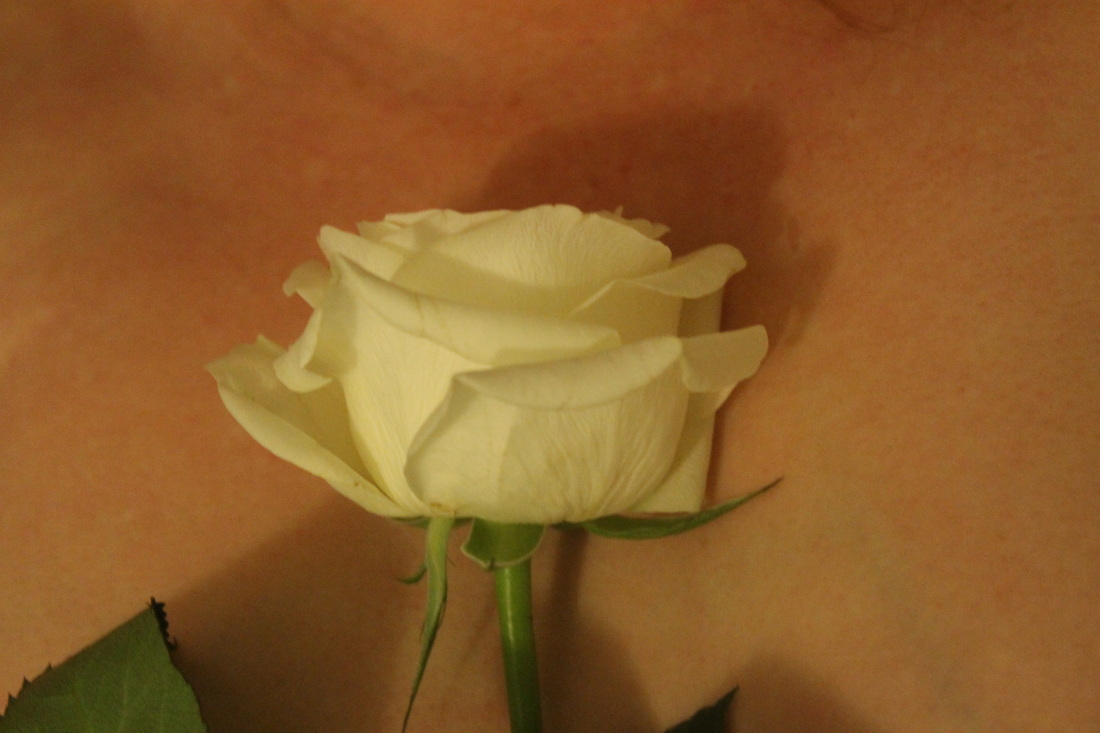
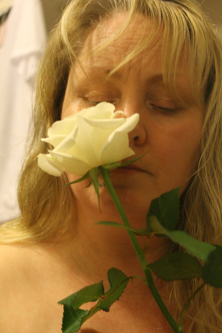
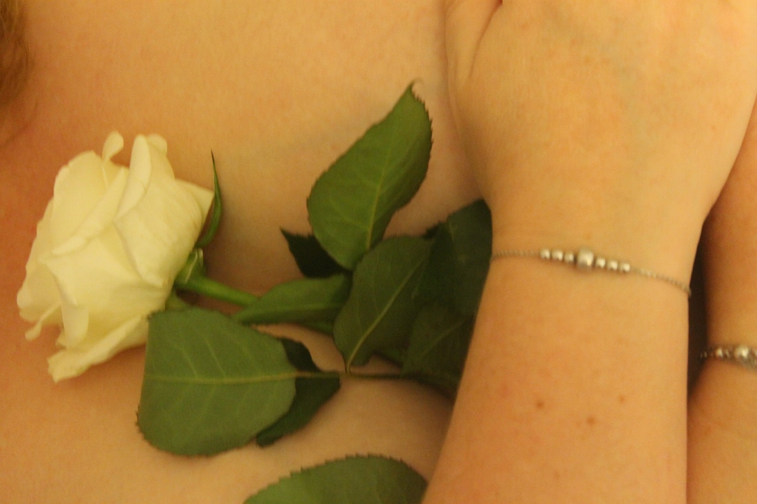
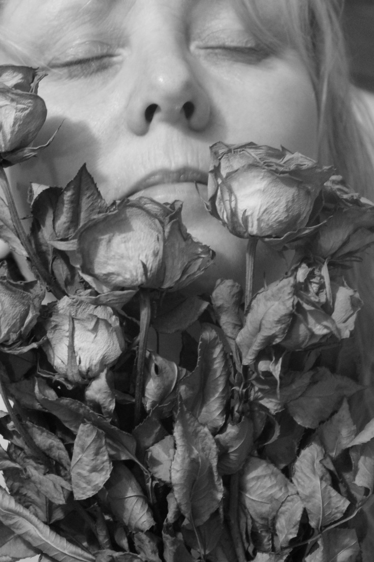
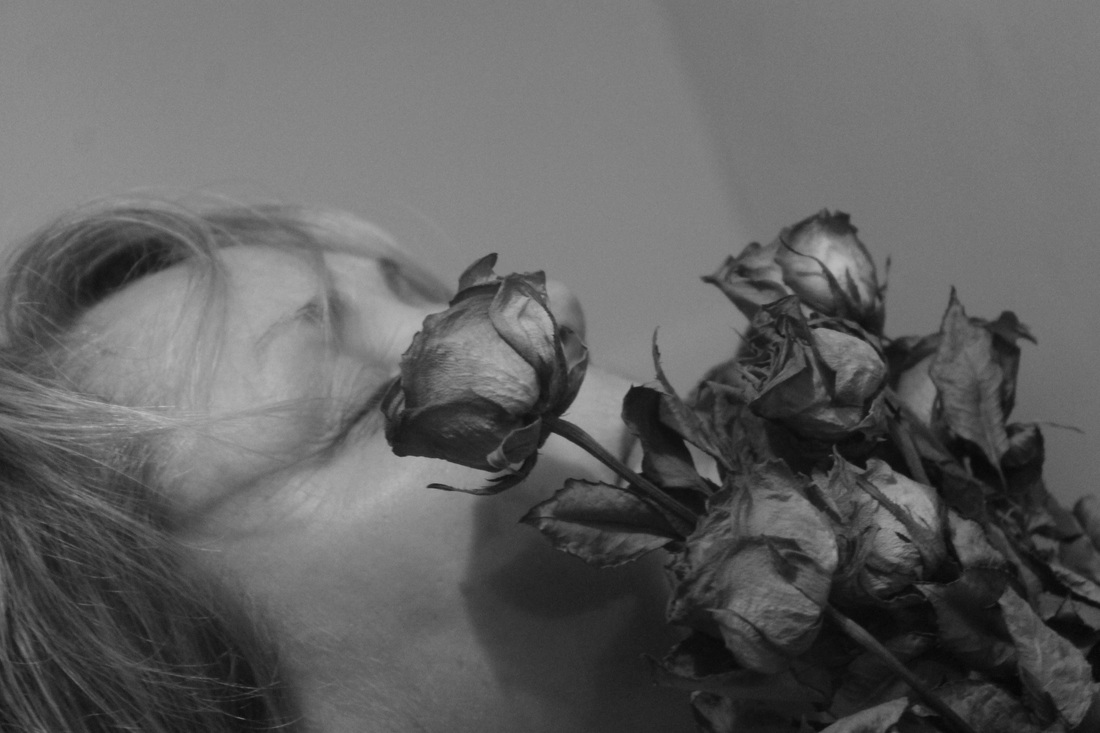
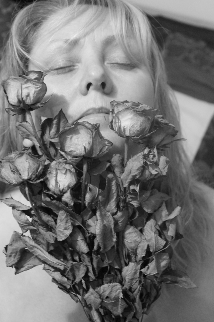
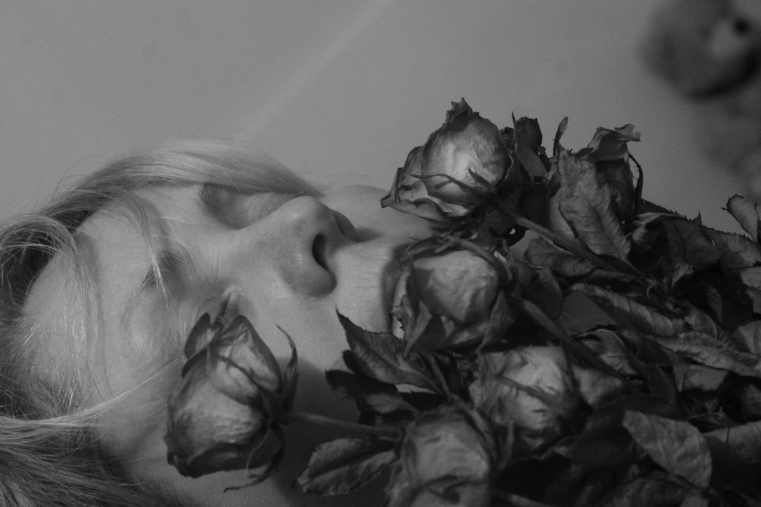
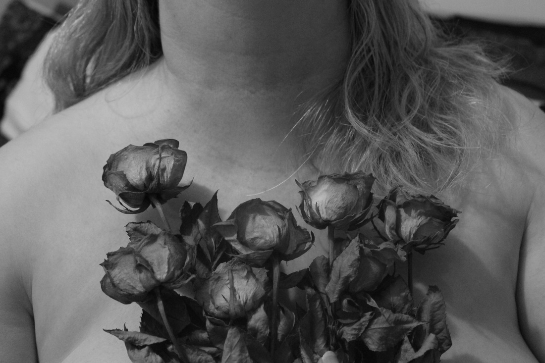
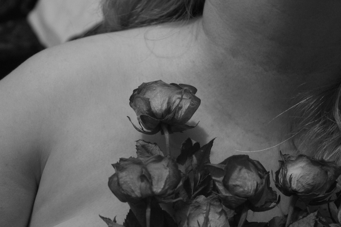
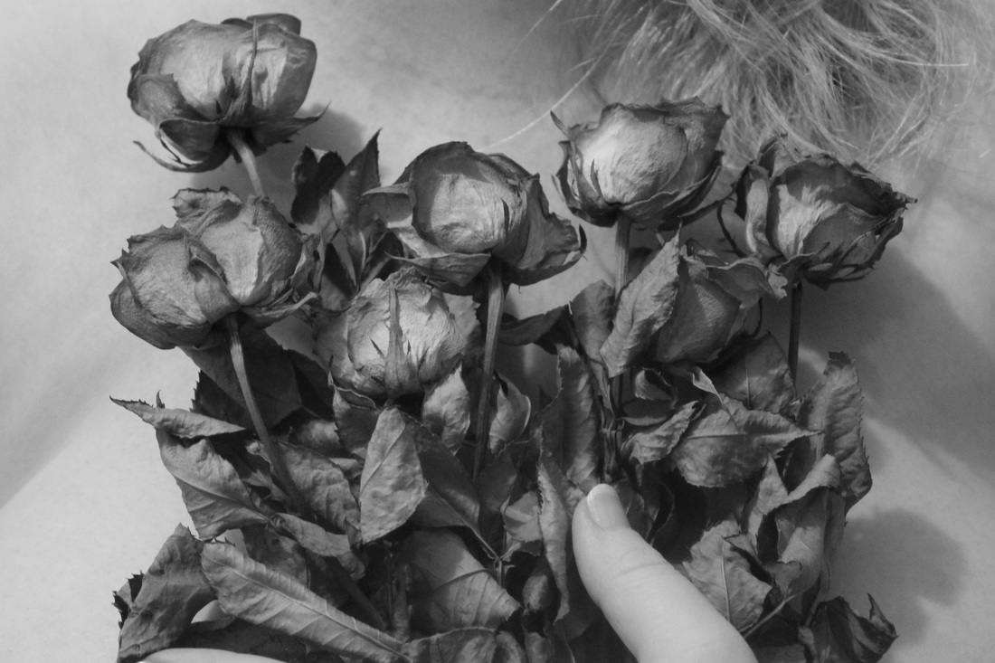
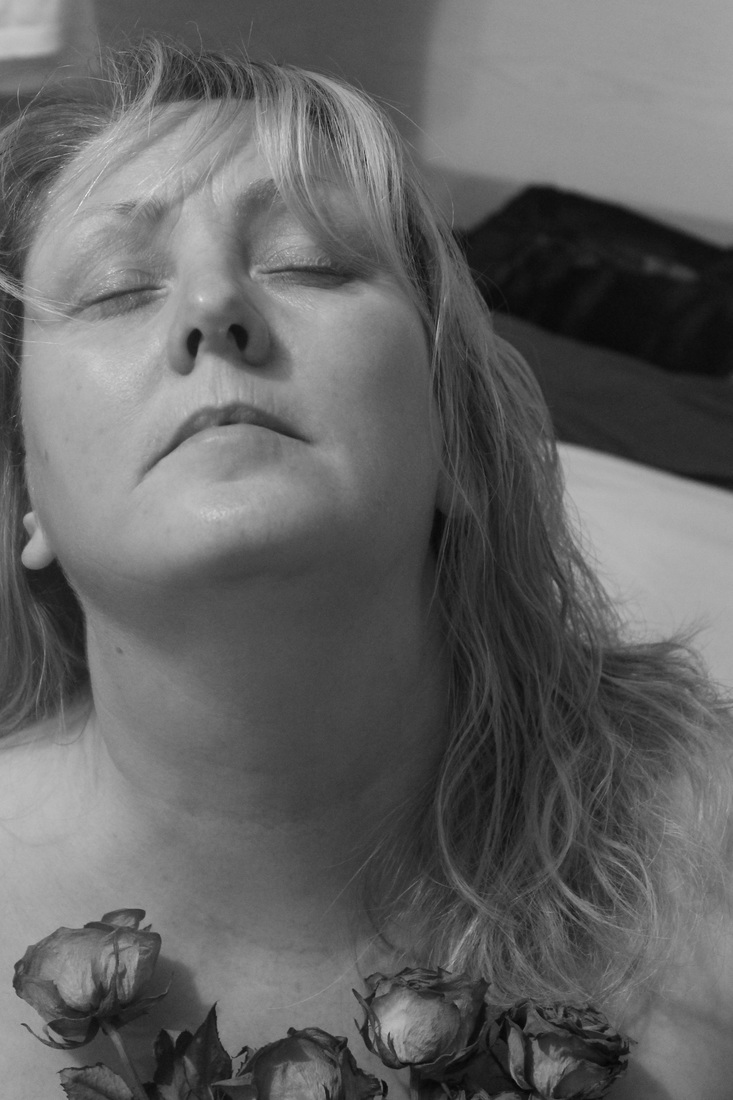
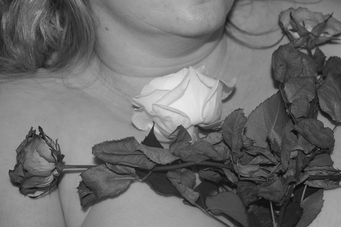
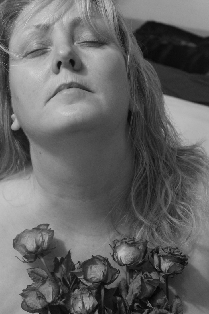
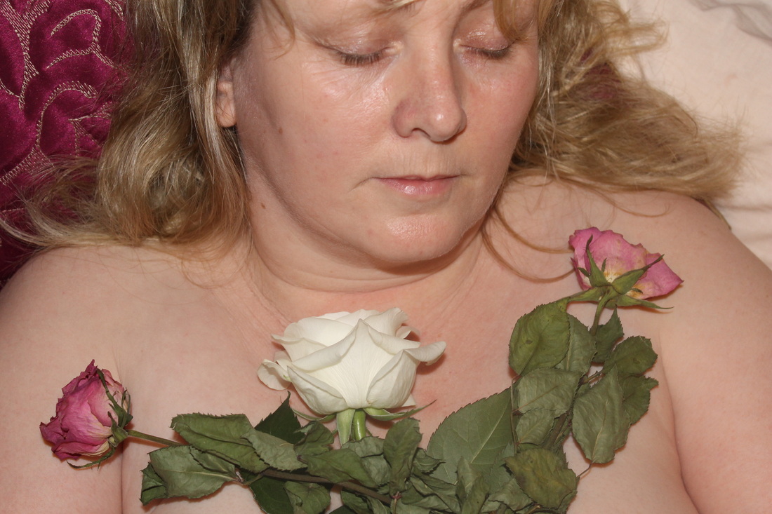
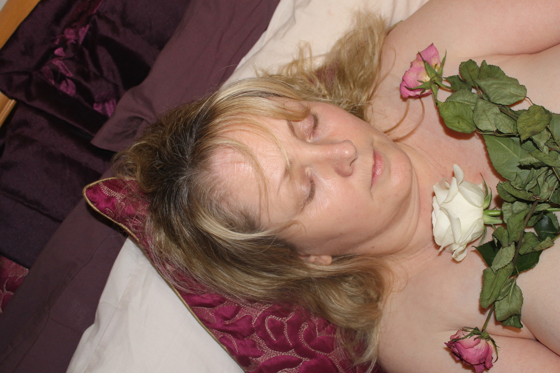
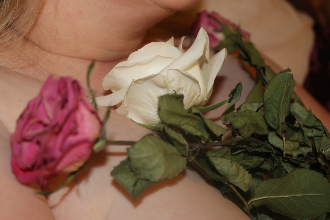
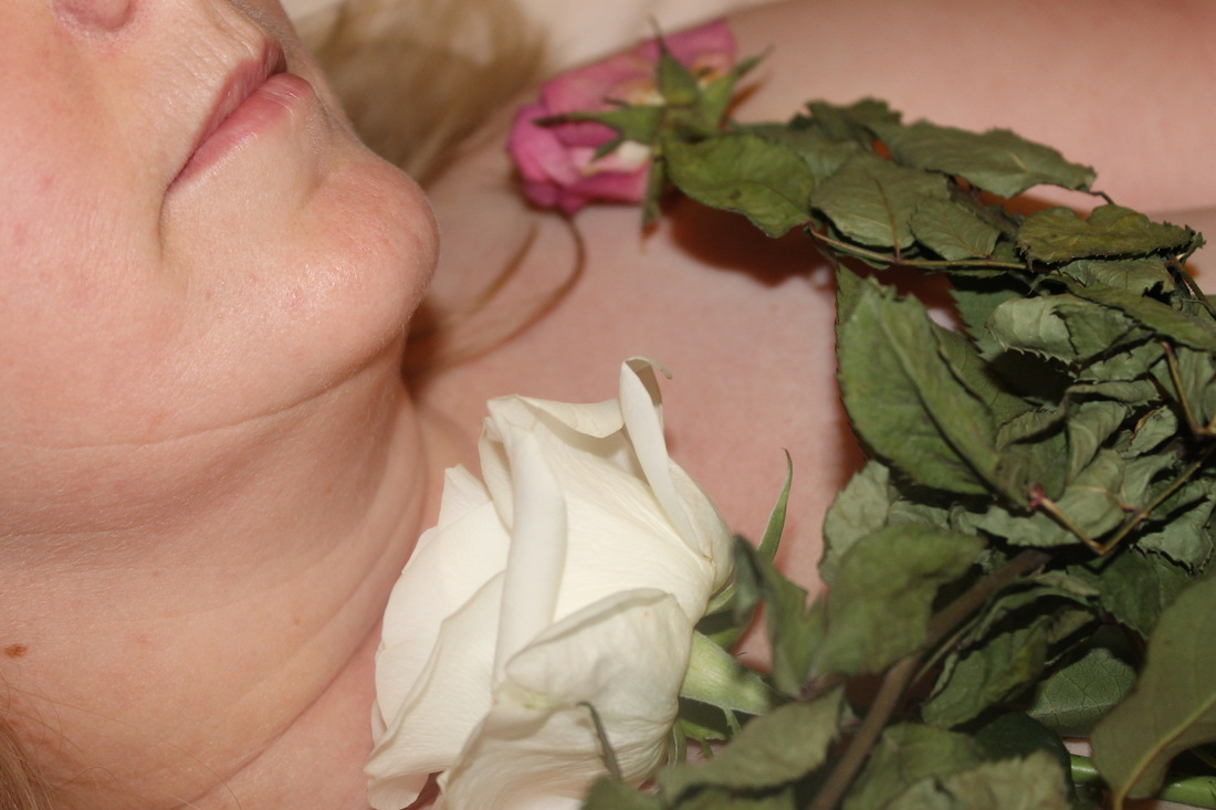
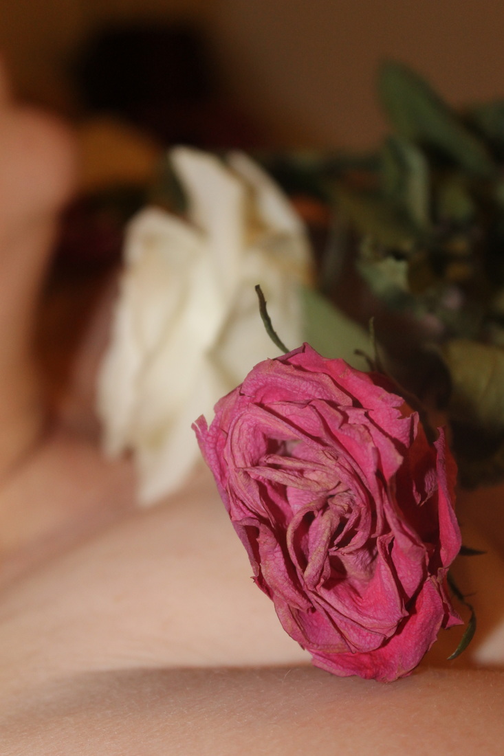
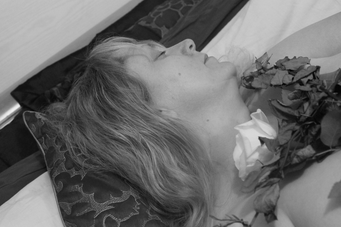
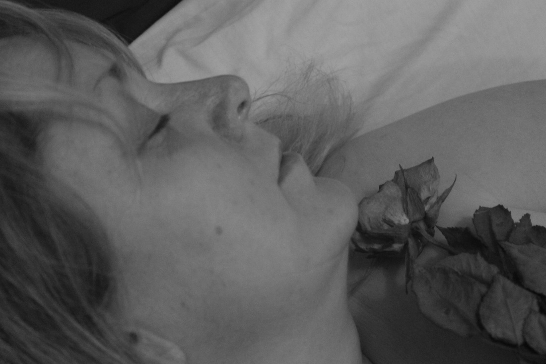
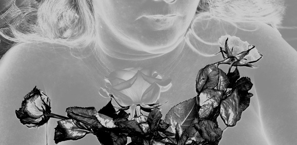
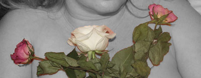
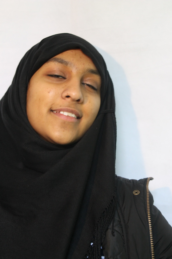
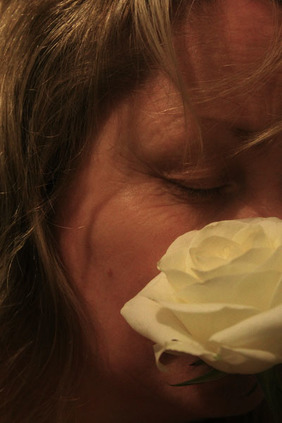
I then photographed the woman holding a cream rose that symbolises letting go and having a fresh start in her life, I also photographed her covering her face with it, showing her fear of letting go. I then photographed the woman holding a bunch of dead pink roses that represents the love that is no longer there and is essentially dead, I chose to use dead roses to really emphasise the heartbreak. For the final part of the photoshoot I chose to photograph the woman on a bed, representing the bed of lies yet memories, I chose to place the fresh rose in between the two dead roses to represent the reality of a heartbreak and how even though you try to move on, the negative memories will still be there in the background.
I then photographed the woman holding a cream rose that symbolises letting go and having a fresh start in her life, I also photographed her covering her face with it, showing her fear of letting go. I then photographed the woman holding a bunch of dead pink roses that represents the love that is no longer there and is essentially dead, I chose to use dead roses to really emphasise the heartbreak. For the final part of the photoshoot I chose to photograph the woman on a bed, representing the bed of lies yet memories, I chose to place the fresh rose in between the two dead roses to represent the reality of a heartbreak and how even though you try to move on, the negative memories will still be there in the background.
My Favourite Photos in a Diary Form...
Edits in the Style of Christian Hopkins...
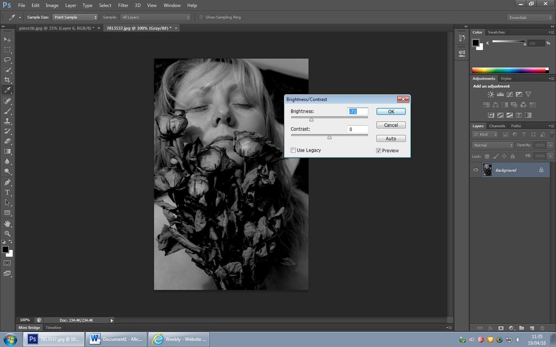
For this edit I chose to keep it quite basic and adjust a few things, I increased the contrast to 98% and used the 'auto tone' tool to adjust the clarity and tone.
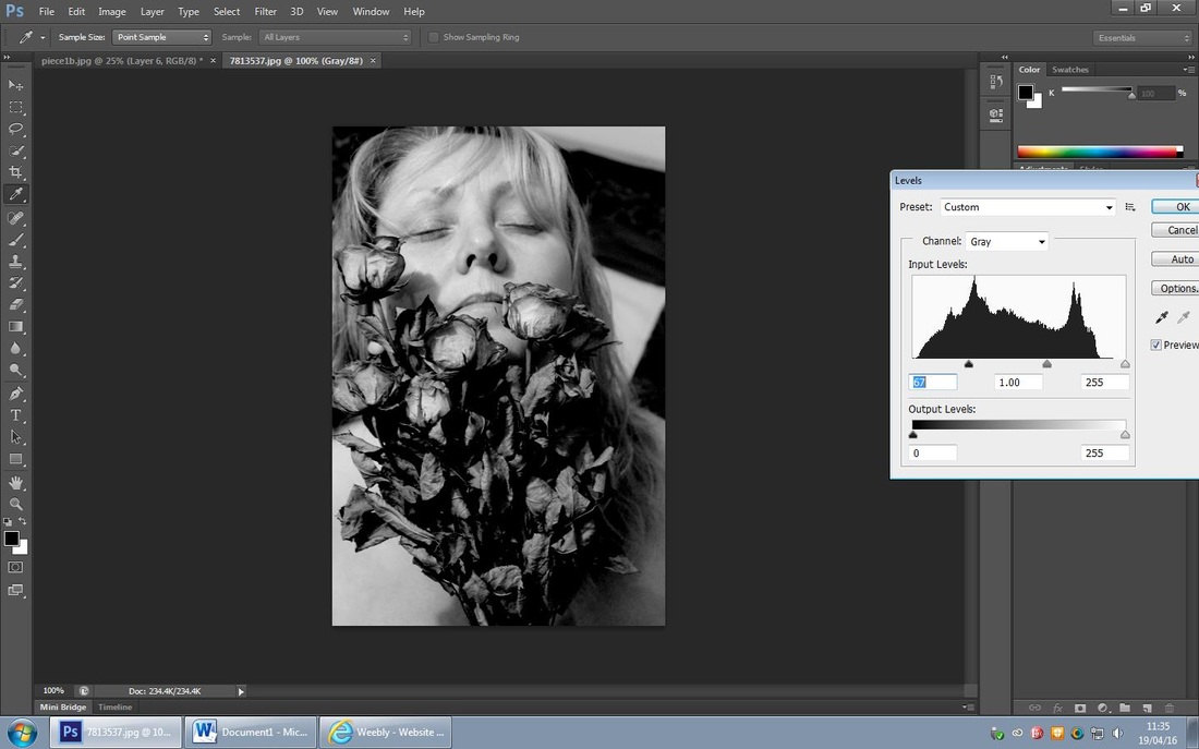
For this edit I chose to replicate a piece of Hopkins' work, even though it is a simple black and white touch up I chose the editing process carefully. Firstly, I increased the 'highlight' to 90% and decreased the 'shadow' to 5%, I then used the 'curve tool' to adjust the lighting throughout and lastly; I used the 'level' tool to darken the woman and lighten the background.
For this edit I chose to have 'negative' as the photo main theme, I decided to invert the woman's body to show the impact on physical health when experiencing heartbreak. The roses represent the heartbreak; I chose to have the two dead roses laying over the new fresh rose to represent the overriding trauma of a heartbreak. For this edit I cropped the photo by a small amount, I then used the 'select tool' to select the leaves and stems of the roses to then use the 'brightness/contrast' tool to decrease the 'brightness' to 40% and then adjust the 'contrast' to 65%. Finally, I used the 'curve tool' to invert the woman's body to represent the negativity.
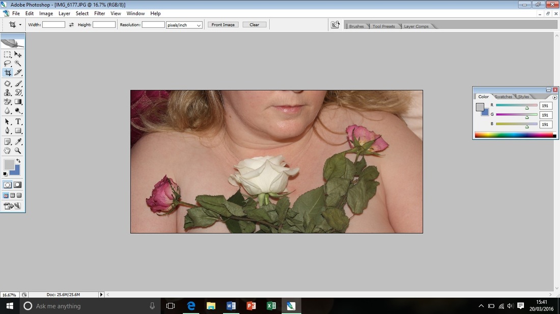
For this edit I chose to emphasise the darkness of the roses and the sadness of a heartbreak, The dead roses represent the sadness and depression you experience when going through heartbreak,by making them darker using the 'hue/saturation' tool I have clearly emphasised this.
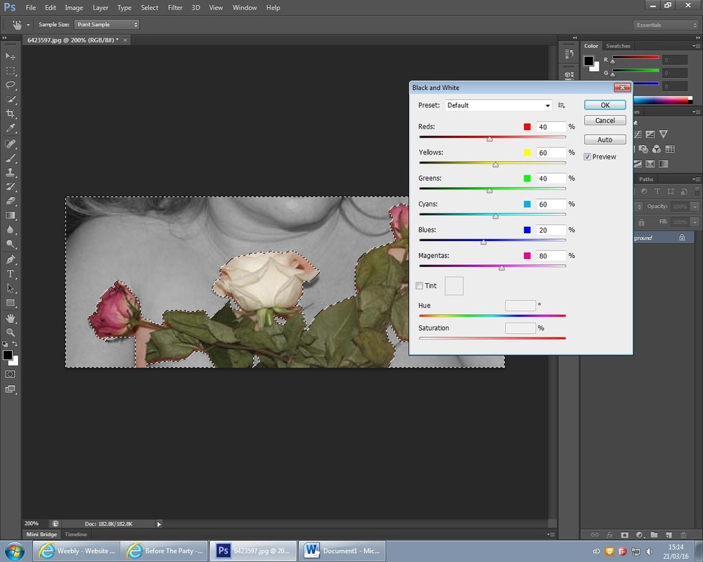
For this edit I again chose to highlight the roses and show their meaning, by making the woman black and white I think it emphasises the feeling the viewer gets from the roses by having them in colour, also it contrasts with her body which would be emotionally hurting. Firstly I used the 'select tool' to cut around the colourful roses and make them stand out, I then used the 'black and white' tool to turn the background black and white to contrast with the roses intense colour.
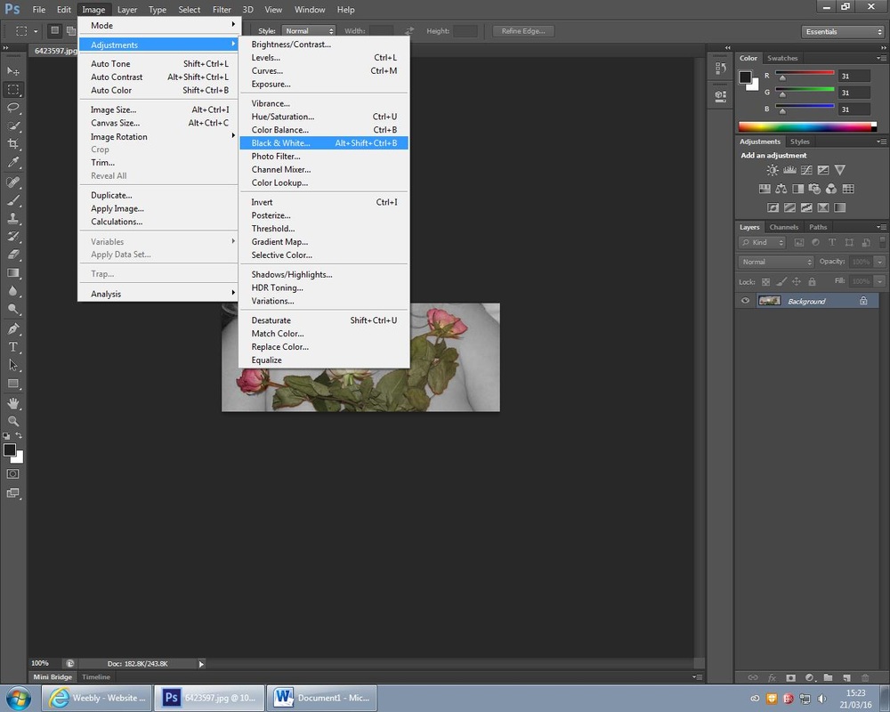
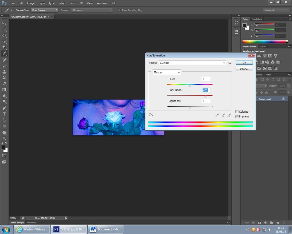
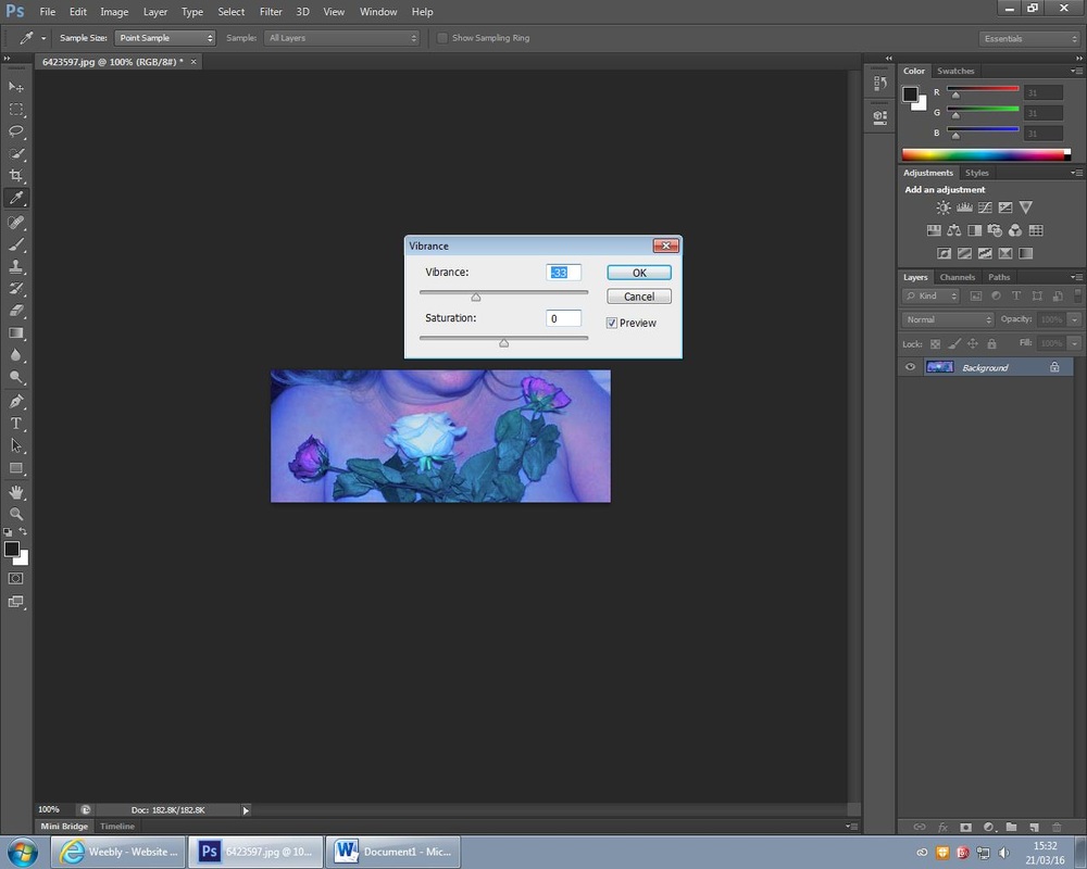
I wanted to replicate a piece of Hopkins' work by creating this intense blue hue. Firstly, I used the 'hue/saturation' tool and increased the 'brightness' to 80%, I then used the 'saturation/vibrance' tool and decreased it to 40% and then increased the 'brightness' to 60%. Finally I then increased the blue/cyan hue using the 'colour mixer tool.
Laura Stevens
Laura Stevens is an English photographer based in Paris, France. She has a BA in photography and Art, she explores the feelings of loss, relationship and intimacy which is perfect for my project. Her work is exhibited in the National Portrait Gallery and many other famous galleries over the world.
I plan to do two photoshoots based on her work, one focusing on 'relationship's' and the other based on 'loss' from relationships, it think that this will tie in perfectly for my project and give me new ideas for my final piece. I really like the style of her work
I plan to do two photoshoots based on her work, one focusing on 'relationship's' and the other based on 'loss' from relationships, it think that this will tie in perfectly for my project and give me new ideas for my final piece. I really like the style of her work
My Interpretation of Laura Stevens' Work: Photoshoot 1- Relationship Reality
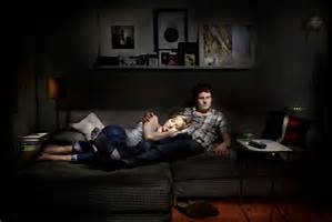
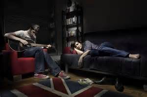
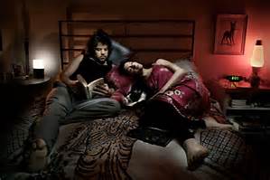
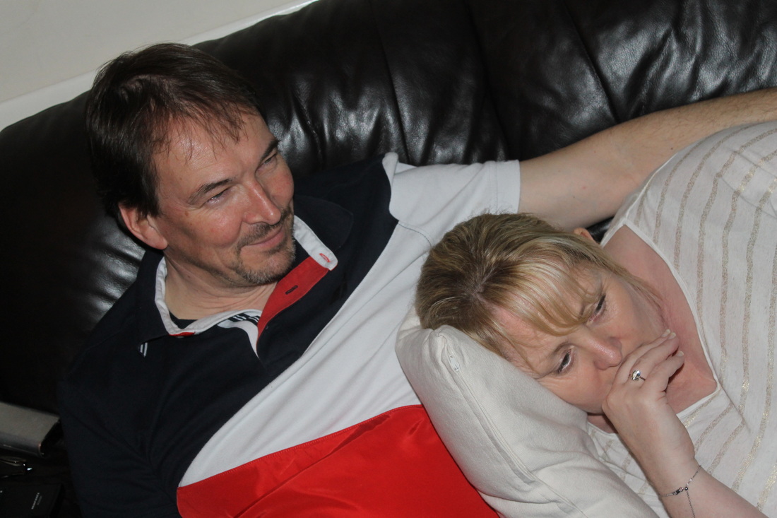
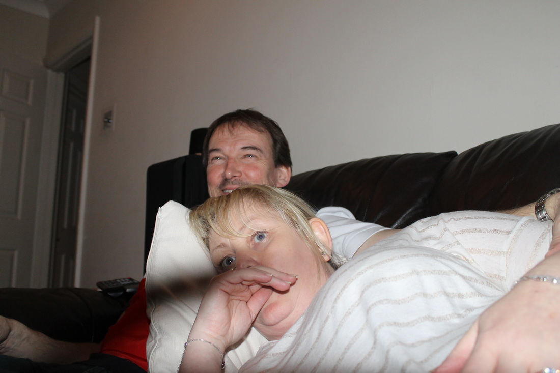
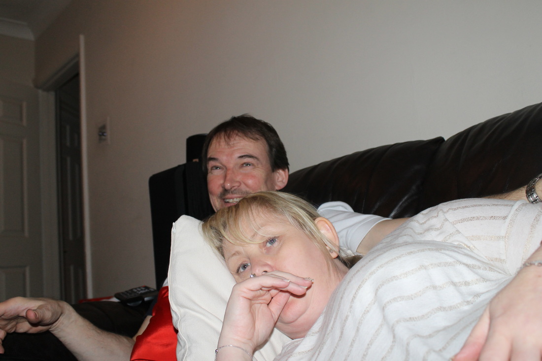
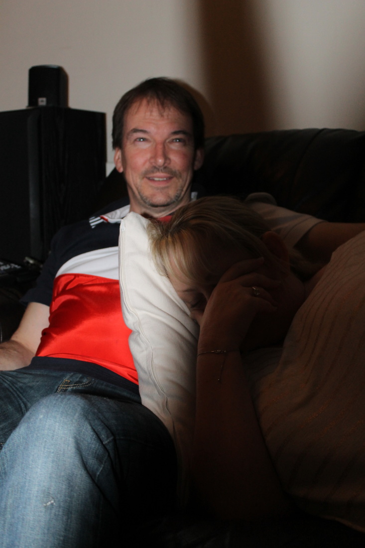
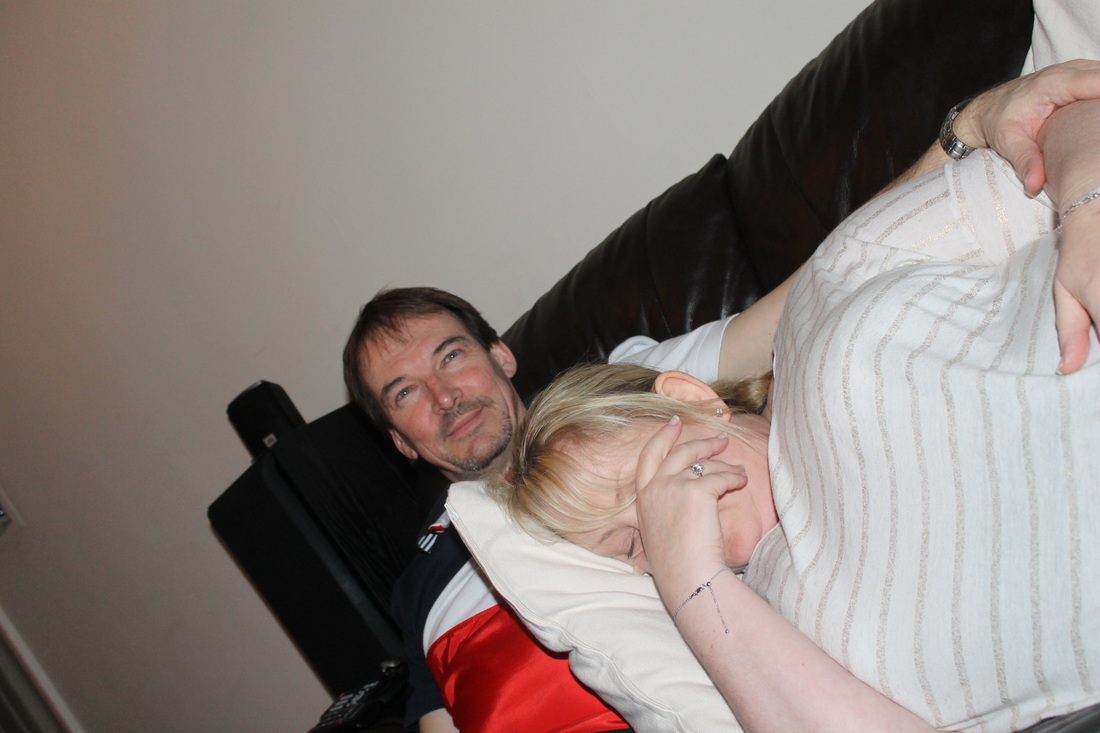
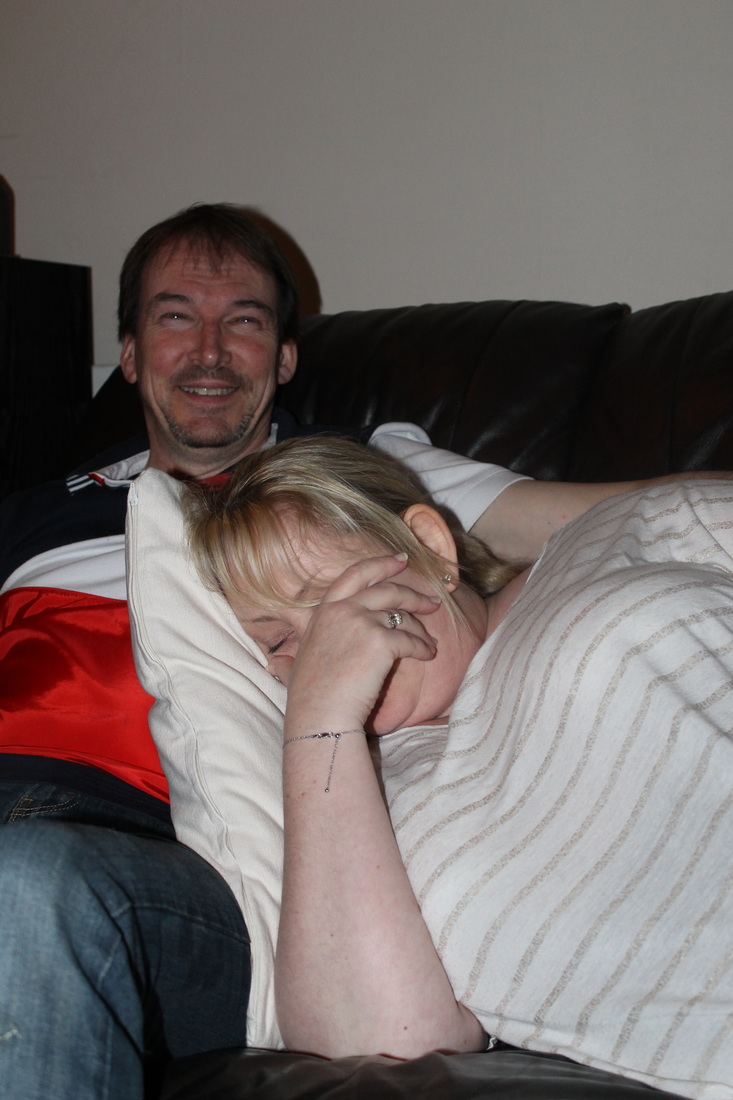
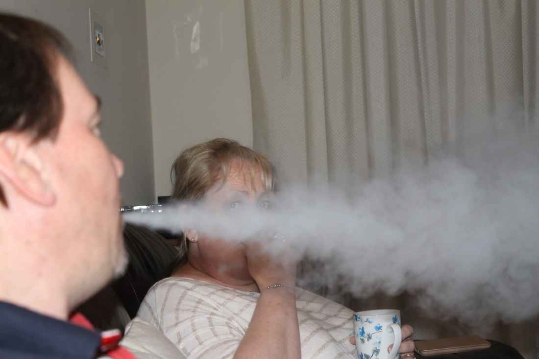
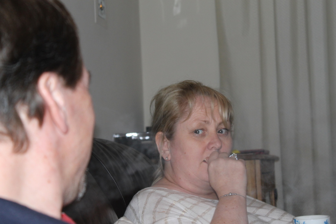
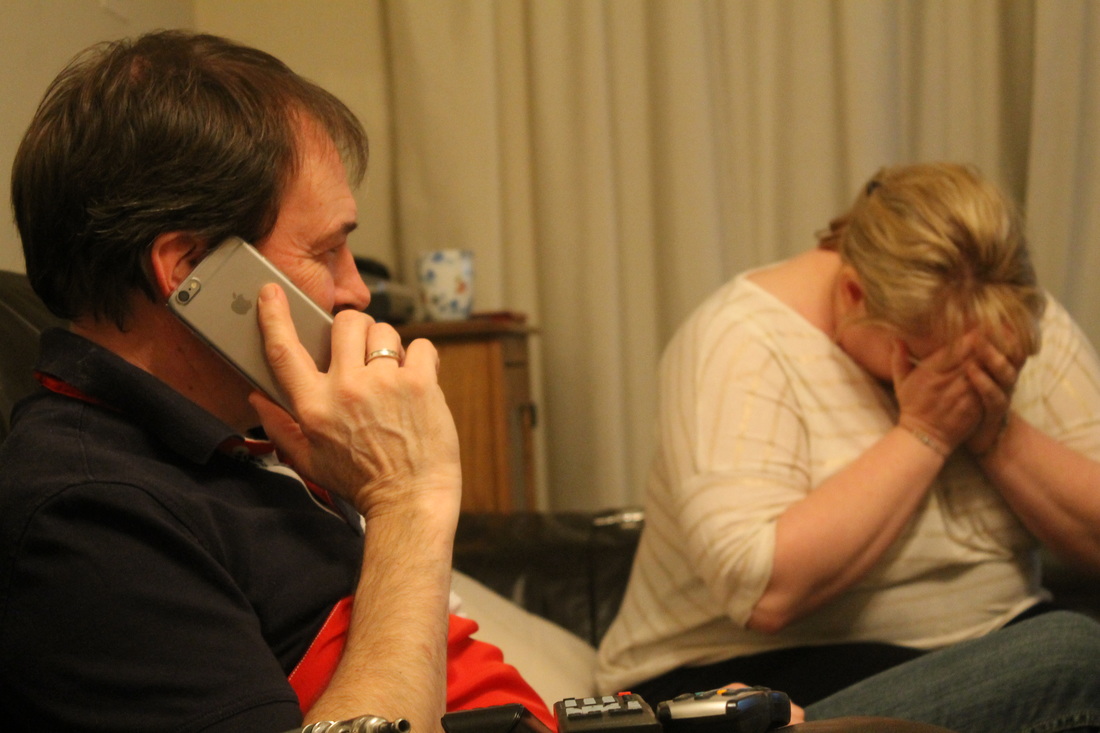
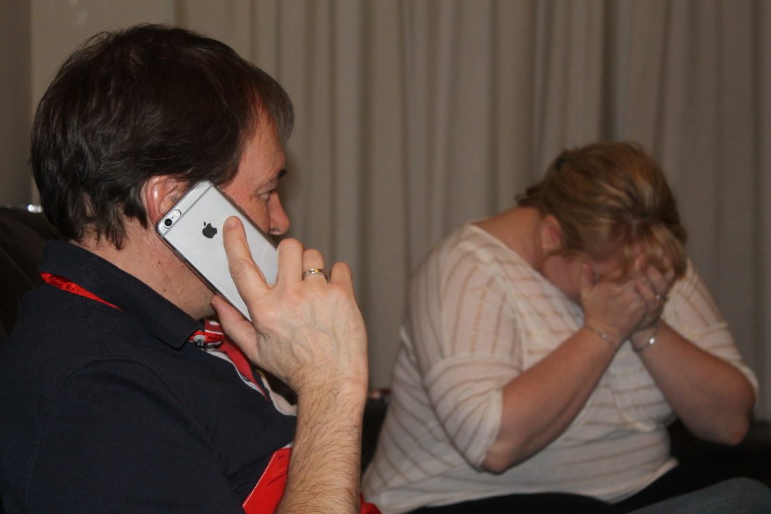
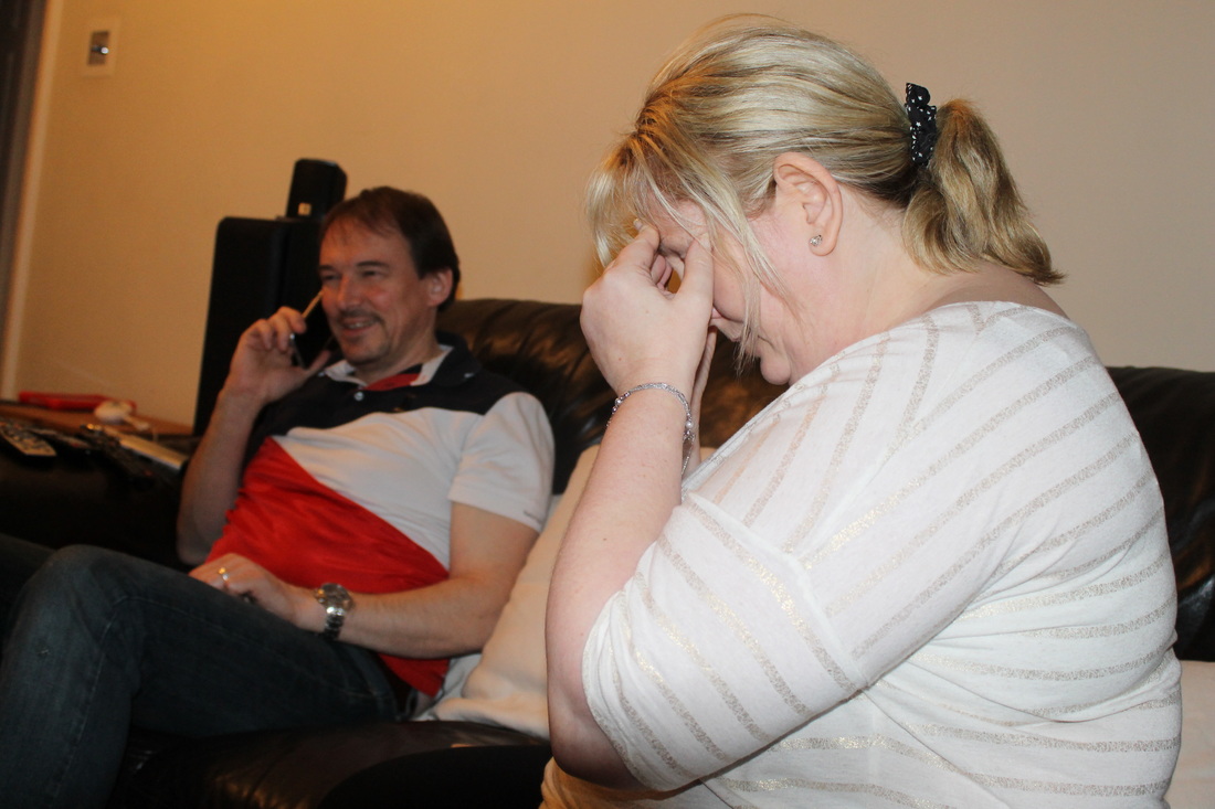
For this photoshoot I decided to base it on Stevens' project of 'relationships' and change it into 'Relationship Reality' I chose this topic as I feel it is a part of a females life at some point. My aim for this photoshoot is to capture the happiness a woman may feel while in an ongoing relationship. The couple photographed are sat on an ordinary couch in an ordinary lounge to show the reality of the purpose of this photoshoot, They are either sat on opposite ends of the couch to show the contrasting emotions, or sat cuddled up together to show the compassion they once had for one another- even though the female thinks otherwise.
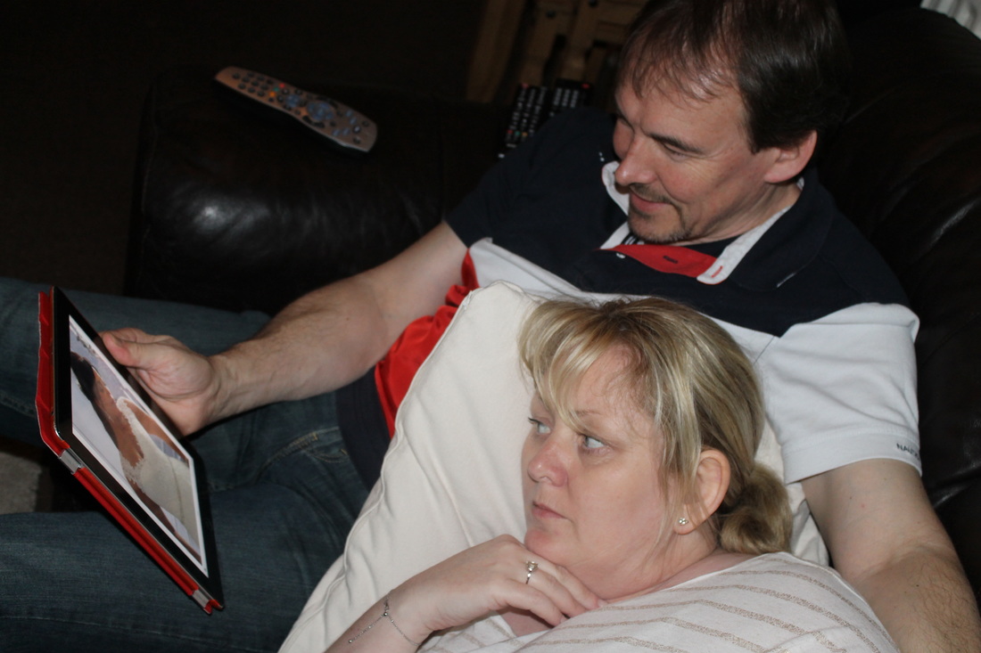
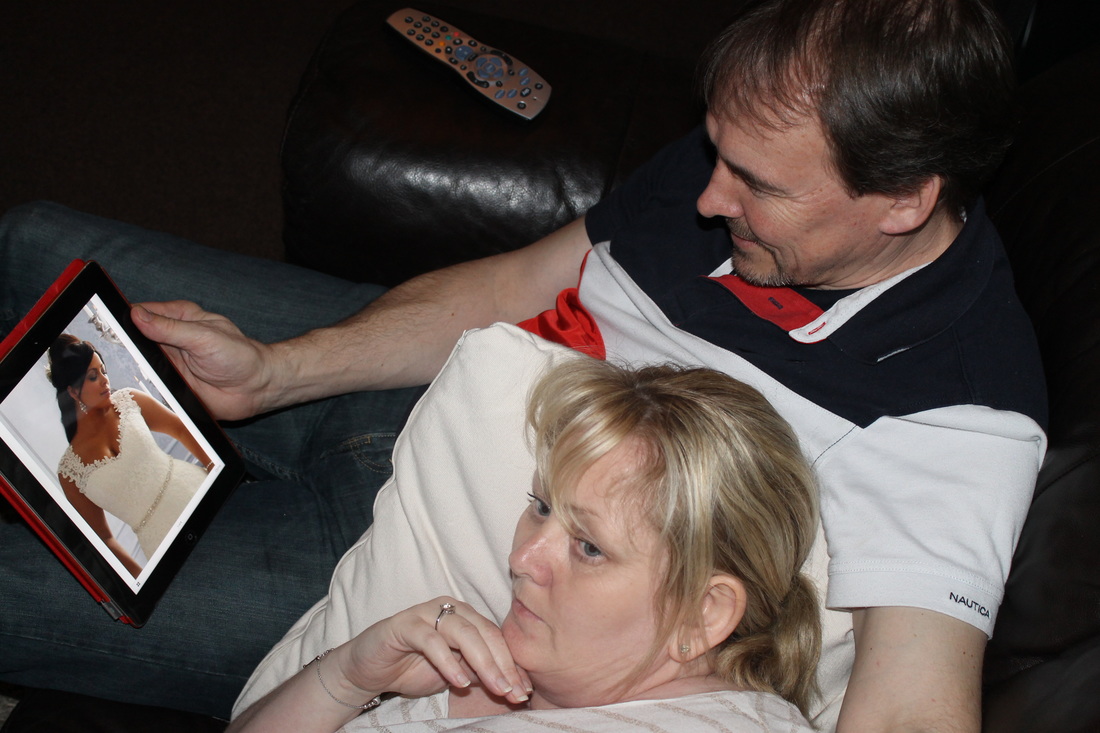
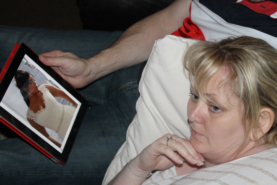
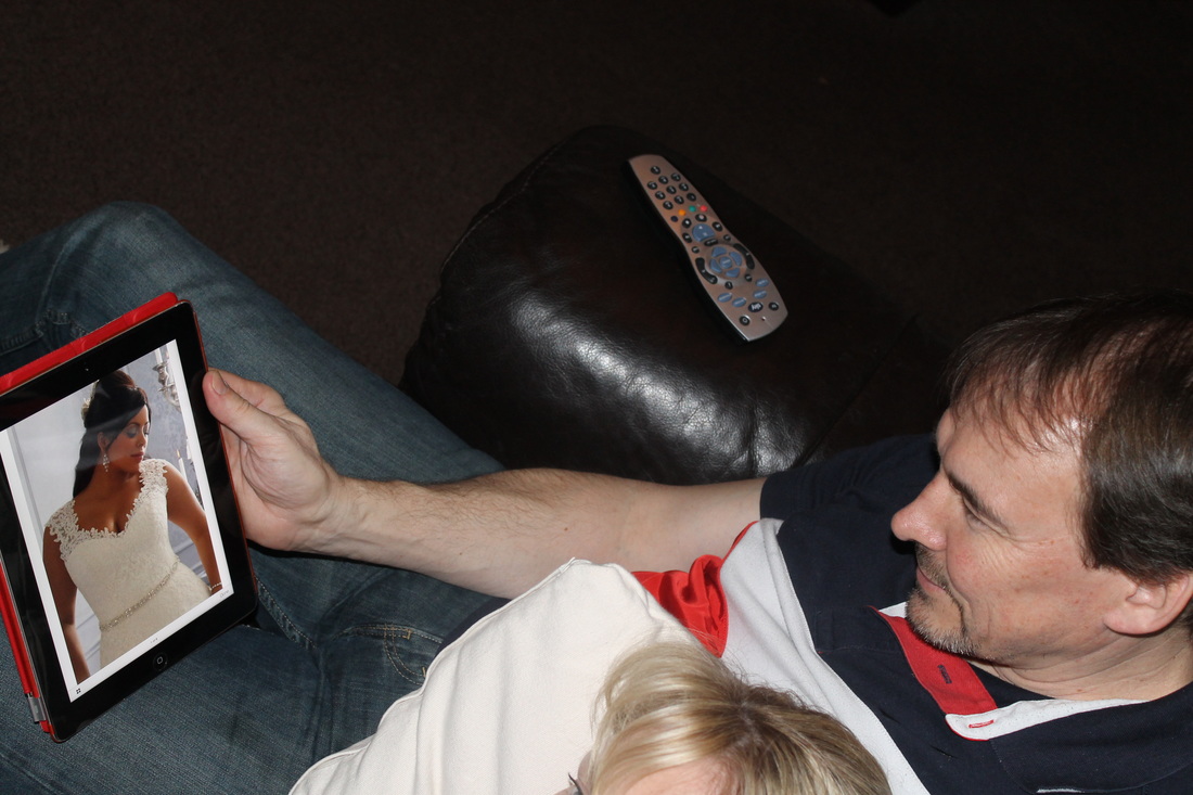
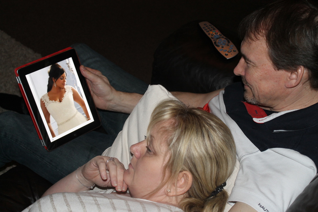
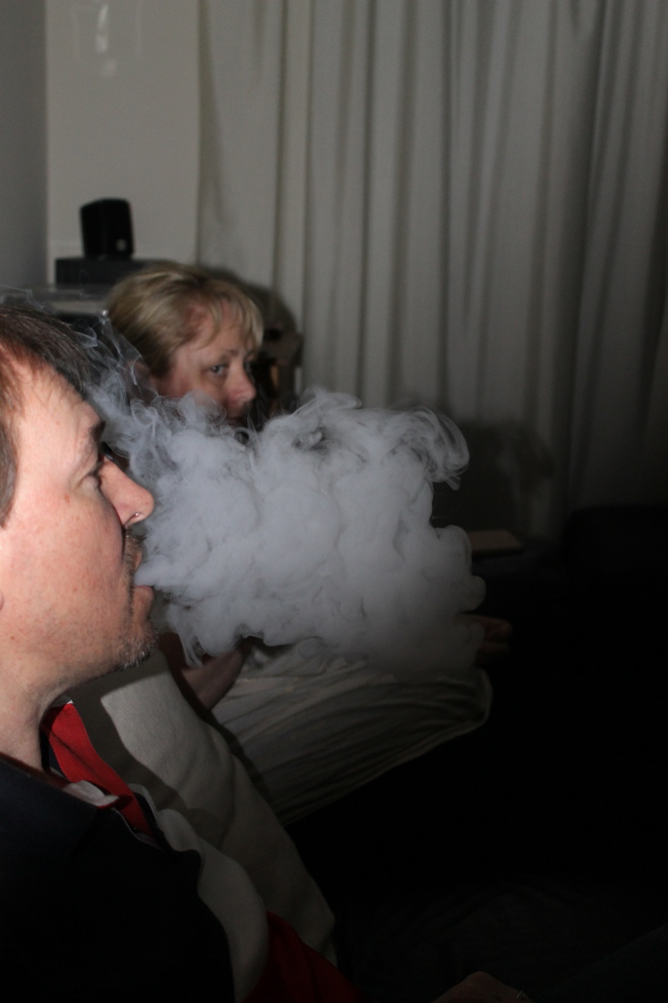
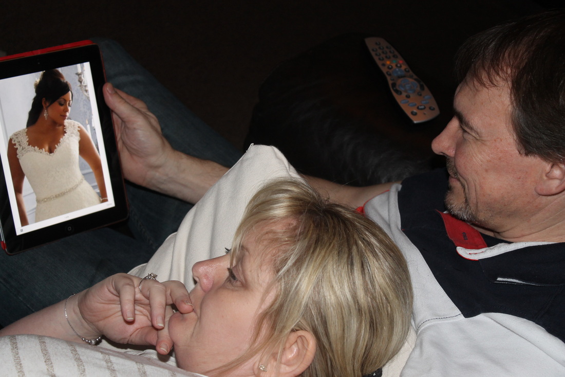
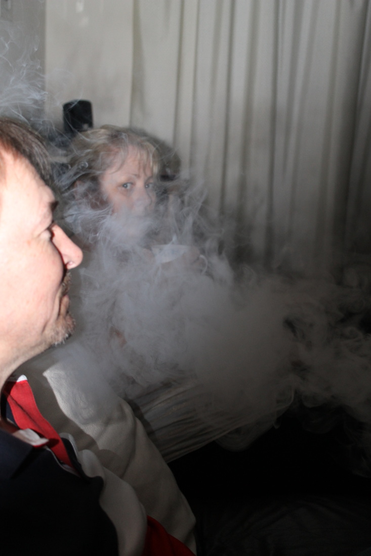
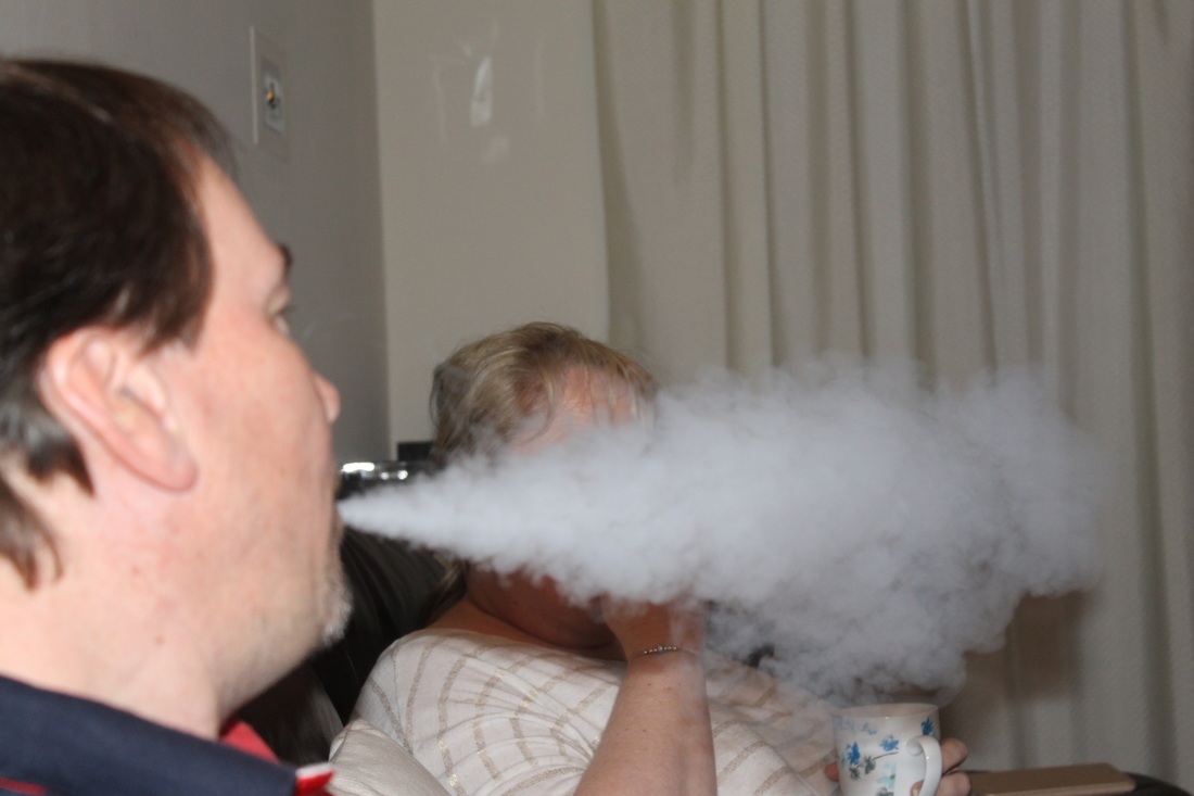
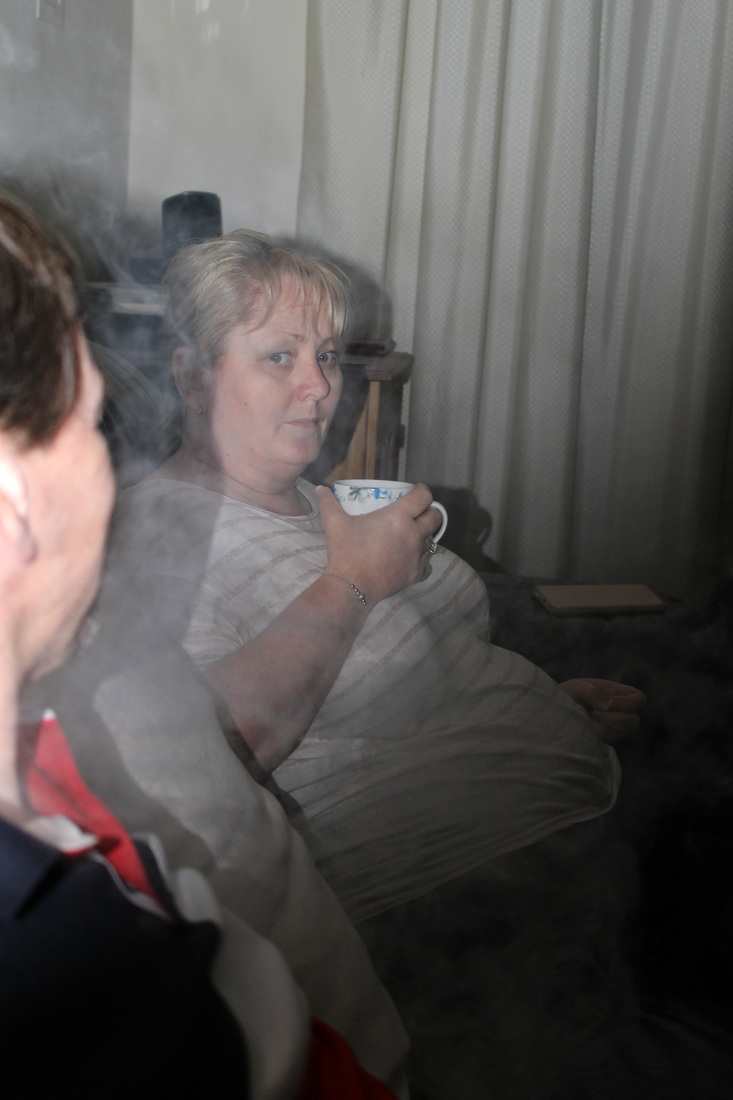
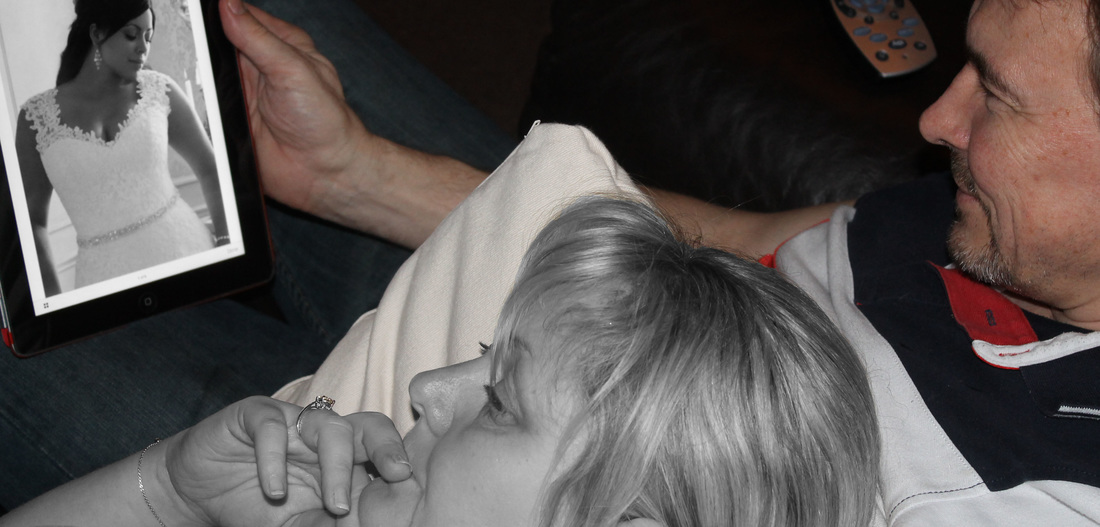
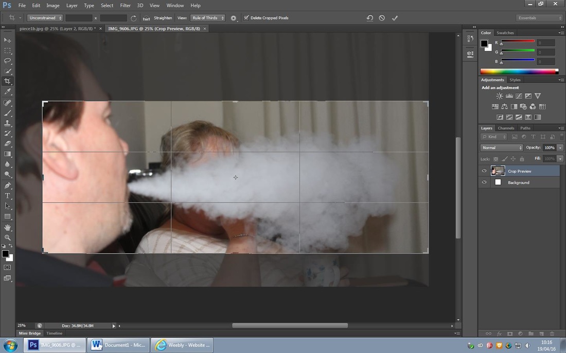
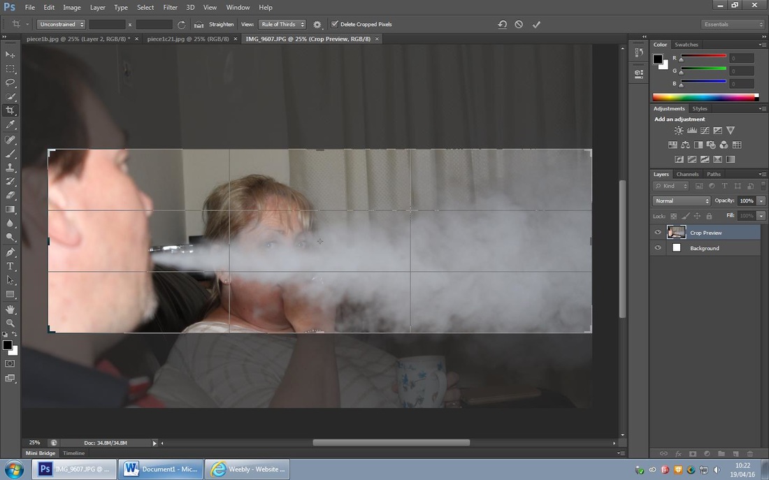
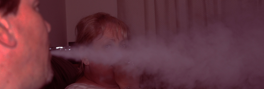
For this shoot I used an iPad, showing a wedding dress (for future plans in their relationship) and have the male hold it in awe of the dress and the exciting steps to come. I then captured the female looking anxious and uncertain about this big step; she also in certain angles looks guilty of not wanting what her partner wants- she is clearly having cold-feet and inside wants to let go of her emotions. I then decided to use another prop- water vapour. The male is exhaling the vapour and in my mind exhaling his happy emotions, whereas behind the vapour (happy emotions) sits an unhappy female who is being suffocated by her own negative feelings. I really like the effect of the water vapour as I think it represents emotions and how they can swallow a person up and take over their life.
For this shoot I used an iPad, showing a wedding dress (for future plans in their relationship) and have the male hold it in awe of the dress and the exciting steps to come. I then captured the female looking anxious and uncertain about this big step; she also in certain angles looks guilty of not wanting what her partner wants- she is clearly having cold-feet and inside wants to let go of her emotions. I then decided to use another prop- water vapour. The male is exhaling the vapour and in my mind exhaling his happy emotions, whereas behind the vapour (happy emotions) sits an unhappy female who is being suffocated by her own negative feelings. I really like the effect of the water vapour as I think it represents emotions and how they can swallow a person up and take over their life.
My Favourite Photos in a shorter Diary Form...
Edits in the Style of Laura Stevens...
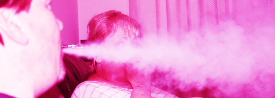
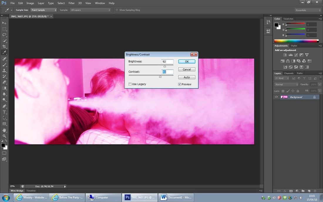
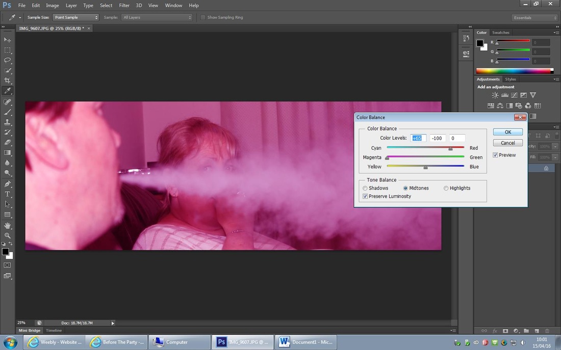
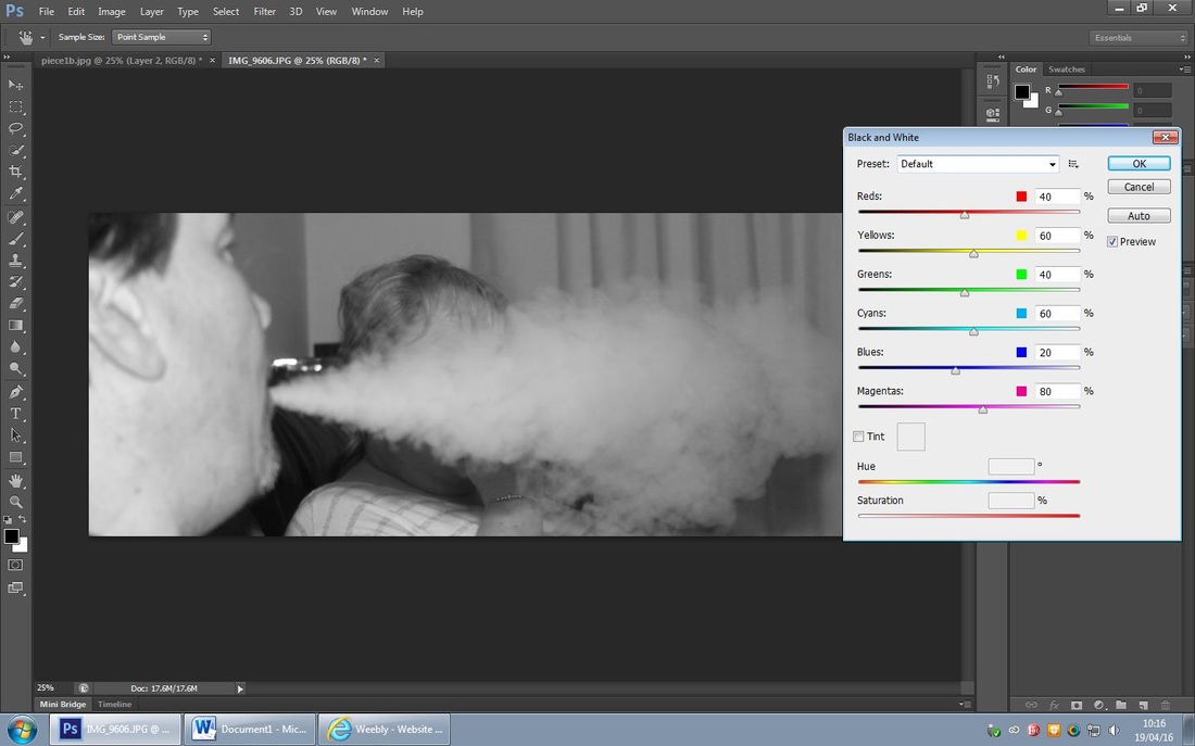
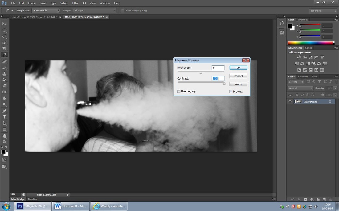
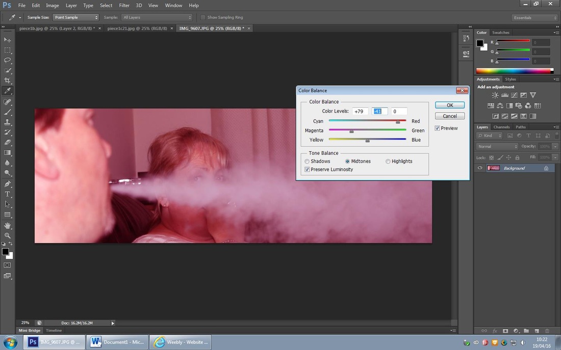
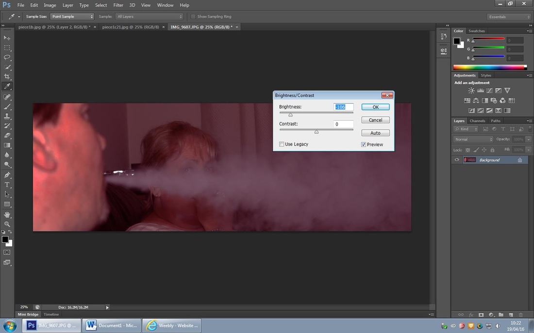
For this edit I cropped the original photo to focus on the woman behind the smoke; I then adjusted the colour balance and increased the red and magenta levels. I then increased the brightness to emphasise the smoke and the woman's eyes behind it.
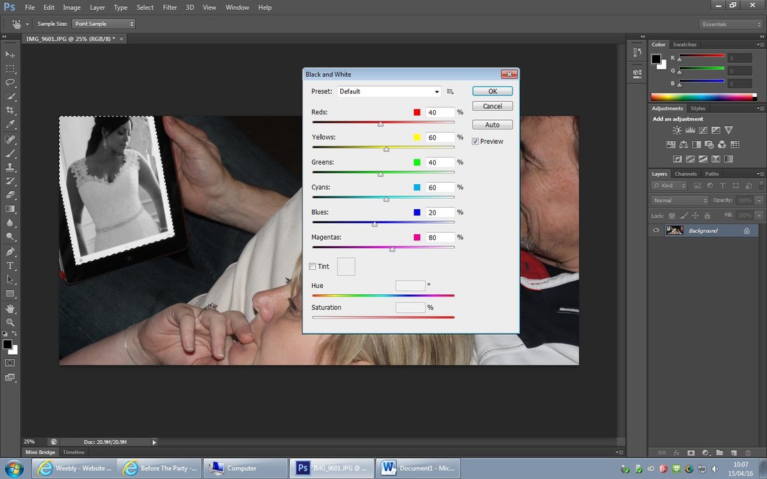
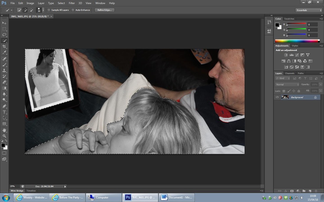
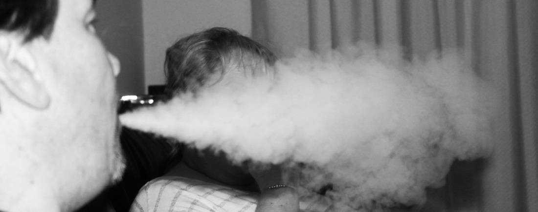
I really like how this edit turned out, I wanted it to be powerful and make a bold statement of how a woman may feel. Firstly I cropped the original photo, I then used the 'quick selection tool' to select the image on the ipad and the woman laying down and turned them both black and white.
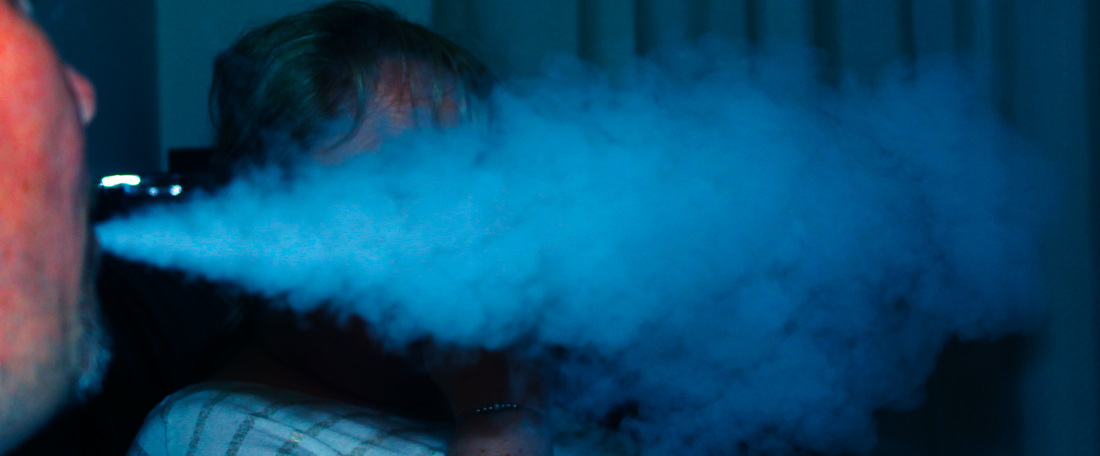
For this edit I decided to experiment with colour, I firstly cropped the original photo and adjusted the colour balance and increased the blue and cyan colour to maximum. I then used the curve tool to darken the end of the water vapour and lighten nearer to the woman. Lastly I used the 'brightness and contrast' and moved the contrast up to maximum.
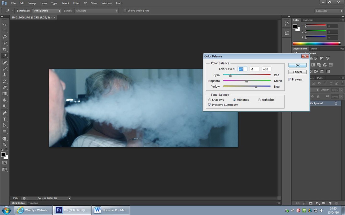
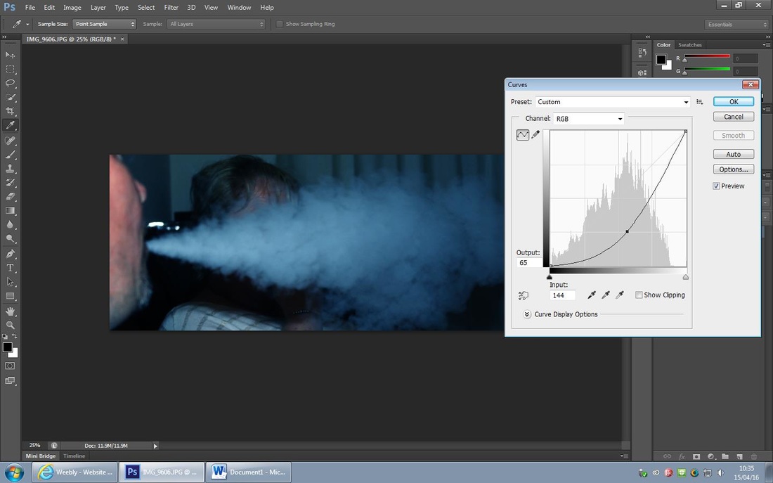
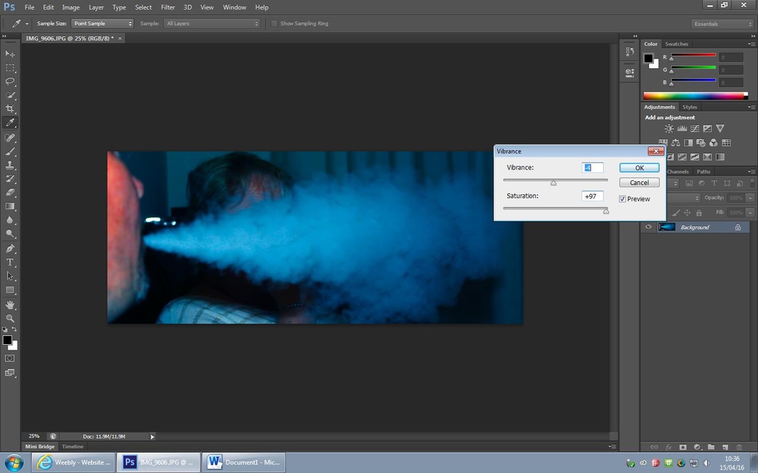
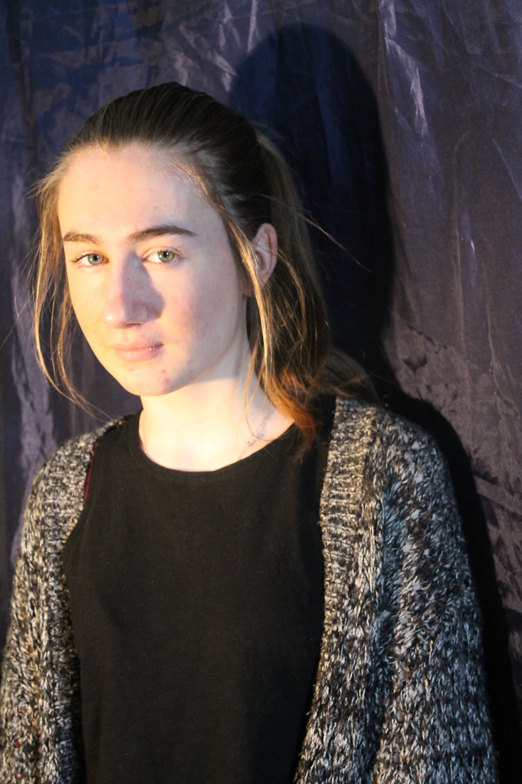
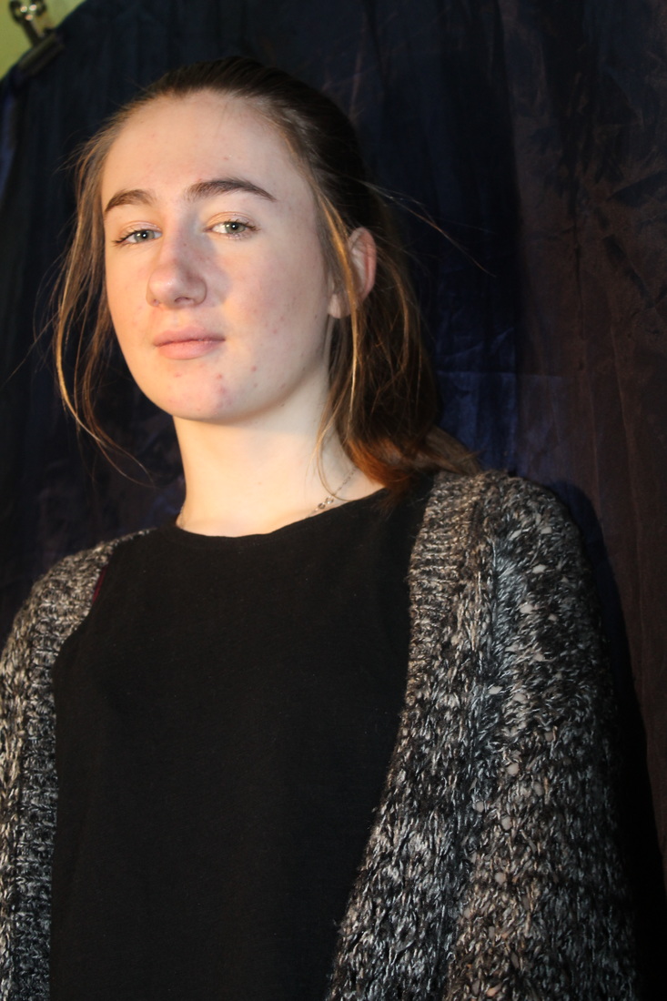
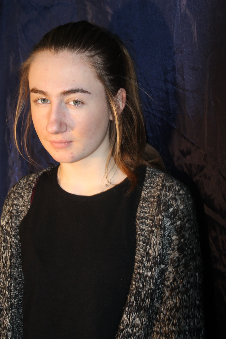
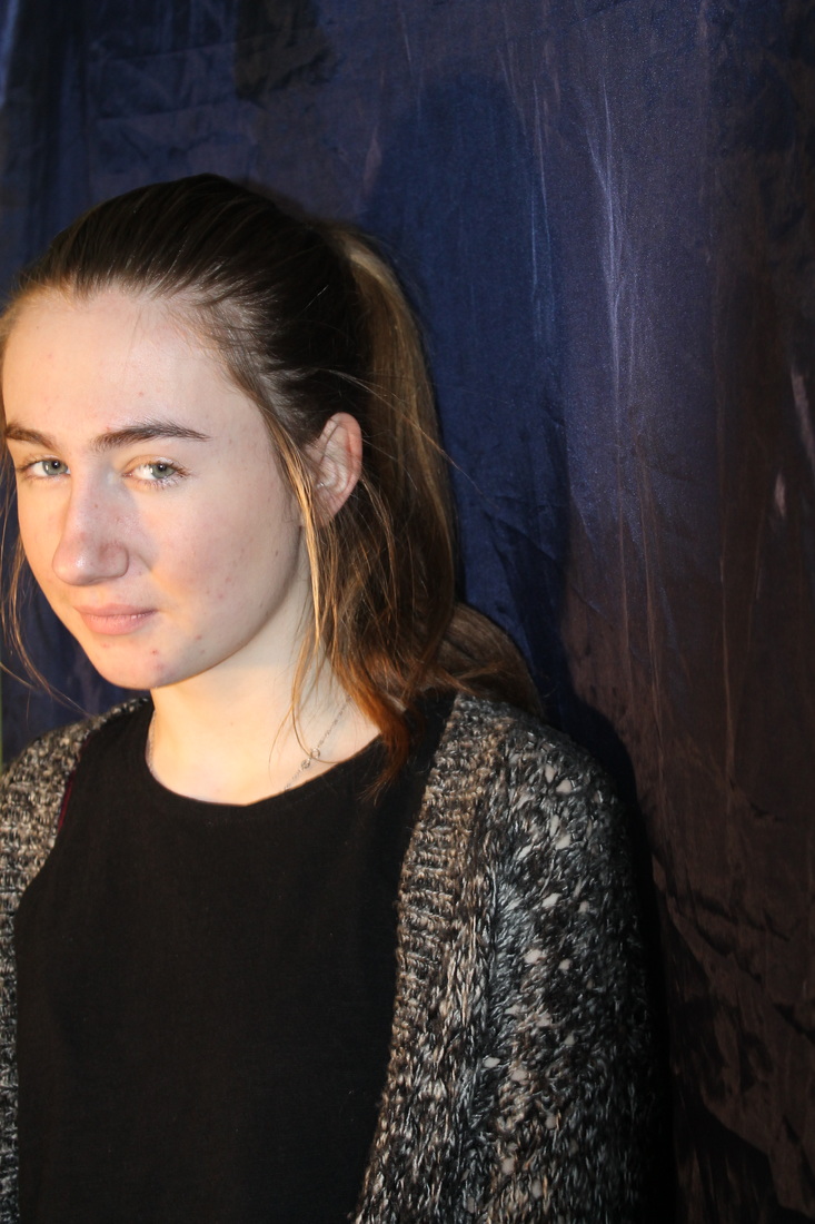
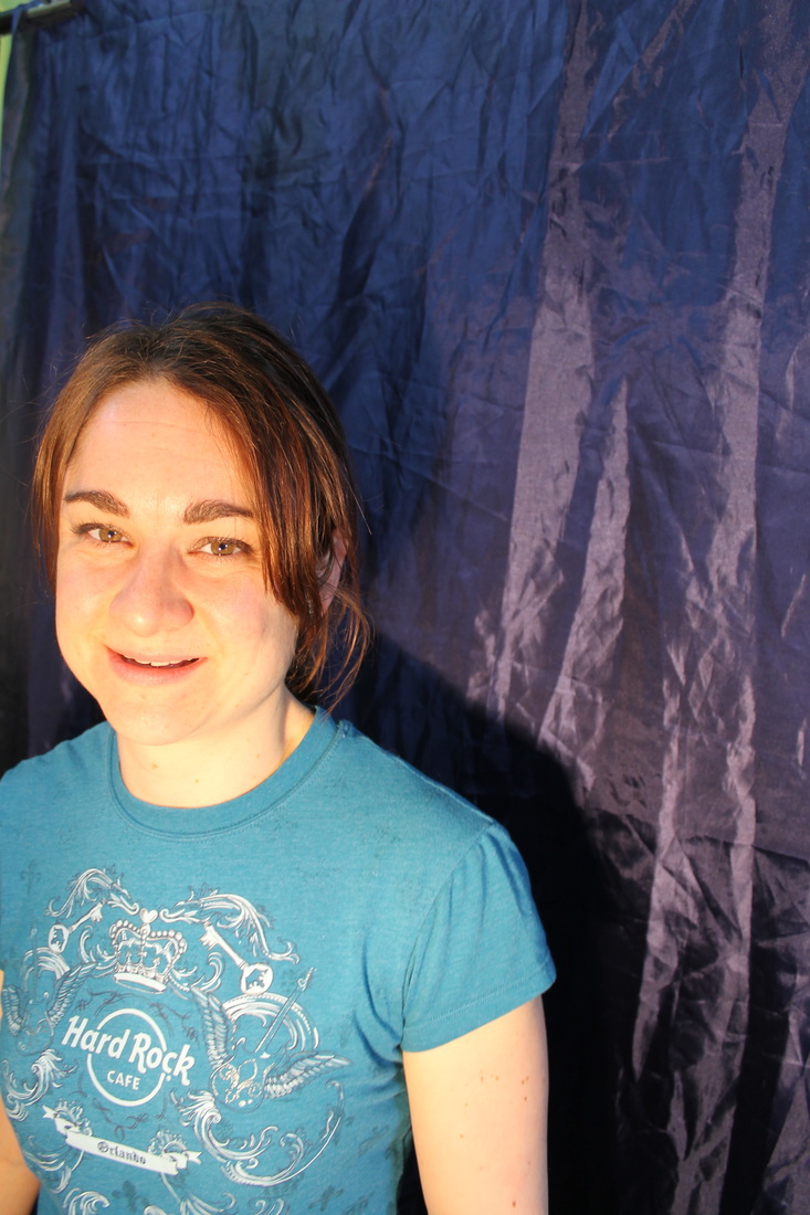
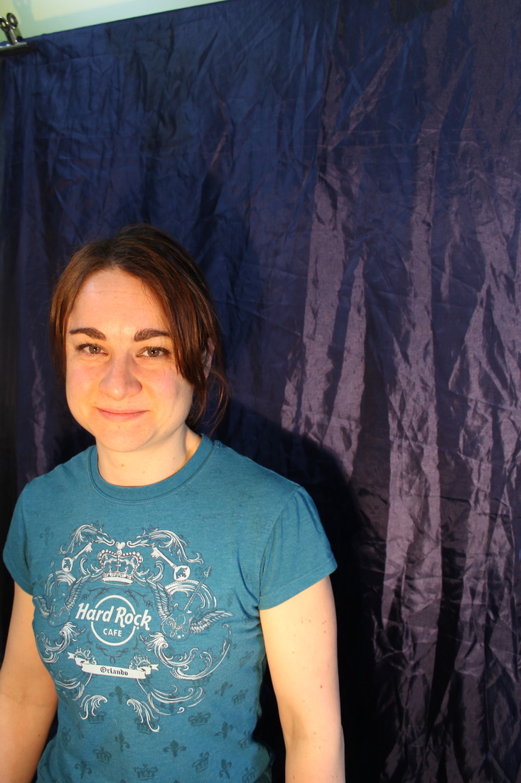
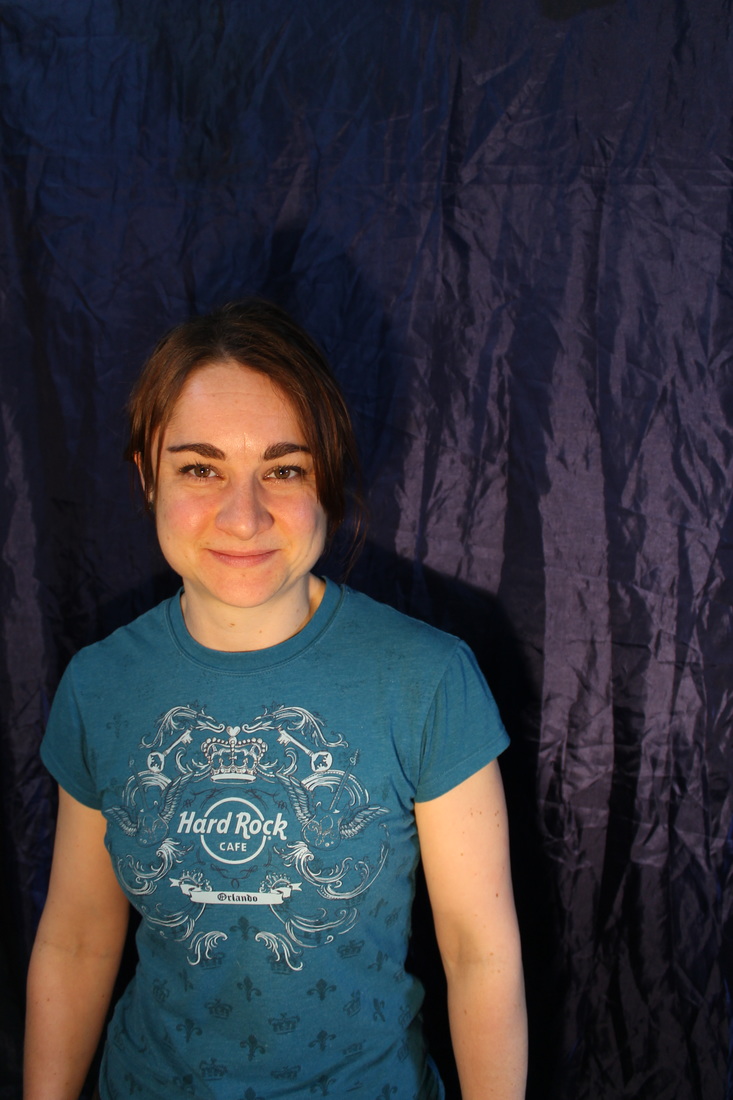
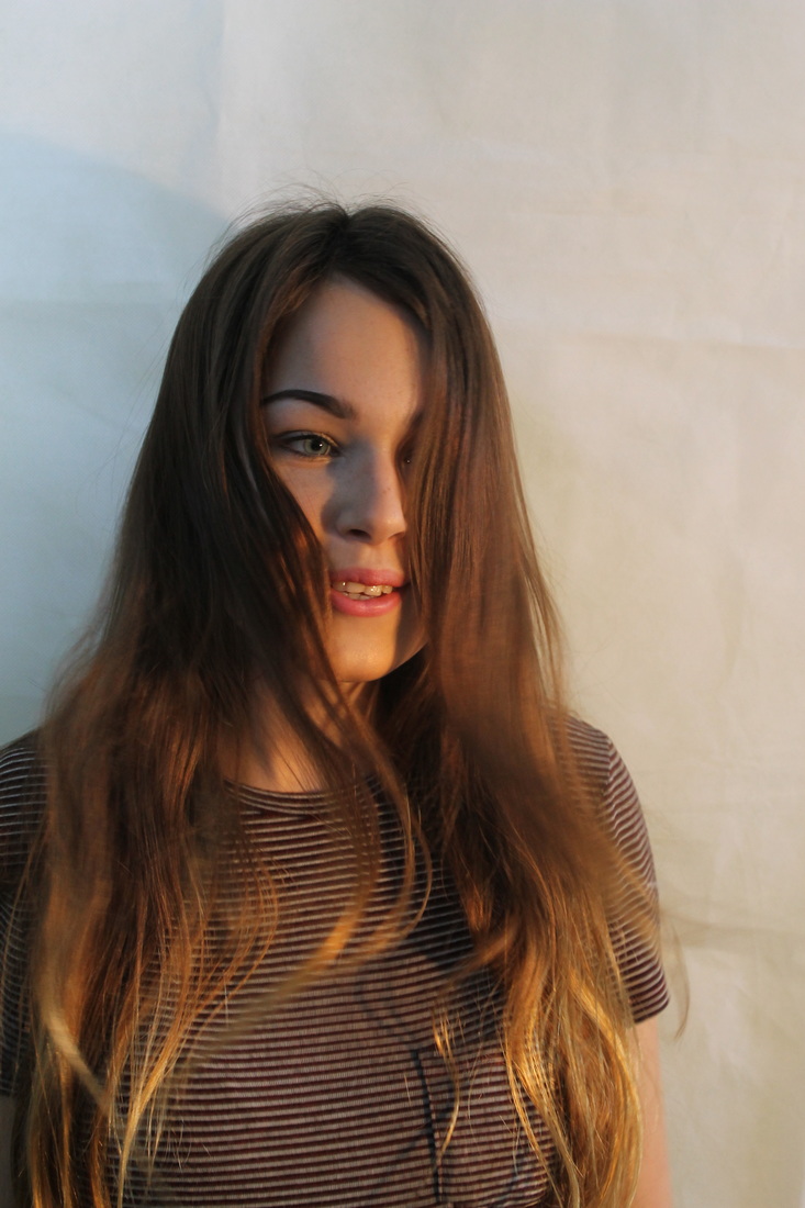
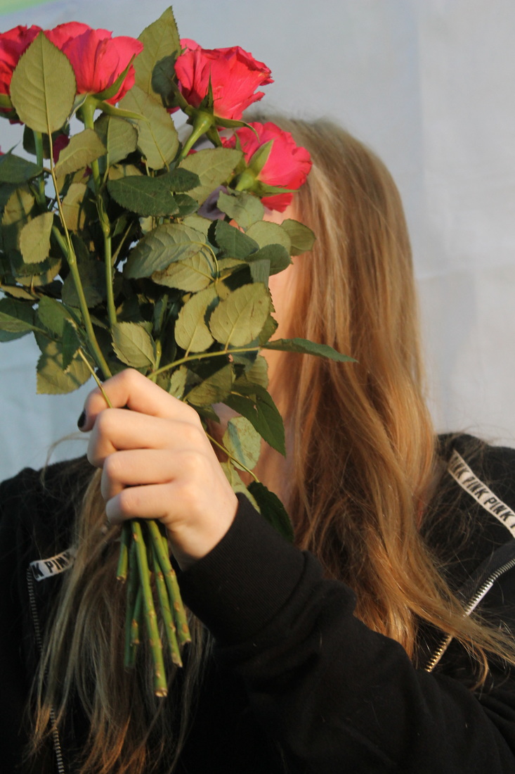
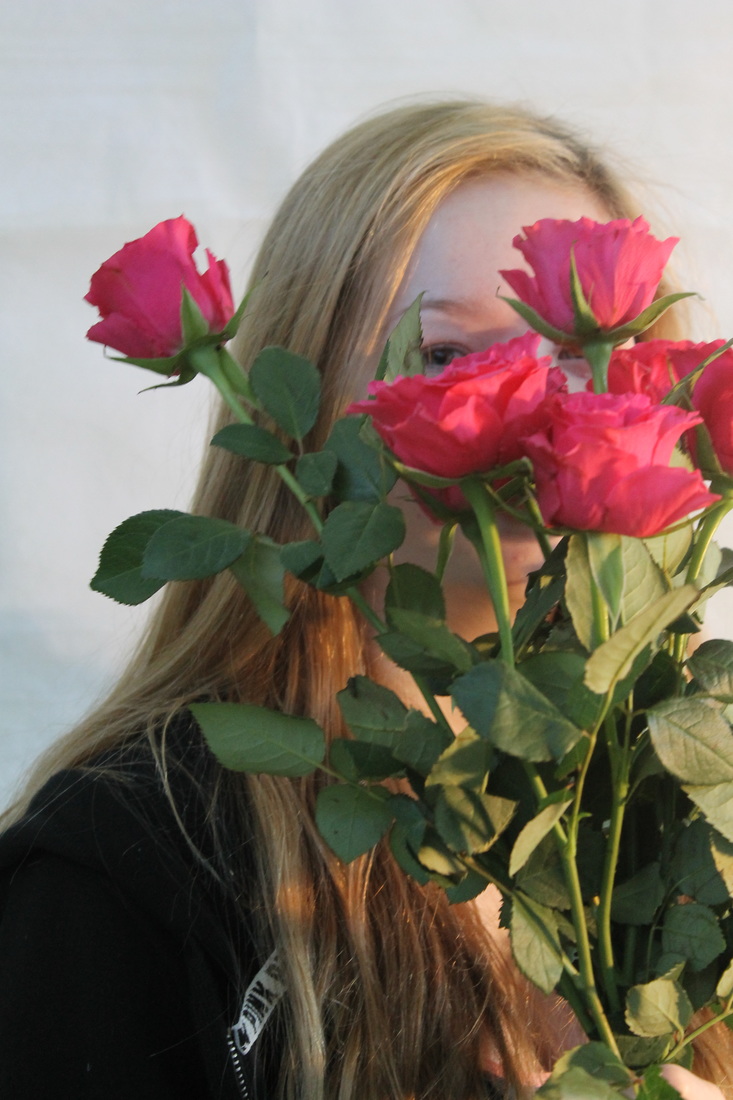
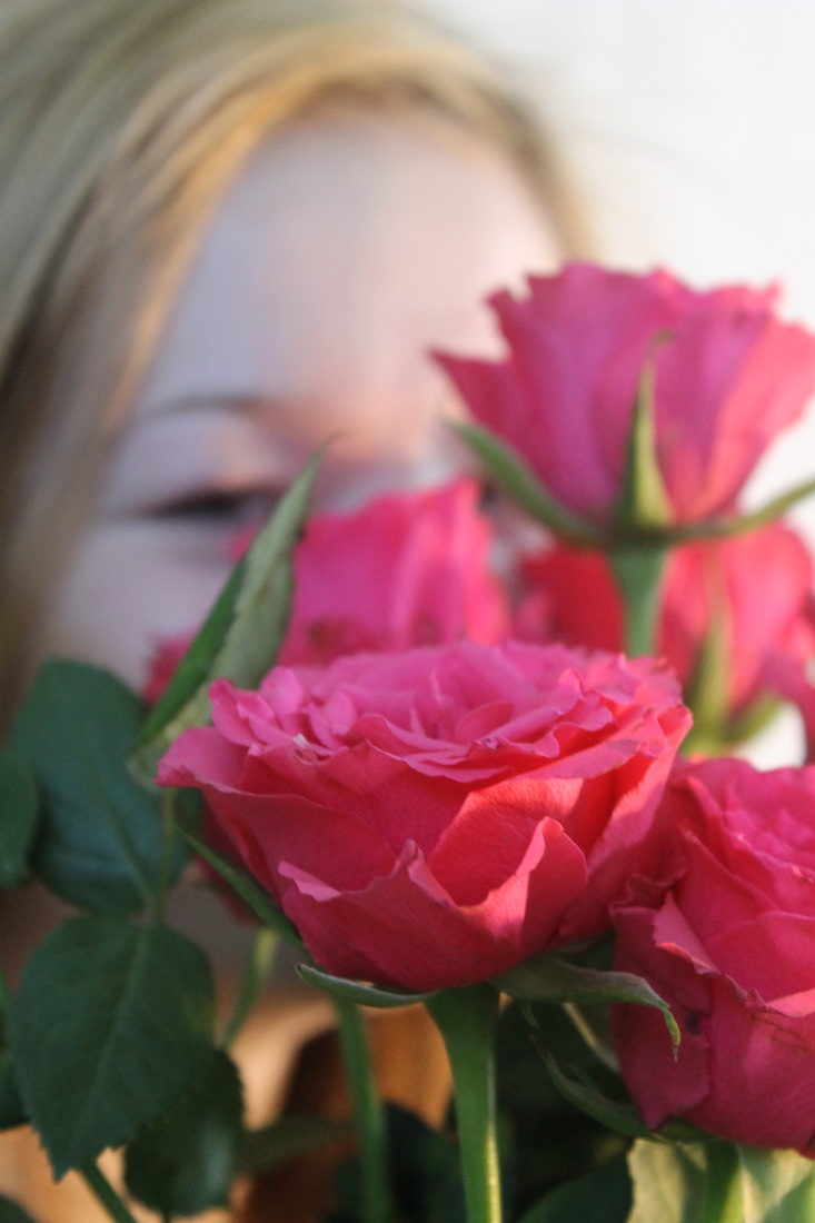
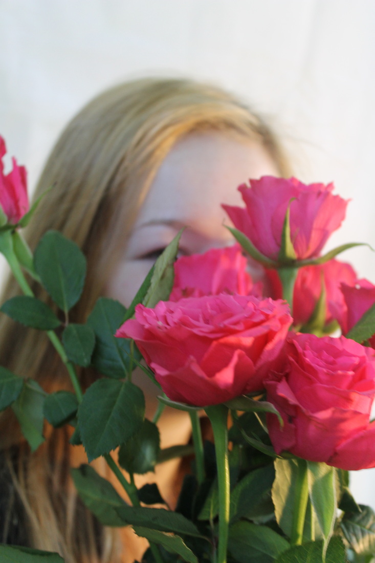
Photo Shoot 2: Laura Stevens' Portrait Interpretation-Happiness
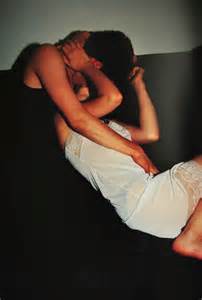
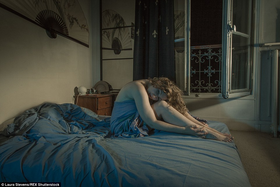
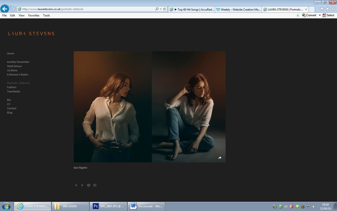
I was unable to save the photos from Laura Stevens' website but these are some of her work.
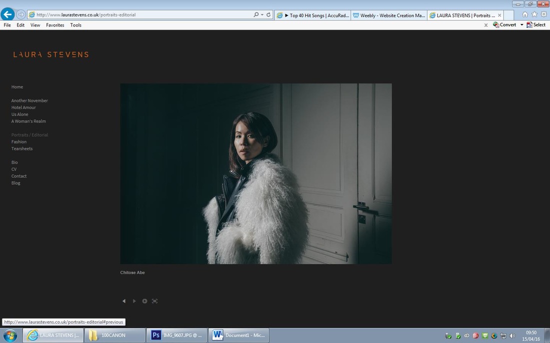
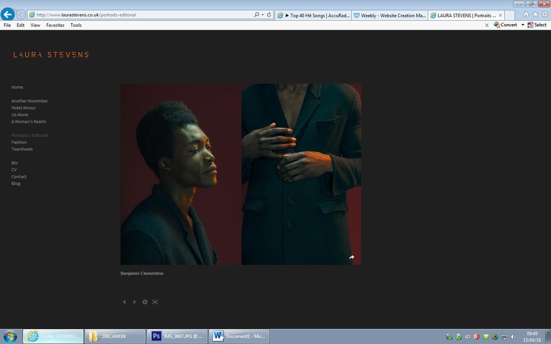
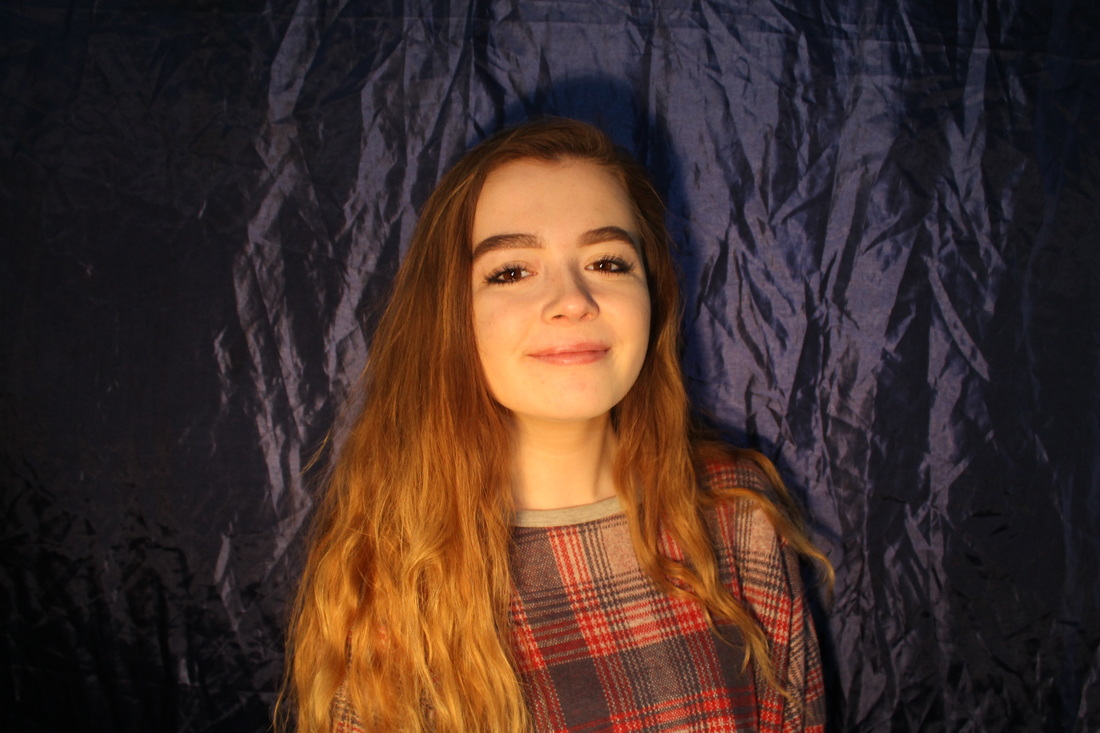
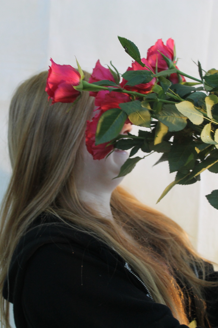
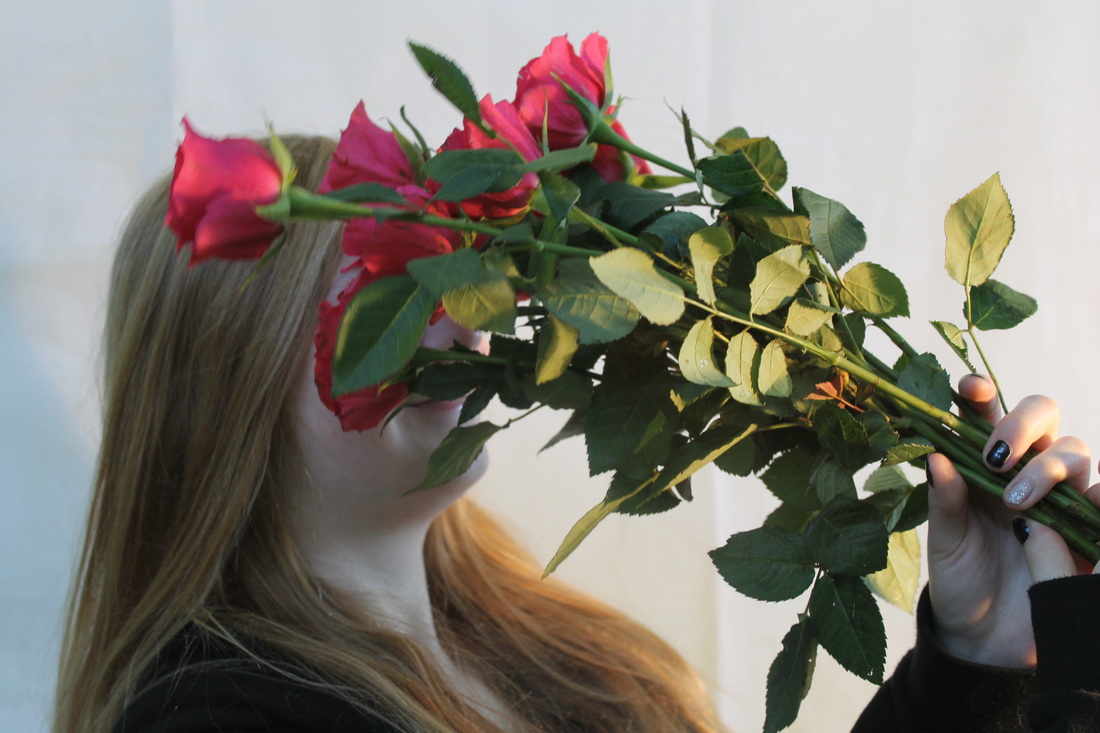
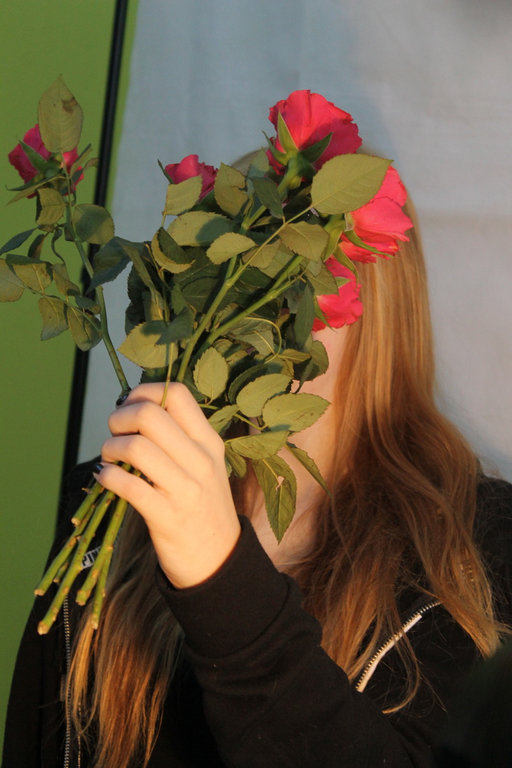
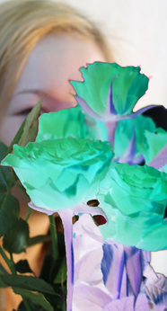
For this photoshoot I decided to replicate Stevens' portrait work as I find it beautiful. I chose only female models as I thought it would tie in nicely with my theme of females emotions; I chose the navy background to contrast with the happy emotion the girls are feeling. I then switched to a white background to enhance the happy emotions. Within the shoot I used fresh roses as a prop like I did in my previous shoots, I think by using flowers it will add a feminine touch to my project.
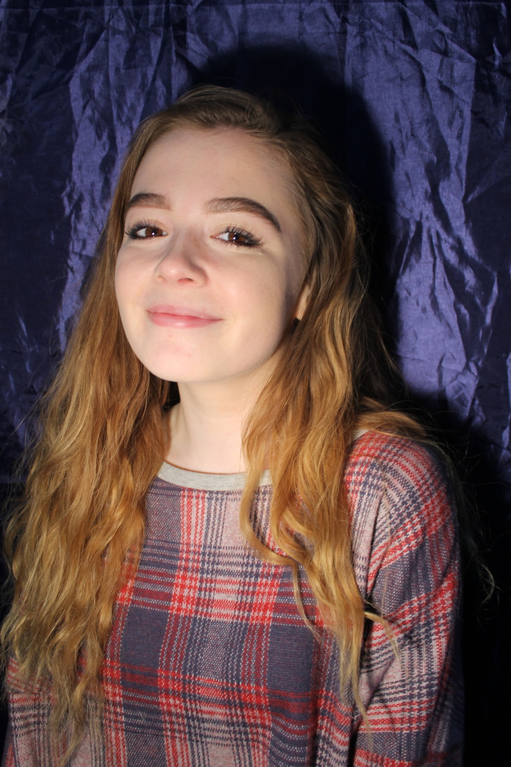

My Favourite Photos in a Diary Form...
Edits in the style of Laura Stevens...
For this edit I decided to replicate a piece of Stevens' work and create an orange hue. I first increased the 'exposure', 'gamma correction' in order to create this gradient effect. I then adjusted the 'hue' by increasing the red and yellow hue to about 30%, I then used the 'curve tool' to highlight the girls face more and darken the backdrop- to emphasise the girl.

Again for this edit I chose to replicate the contrasting hues in Stevens' work, I decided to emphasise the girls face to emphasise the happy emotions upon it. I firstly adjusted the hue by increasing the red and yellow colours. I then increased the contrast using the 'contrast tool', lastly I used the 'curve tool to darken the background and highlight the girls face and intensify her face,
I decided to experiment with this edit and use the 'invert' to create a contrasting hue like Stevens' does in her work; I then cropped the photo to make the colourful roses the focal point on the photo.
I wanted this edit to have contrasting hues but within black and white, firstly I cropped the photo to make the girl the focal point. I then changed the photo to black and white; secondly I used the 'curve tool' to darken the photo and enhance the shadow behind the girl. Lastly, I used the 'levels tool' to darken it further and enhance the girls face as she is expressing happy emotions.
I really like the way I've edited this photo as I think I've given it lots of depth and contrast; firstly I cropped the photo to make the girls face fit the scale of the photo; I then turned the photo black and white. Secondly, I adjusted the 'gramma' and 'exposure' use the tools and increased both the gramma and exposure. I then enhanced the photo even more by enhancing the girls
Unfortunately, I lose the screenshots for this edit but m idea for this edit was to enhance the girls beaming smile and make a silhouette on her face to enhance it further.
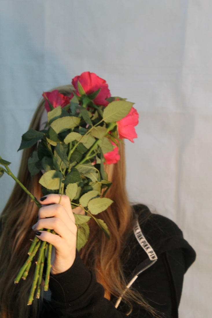
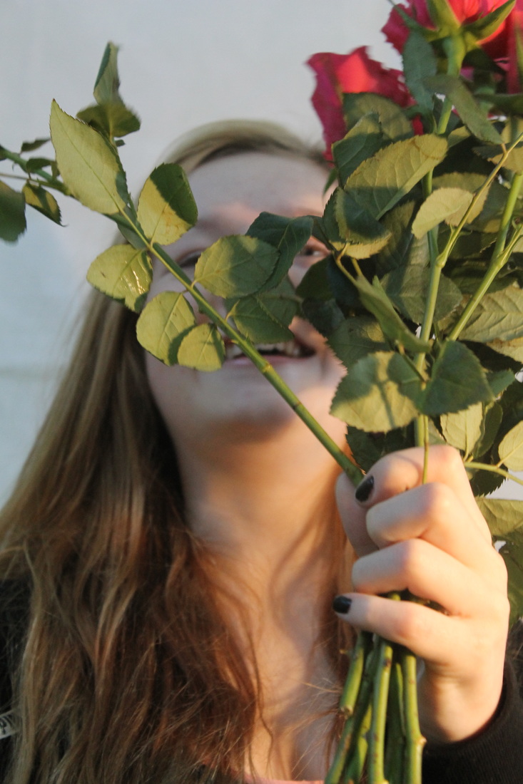
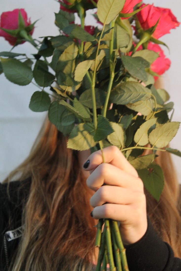
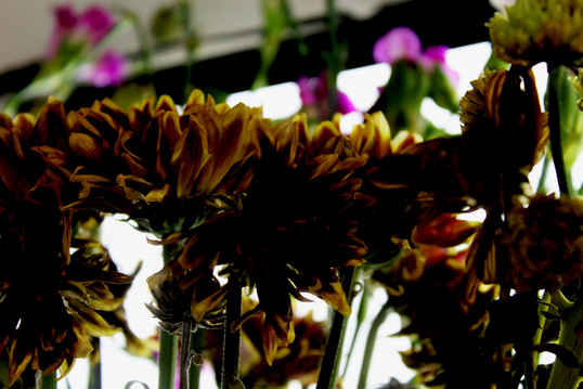
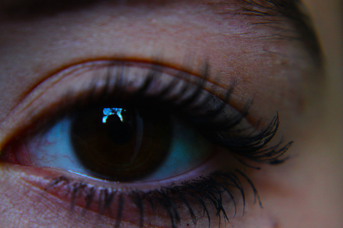
Extra Photos to Contribute to My Project...
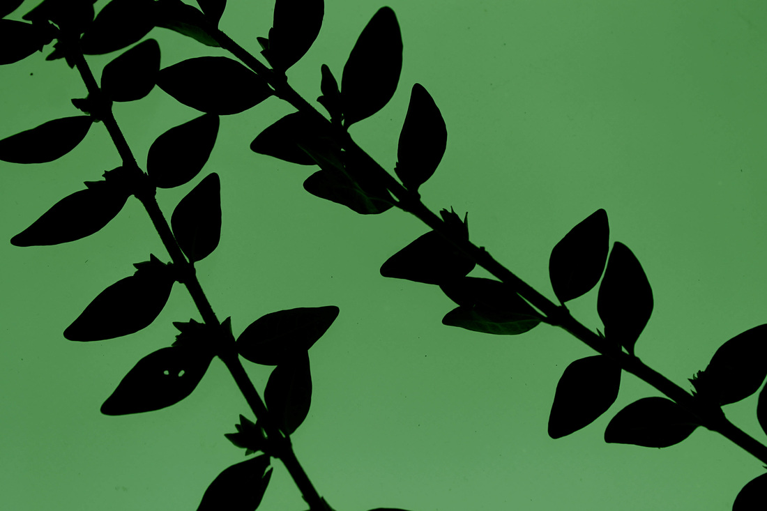
These photos are extra photos of flowers, eyes and other objects that can link to my theme. I will mostly photograph feminine objects as I think that in my Final Piece they would be useful for layering backgrounds.
My Final Exam 2016
My idea for this exam is to create a final piece that shows a teenage girls emotions whether they are positive or negative. I have an idea to create two pieces of work, one that represents the positive and one that represents the positive; both hopefully will have deep meaning and will connect with the viewer.
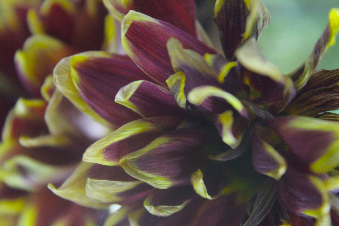
Piece 1- Refining the Background
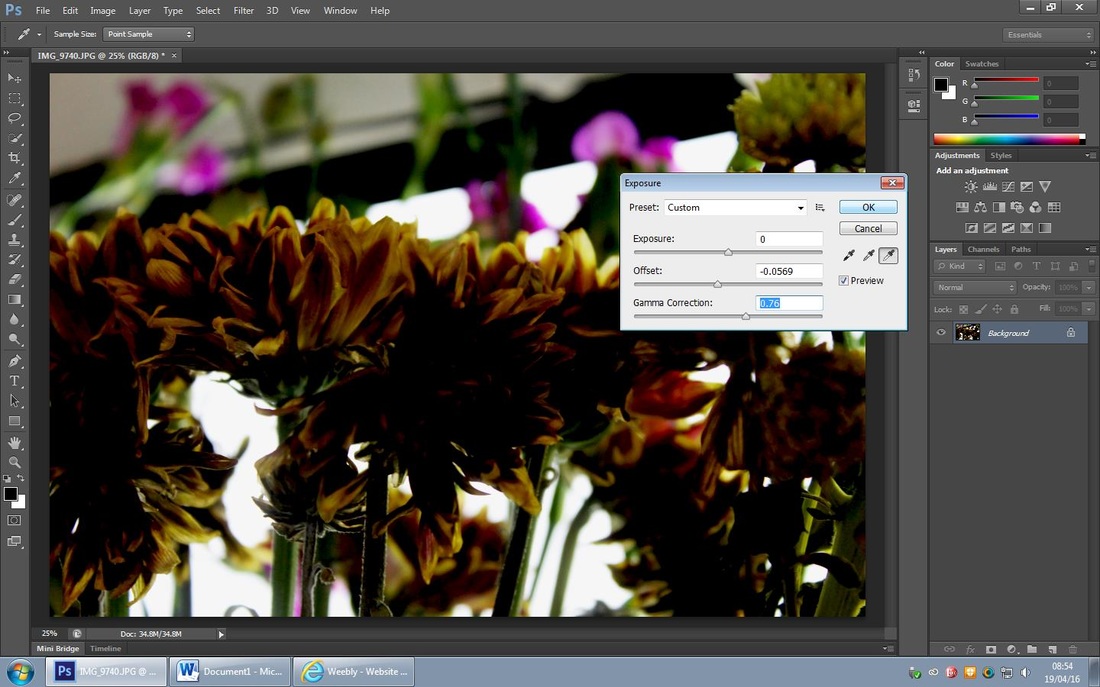
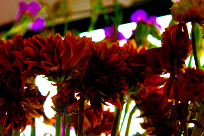
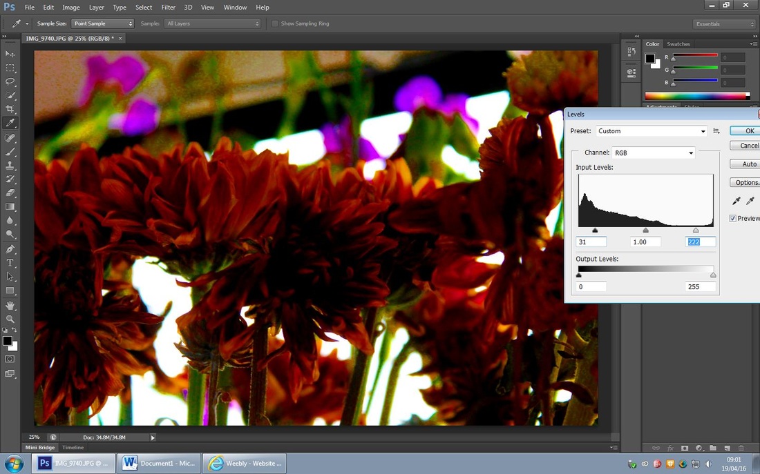
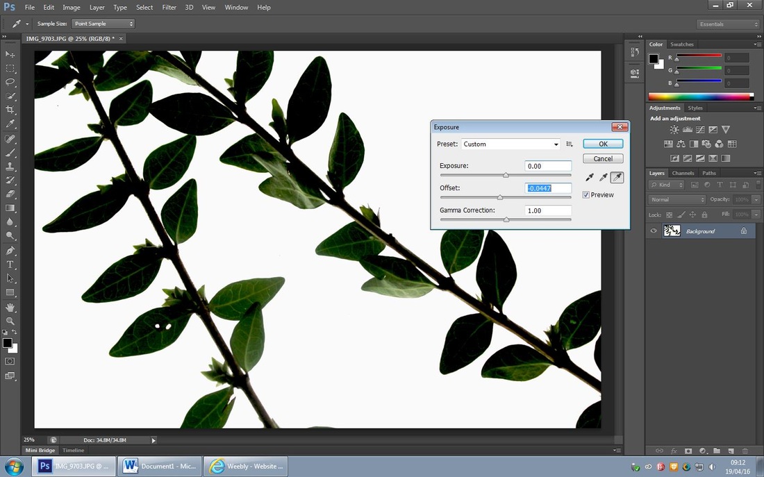
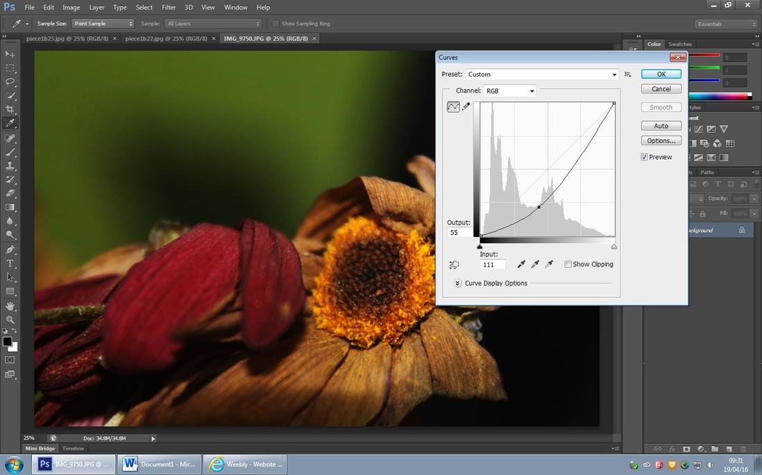
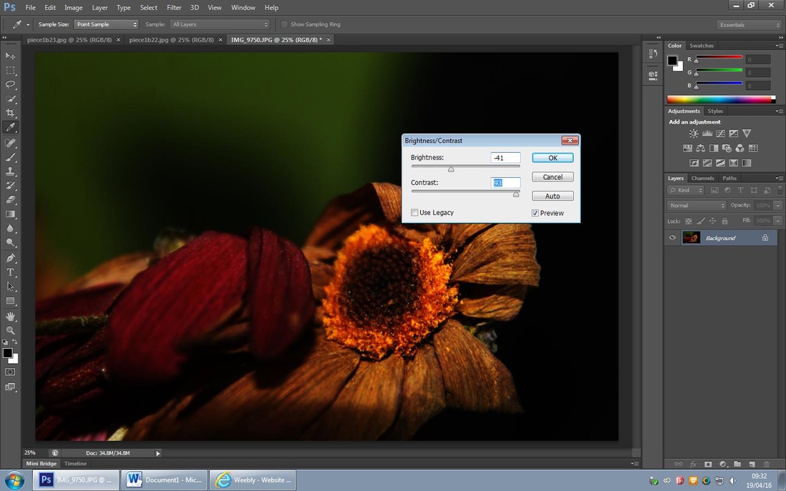
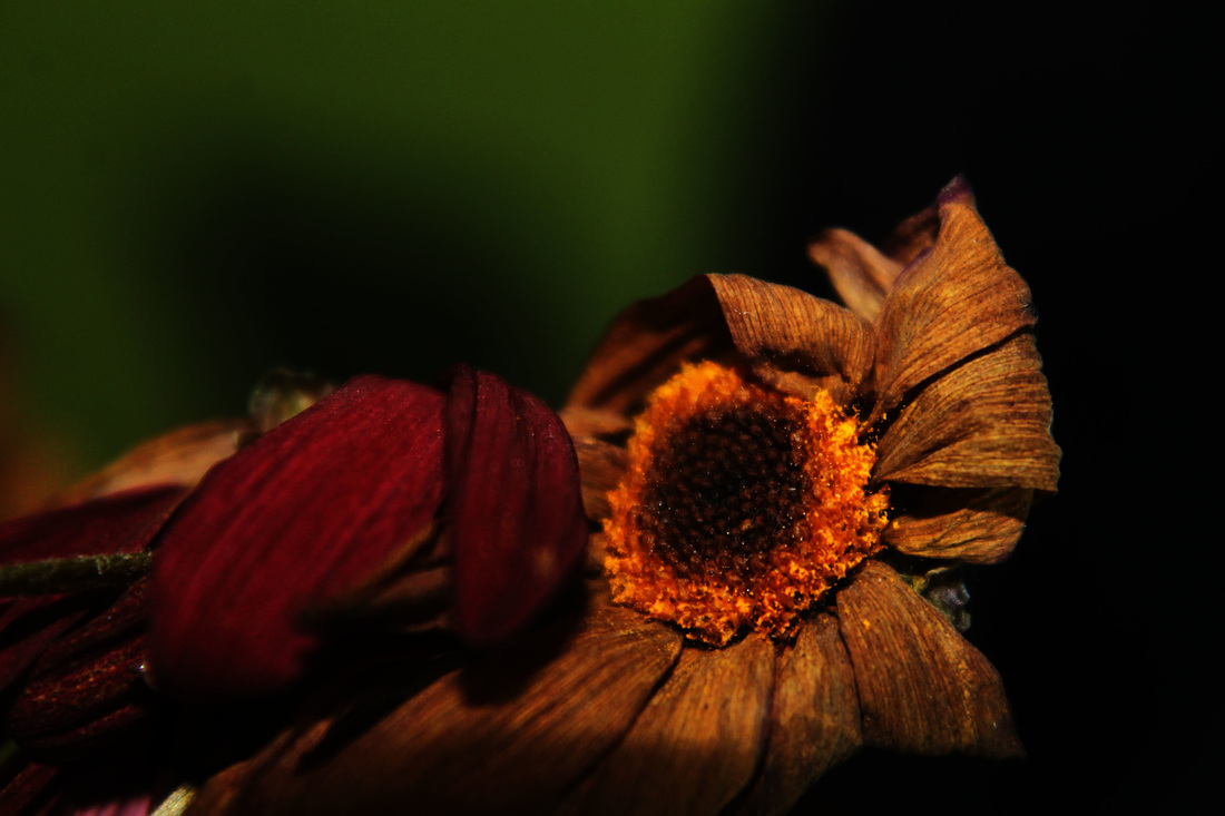
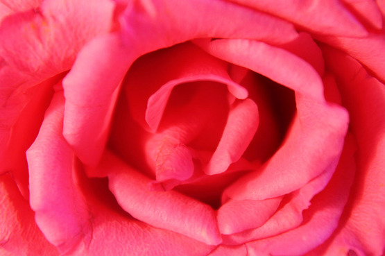
For this edit I chose to create dark undertones with bright elements within the flowers, firstly I used the 'curve tool' to create darkness in the lower right hand corner, I then used the 'brightness and contrast tool' and increased the brightness- to enhance the flower petals. I then used the 'exposure tool' and increased the 'gamma correction' and 'offset' to create an old outdated feel to the photo and enhance the petals further.
Refining my Ideas...
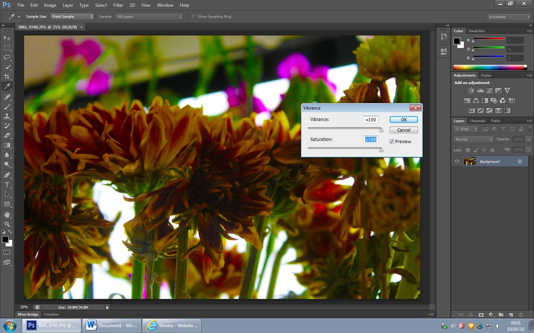
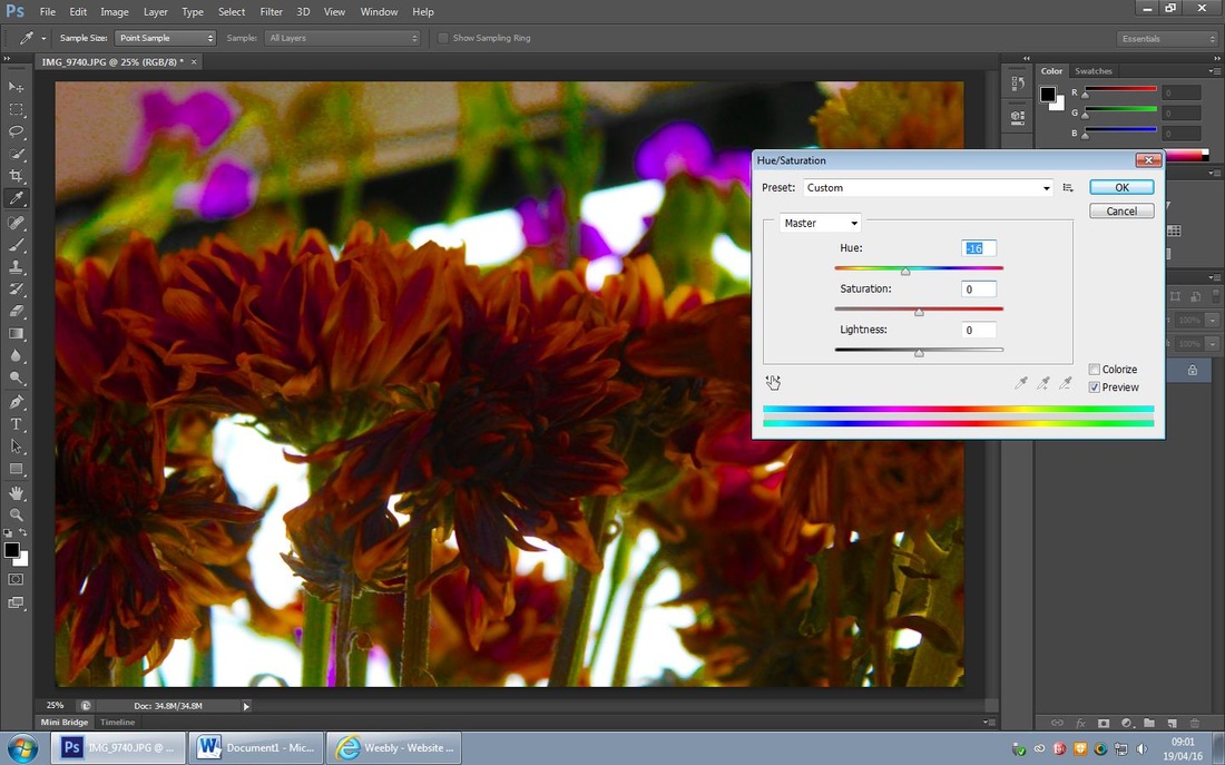
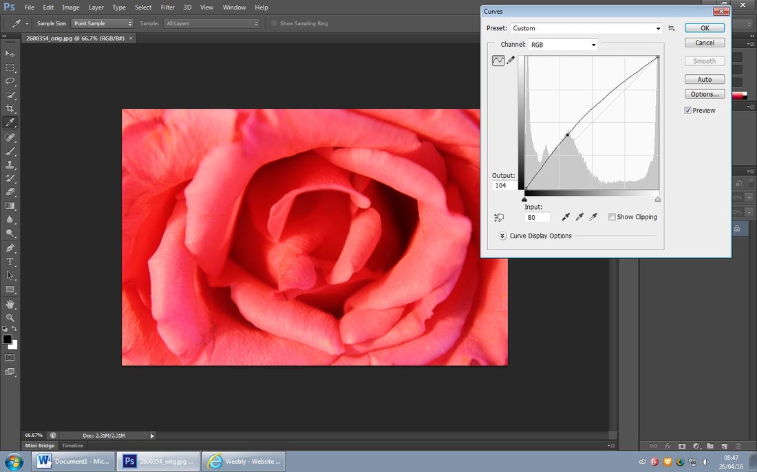
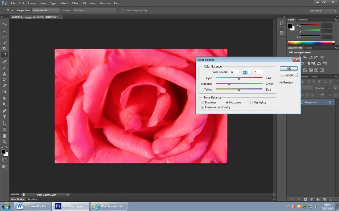
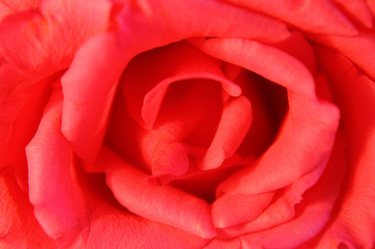
I wanted to enhance the red tones in the original photo so I firstly used the 'brightness and contrast tool' and increased the contrast, I then used the 'hue/saturation tool' and maximised the red, I then enhanced t further by using the 'levels tool' and darken the left of the photo and then lightened the right of it.
Refining my Ideas further...

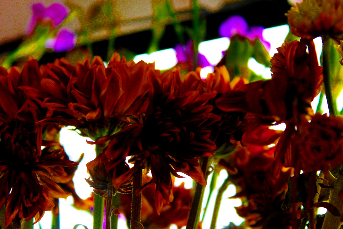
Out of these two edits I prefer the first one as it fits in with my idea for piece 1. I like the darkness of it as I think it will look good layered beneath other backgrounds as it subtly brings out the pop of colour from the petals.
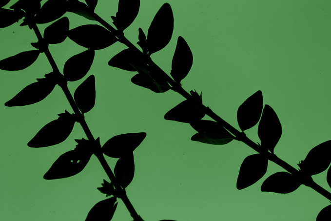
Piece 1- Refining my Background 2
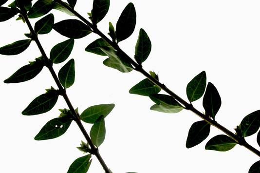
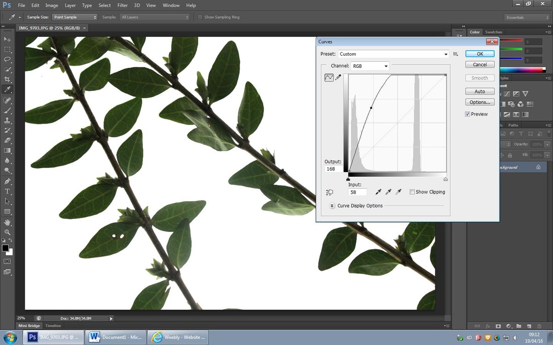
I chose the have this bright effect to layer onto my previous edited background as I think it will be contrasting and interesting. firstly I used the 'exposure tool' and decreased the 'offset', I then used the 'curve tool' and brightened up the leaves to enhance then further.

Refining my Ideas further...
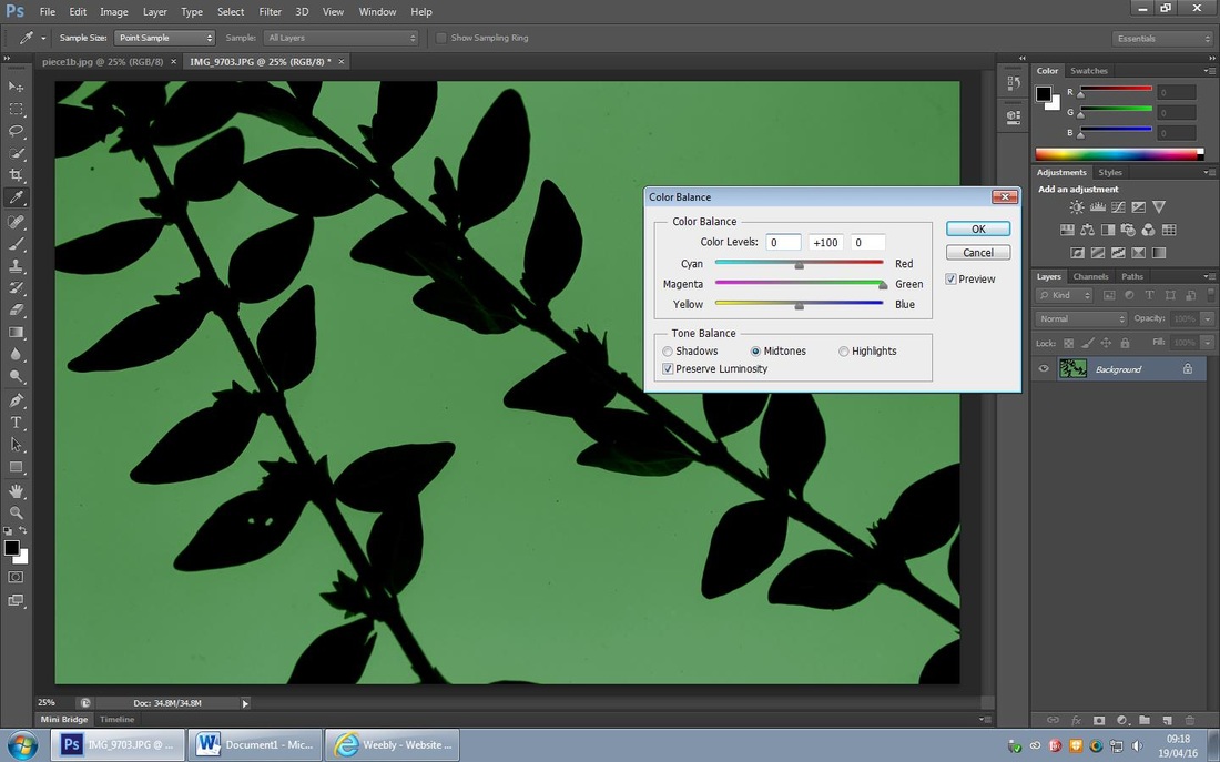
For this edit I chose to enhance the background and change it to green to contrast with the leaves. Firstly, I used the 'exposure tool' and decreased the offset, I then used the 'colour balance tool' and maximised the green to create this contrasting effect.
Refining my Ideas further...
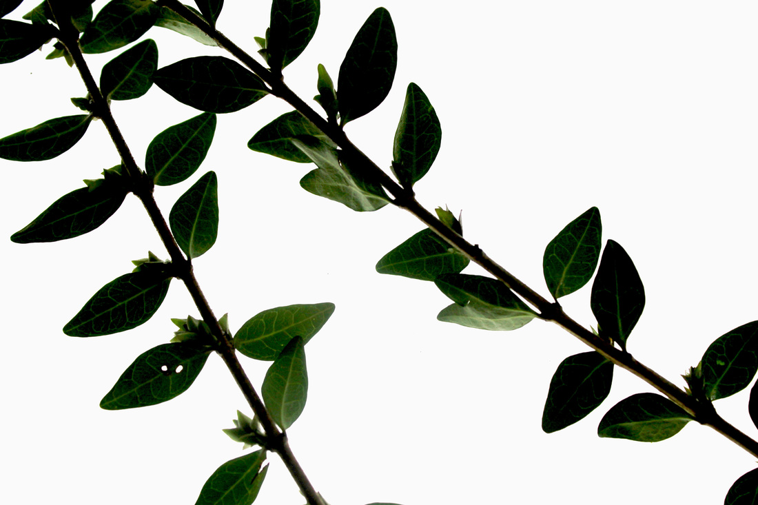
I like the first edit compared to the second as I think it is interesting as it shows the veins of the leaves and enhances their natural colours; I also think layered upon the previous edit it would work really well.
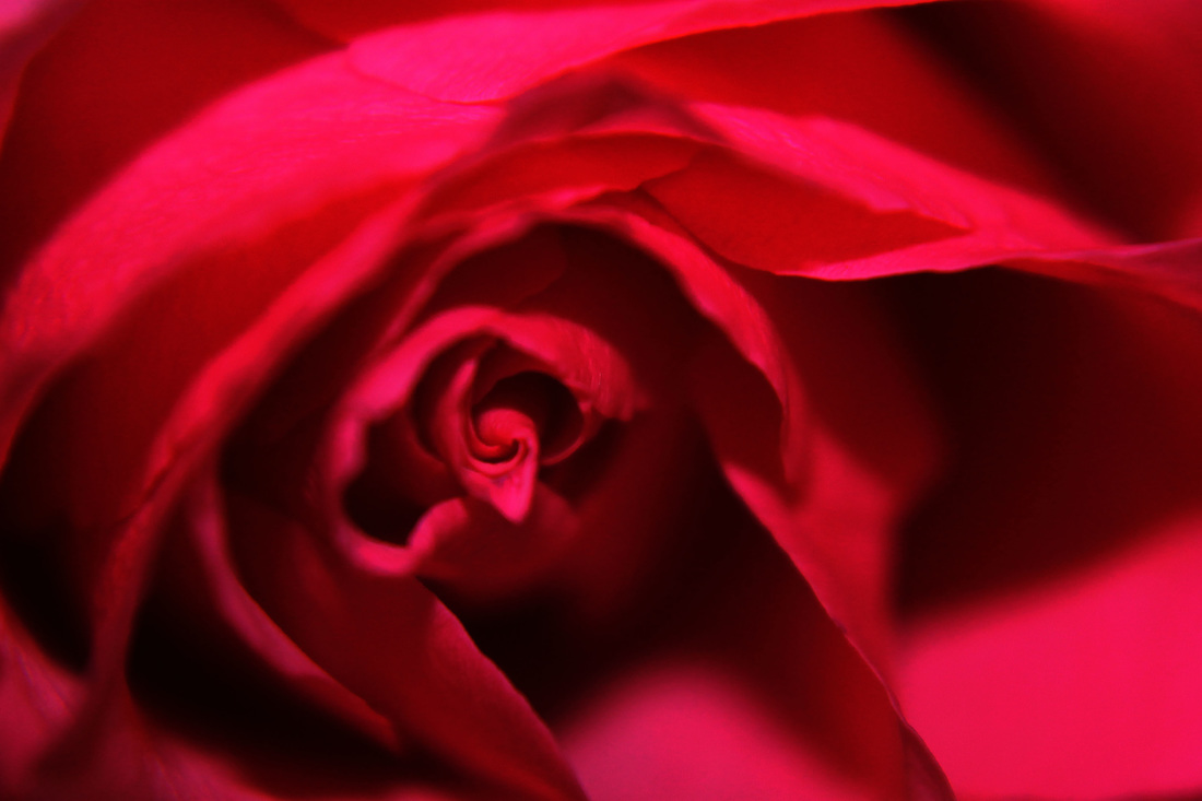
Piece 1- Refining my Background 3
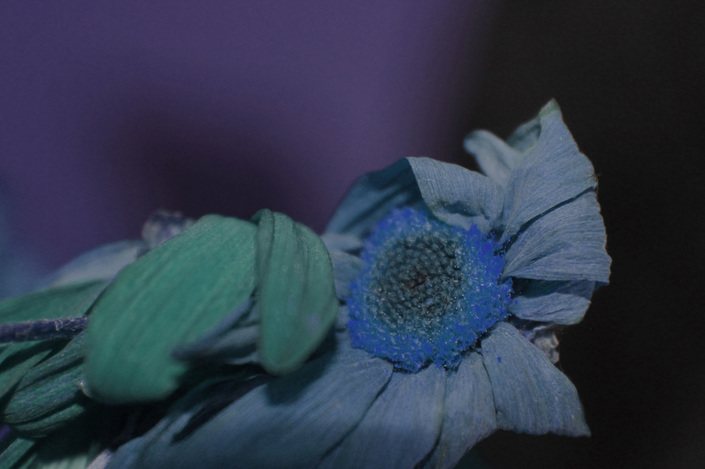
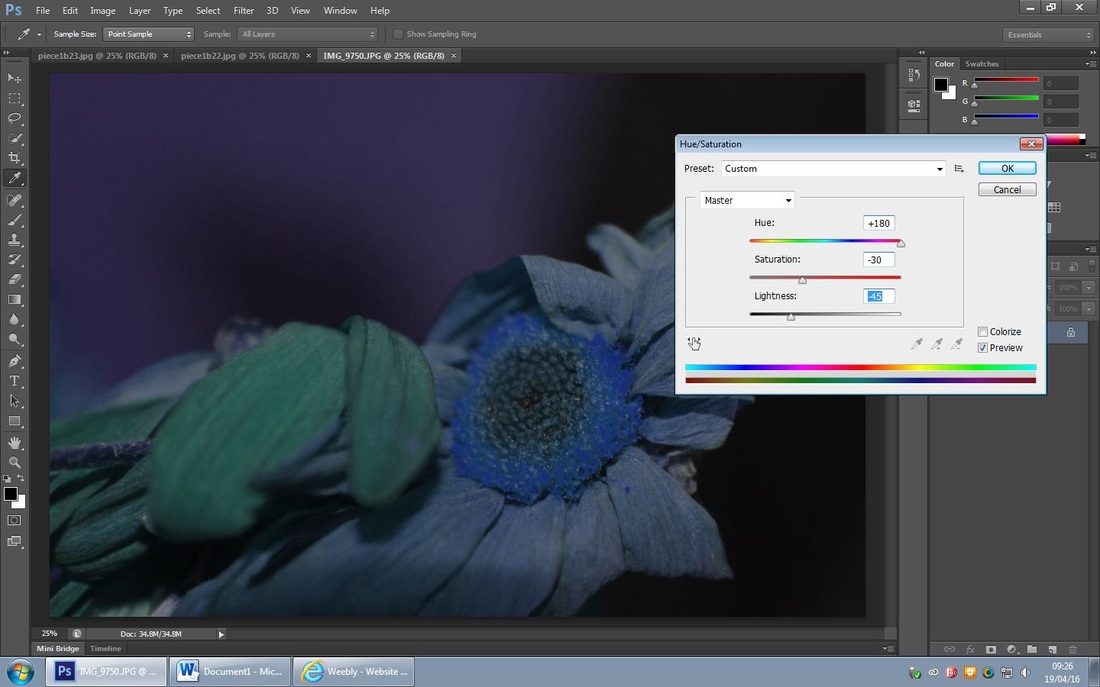
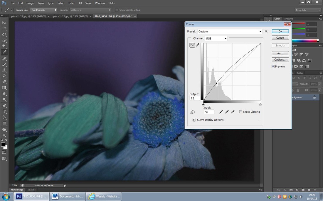
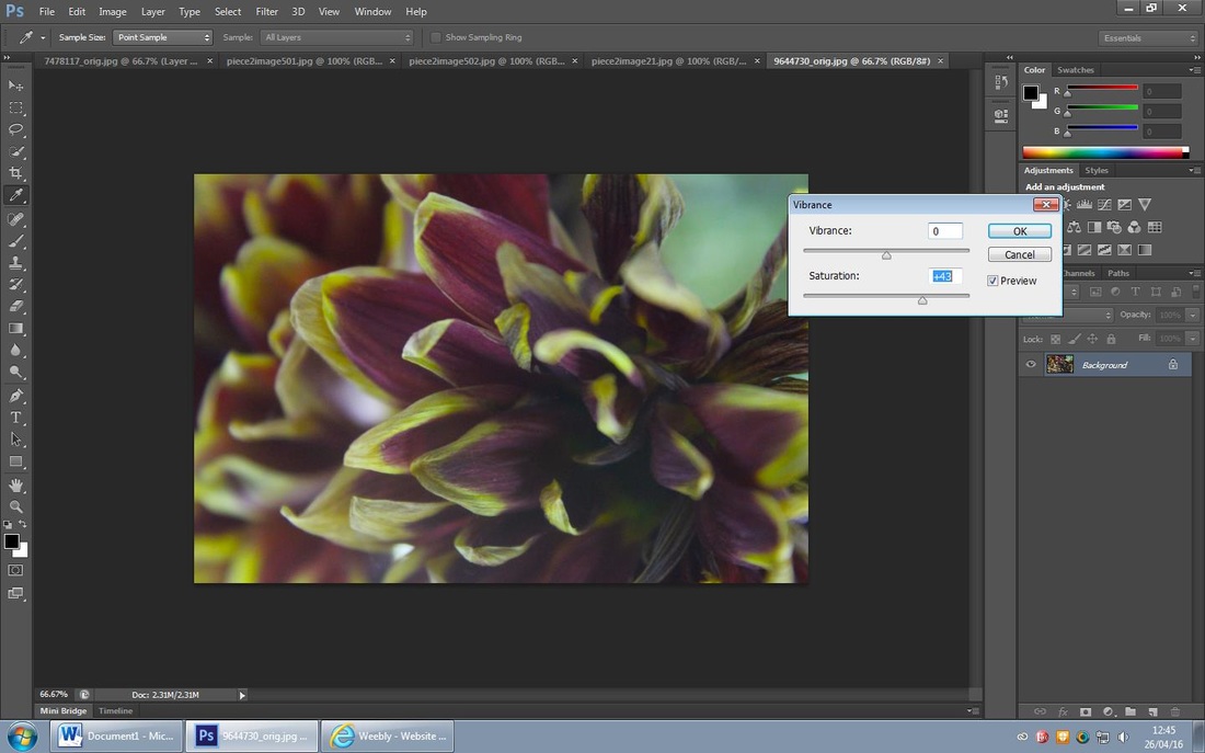
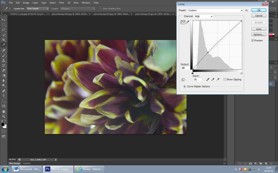
I opted for another dark background to layer up so I firstly used the 'hue/saturation tool' to enhance the blue hue and then brighten to enhance it. I then used the 'curve tool' to enhance the centre of the dead flower and enhance the blue.
Refining my Ideas further...

For this edit I chose t0 enhance the loss of life in the flower and enhance the little of life it had left. I firstly used the 'curve tool' to brighten up the centre of the flower, I then used the 'brightness/contrast tool' to enhance the deep colour.
Refining my Ideas further...

I prefer the second edit as the colours are warm and I feel like the way I edited it enhanced the colour. I think it will look good with my other backgrounds as I think the pop of colour will contrast with the meaning of my piece 1.
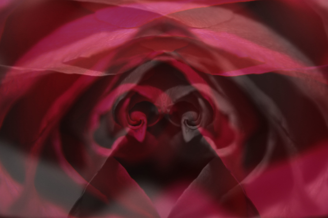
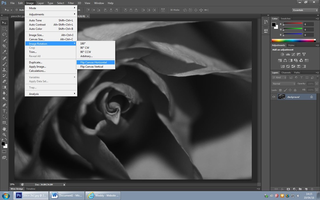
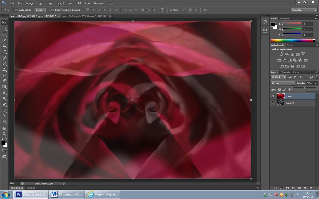
Piece 1-Background Refined
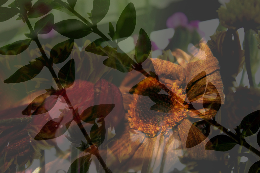
I really liked how this background turned out, I feel like there is a lot of depth within it and the colour pops out but the photo is still very dark in itself. I think this will go perfectly with the girls I layer onto it to show the negative emotions of the teenage girls. To complete this edit I reduced the opacity in order to blend all of the edits together.
Piece 1- Colour Development

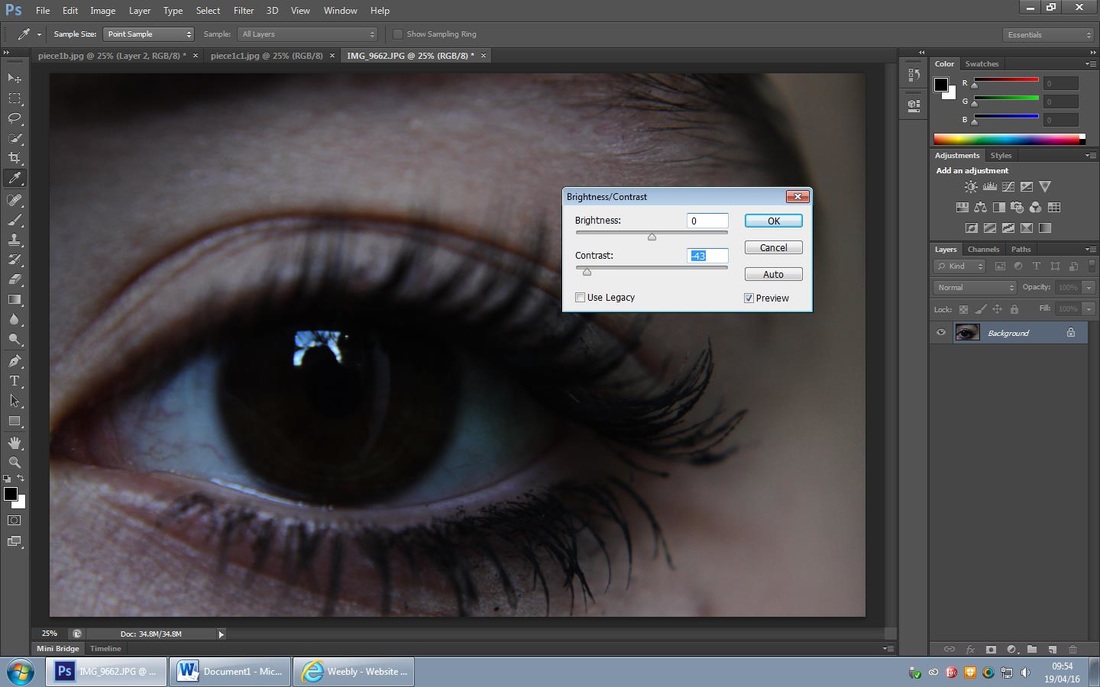
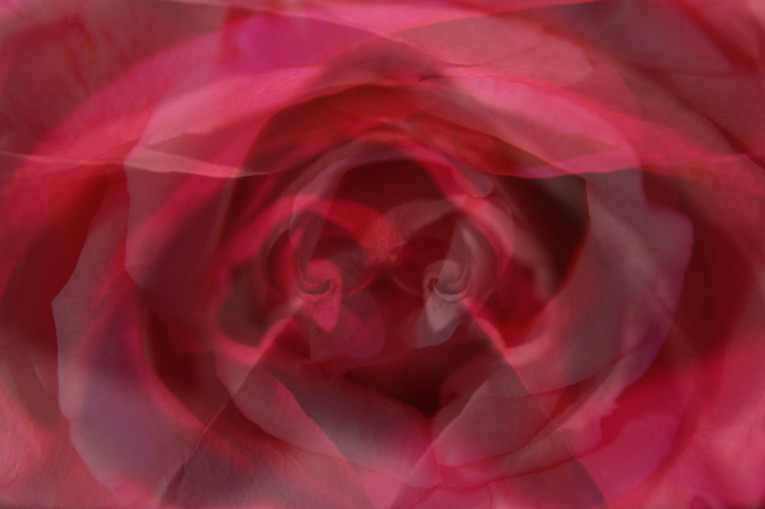
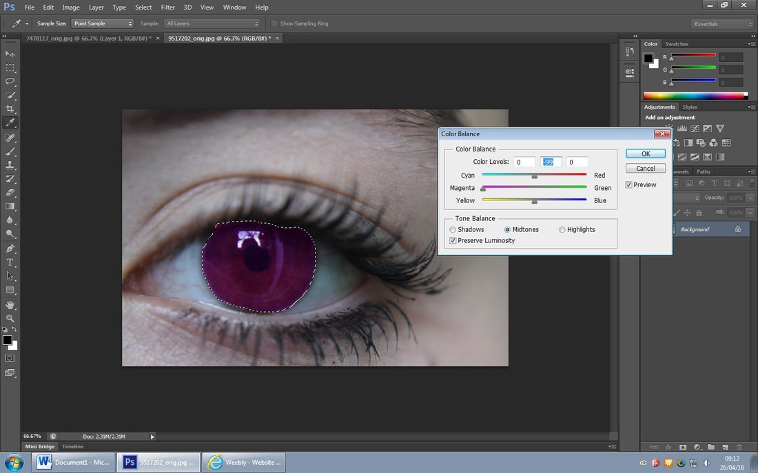
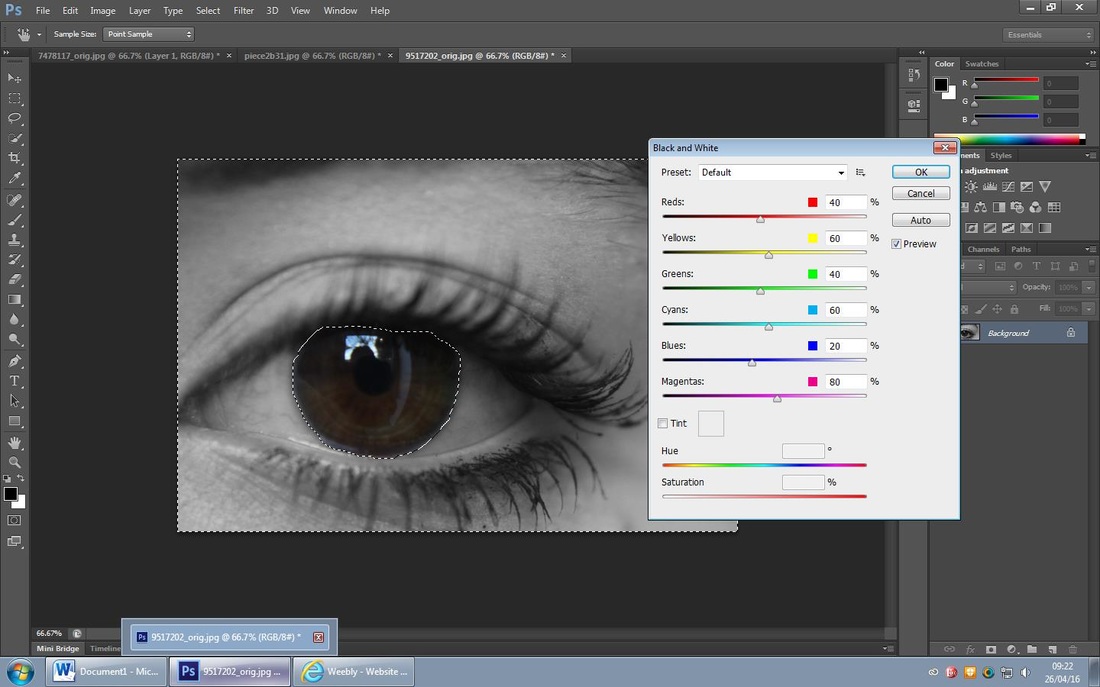
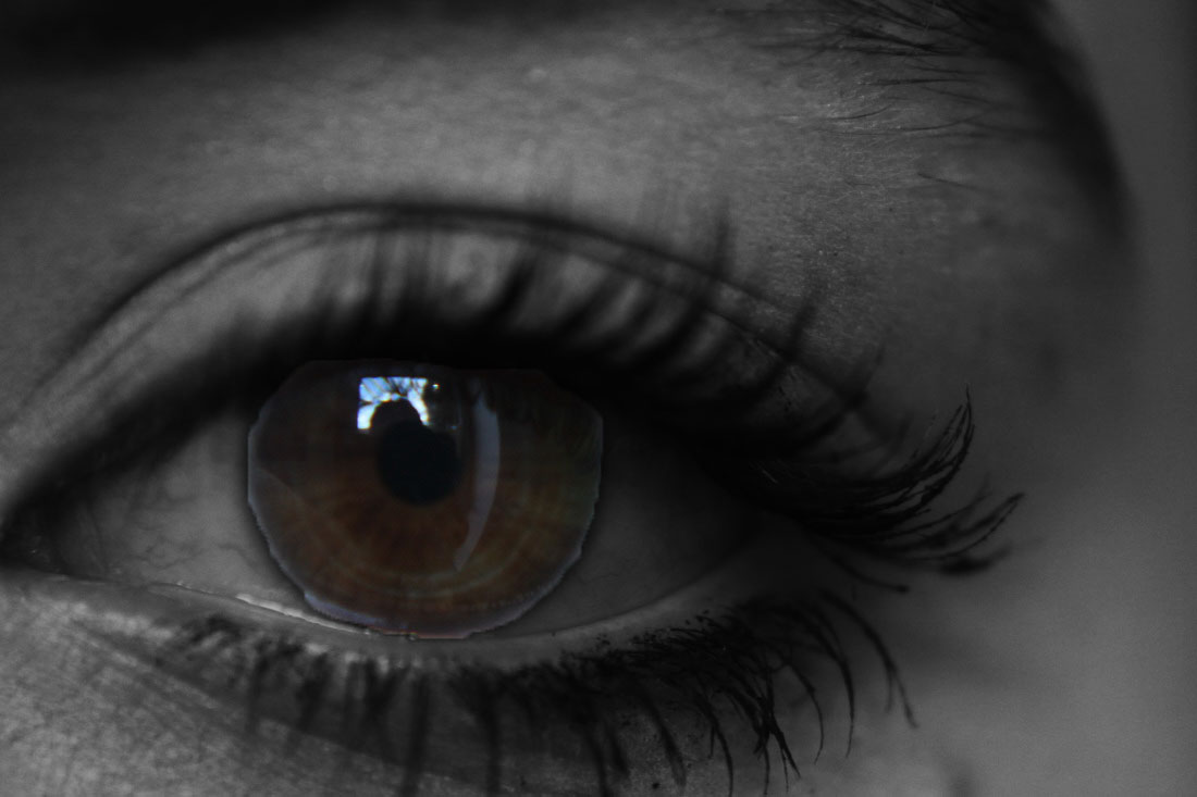
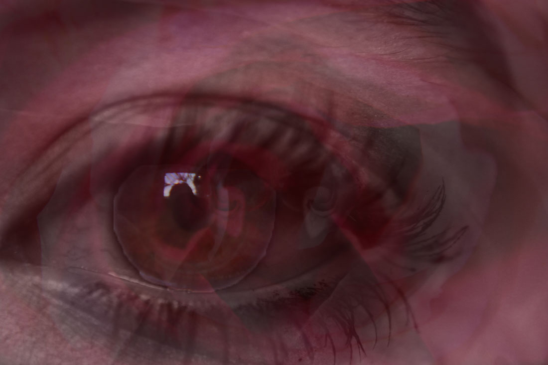
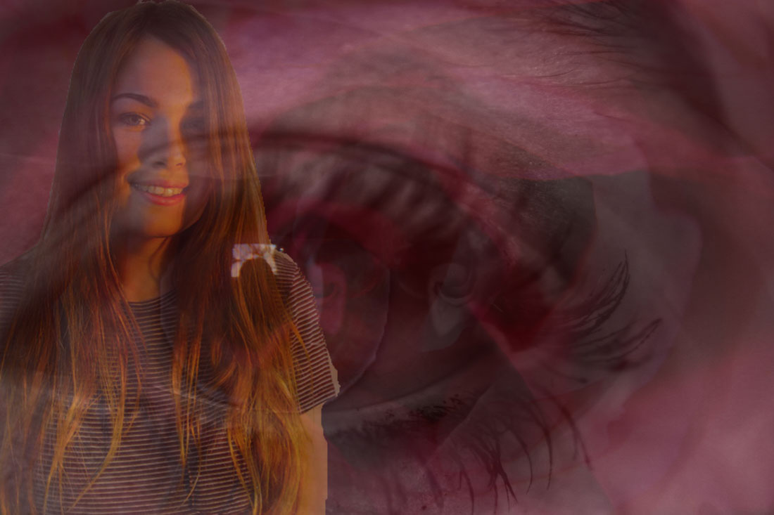
To develop the colour aspect of my Piece 1, I decided to refine the girls eye, firstly I changed the original photo to black and white, I then used the 'brightness/contrast tool' to enhance the blurry dark colour of the eye; I then used the 'curve tool' to darken the girls eye colour and have only a segment of light upon it.
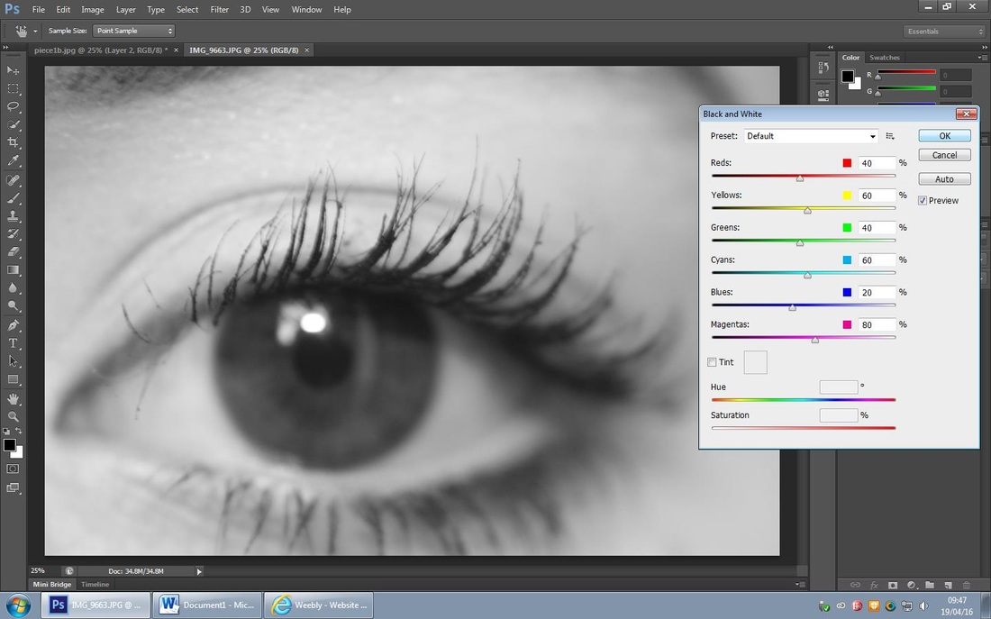

Refining my Ideas further...
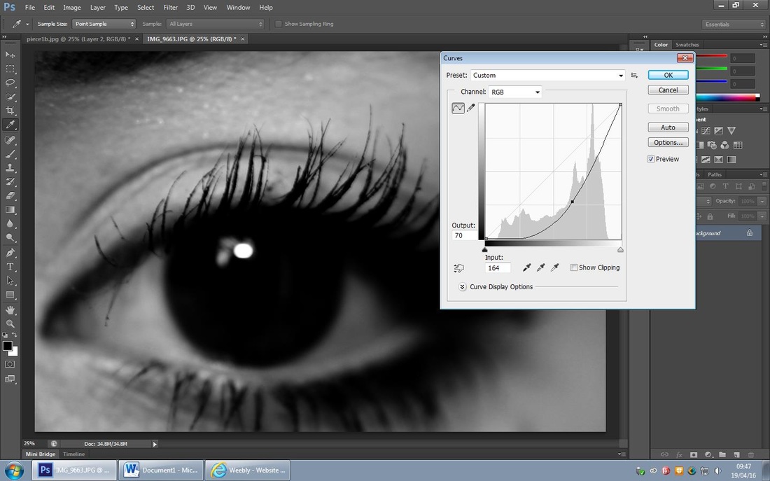
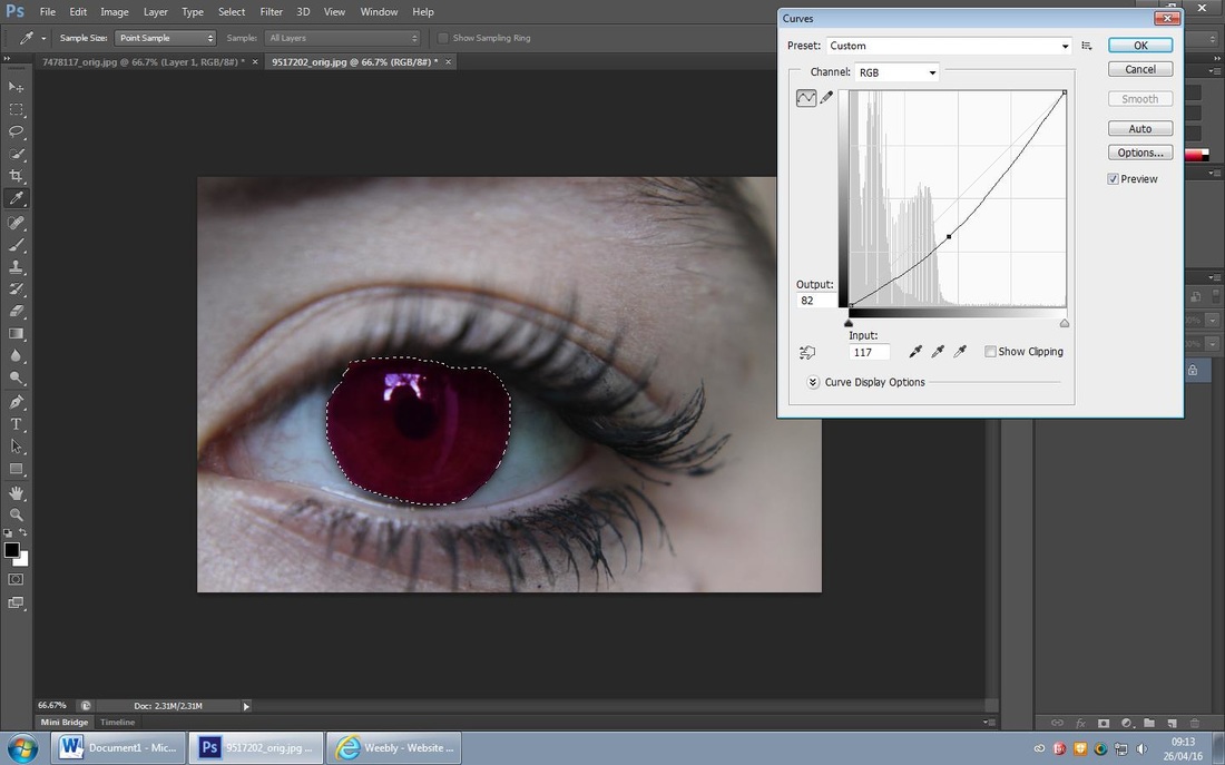
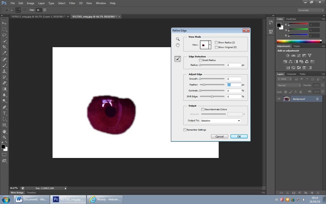
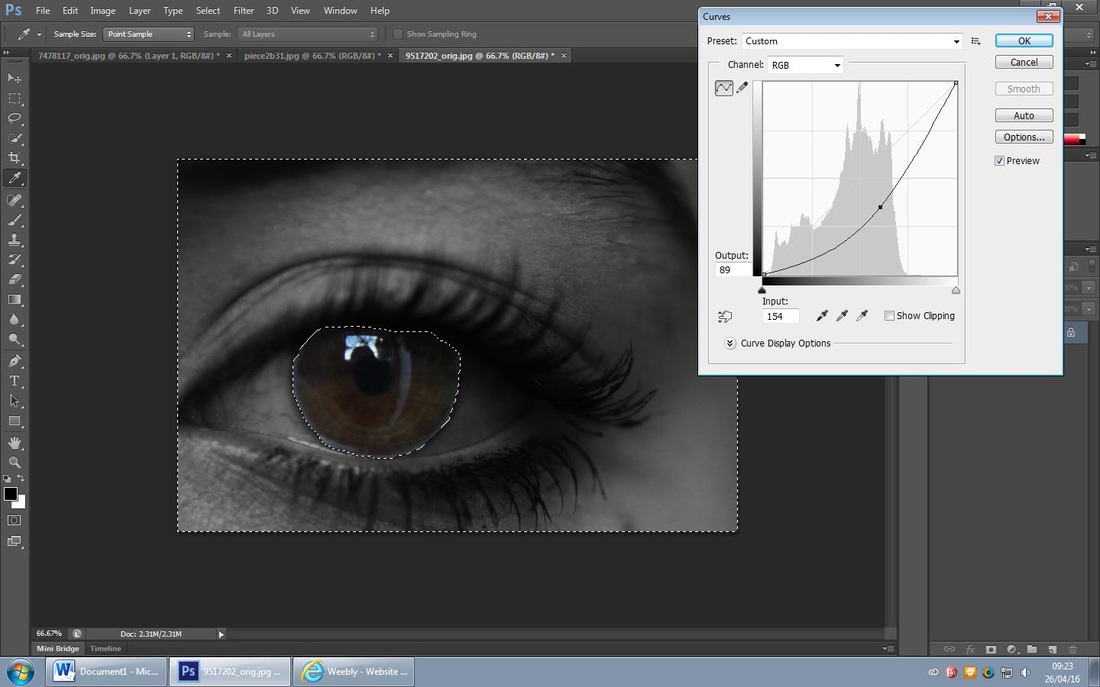
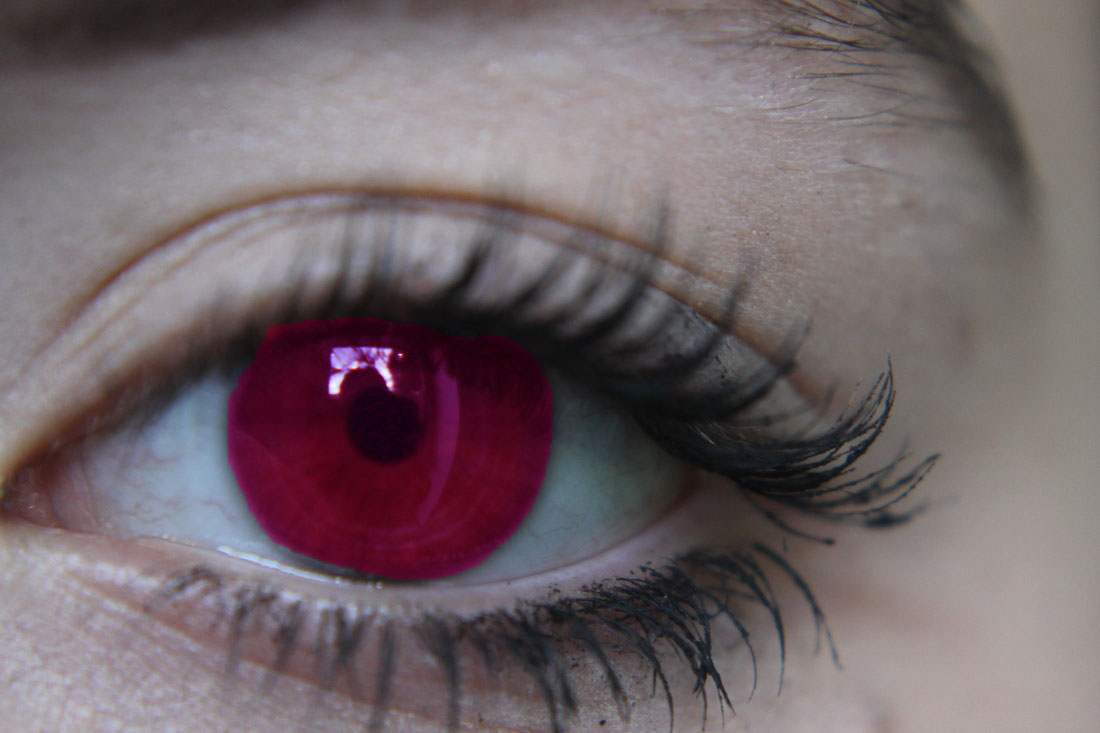
For this edit I chose to refine my idea by keeping the girls skin natural but enhance the redness of her eye. I firstly used the 'curve tool' to darken her eye, I then used the 'brightness/contrast tool' to lighten the girls whites of her eye; I then used the 'vibrance tool' to enhance the red veins of her eye and make it look bloodshot as if she had been crying.
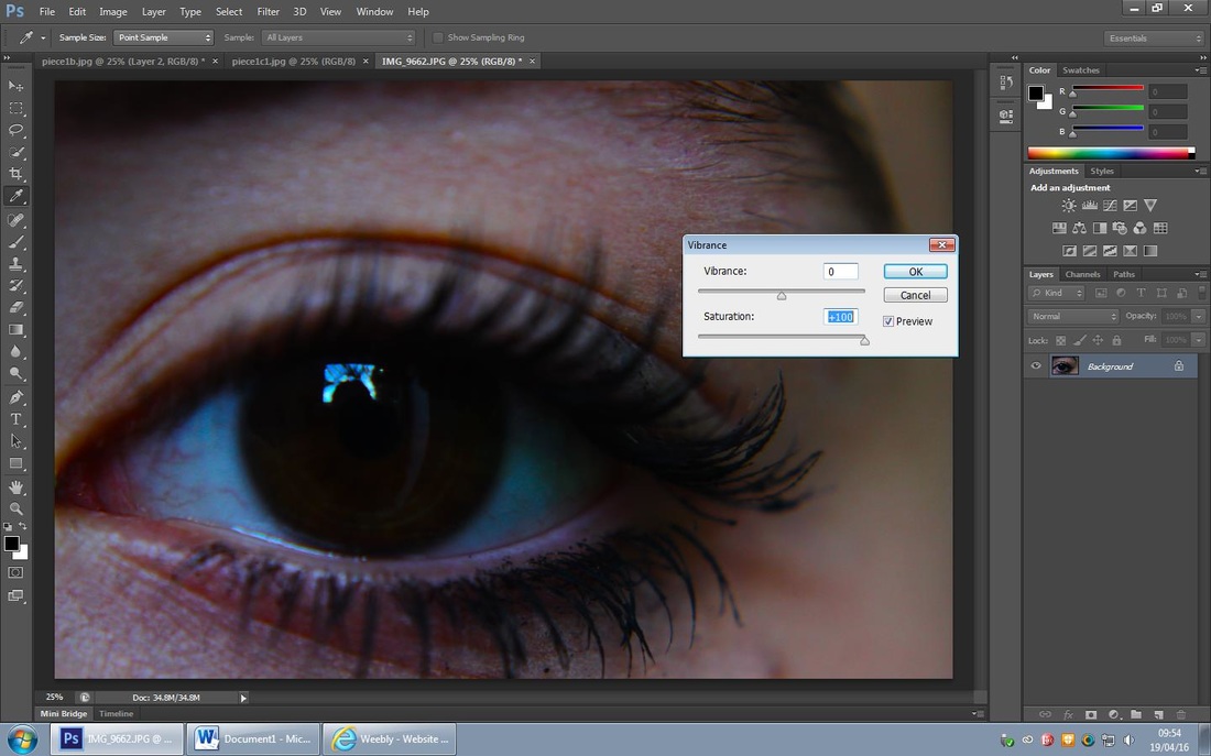
Refining my Ideas further...

I really like the second one of the two edits I produced as I think the colour keeps in the reality of sadness and I like how I've made it look like the girls has been crying; which adds to the effect of the negative emotions.
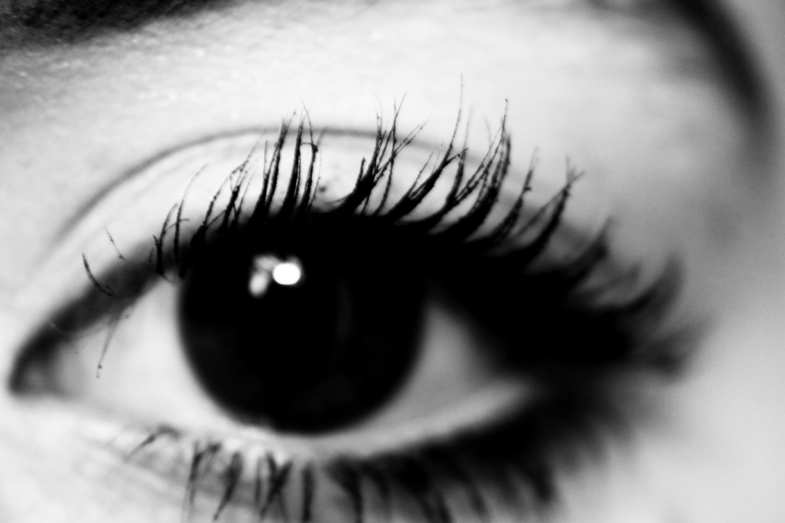
Refining my Ideas further...
Once layering the girls eye onto the background I felt that it didn't work as well as I hoped it would; therefore I will not be using this eye as part of my Piece 1.
Piece 1- Colour Refinement...

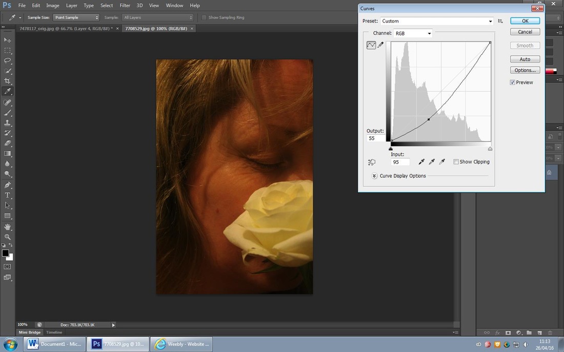
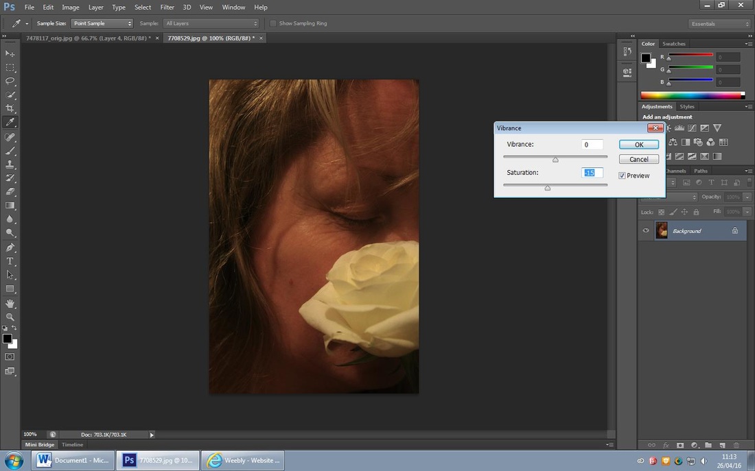
For this edit I wanted to enhance the water vapour covering the woman and experiment with colour. Firstly I cropped the photo to put all the focus on the vapour, I then used the 'brightness/contrast tool' to enhance the vapour and darken the woman behind it.
Refining my Ideas further...

For this edit I chose to create a musky dark photo, I firstly cropped the original photo, I then used the 'colour balance tool' to maximise the red and magenta hues, I then used the 'brightness/contrast tool' to darken the photo further.
Refining my Ideas further...
Out of these two edits I prefer the first one as I think it will compliment the busy background, I also feel that it will show negative emotions to correspond to the background.
Piece 1- Background & Colour Refined...
I'm pleased with how my piece is turning out so far; I like the photo across the entire length of the photo isn't too harsh; I think it works well with the background. I layered it on top of the background edits and used the opacity tool to achieve this look.
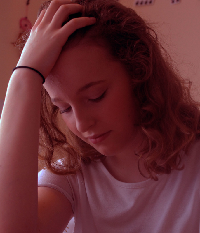
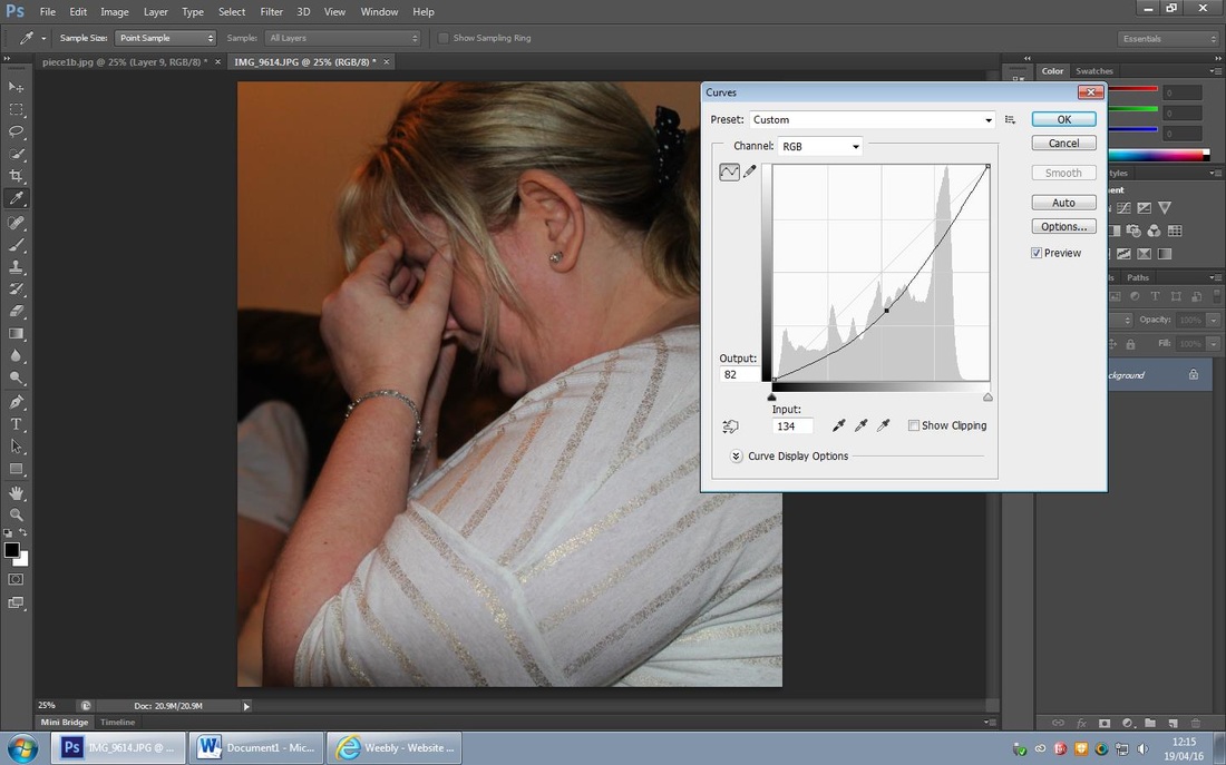
Piece 1- Image Development, Nan Goldin Inspired...

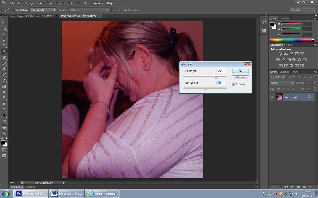
I chose to edit this photo of this girl as I think it has depth already in it and is a powerful photo I itself, firstly I maximised the red hue using the 'colour balance tool' , I then used the 'brightness/contrast tool' to darken the photo.
Refining my Ideas further...
As you can see there is a clear theme through Piece 1, contrasting hue. for this edit I firstly cropped the original photo, I then maximised the red and magenta hue, I then darkened the photo by using the 'brightness/contrast tool'.
Refining my Ideas further...
I choose to use both of these edits in my Piece 1 as I think they are equally well thought out; they contain depth and meaning and show negative emotions; ultimately they resemble Nan Goldins work.
Piece 1- Background & Colour & Image Refined...
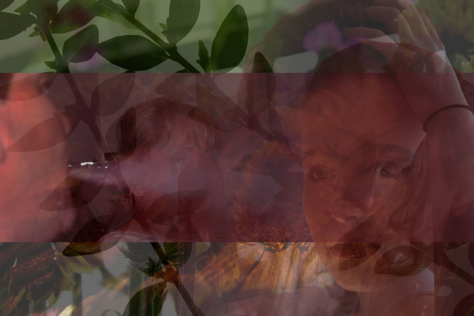
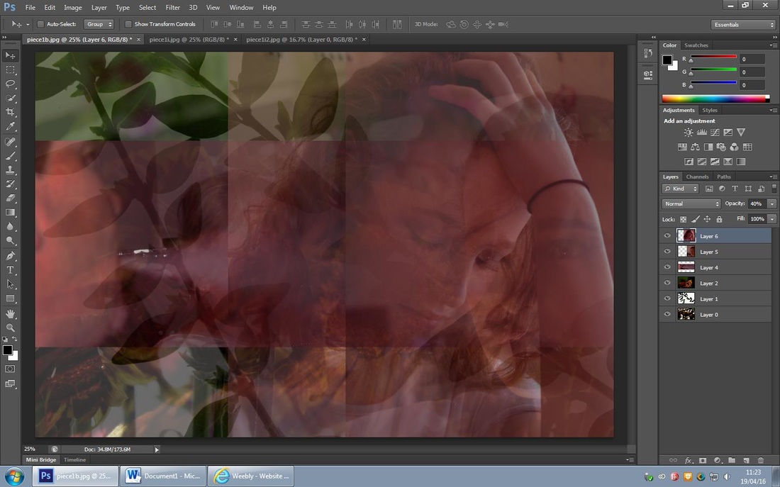
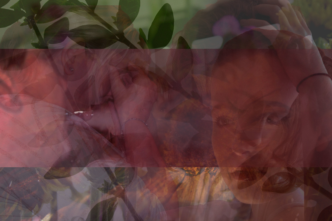
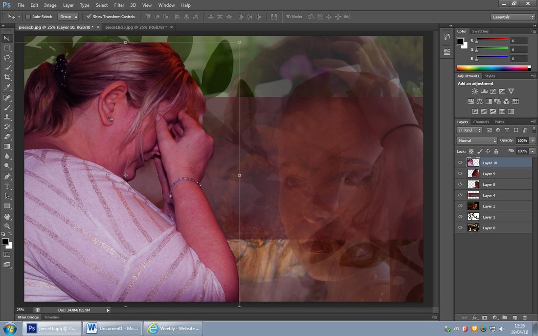
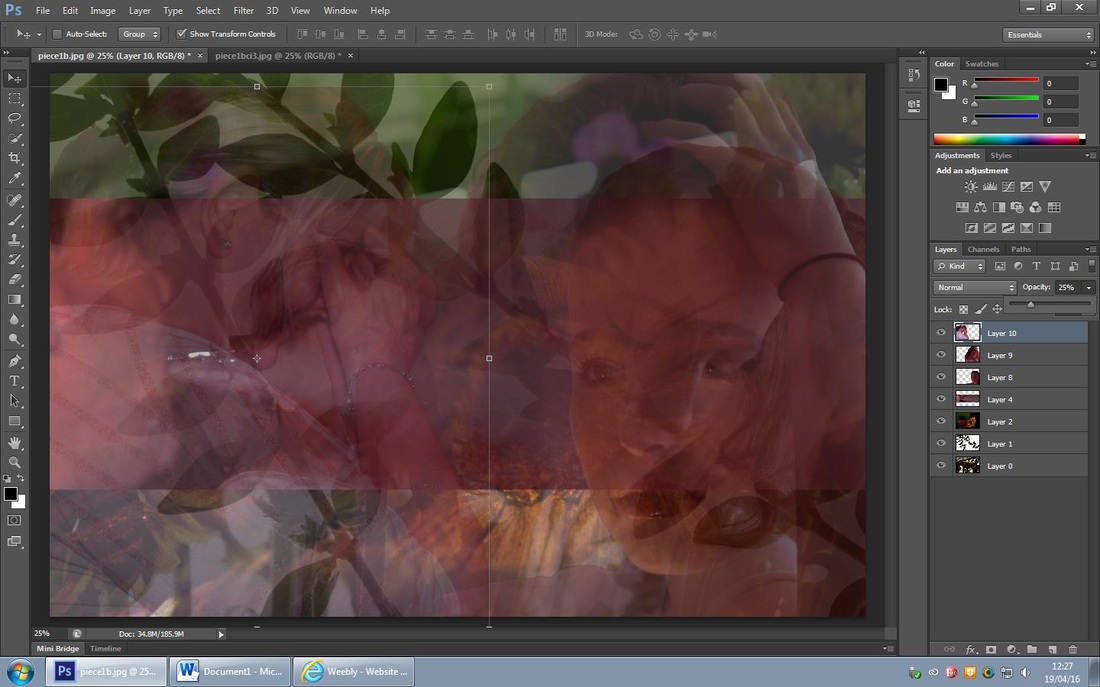
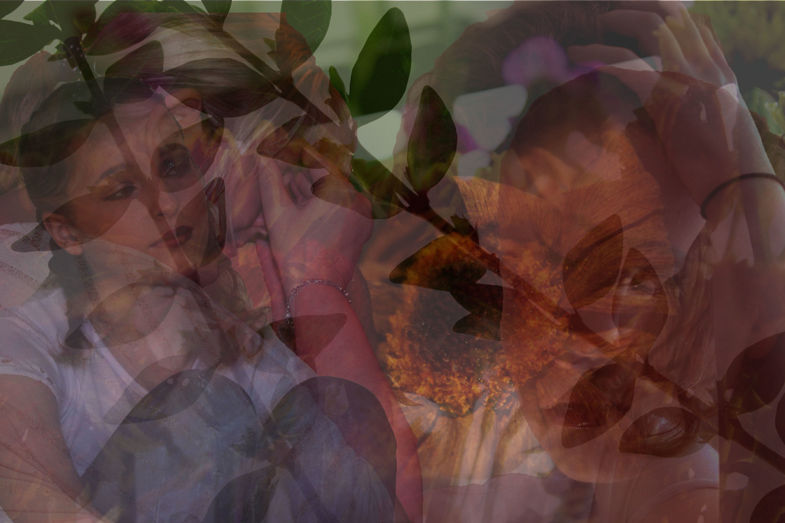
I am pleased with how my Piece 1 is going as I think its forming what I want it to- Negative Emotions. I like how the girls face is overlapping and how you can still see the woman and vapour beneath the teenage girl. To create this refined edit I firstly cropped the first edit to fit the background canvas size, I then layered it upon the backgrounds and reduced the opacity. I then added the other refined image and placed it over the previous one; I think it gives a lot of depth as the girls face is almost doubled with negativity. I also had to flip one of the images horizontally to get the mirrored effect.
Piece 1- Image Development, Christopher Hopkins Inspired..
For this edit I wanted to darken it but keep the woman's face as a focal point. Firstly I used the 'curve tool' to darken the stems of the roses, I then used the 'brightness/contrast tool' and reduced the brightness to darken it further. I then used the 'exposure tool' and increased the 'gamma correction' to 80% to darken it even further.
Refining my Ideas further...

For this edit I used the 'colour balance tool' to maximise the red and yellow hue, I then used the 'brightness/contrast tool' to reduce the darkness; I finally used the 'curve tool' to add more depth and darken the photo further.
Refining my Ideas further...

Out of these two edits I prefer the first one as it appears more negative and has lots of depth within it.
Refining my Ideas further...
Due to the edits image size I was unable to blow it up to fit the canvas.
Refining my Ideas further...
For this edit I first cropped the original photo, I then used the 'curve tool' to darken areas of it; I then used the 'colour balance tool' to maximise the magenta hue.
Further Refinement...
To refine I used flipped the image horizontally and then used the 'select tool' to select areas I wanted to put into my piece. I then recued the opacity.
Further Refinement...
I decided to move the vapour photo from beneath the layers as I felt the bold outline of it didn't work well with the overall piece.
Further Refinement...
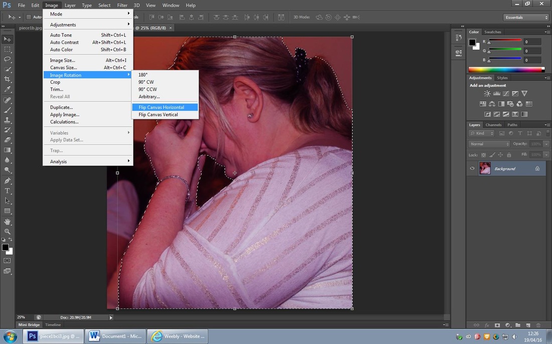
I'm happy with the way my Piece 1 is turning out as I like the images overlapping each other. I added another girl to the edit, I refined the original photo of her by using the 'curve tool' to darken areas of the photo, I then used the 'exposure tool' and increased the 'gamma correction'. To then put it onto the piece I used the 'quick selection tool' to select the areas I needed; I then flipped the photo horizontally and then changed the opacity to 35%.
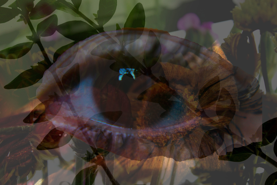
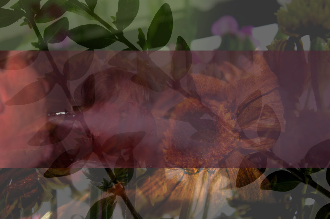
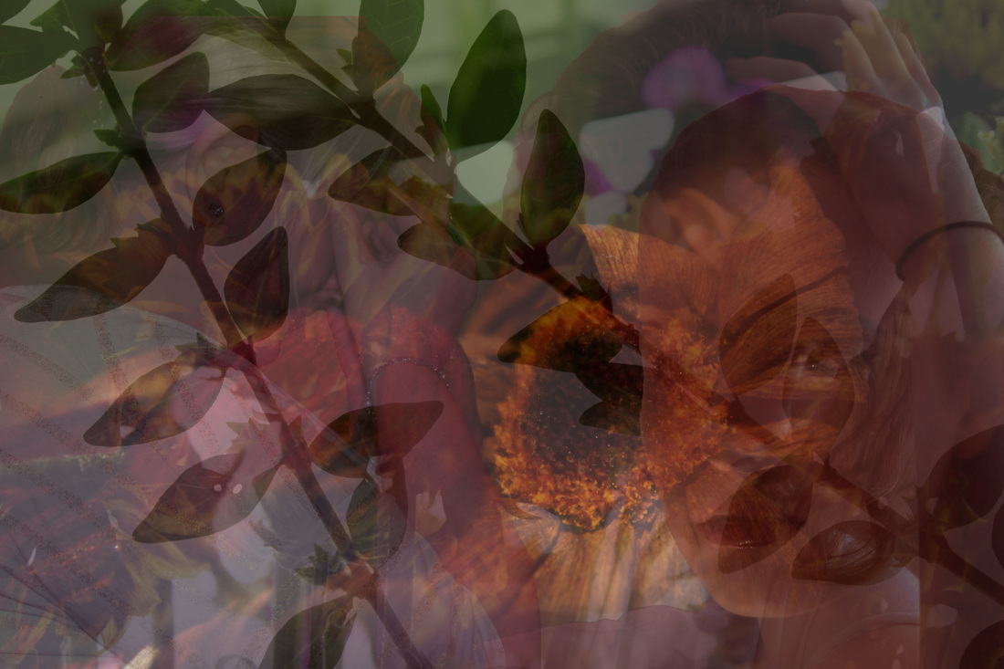
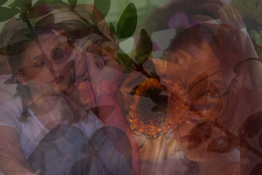
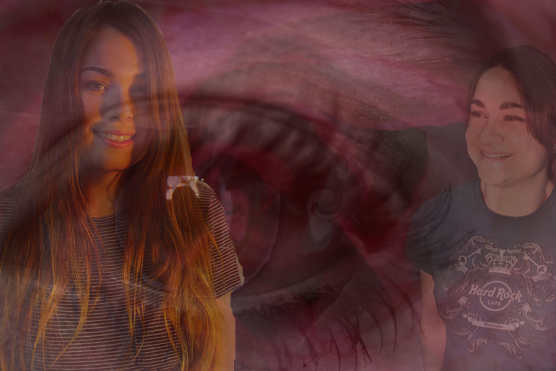
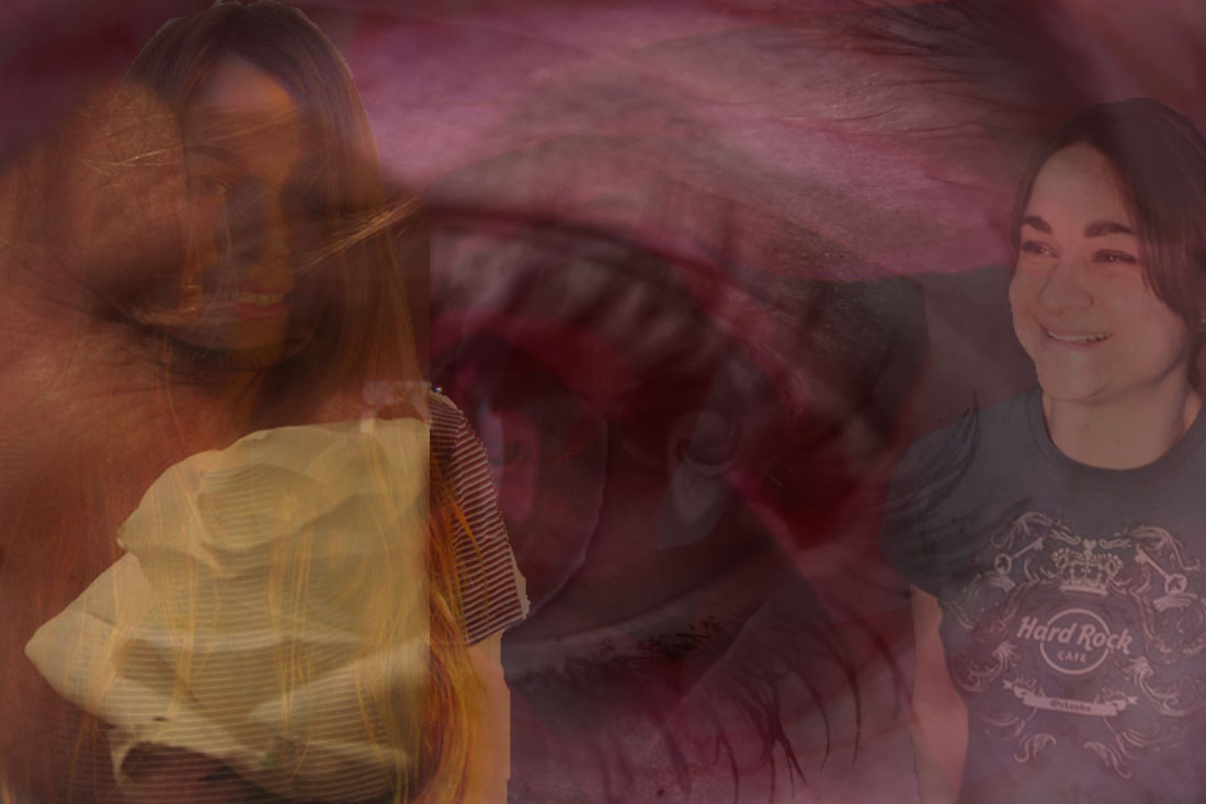
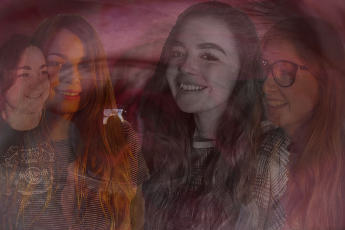
My Piece 1 Completed

This is my first piece of my Final Exam. I'm really pleased with the overall outcome of it as it looks how I wanted it to, I like how the girls are layered upon one another and are looking sad and distressed; this emphasises the negative emotions that teenage girls go through; due to media stereo-types, body shaming and relationships. The layered background represents the front that is put on when feeling like this.
Piece 2- Refining the Background

For this edit I didn't want to change much of it because it is a simple base for other layers to go onto; I firstly used the 'curve tool' to darken the parts in between the petals, I then used the 'brightness/contrast tool' to enhance the pink colour; I then used the 'vibrance tool' to enhance the vibrant pink colour further.
Refining my Ideas further...
For this edit I changed the original photo black and white, I then used the 'curve tool' to give the rose more depth.
Refining my Ideas further...

Out of these two photos I think I will merge them together to create a layer of background.
Piece 2- Background 1 Complete
I really like how this turned out. The contrasting colours compliment each other well and I think its a beautiful edit. I flipped the black and white edit horizontally and layered it on top of one another.
Refining my Ideas further...
To make the background even more colourful I chose to edit this rose as I think it is vibrant and pretty. For this edit I used the 'curve tool' to brighten the petals and then used the 'colour balance tool' and increased the magenta hue slightly.
Refining my Ideas further...
For this edit I increased the red hue using the 'colour balance tool', I then used the 'levels tool' to lighten the petals to reveal the veins on the petals.
Refining my Ideas further...
Although these edits are both very similar, I prefer the first one as its more pink and that ultimately shows the veins on the petals.
My Background so far...
To achieve this edit I used the 'quick selection tool' to select the entire previous edit, I then transferred it onto the first background I created and used the 'opacity tool' and decreased the opacity to 35%.
Refining my Ideas further...

Even though the selection isn't perfect on this edit I like how the pink is bright ad bold and ultimately shows a positive insight to emotions and feelings. To create this edit I used the 'quick selection tool' to select the eye, I then used the 'colour balance tool' to enhanced the pink and red hue; I then used the 'curve tool' to lighten parts of the colour. Lastly I feathered out the edges to make it more realistic.
Refining my Ideas further...

I decided to go black and white with this edit as I think it looks really nice, even though the selecting isn't the best I think it makes a good effect. For this edit I used the 'quick selection tool' again to select the outside of the eye and then changed it to 'black and white'; I then darkened the skin using the 'curve tool'. I feel that this improved the edit entirely by adding more depth.
Refining my Ideas further...
Out of the two edits I didn't I prefer the second one as it has more depth and I think it would look better with the other background layers.
Piece 2- Background Complete...
This is my complete background for my second piece, I am happy with the overall outcome of this and I like how they have all merged together.
Piece 2- Image Refinement- Nan Goldin Inspired...
For this edit I used the 'colour balance tool' and enhanced the pink hues, I then used the 'curve tool' to make the girls beaming face the focal point of the photo.
Refining my Ideas further...

For this edit I wanted to enhance the girls face more. I used the 'vibrance tool' and enhanced the saturation to give the photo its golden tones; I then used the 'curve tool' to enhance the girls face further and darken the background slightly.
Refining my Ideas further...
Out of the two edits I prefer the second one as I think the golden tones will work well with the pink toned background I have layered.
Piece 2- Background & Image 1 Complete...
I'm happy with how the first photo has merged onto the background as the golden tones work well alongside the pink in the background. To achieve this outcome I used the 'quick selection tool' to select the girl, I then transferred the photo onto the background layers and used transform tool to enlarge the photo. I then used the 'opacity tool' to merge her with the background appropriately.
Refining my Ideas further...
For this edit I wanted it to not be too colourful and I didn't want it to detract from the vibrant background. For this edit I firstly cropped the original photo, I then used the 'curve tool' to enhance the woman's shadow; I then used the 'vibrance tool' and decreased the level of saturation.
Refining my Ideas further...

For this edit I cropped the original photo to focus on the woman's beaming face. I then used the 'hue/saturation tool' and decreased the lightness of the photo; I then used the 'levels tool' and enhanced the woman's face and darkened the background
Refining my Ideas further...
Out of these two edit I prefer the first as it has a nice outdated effect to it and I think with it combined with the background it will work well.
Piece 2- Background and Image 2 Complete...
I'm very pleased with how these image work with the background. I like how I've used strong coloured edits and weak coloured edits to refine my piece; I feel that my second piece is making good progress.
Refining my Ideas further...
For this edit I decided to make the rose the focal point and make it stand out. Firstly I used the 'curve tool' to lighten the rose, I then used the 'vibrance tool' and decreased the saturation to -45%.
Refining my Ideas further...

For this edit I wanted to create an orangey tone to the photo, I firstly used the 'colour balance tool' and enhanced the yellow hue slightly, I then used the 'brightness/contrast tool' to enhance the yellow hue of the rose further.
Refining my Ideas further...
Out of the two edits I've done I prefer the first one as I feel that although the rose isn't as enhanced as the other edit; it still stands out and has a softer feel to it.
Piece 2- Background & Image 3 Complete...
Refining my Ideas further...
For this edit I flipped the photo horizontally, I then used the 'curve tool' to focus the light on the girls face; I then used the 'hue/saturation tool' and decreased the saturation.
Refining my Ideas further...
For this I did the same process as the previous edit, I used the 'exposure tool' and increased the 'gamma correction', I then used the 'curve tool' to enhance the girls face and smile.

Refining my Ideas further...


Despite both edits being very similar I feel that the second one has more of a saturated effect to it and I think it would tie in perfectly with my piece.
Piece 2- Background & Image 4 Complete...
I am happy with how it look so far, as you cans see I have removed one of my edits as I felt it didnt fit in well with the other edits.
Refining my Ideas further...
As this will be my last photo to go onto my work I want it to be perfect and stand out the most. For this edit I used the 'curve tool' to enhance the girls face, I then used the 'colour balance tool' and increased the pink hue and then increased the blue hue slightly.
Refining my Ideas further...
For this edit I chose to create a tonal version of the photo, I firstly changed the photo black and white, I then used the 'curve tool' to darken the background slightly but still have the girls faces the focal point; I then used the 'brightness/contrast tool' to enhance the girls face further.
Refining my Ideas further...


Out of these two edits I like both of them so will test which one looks best on my piece.
Refining my Ideas Further...
Once layering up the previous edit I chose to move the other photos and experiment with their opacity; I feel like I am happy with how my piece now looks.
My Final Layer...
I thought it would look good if I added another subtle layer of flowers, for this edit I used the 'vibrancy tool' and increased the saturation; I then used the 'curve tool' to enhance the yellow tips of the flower petals..
Refined Idea...

I only edited one version of my overlay as I think it needed to be subtle and opaque. I am really pleased with how my Piece 1 looks as I really think the overlay pieces the second piece together.
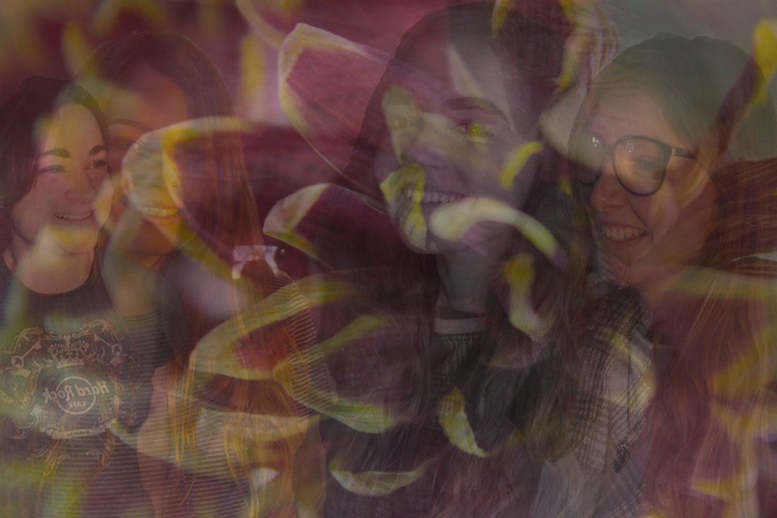
My Piece 2 Completed...

This is my second part of my Final Piece, I am really pleased with how it has turned out; I thin it was the right decision to choose the final flower layer as I think it brings the whole piece together. I also am pleased with the arrangements of the girls and how they are placed and in some cases merged upon each-other. I am overall very pleased with the outcome.
My Final Exam Final Pieces...
Piece 1 Evaluation...
I think this piece shows negativity due to the negative emotions of the girls photographed, the pop of vibrant colour still shows through to show that there is a chance of regaining happy emotions. This piece represents the Negative Emotions go through while being teenagers and through relationships and heartbreak; this exceeded my expectations for this piece as I feel I have created deep meaning and created depth with these photos and layers.
Both of my pieces have been influenced by Nan Goldin and Christopher Hopkins; both known for their meaningful photography. I feel that Christopher Hopkins has been my biggest influence in this piece in terms of sadness and negativity. I hope to send a message to anyone who views this piece, as I want my photography overall to have meaning. The message is that event though sometimes times can be tough but each time you have to try and get yourself back up again; I hope I have shown this through the girls photographed and the flowers emerging behind them. I feel that this piece is personal to me as I have been through some tough times but each time have become stronger so overall I wanted to recreate this in my piece.
Both of my pieces have been influenced by Nan Goldin and Christopher Hopkins; both known for their meaningful photography. I feel that Christopher Hopkins has been my biggest influence in this piece in terms of sadness and negativity. I hope to send a message to anyone who views this piece, as I want my photography overall to have meaning. The message is that event though sometimes times can be tough but each time you have to try and get yourself back up again; I hope I have shown this through the girls photographed and the flowers emerging behind them. I feel that this piece is personal to me as I have been through some tough times but each time have become stronger so overall I wanted to recreate this in my piece.
Piece 2 Evaluation...
This is my second final piece and I again very pleased with how it has turned out, although it planned to have more black and white initially I prefer this to my initial idea. I like how the girls are bold and merged together in some places and I think that this adds to the effect. I feel like I have created depth by creating the multiple layers and I hope anyone who is viewing it will see those layers. I feel that this piece is influenced entirely by Laura Stevens; I think this because of the happiness within the girls photographed and how they reflect their happiness through the piece; I also like the multiple layers of flowers and how I have balanced the colour scheme. Finally, I like the final layer I did as I think it brightens the piece up entirely. I am overall pleased with how this piece has evolved and achieved. This piece is personal to me as I feel that I can look past the negatives and try and think positive and I feel that I have represented this through the femininity of my piece and the teenage girls emotions.
