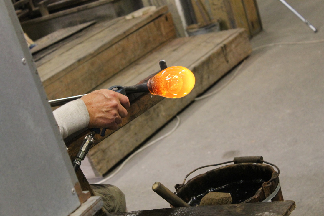
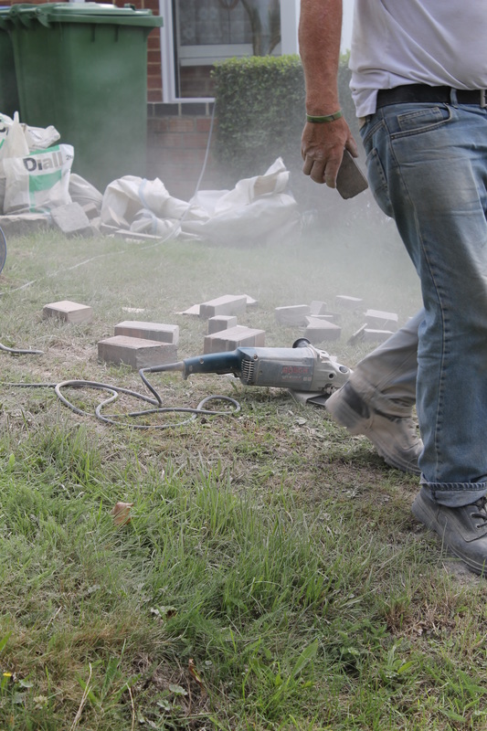
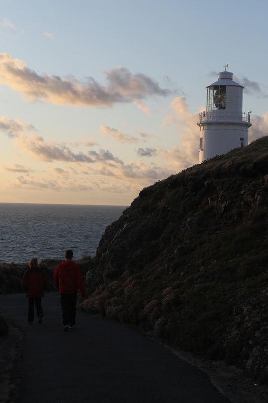
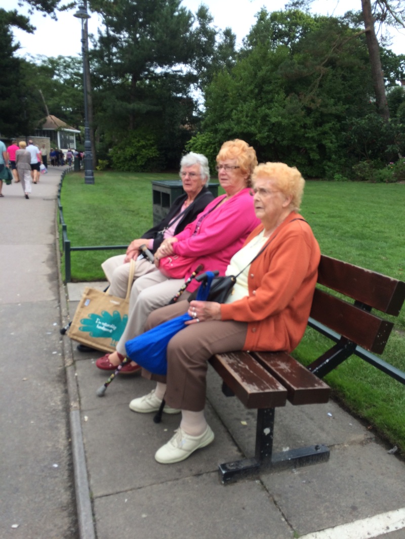
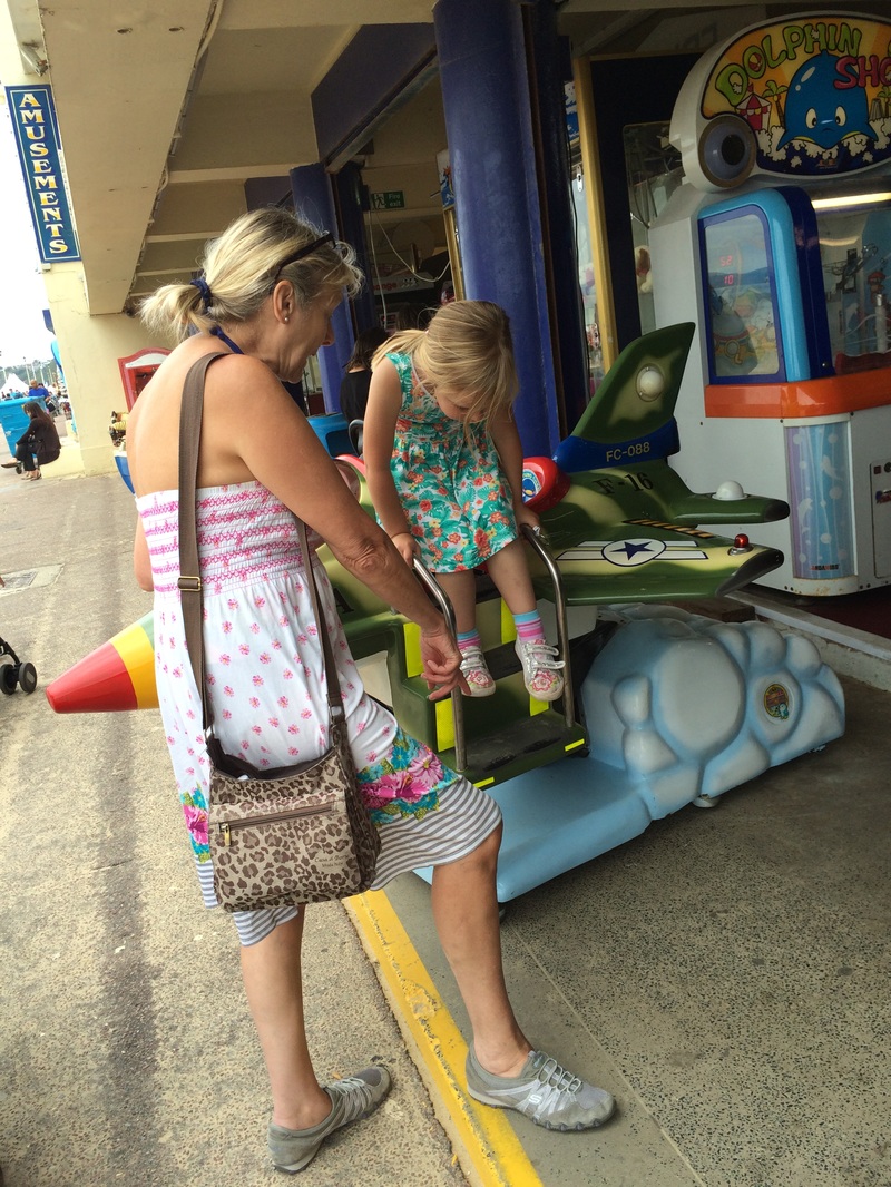
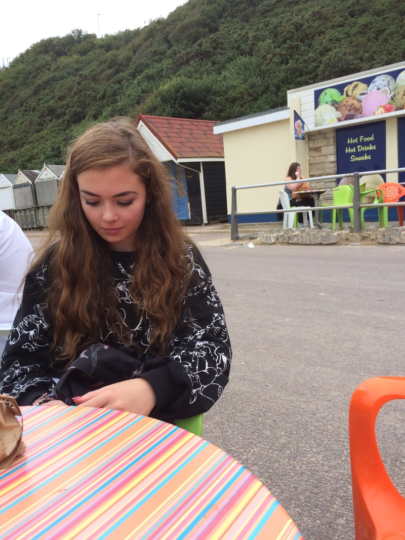
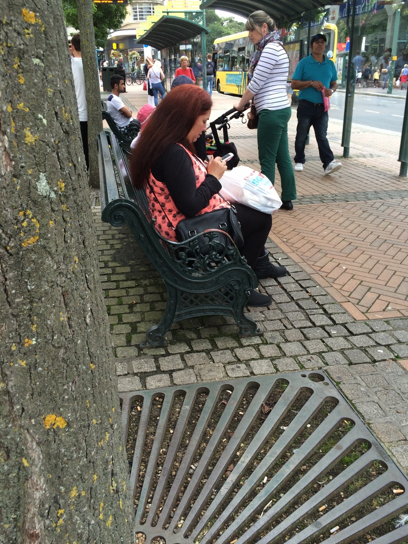
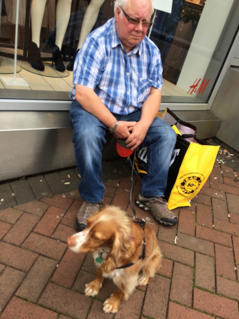
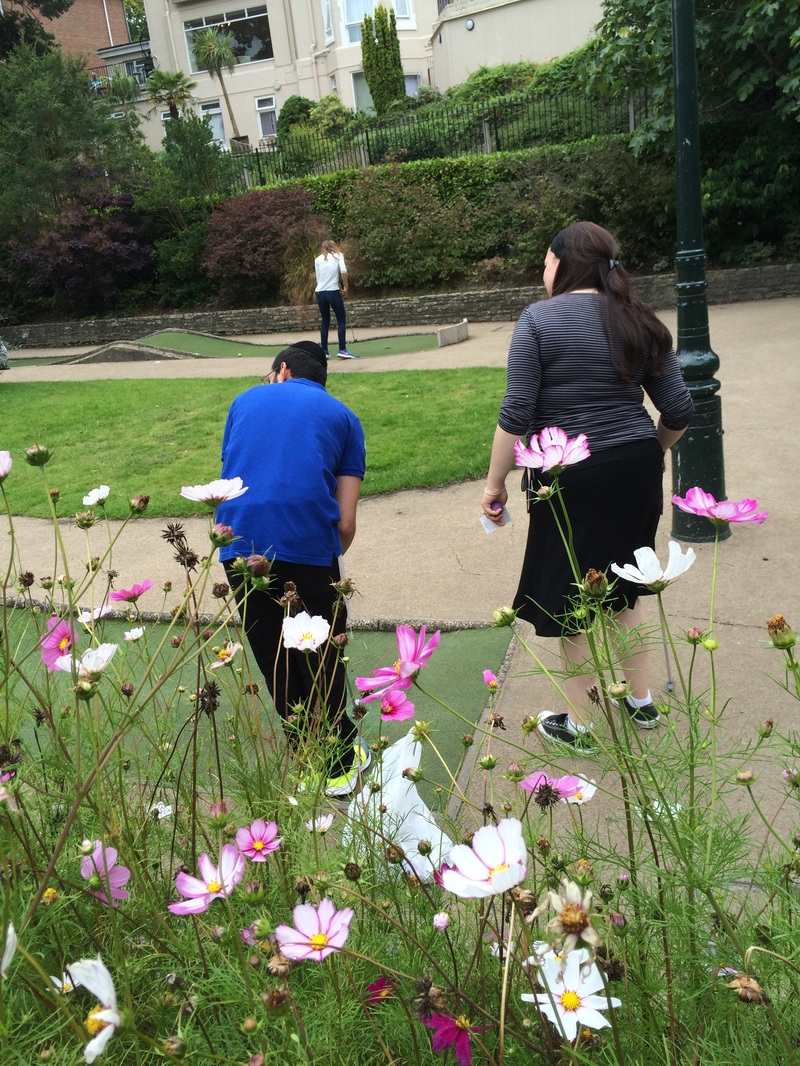
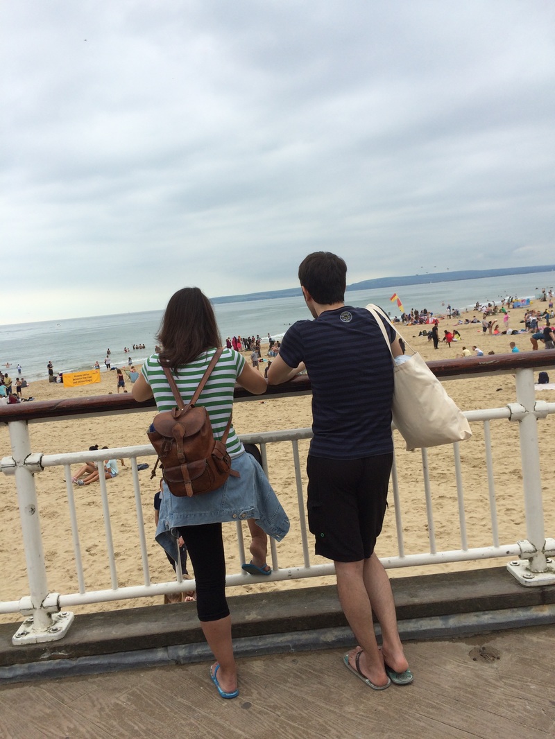
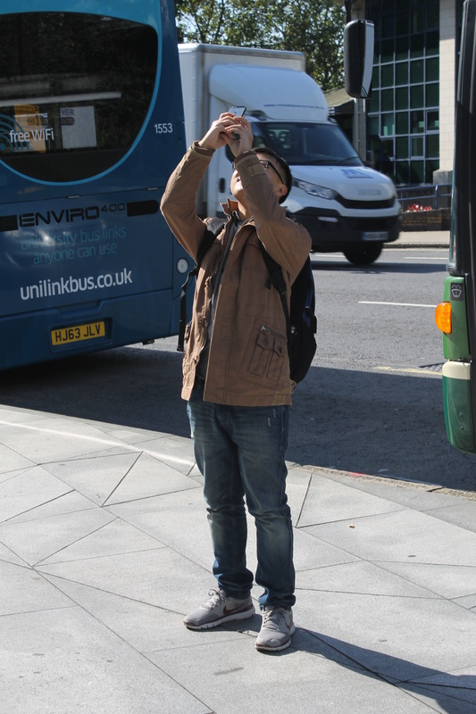
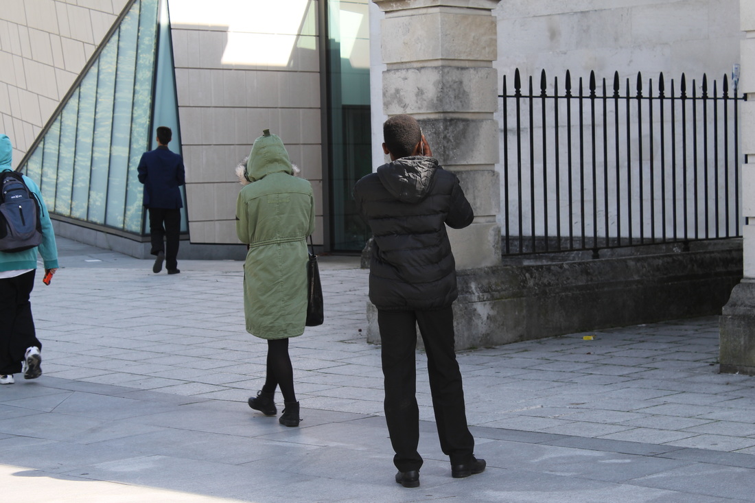
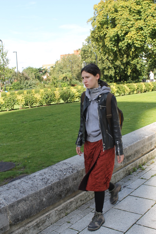
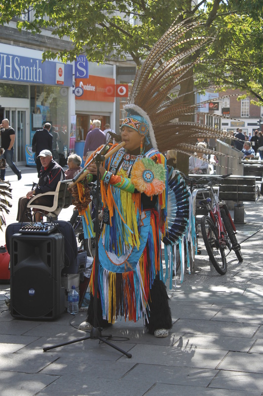
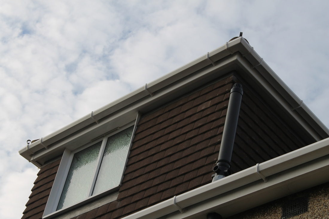
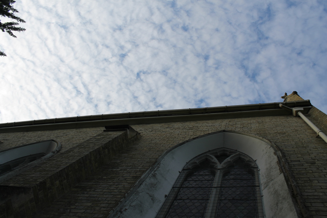
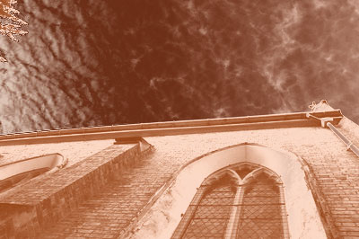
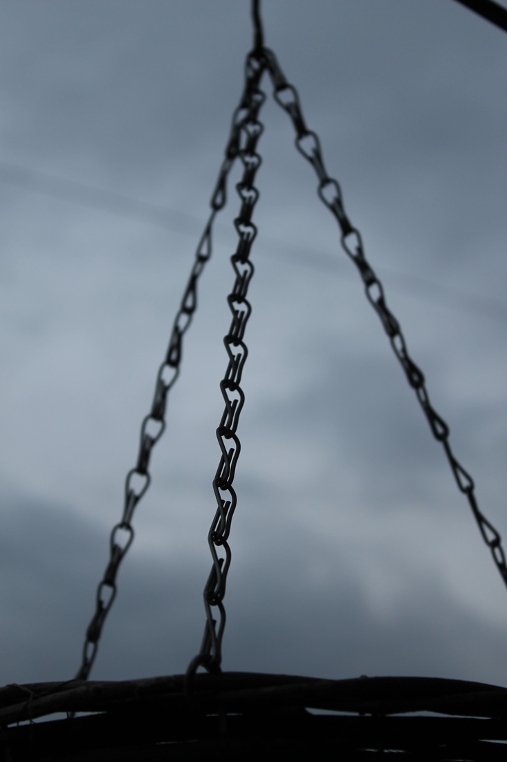
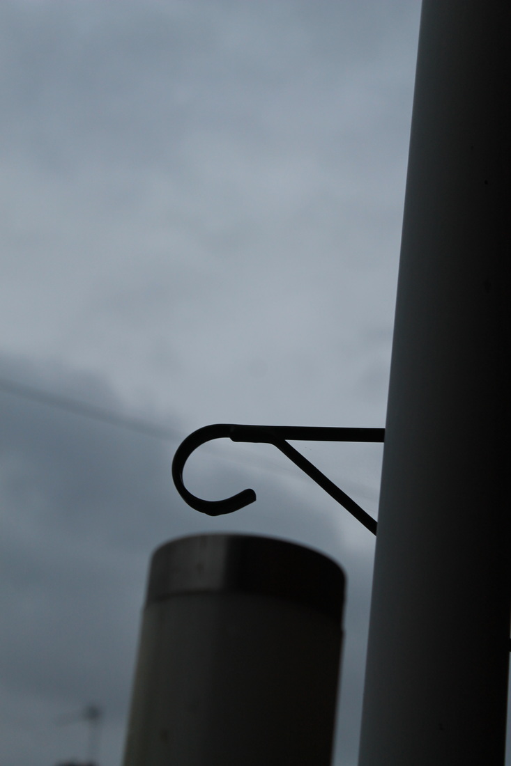
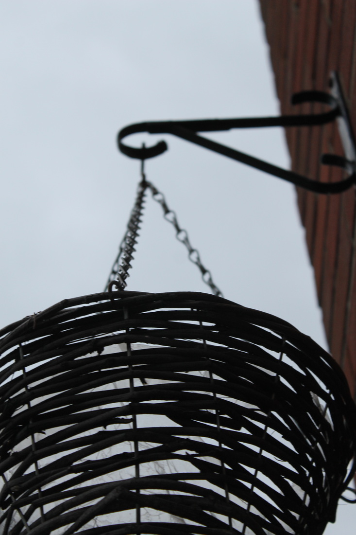
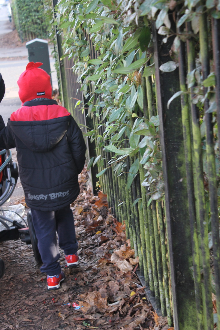
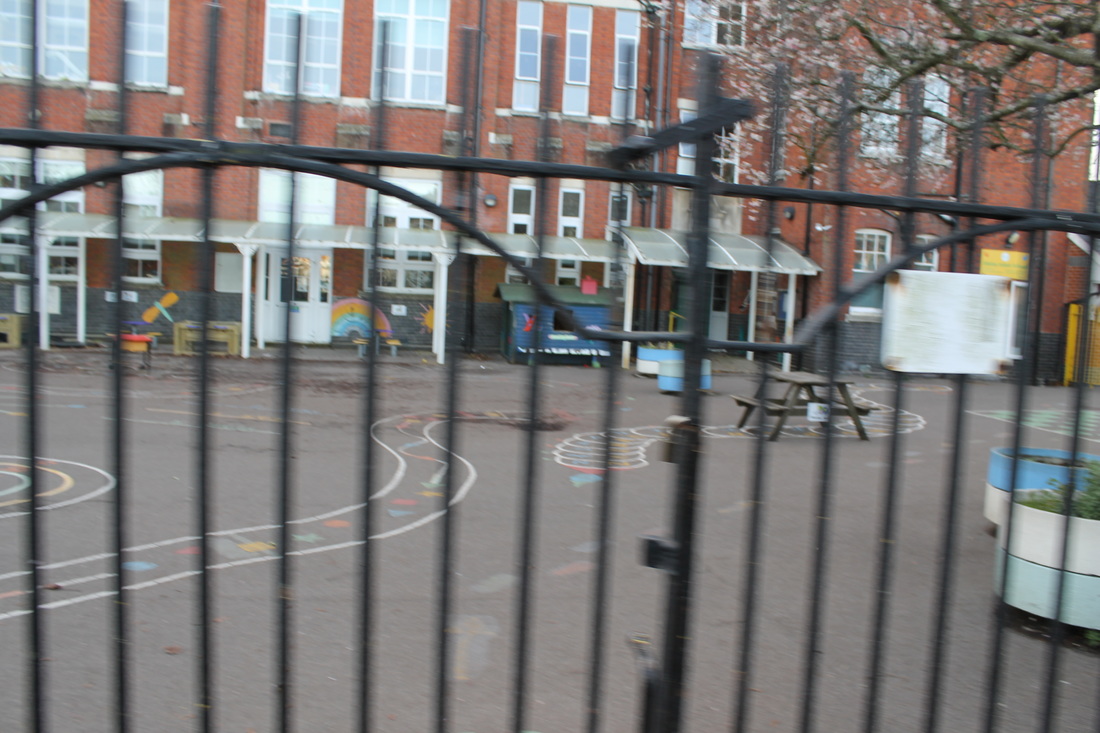
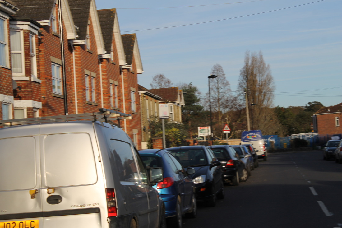
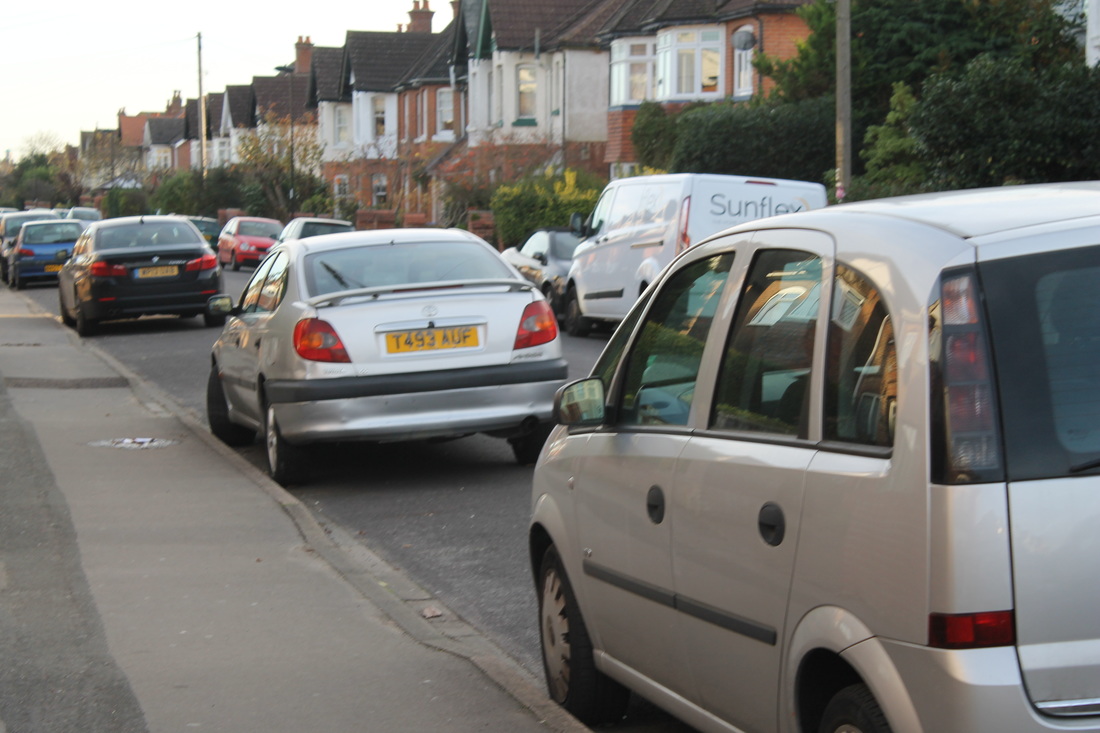
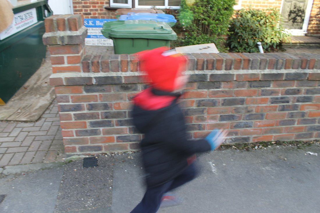
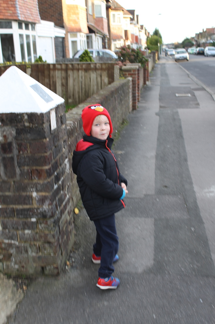
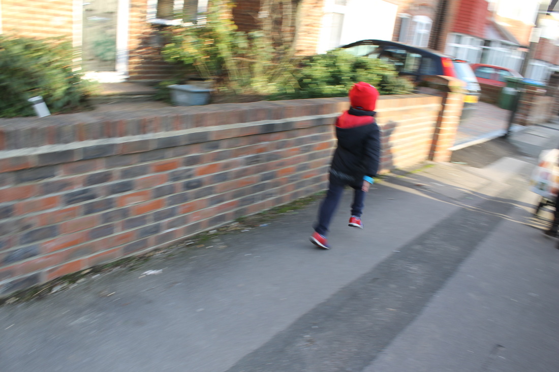
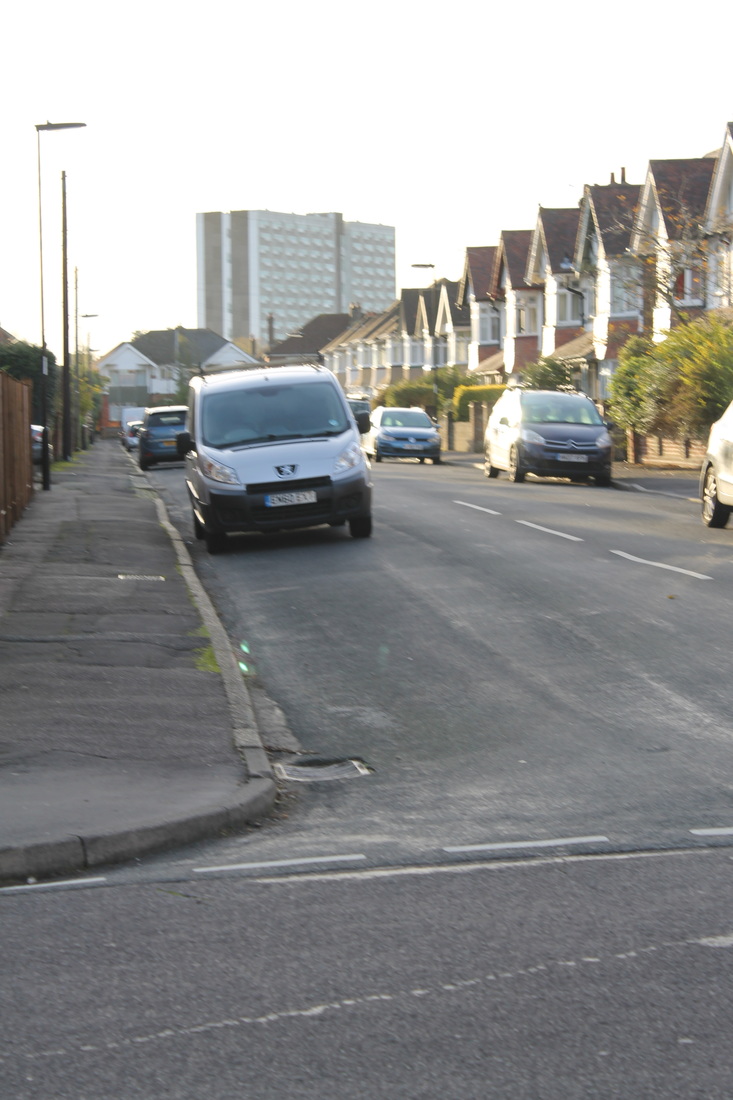
Urban Photography
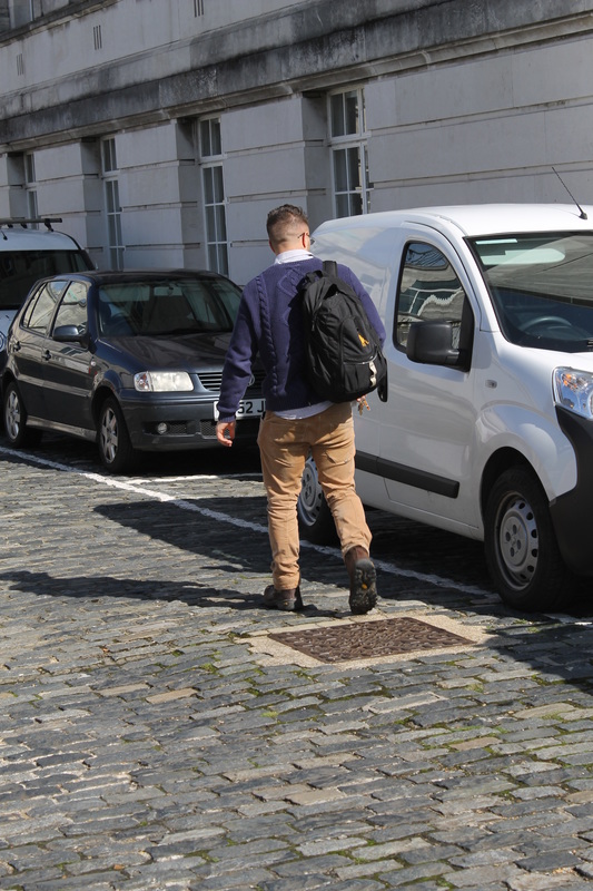
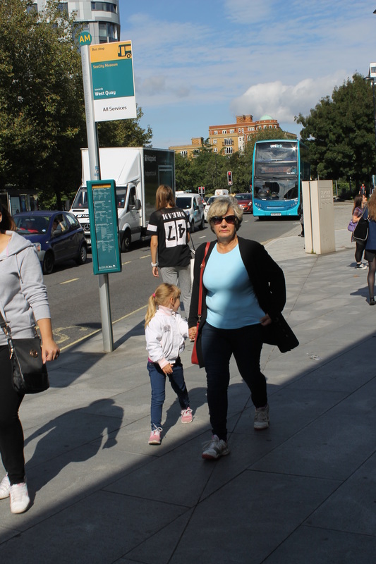
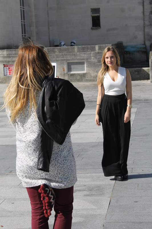
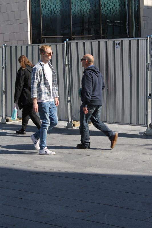
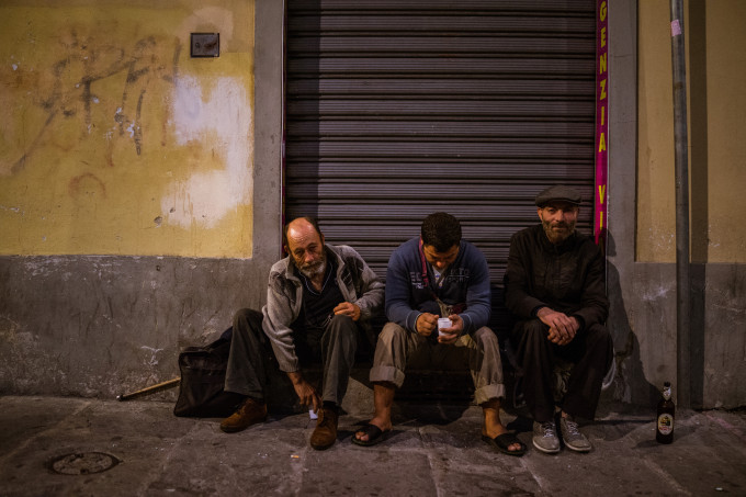
Urban Photography is a popular form of Photography and opens up many opportunities in the world of photography, there are many photographers who's work is based around Urban and Street Photography. I feel that its one of the best forms of Photography due to its wide range of things to cover, its also an easier form to do as you can take photographs all around you.
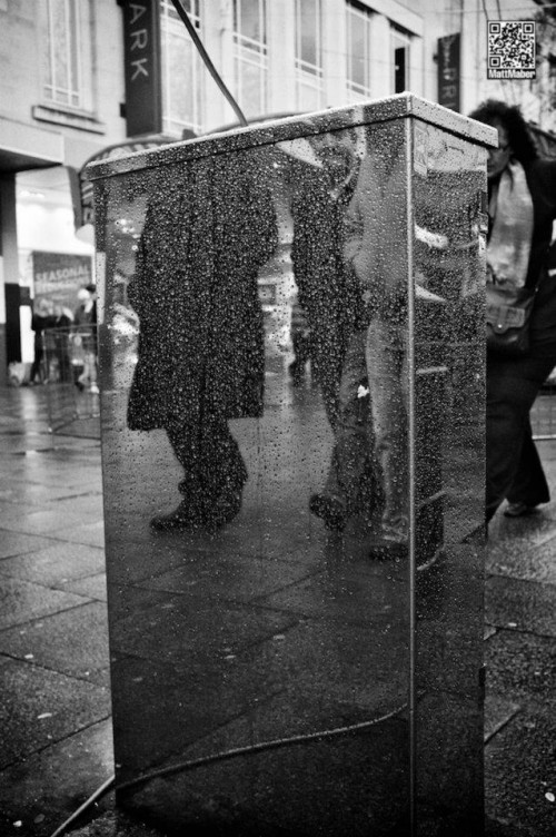
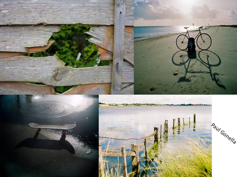
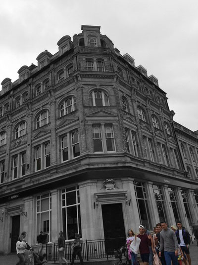
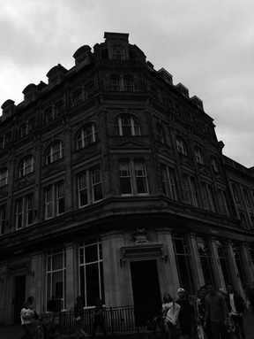
Paul Gonella
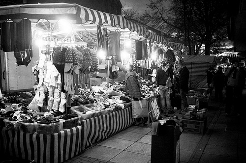
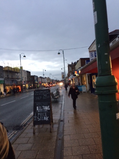
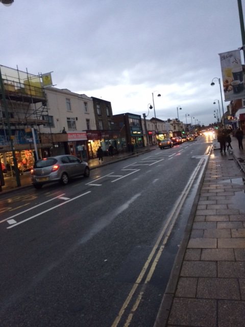
Paul Gonella is a local photographer who is based in Southampton and Portsmouth, he specialises in Street Photography, Film Photography and Wedding Photography. He started doing photography as a hobbie and over the years has progressed and found his unique style, he has worked for numerous companys both local and national. Currently, he is exceeding in wedding photography and film photography, he takes stunning photos that are unique. He is well known for his street photography within Southampton and Portsmouth. He focuses on the natural street life and the daily life of the city, he uses a range of composition and angles, which creates a different style of street photography.
Paul runs a website called 'Quiet Corners' alongside other photographers, they specialise on the quiet local areas that usually we wouldn't go too or think of as being a photographic place.
Paul runs a website called 'Quiet Corners' alongside other photographers, they specialise on the quiet local areas that usually we wouldn't go too or think of as being a photographic place.

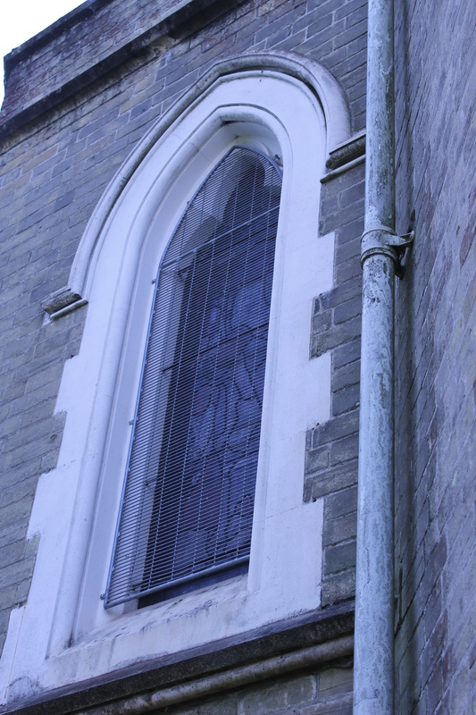
Picture Observation
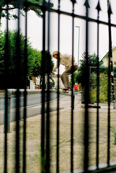
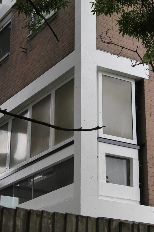
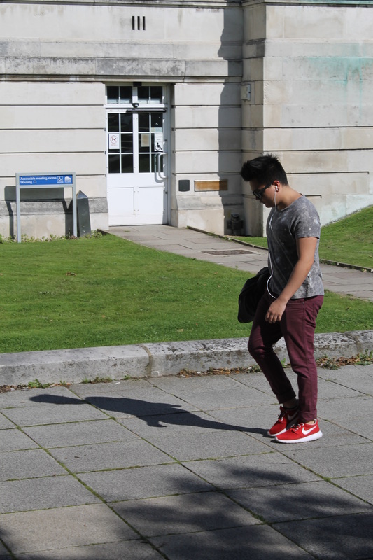
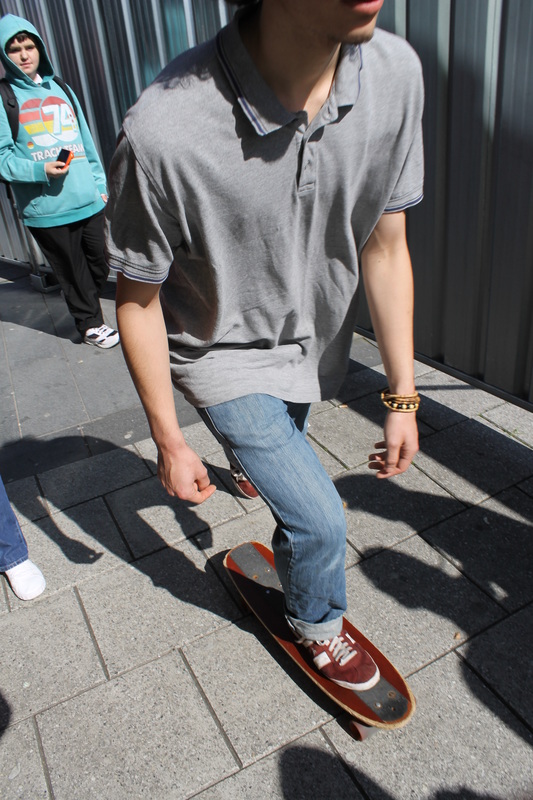
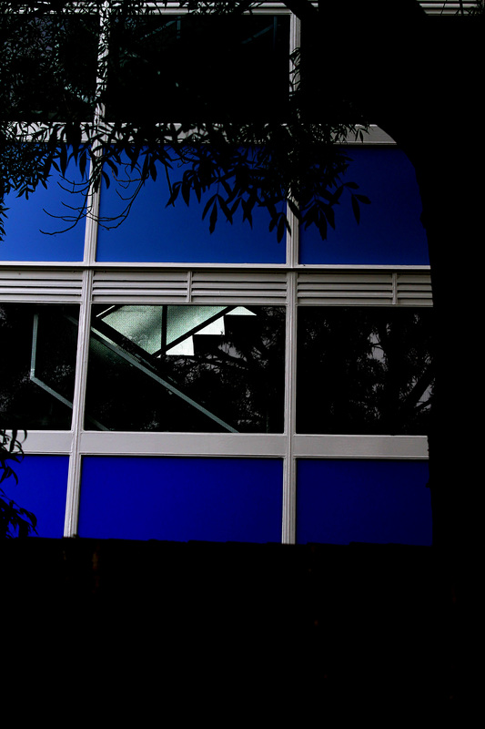
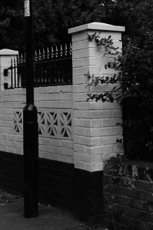
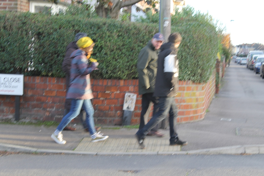
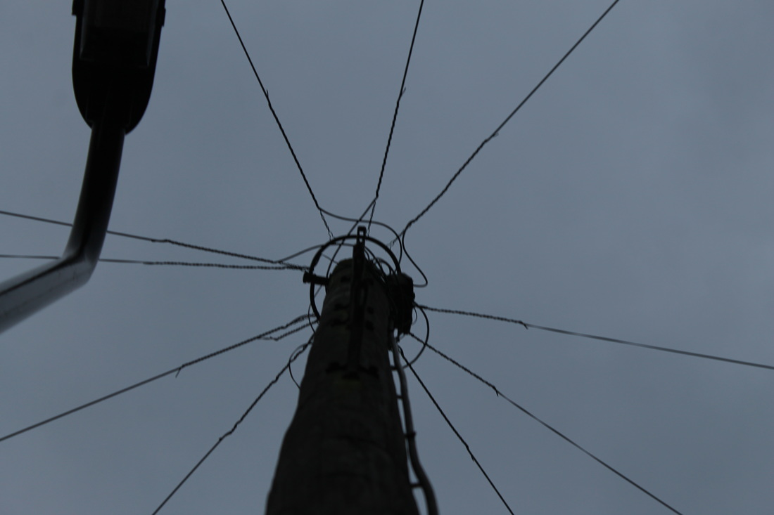
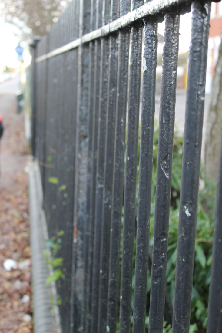
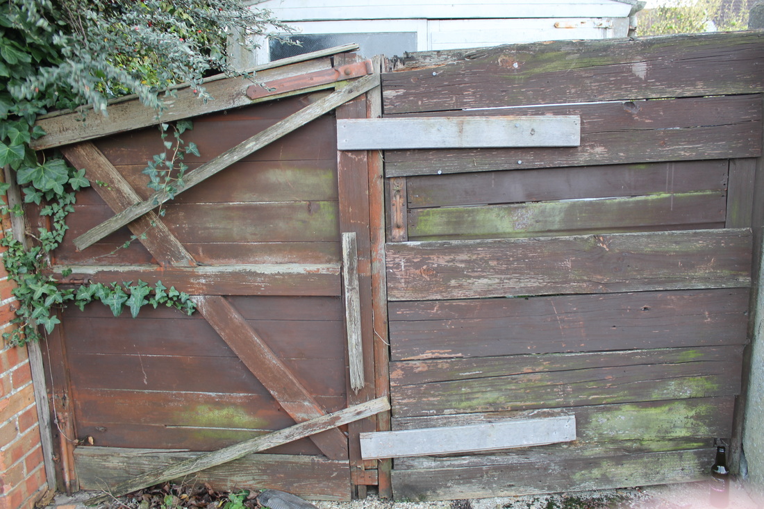
I was drawn to this photograph by Paul Gonella due to its complexity and angle. The focus point of the photograph is the skater riding on the pole in the middle of the street; I like that the photograph was taken most likely without the man knowing. This photo stood out to me because of the blurred out railings that cover the photograph, I like the simplicity of the lines and how it doesn't take away the focal point. The basic natural light gives the photograph the depth and this means no editing is required, the low angle gives the viewer a different perception of street photography.
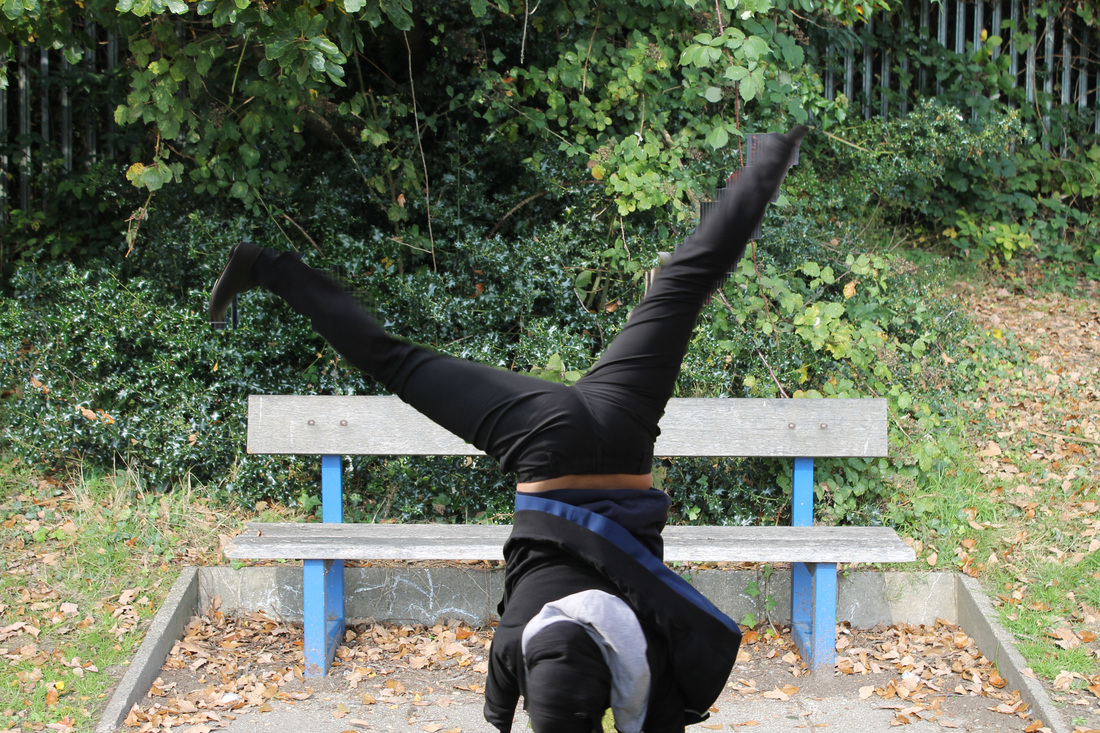
Photoshoot 1: Paul Gonella Interpretation
My personal favourites...
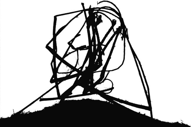
Abstract
|
|
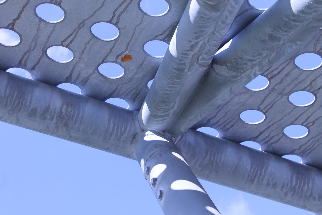
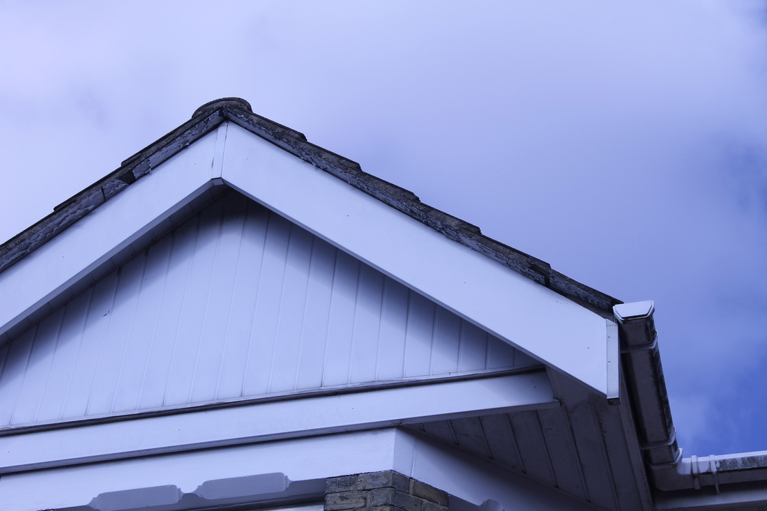
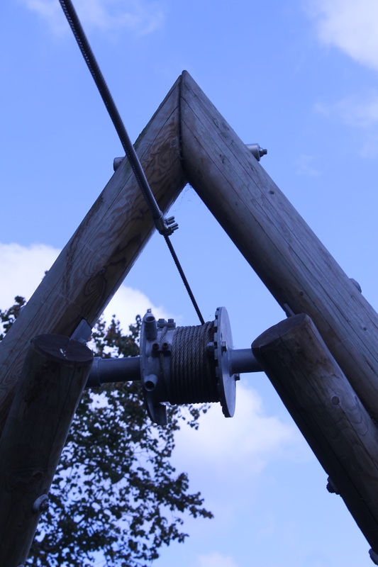
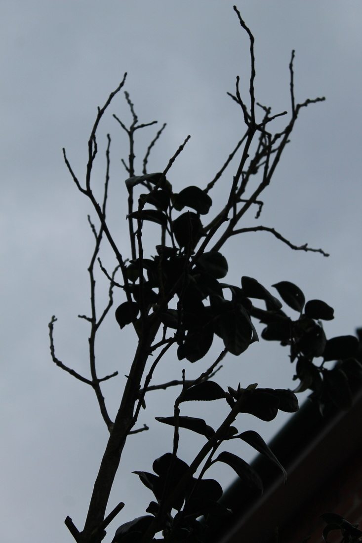
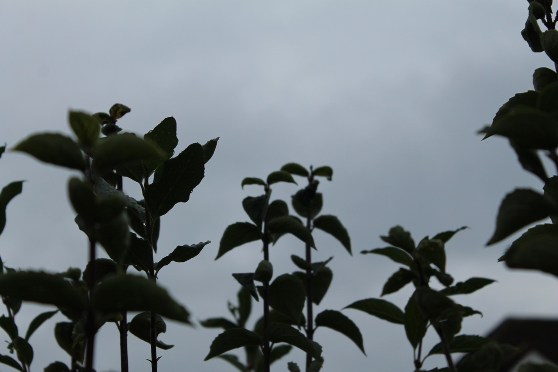
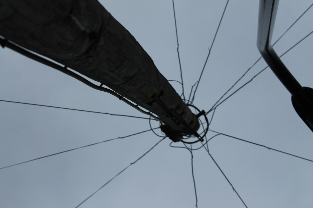
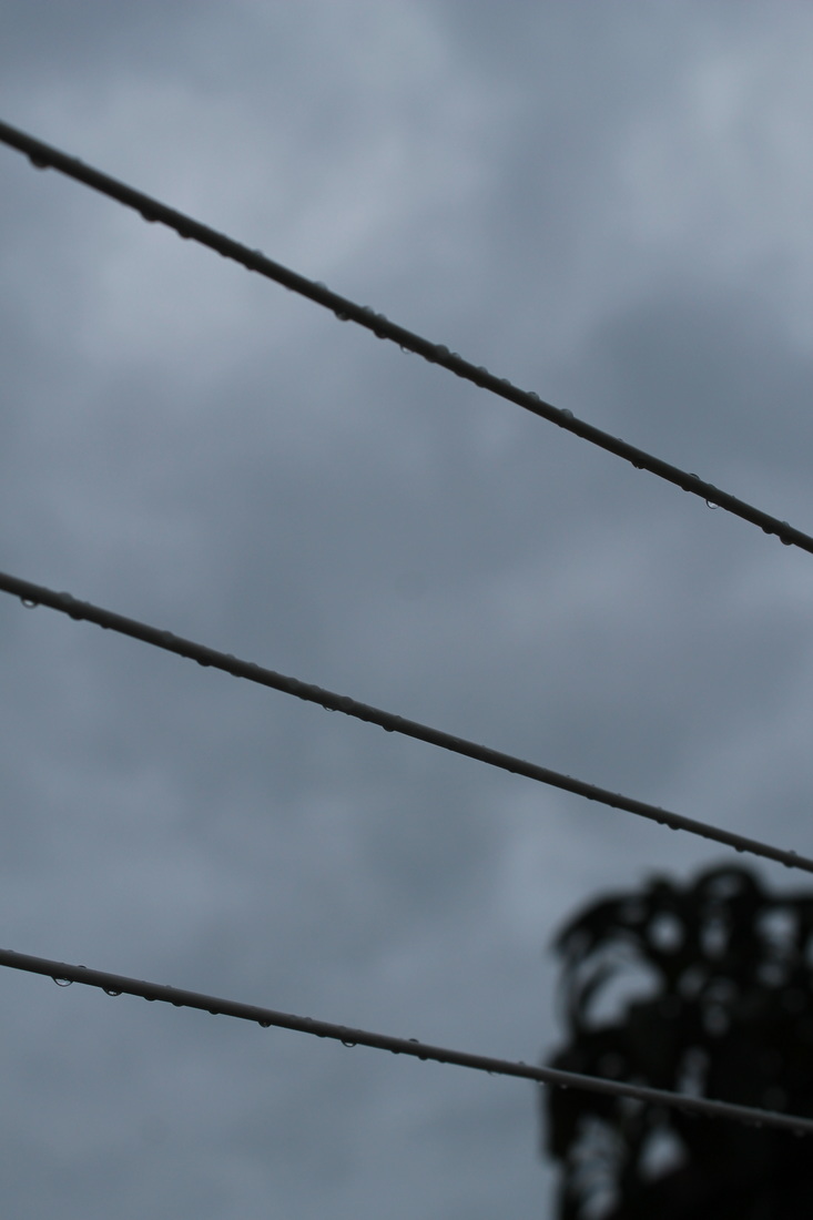
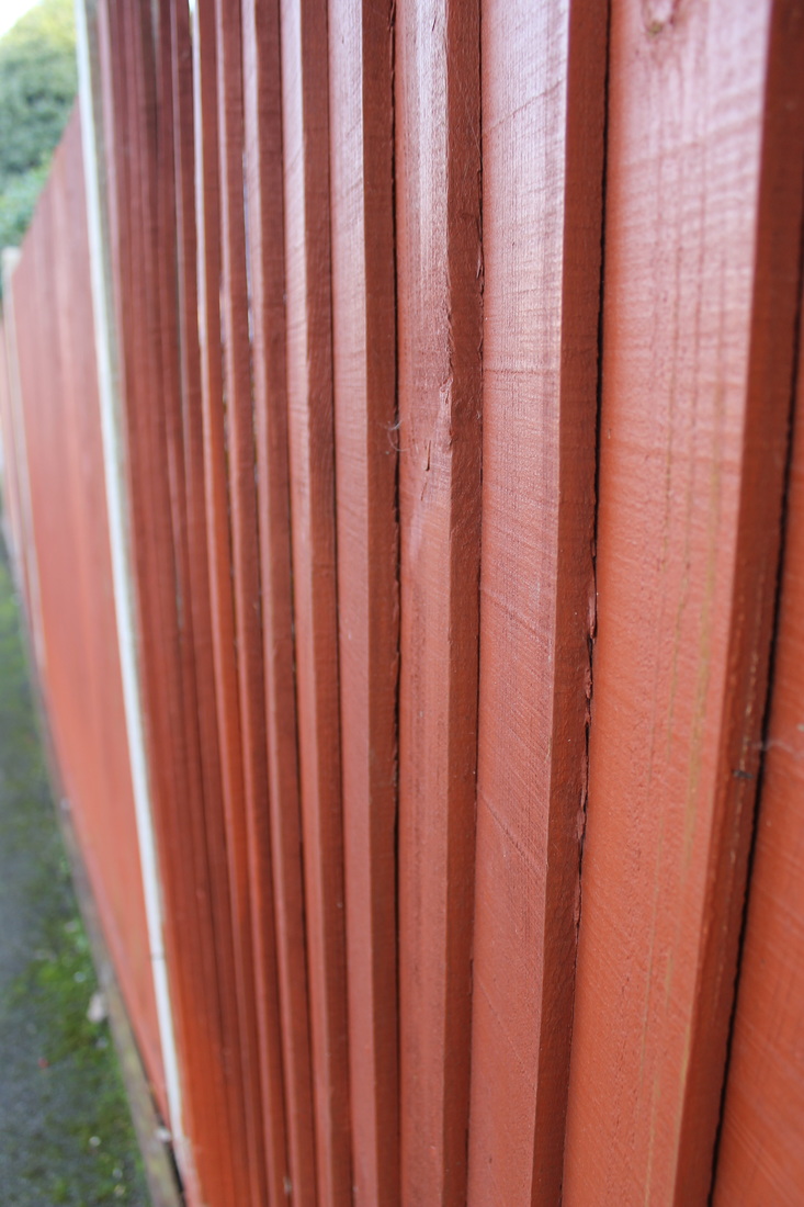
Photoshoot 2- Abstract


My Personal Favourites...
|
I feel that these two photographs of mine are my favourites due the bold shapes and edges they have, also the angle I took them at make them more significant compared tot the others,
|
|
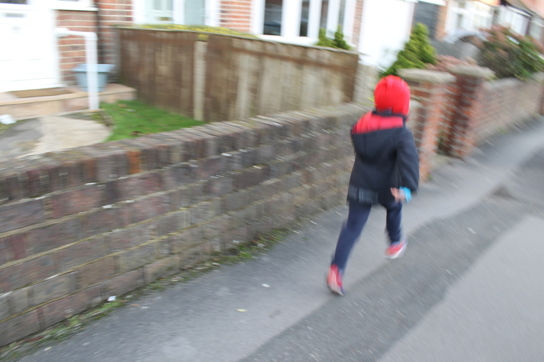
Capturing the Moment
Photoshoot 3- Capturing a moment

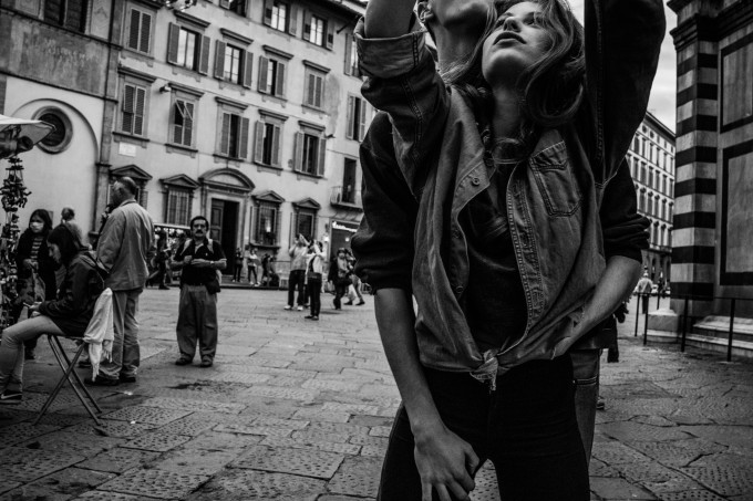
Some of these photographs were influenced by Paul Gonellas work including the beach photos; I feel that Gonellas work fits in well with the Capturing The Moment category; as his work is based on natural settings and none of his work is posed.
Developing my ideas-Edits
Repetition
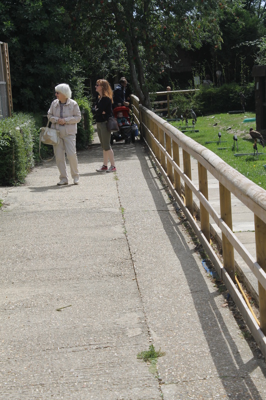
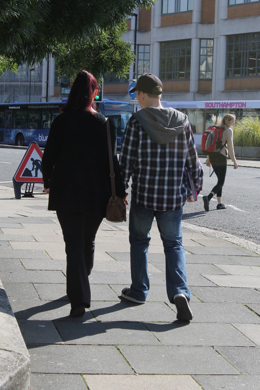
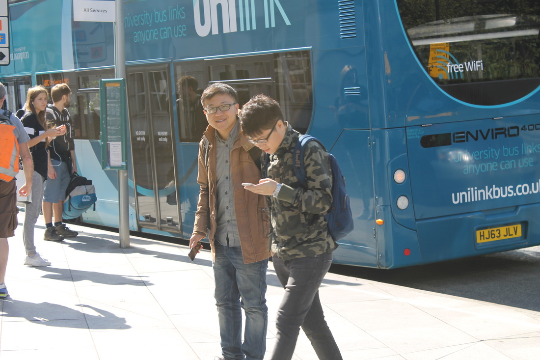
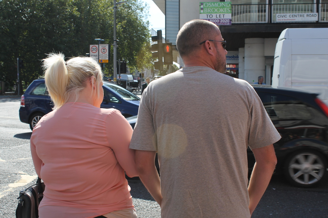
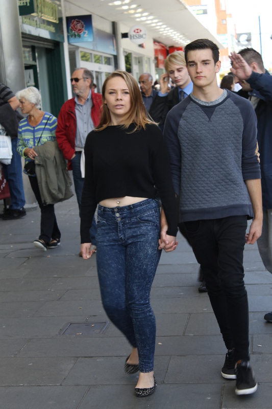
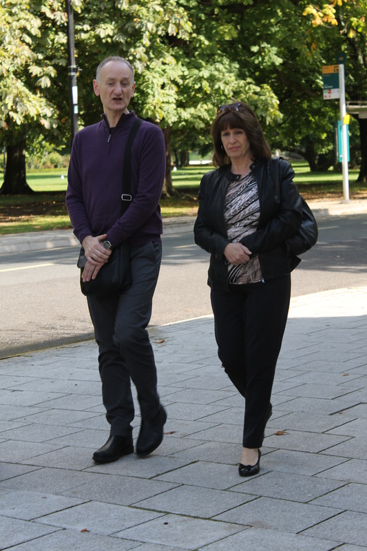
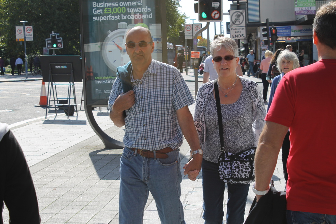
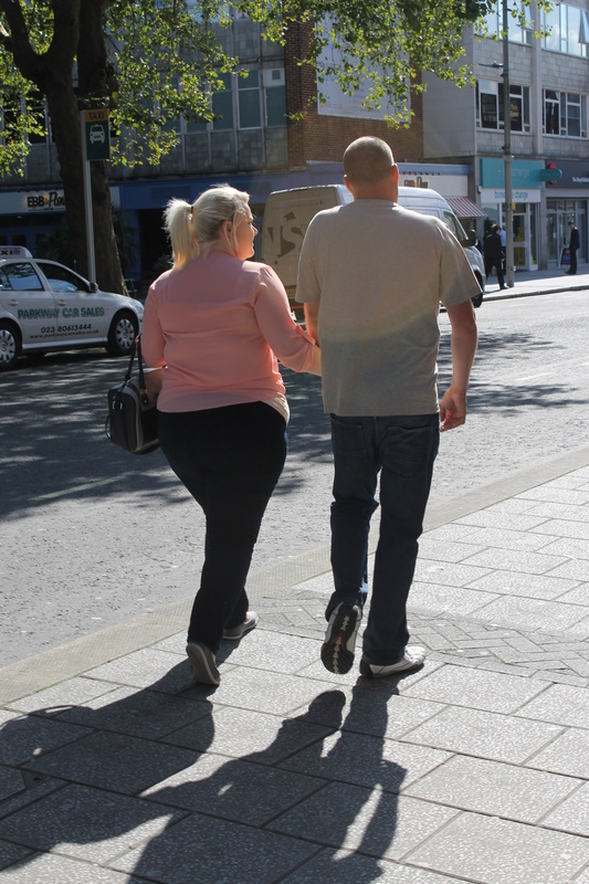
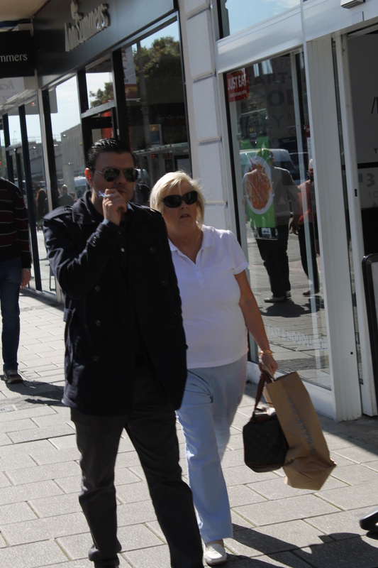
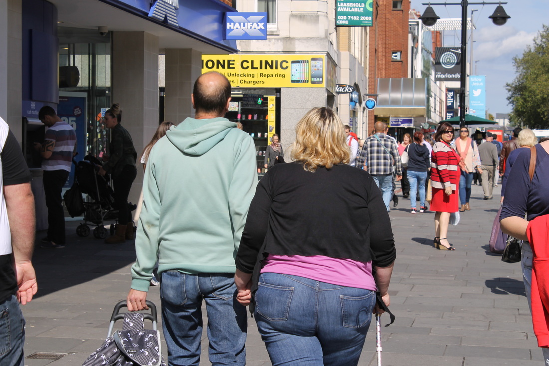
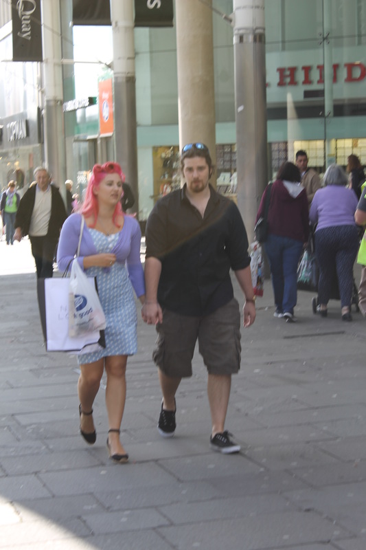
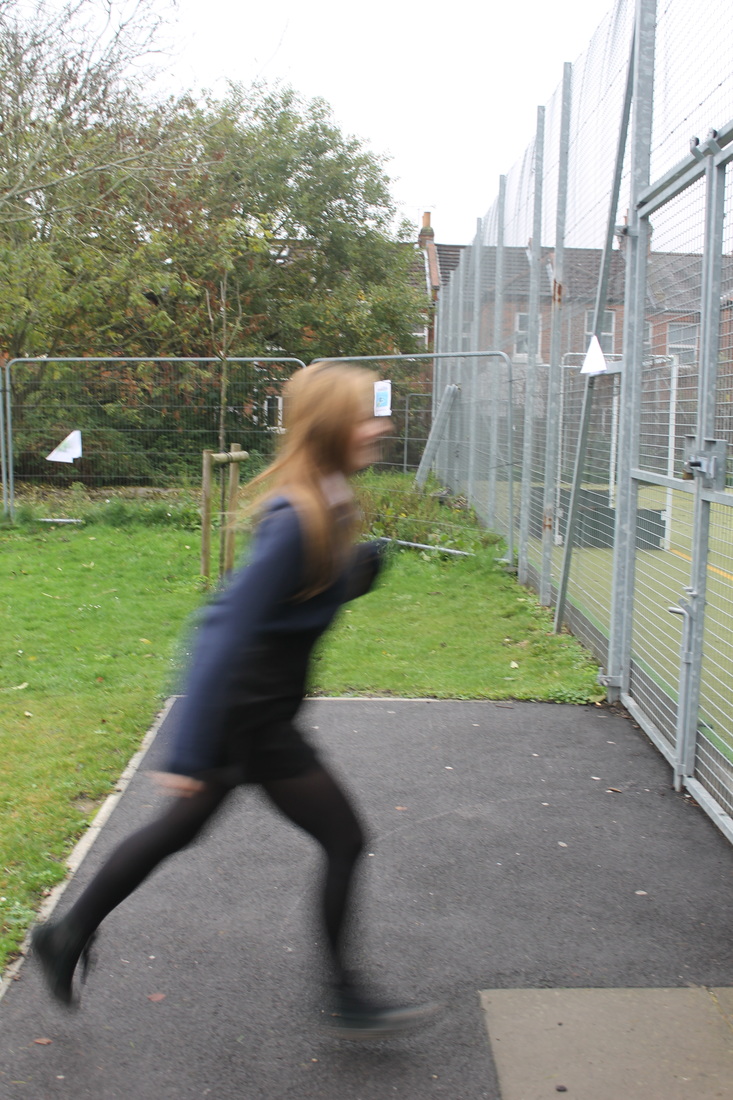
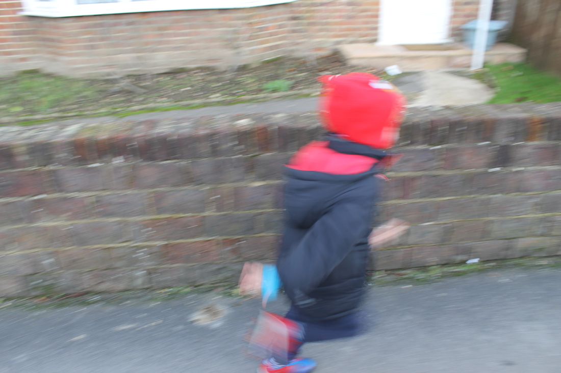
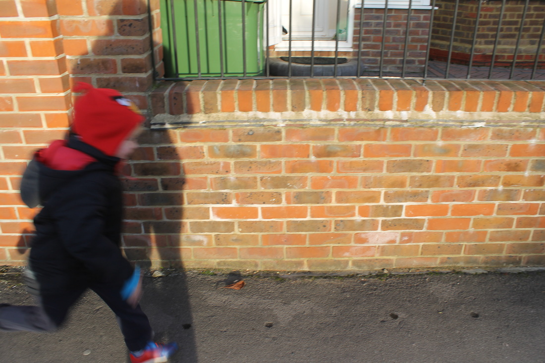
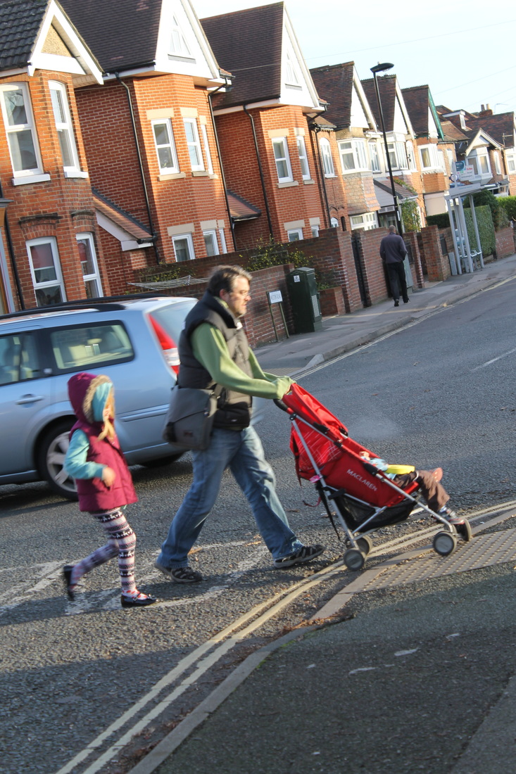
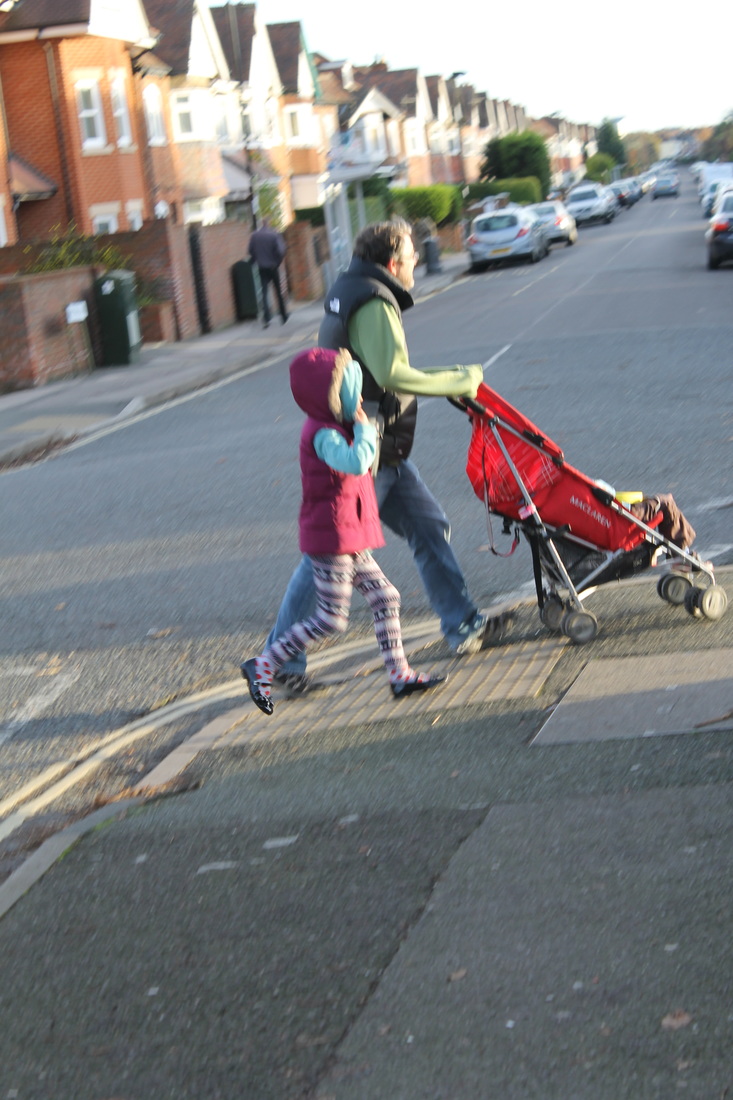
My idea for my repetition section of Street Photography is influenced by relationships. I chose to do this topic because relationships are all around us on the streets, whether its romantic or friendship. Relationships occur in families and in daily life on the streets.
I have been influenced by a street photographer called Danny Schaefer, he started from a young age doing street photography, and one of his topics is relationships.
I have been influenced by a street photographer called Danny Schaefer, he started from a young age doing street photography, and one of his topics is relationships.
My Intepretation
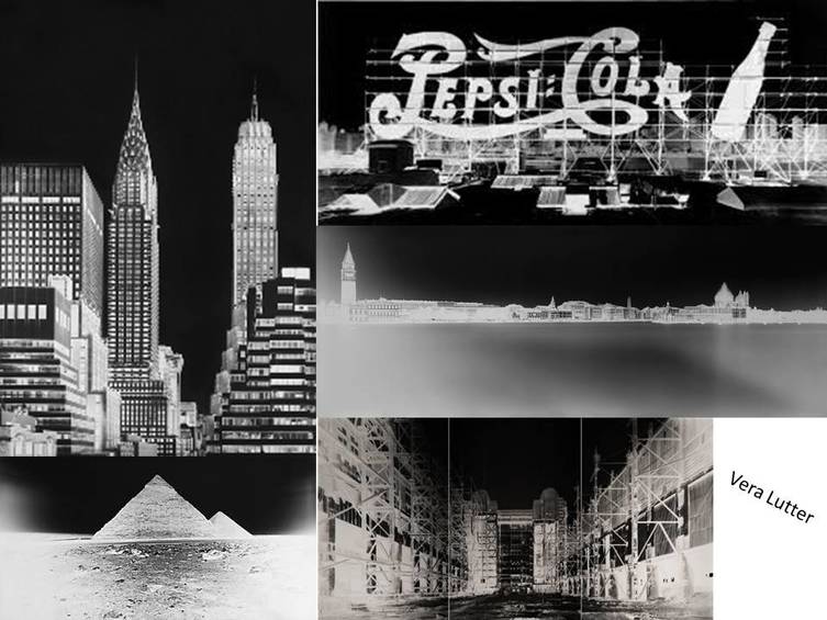
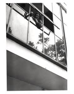
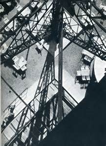
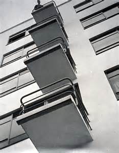
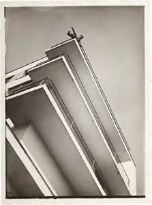
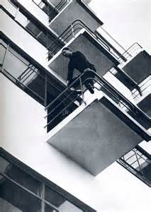
Moholy Nagy
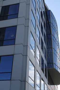
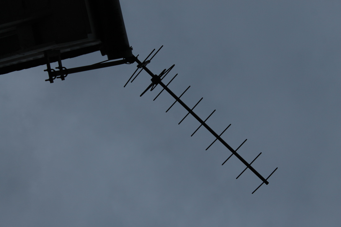
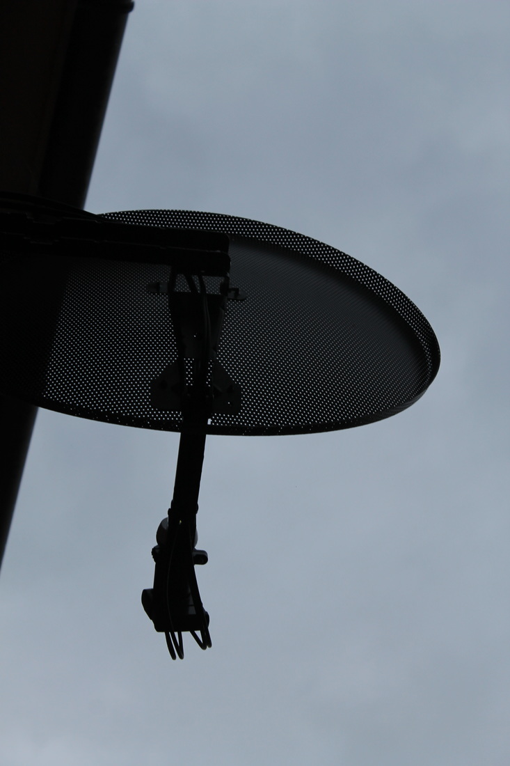
Moholy Nagy was a Hungarian Photographer and Painter and also a professor. He is best known for his unusual angled photographs of buildings and construction. His work is highly influenced by constructivism and the integration of arts and technology. In my opinion his work isn't my favourite but I understand his work, I like the 'up above' angles within his work; that attracts a new form of Urban Street Photography.

My Interpretation

Refining My Ideas
To further my search into Moholy Nagys work I decided to edit my photos to make them similar to his work. I used a range of tools on photoshop including curve tool, levels tool, adjusting the brightness and contrast and inverting the colours.
My Edits using Photoshop
I edited two of my original photos in the style of Moholy Nagy's work, I followed a step to step guide in order for me to complete these edits. I decided not to make any other adjustments in terms of contrast or saturation; as didn't want to distract from the bright clouds in the photograph.
How I created my edits...
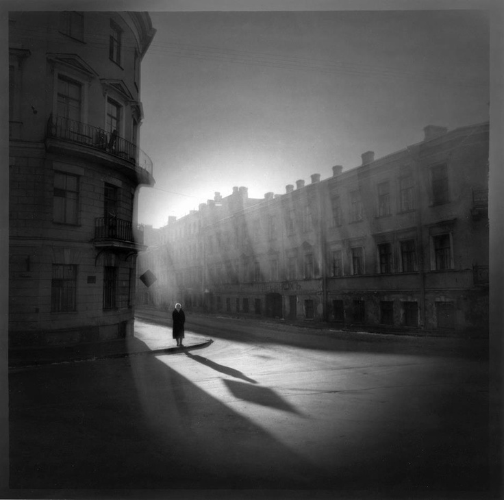
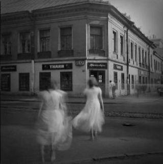
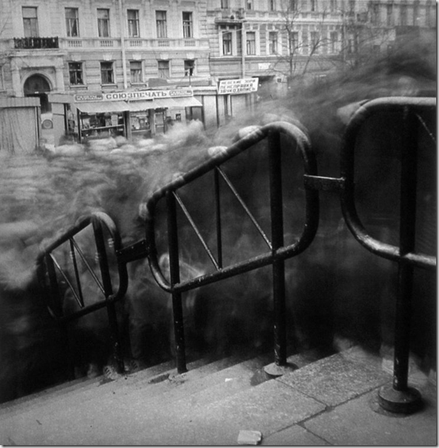
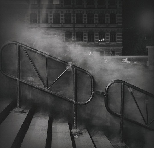
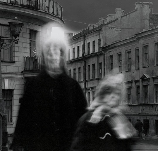
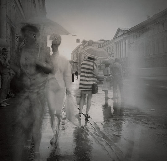
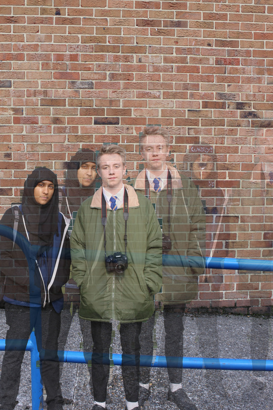
Alexey Titarenko
Alexey Titarenko is a Russian American photographer who is well known for his eerie ghost photography that inspires. He graduated from the Department of Photographic Art and Cinematic at the institute of Culture in 1983, after graduating and the Soviet Union had passed over Russia; he then produced several series' of photographs representing the conditions of the Russian civilians during the 20th century. During the series he created powerful photographs due to his use of long exposure and intentional camera movement that entered him into the world of Street Photography.
His most famous photographic series is 'City of the Shadows', its well known for it's unusual yet interesting ghost effects. I personally love his work on 'City of the Shadows' is amazing and the individuality and quality of his work memorises me.
His most famous photographic series is 'City of the Shadows', its well known for it's unusual yet interesting ghost effects. I personally love his work on 'City of the Shadows' is amazing and the individuality and quality of his work memorises me.
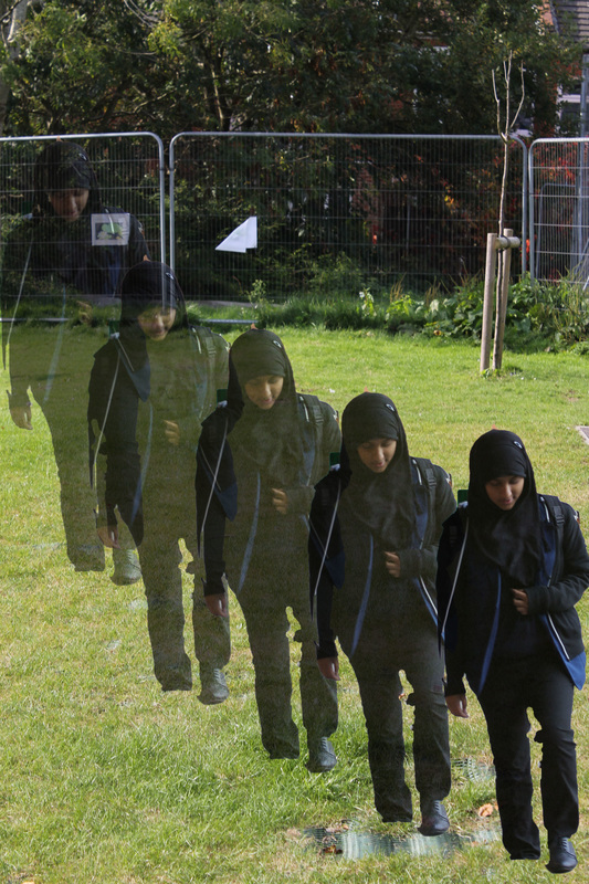
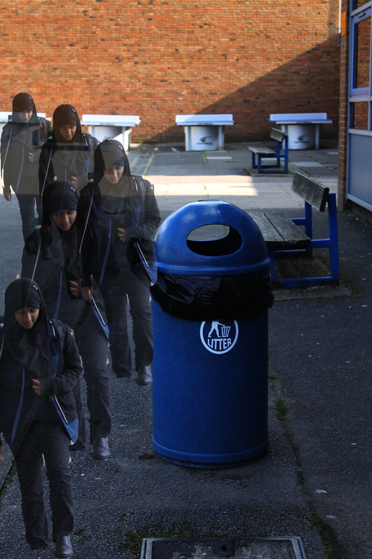
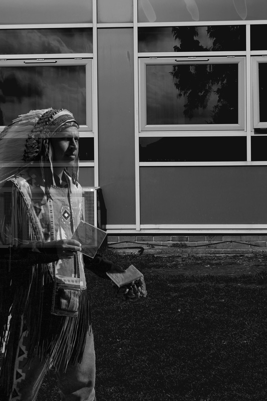
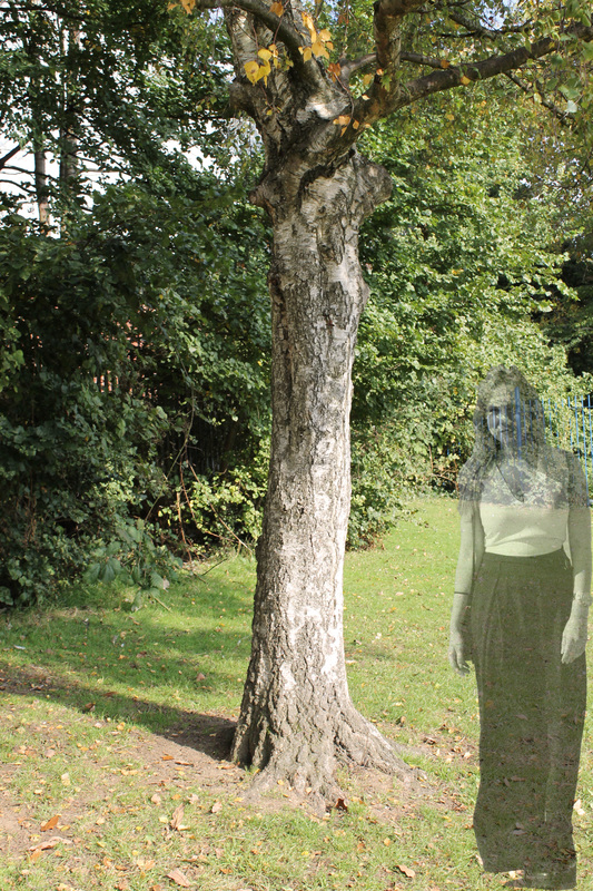
Ghosting Edits Inspired by Titarenko
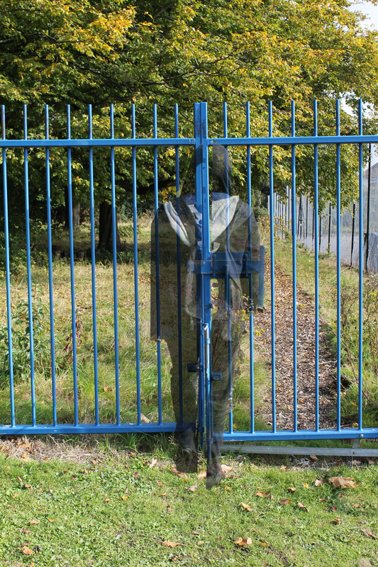
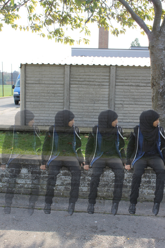
Additional Edits Inspired by Alexey Titarenko
For these edits I followed the ordinary step by step instructions but furthered the editing on by adding a 'Black and White Filter' onto the background and first layer, I then experimented with the 'Curve Tool' to add a textured look to the photograph. On the first layer I reduced the opacity, and continued to experiment with the 'Curve Tool' in order to get to my desired effect.
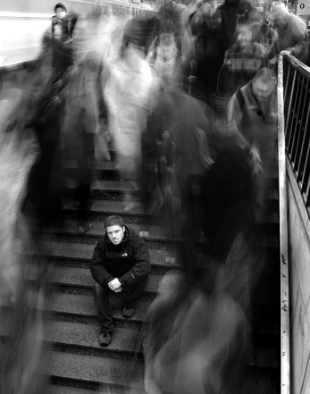
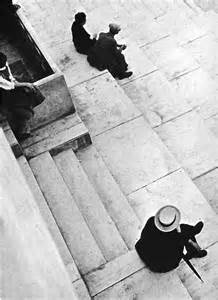
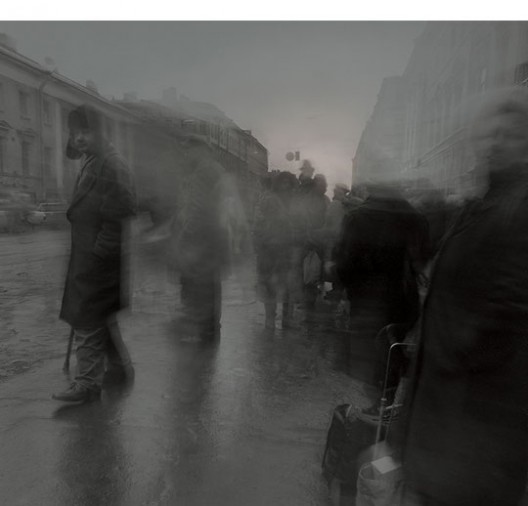
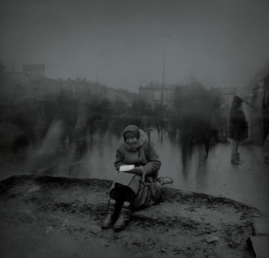
I think this photograph by Alexey Titarenko is interpreting 'loneliness and depression'. In my mind the man who is sitting on the steps is feeling like an outcast; and Titarenko has chosen to make him more apparent in order to make him stand out.
My Interpretation


Keld Helmer Peterson
Keld Helmer Peterson was a Danish Urban Photographer who achieved an International breakthrough after publishing 122 photographs in colour, inspired by Albert Renger-Patzsch. After completing a years study at the Art Institute of Chicago in 1950 he then found his true profession, photography. He is known for his famous shape form of Urban Photography, which is mostly in 'black and white'; it consists of lots of lines and unusual shapes. In my opinion I find his work abstract and unique, I like the contrast of colours and shapes that created magnificent photographs.

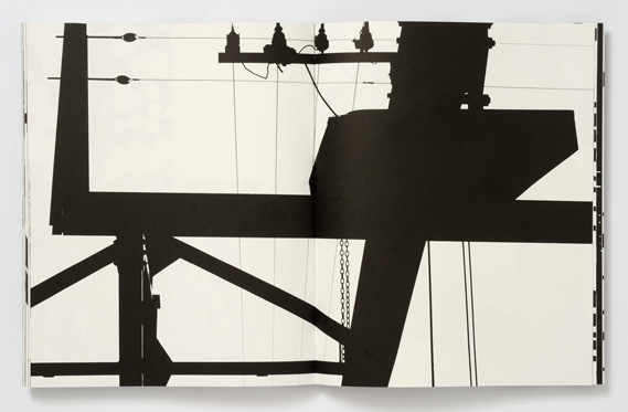
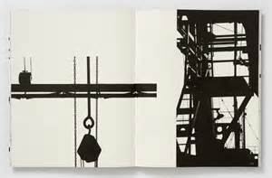
I think this is my favourite piece of Peterson's work due to its urban feel to it and the contrast between the black and the white. It looks like a port within Southampton for example, which I think I could maybe recreate. It looks like it is a photograph taken of mechanical machinery or a construction site.
My Interpretation
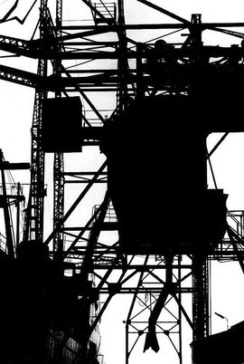
I took 20+ photographs in the style of Keld Helm Peterson and I will them edit them to make them even more similar to his work. I thought the cloudy and muggy background in these photos add to the effect and will therefore make it easier to edit. Even though I don't have industrial photos I think I have captured the bold lines and shapes just like Peterson had.
Editing in the style of Keld Helm Peterson
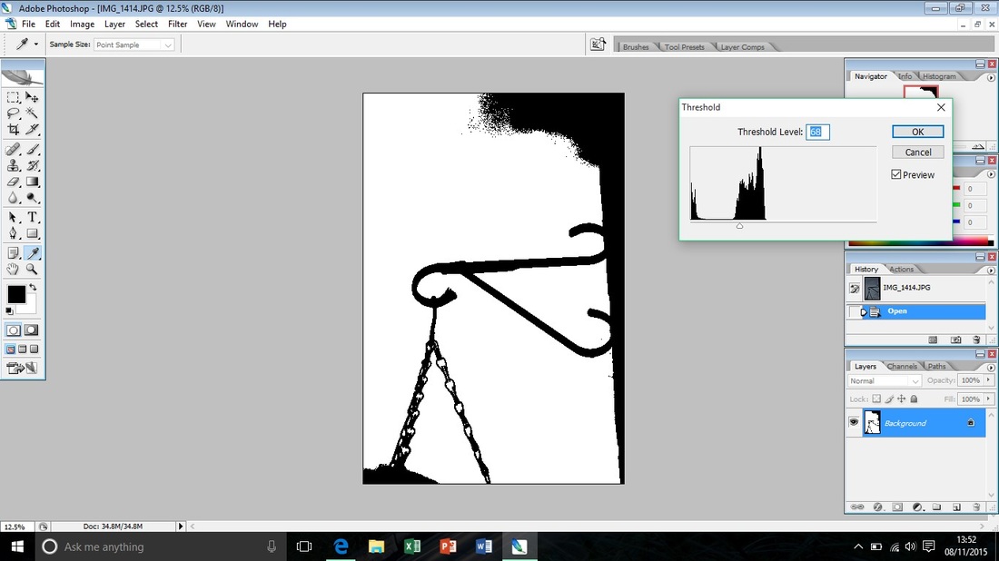
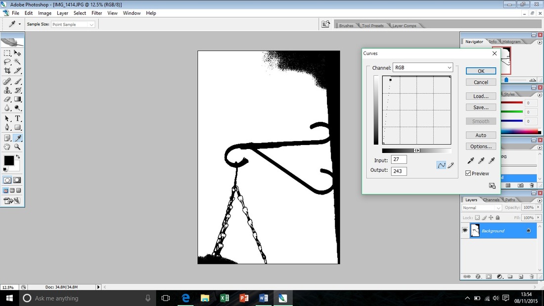
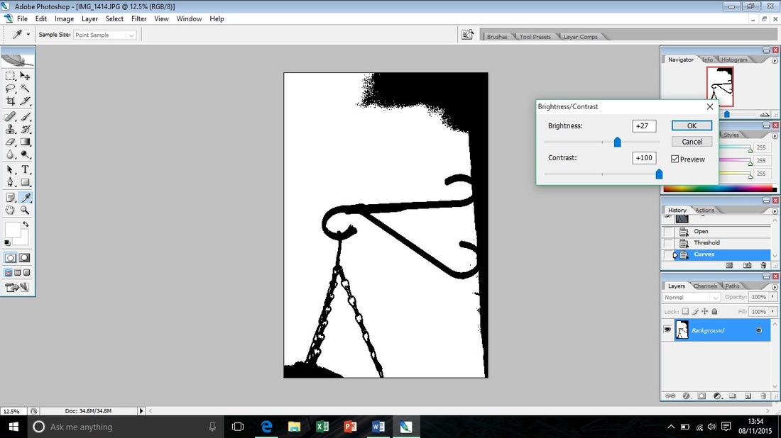
I decided to edit my photographs on Photoshop, I adjusted the threshold to make the contrast of black and white, I then used the 'Curve tool' to define the contrasting colours- and lastly I increased the brightness in order to make the white whiter and finally increased the 'contrast' up to +100 to make the contrasting more apparent.
Design Development in preparation for my Final Piece
My initial idea for my final piece is to have a photo that is edited on photoshop with layers, black and white in order to represent the tragedies of war and conflict that effect the streets every day around the world. The Paris Attacks sparked this idea and I wanted to send a powerful message through my final piece.
Photoshoot...

Photoshoot...


Background Development...
As one of my backgrounds I decided to have it darker with a section of the photo in colour to represent the small light of life left after war has hit a city. Once I had added the ' black and white' effect onto the photo I then used the 'curve tool' to darken the background.
As another part of my background I was going to do the same as the previous edit but I found that the original section of the photo didn't look realistic.

So I then decided to do a simple background in the style of Alexey Titarenko, I feel that his work is the main influence for my final piece...
.
.
I feel that this will be my main background for my final piece as it looks highly similar to Tiotarenkos work... In my final piece I hope to layer my backgrounds and mirror them to create a street effect.
Composition Development...
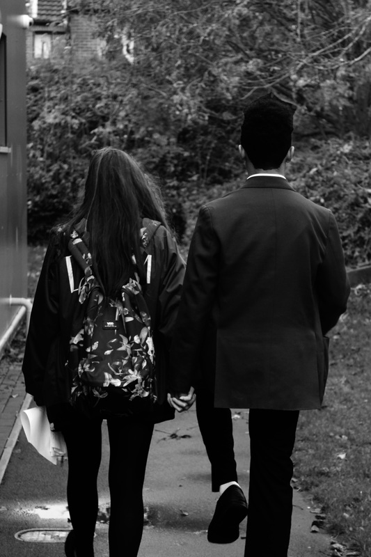
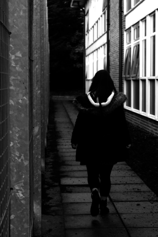
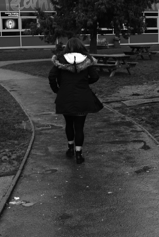
Image Development...
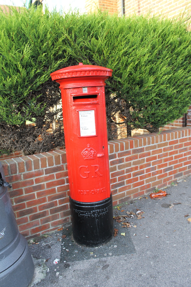
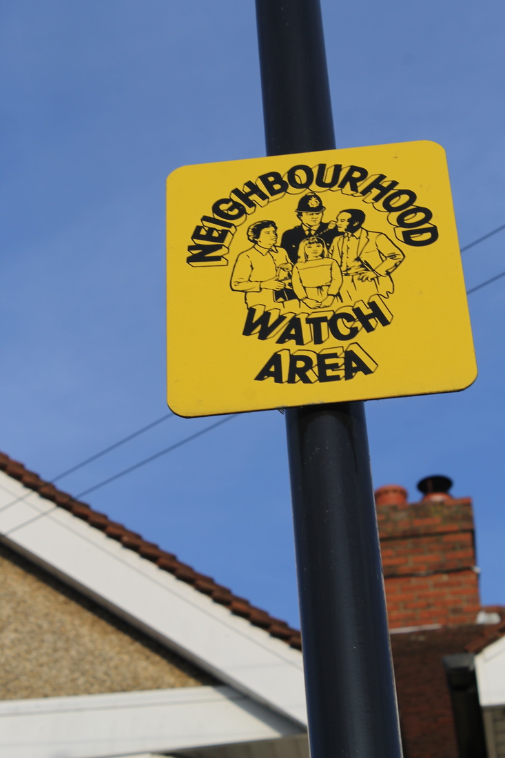
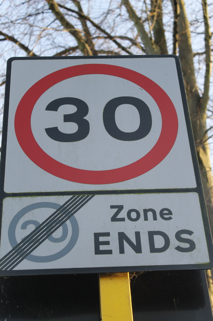
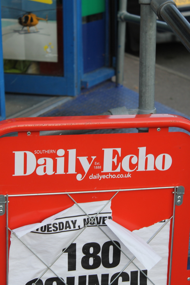
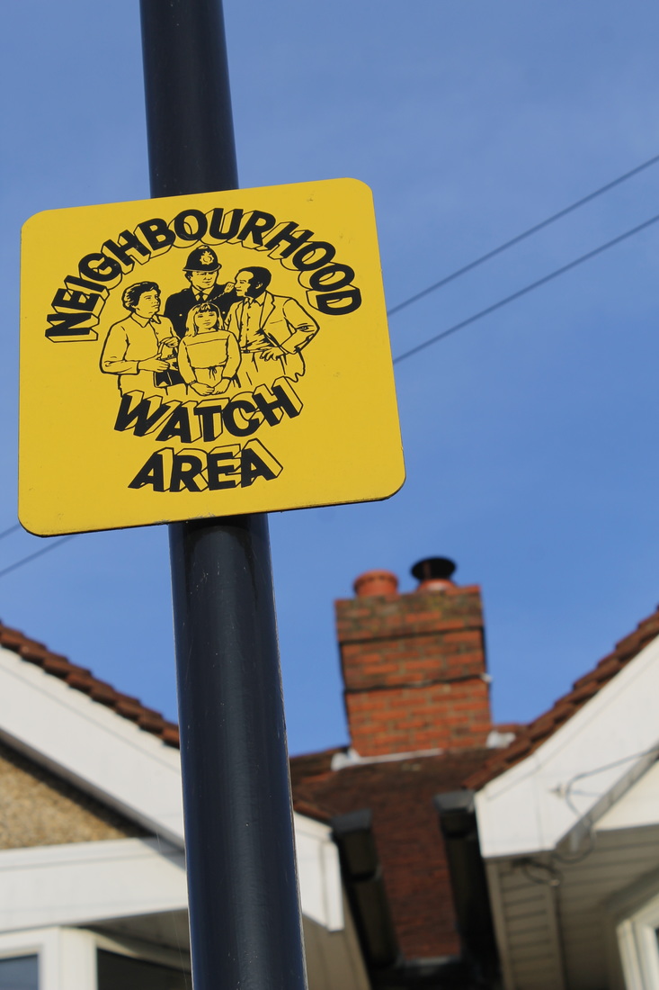
My vision for my final piece includes bold signs with vibrant colours that capture the eye, I took signs specifically for me to edit them, my inspiration for my photographs is Paul Gonella. He takes photographs of interesting daily things that are colourful and is in an everyday street.


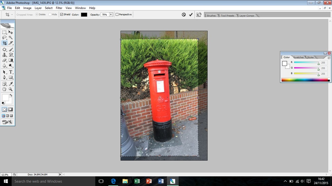
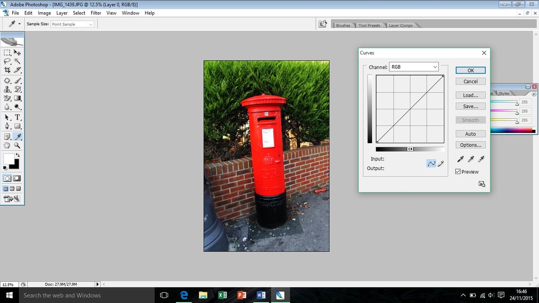
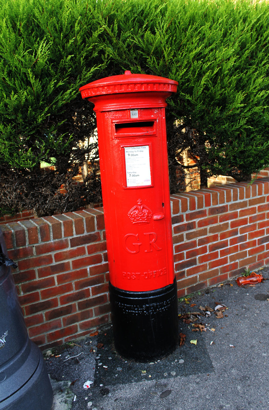
(left to right) I cropped my photograph in order to focus on the postbox, I then used the 'curve tool' to darken the background slightly; my final edit of my original photograph is more bold and attractive.
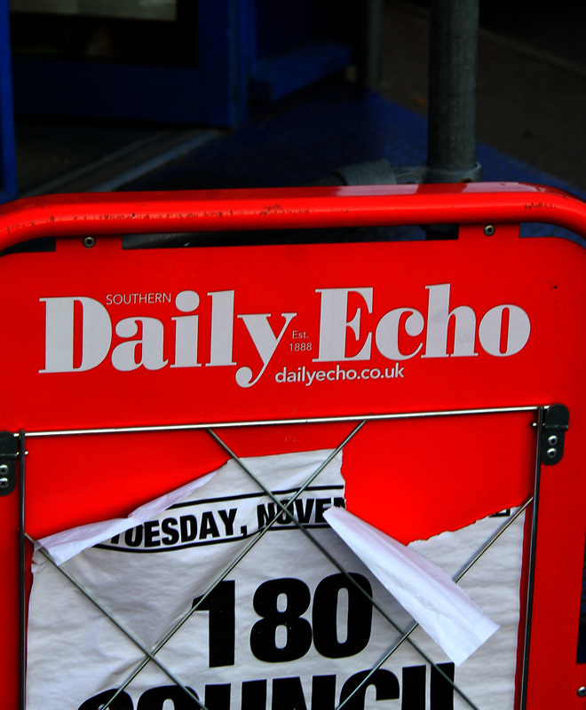
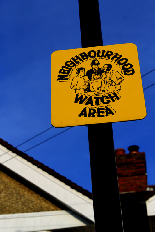
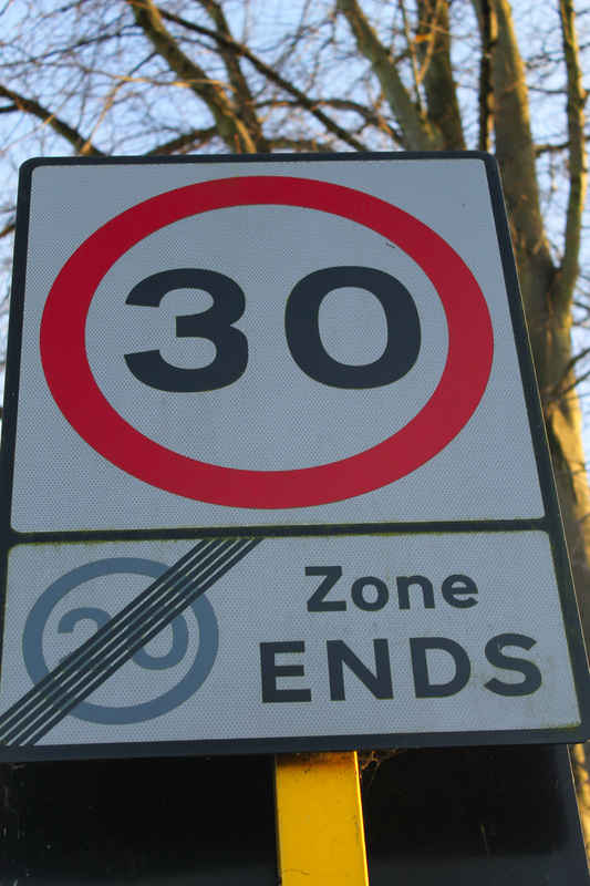
For all of these edits I cropped them, adjusted the lighting using the 'curve tool' and increased the 'colour intenisity' to emphasis the bold colours.
Change of idea...
After initially having the idea of recreating conflict in my final piece I then thought it would be difficult to create it with the same effect, so I thought of representing the relationships that people either create or depart from in the street during conflict. I feel like this will show the other positive side to conflict and the effects of the civilians effected.
Lighting Development...


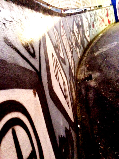
(from left to right) I edited the original photograph on the left and experimented with the light and dark; and decided that out of the two I liked the darker edit because its contrasts well with the white graffiti. I chose the darker edit due to it being similar to Alexey Titarenko; his work is tasteful and contrasting even in black and white.
Photographer Influence...
I feel that Alexey Titarenko is my main influence for my final piece as I find his work elaborates on personal stories ad all community based stories, I also like the fact that most of his work is in black and white and I find that it attracts the viewer more, I hope to create my piece in a similar style to his work but with added colour to emphasis the colourful aspect to Urban Photography. Also another influence for my final piece is the work of Danny Schaefer, his work is based on relationships in and around streets and directs his work from this and ultimately creates stunning photographs when doing so. I feel that my idea for my final piece is unique and not many people with associate relationships in the topic of Street Photography; but I hope to create a piece of work that can possibly change peoples perspective on it.
Refining my ideas- The process of completing my final piece...
Creating my background...
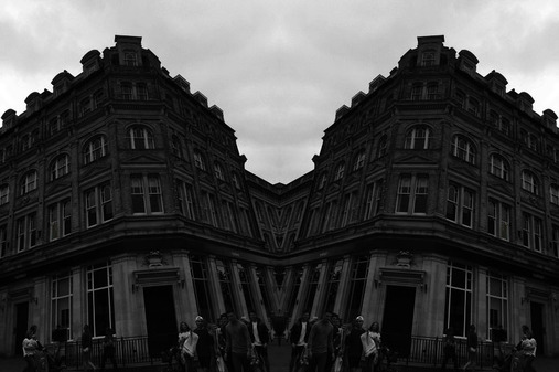
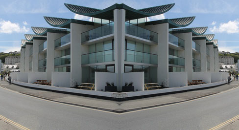
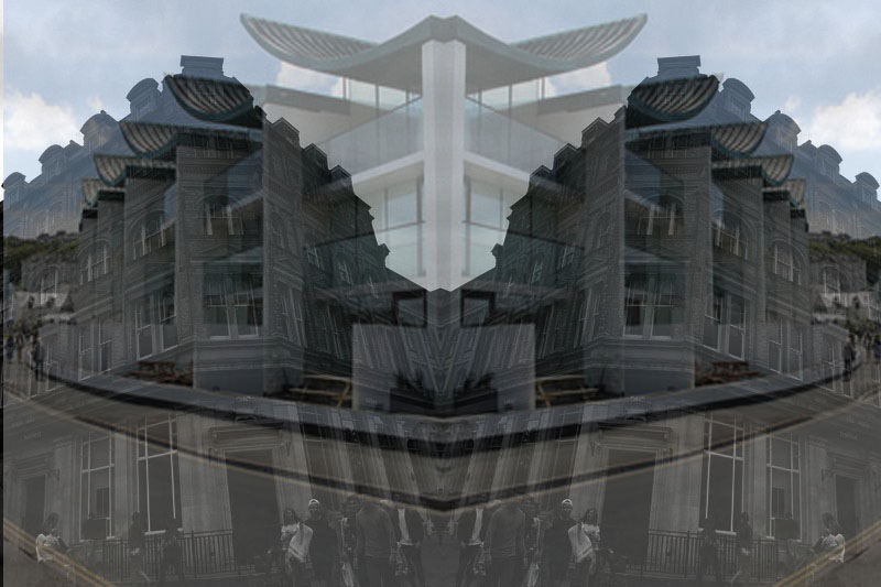
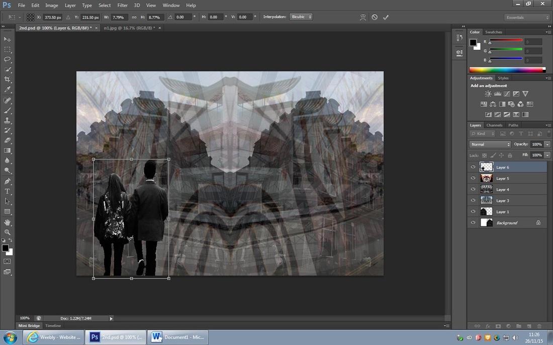
I chose to create a mirrored effect on my background because I think it will look simiair to Alexey Titarenkos work; likewise I previously edited my photograph black and white to make it even more like his work. I did this by:
Adding another layer,
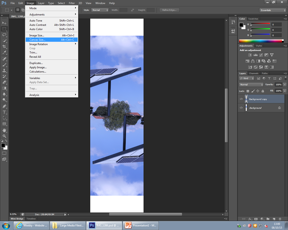
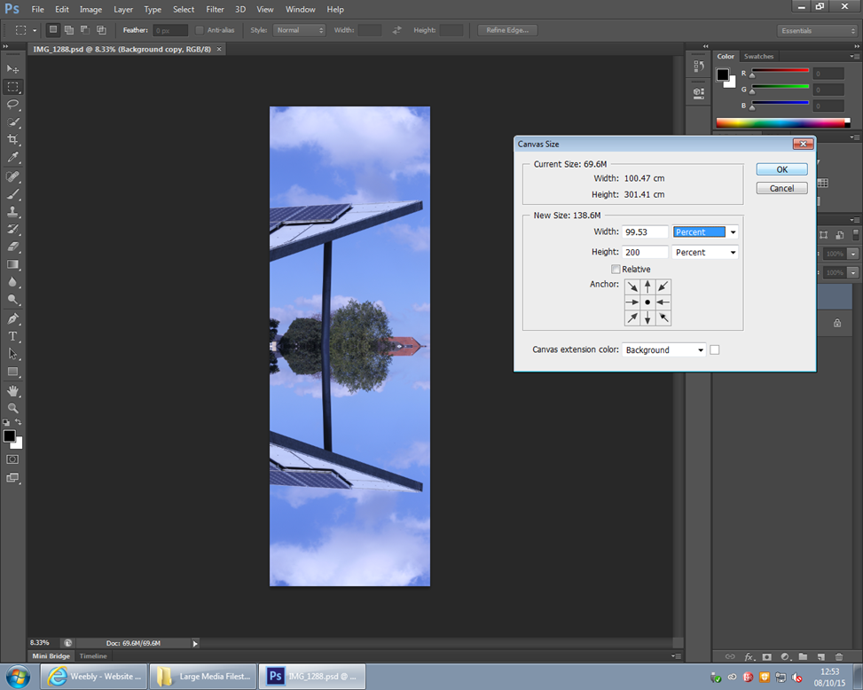
Increasing the canvas size in percent and by 200 width,
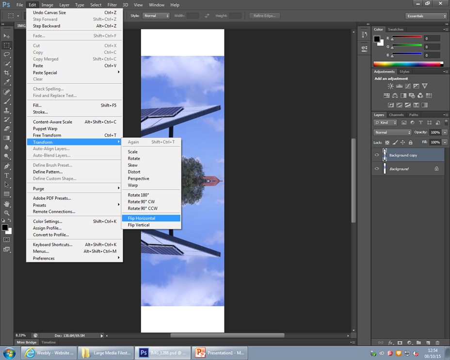
I then had the two photos side by side and then flipped the left one horizontally.
Adding another layer,
Increasing the canvas size in percent and by 200 width,
I then had the two photos side by side and then flipped the left one horizontally.
I chose to do a new photoshop skill that I had learnt in order to make my work more interesting, I really like this mirrored effect as it brings out a different perspective within an edit and overall makes the photo more interesting.
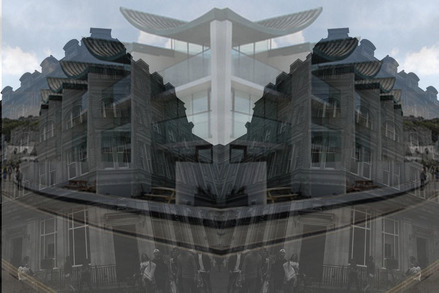
I again repeated the previous steps to create this mirrored effect that in my opinion looks better tan the original photograph,
I completed this edit by:
Adding another layer,
Increasing the canvas size in percent and by 200 width,
I then had the two photos side by side and then flipped the left one horizontally.
I completed this edit by:
Adding another layer,
Increasing the canvas size in percent and by 200 width,
I then had the two photos side by side and then flipped the left one horizontally.

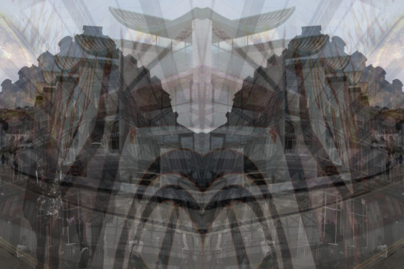
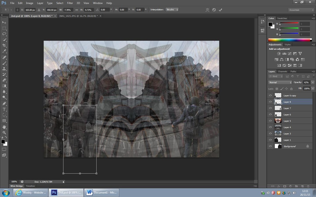
(from left to right) I used the 'select tool' to select the entire image the layer onto the first layer, I then increased the top layer to the maximum canvas size and then decreased the opacity by 45%; I used the 'opacity' tool to create a neat layer effect in the style of Titarenko.
This was the final outcome of the editing process and I really like the way its turned out; I like the opacity of the first layer and the interesting shapes and edges it created, I thought it was an interesting comparison of the two photographs yet they worked well together.
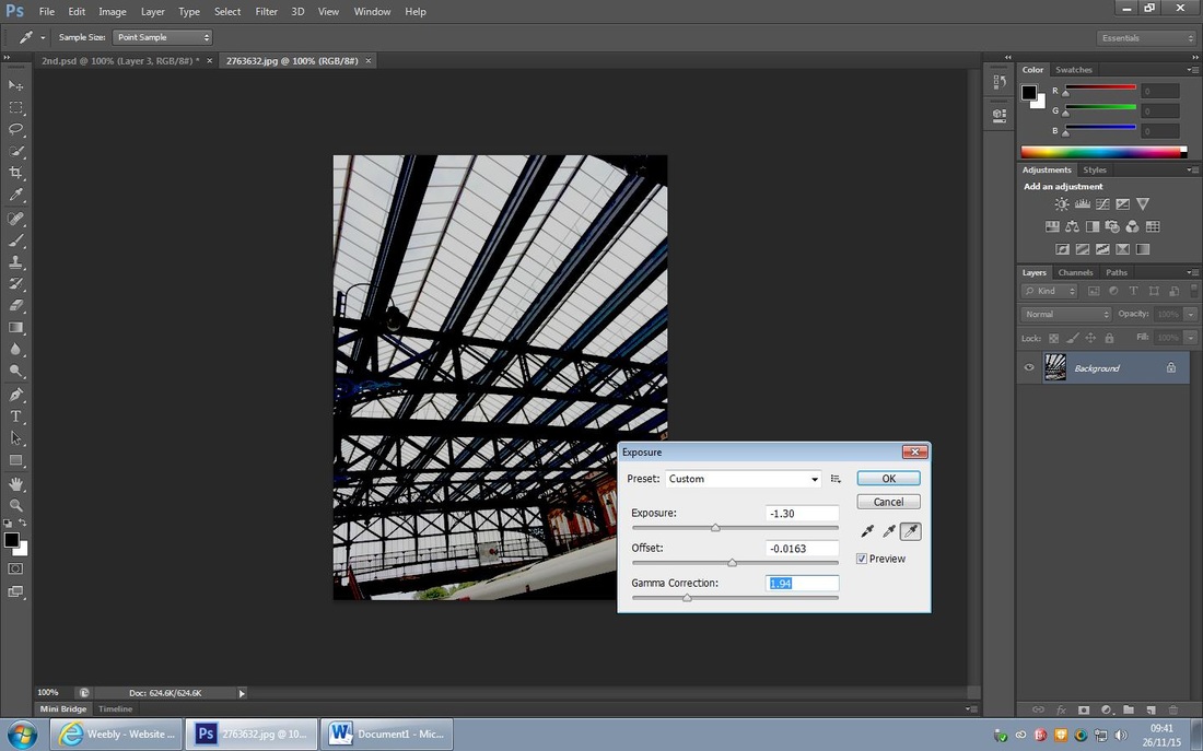
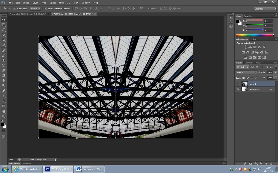
I decided to add another layer to my background I felt that I wanted it to have abstract shapes and lined within it that again contrast with the other layers. I firstly edited the image by increasing the ''gramma corection', exposure and then decreasing the offset, I did this to experiment with the contrasting lines in the photograph and really emphasis the contrast. I then followed the same editing process as the previous and I did this by:
Adding another layer,
Increasing the canvas size in percent and by 200 width,
I then had the two photos side by side and then flipped the left one horizontally.
Adding another layer,
Increasing the canvas size in percent and by 200 width,
I then had the two photos side by side and then flipped the left one horizontally.
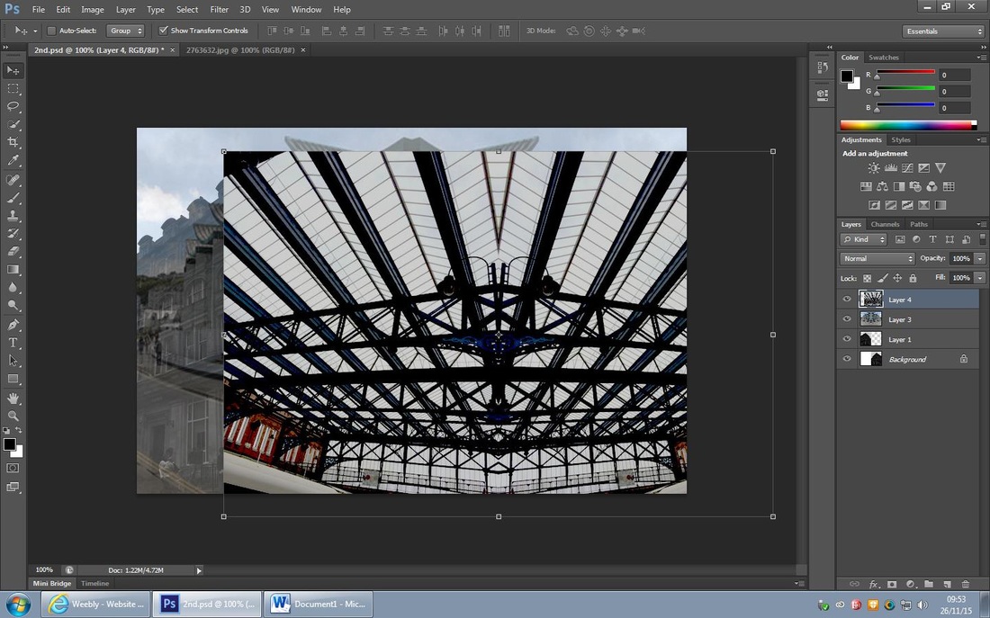
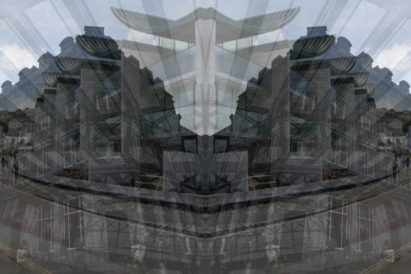
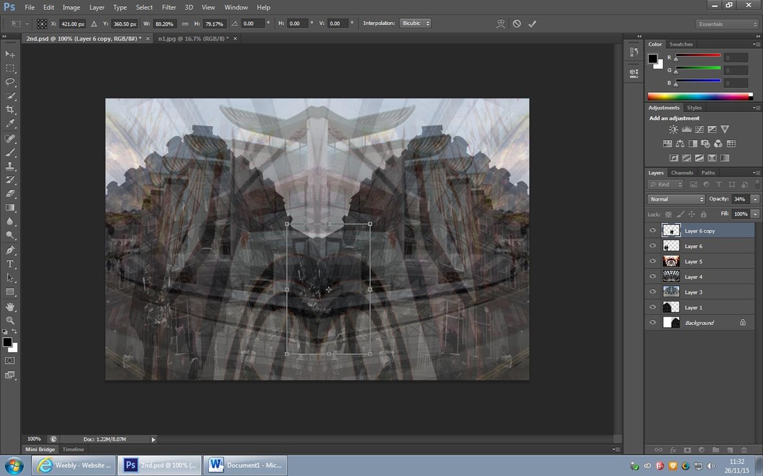
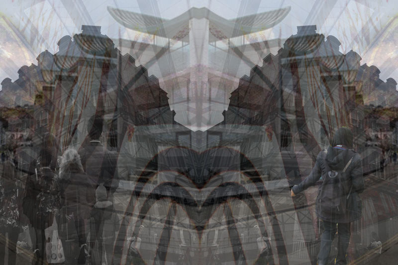
I used the 'select tool' and selected the entire photograph and used the 'move tool' to move the photo onto the main layer (previous) and again created a third layer, I then increased the photo to the maximum canvas size and experimented with the opacity. I tested the opacity at 30% but I felt that it was too apparent and would detract from the other photos behind it so I chose to have the opacity set at 10% as it felt It gave a better layered effect overall and worked well with the other layers.
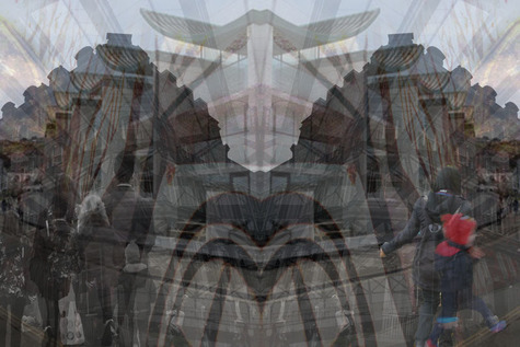
This was the final outcome and I'm really pleased with how it turned out; I feel that the layers compliment each other and the shapes within the photo work well and have lots of depth in them that will attract the viewer into seeing other perspectives of the photograph.
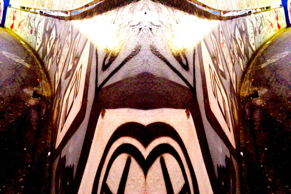
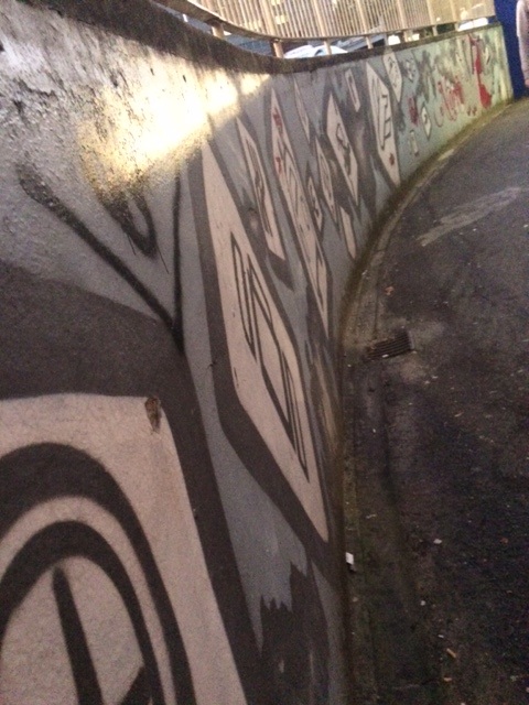
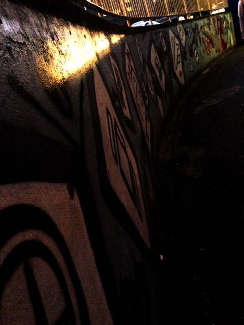
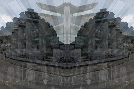
In my opinion graffiti and street art plays a bit part in Urban Photography due to it being created my people and sometimes it can resemble peoples relationships as they can express them throughout their art. I then followed the same mirroring process as before and followed these steps:
Adding another layer,
Increasing the canvas size in percent and by 200 width,
I then had the two photos side by side and then flipped the left one horizontally.
I like the effect that the photo on the far right has as it creates a different perspective and a different viewpoint to the photograph and ultimately creates a nice curve.
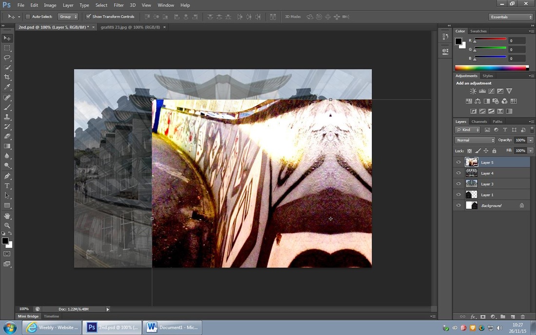
I used the 'select tool' to select the graffiti layer and then added it onto the main layer to create an urban effect that is bold and shows a different side to street photography. I then changed the opacity to 10% and thought that the colour weren't as clear an they faded too much into the layers behind it.
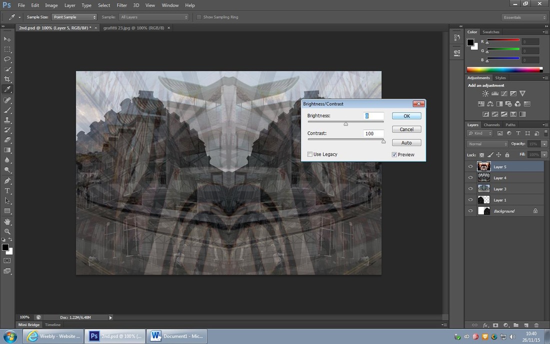
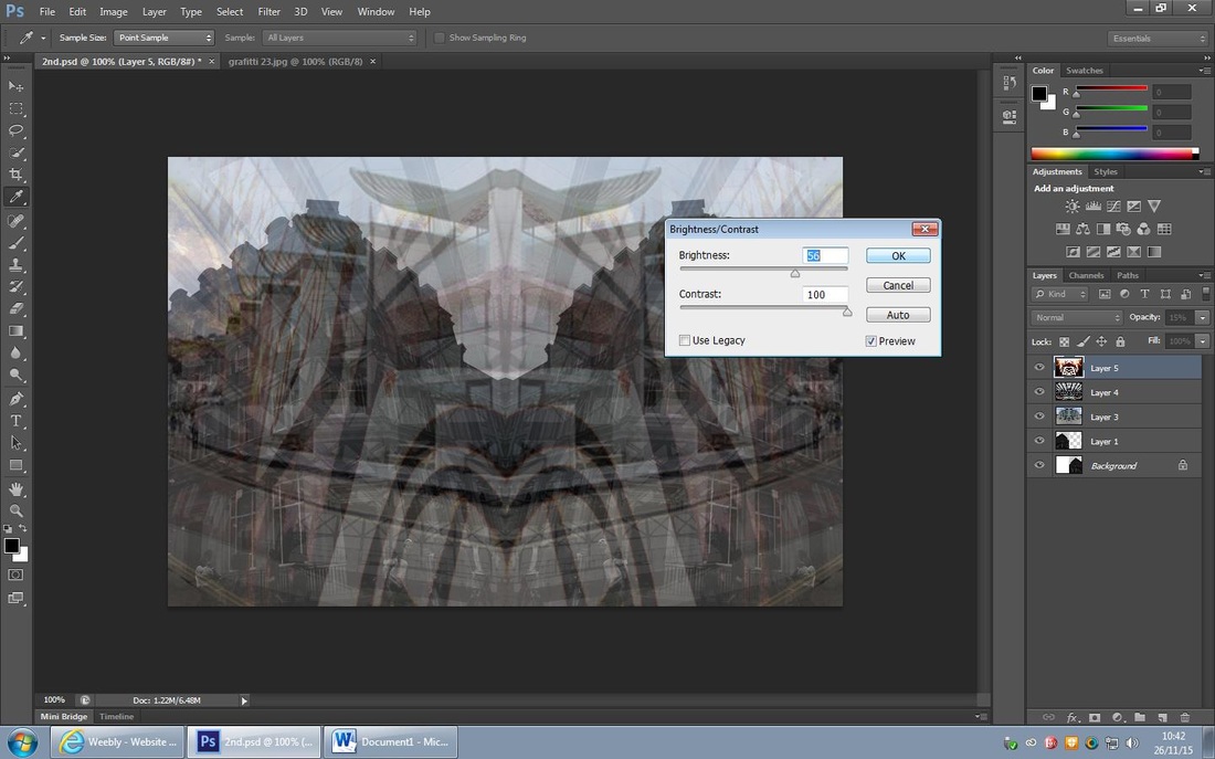
I then experimented with changing the contrast and brightness of the graffiti layer, I firstly increased the contrast by +100 and decided that I liked the bold colours that emerged and I then experimented with the brightness and set it to +56; I think that by increasing the brightness made a burnt auburn effect on the outside of the photograph and again made the graffiti stand out.
I feel that this final outcome is much better now I've adjusted the brightness and contrast as I think all of the layers are all noticed and overall create a street like effect; I chose to make this effect because I wanted the viewer to have lots to look at and ultimately be attracted to the background and see the depth of it.
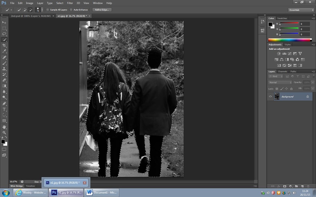
I decided to use the 'select tool' to select around this couple which I then layered onto the main layer, I then decreased the opacity to 34% in order to make it fade into the main layer and create the ghost effect; I then placed the couple onto the layer making it look like they are walking down the street.
I really like this start to my edit because it looks very realistic and shows the relationships within the street, it shows a couple coming together and walking down a street, hand in hand. Walking away from conflict and supporting each other.
I then duplicated the layer and decreased the new layer so it looks like their walking off into the distance, I then increased the opacity of the first layer of the couple as I felt it needed to be more apparent and bolder than the second layer of the couple.
It may look unfinished but I like this edit so far as it shows the relationships people have when hit by conflict and how some come together; I chose to make two of these layers because I felt that it creates a good ghosting effect just like Alexey Titarenko.
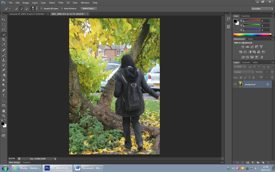

I wanted someone standing on their own to represent people who depart when hit by conflict, I firstly used the 'select tool' to cut out the girls body and then I used the 'move tool' to move her onto the main layer, I then experimented where to place the girl and decided it would be better to have her walking the opposite way to the couple. I then selected the girl and selected the 'flip horizontal' to make the photo of the girl look like she's walking the other way.
I am happy with the final outcome of this process as you are starting to see a clear comparison of departure and the coming together of relationships. I like the way I have done selected the correct opacity as I feel it look similar to Titarenkos work.
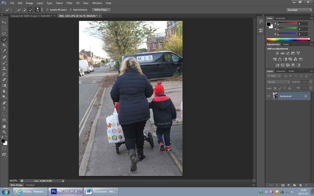
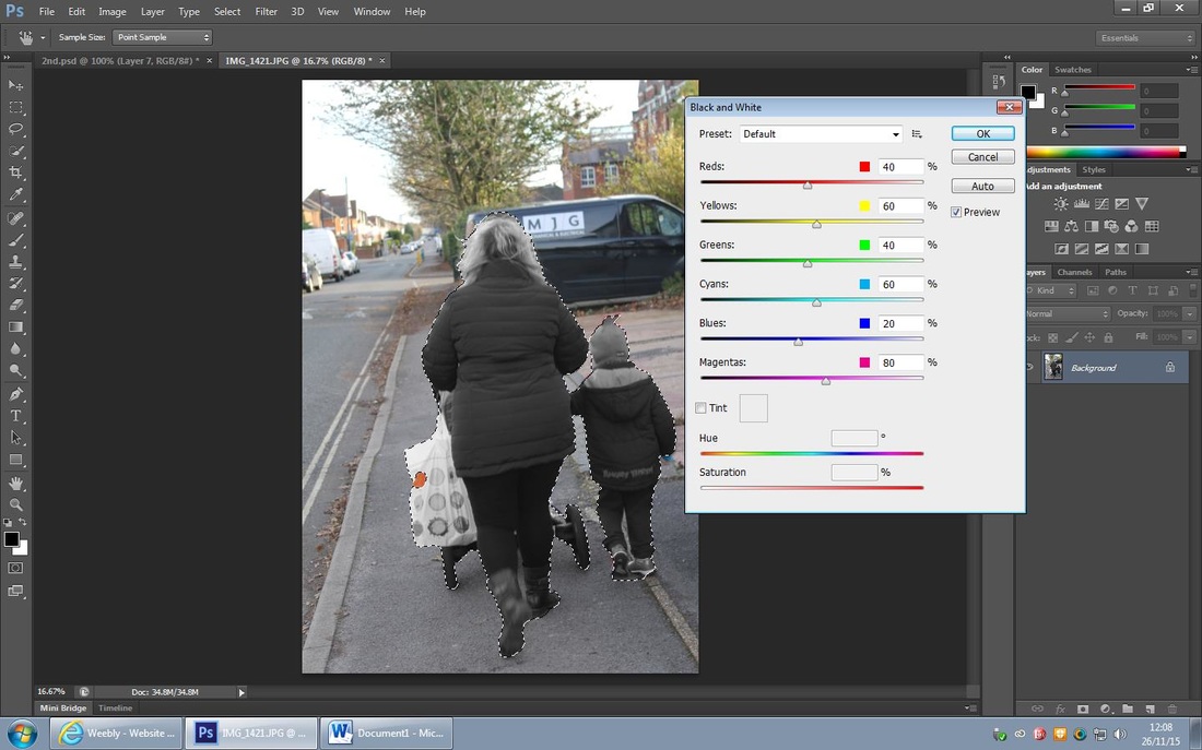
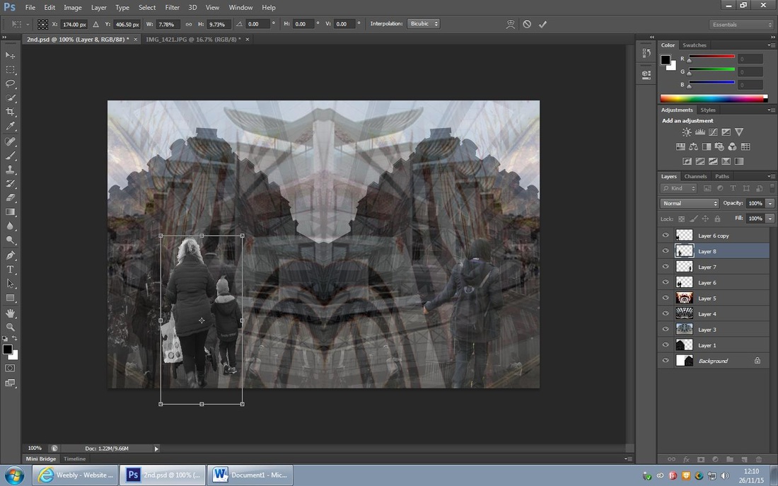
I started off with using the 'select tool' to cut out the body of a mother and her son and then experimented with colour by changing the selected area to 'black and white' and used the 'curve tool' to emphasis the contrast, and then used the 'move tool' to apply the cut out to the main layer. I then experimented with where to place the cut out, eventually I placed it in between the couple layers and I feel it looks like a crow of people coming together; I decided to make it black and white to link to the background.
I am again pleased with the final outcome of tis process as it creates a crowd like feel on the left of the photo, I chose to include a mother and son as I think that when conflict strikes a community a family is the mot common relationship to evolve and come together more.
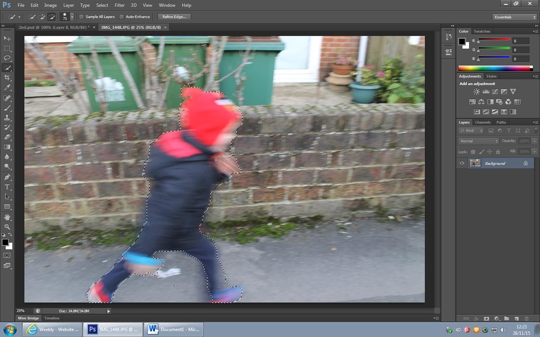
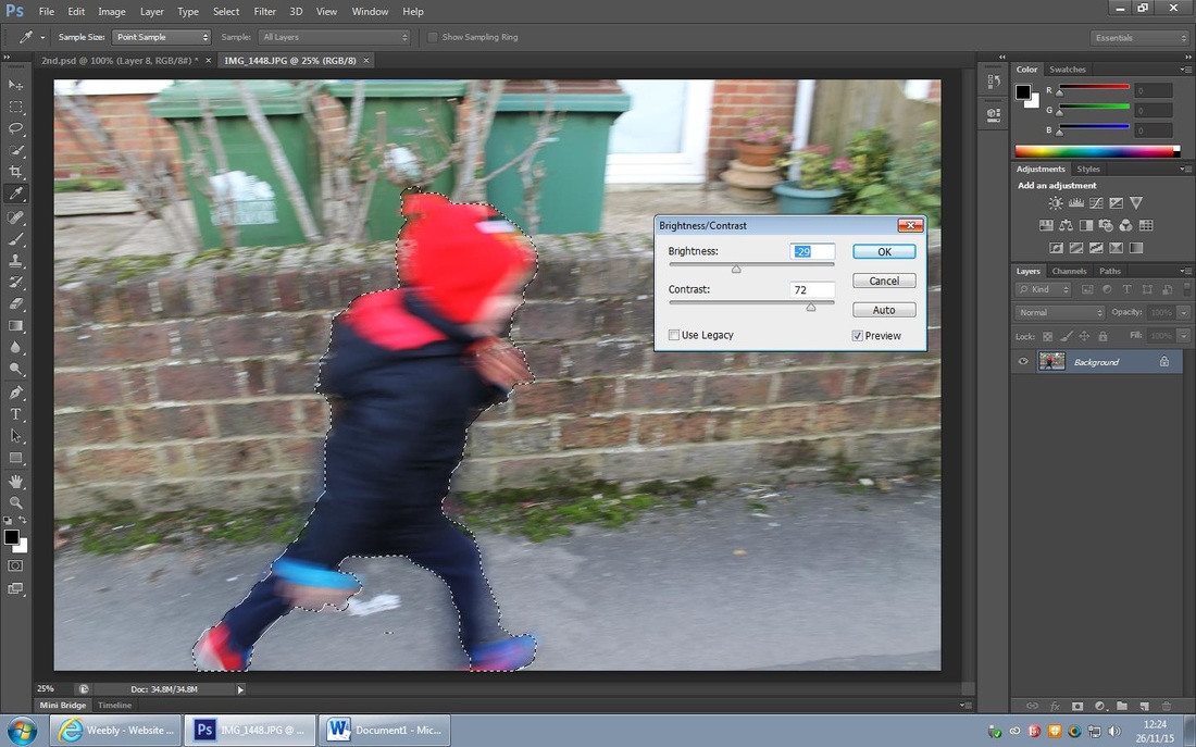

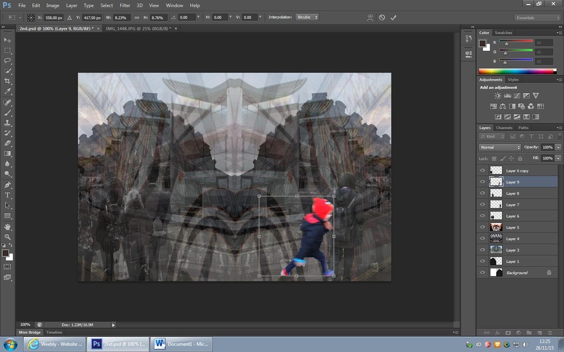
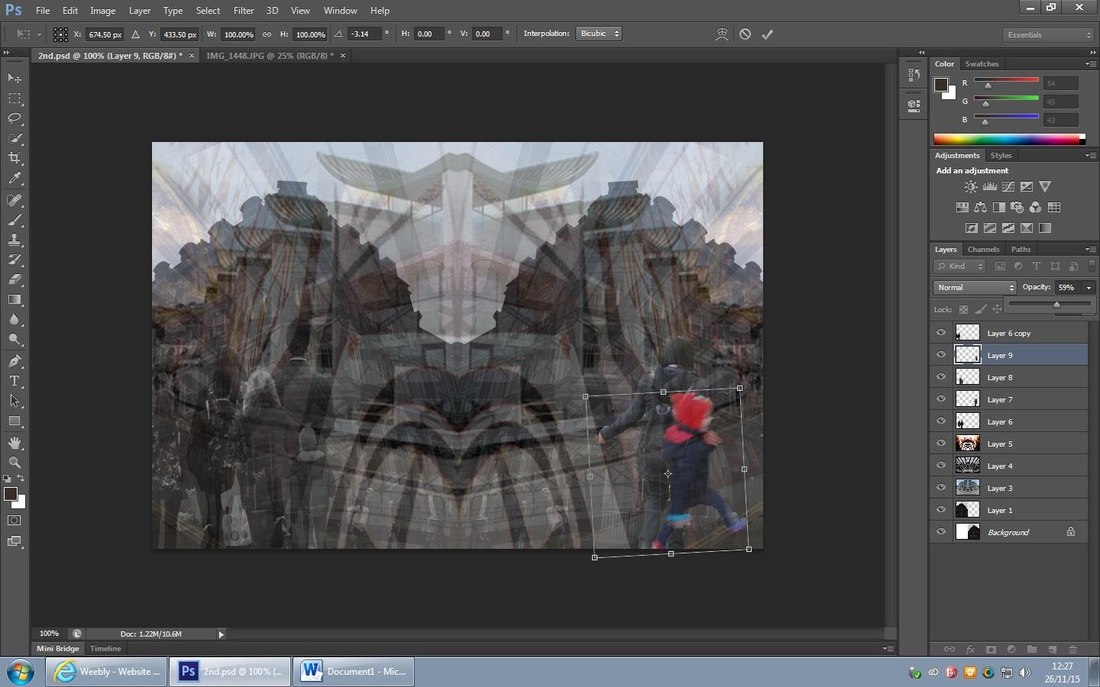
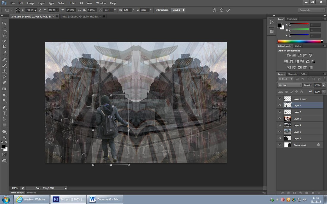
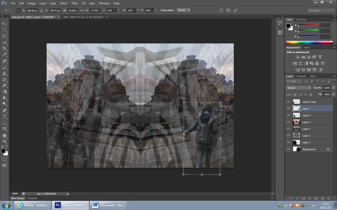
I used the 'select tool' to cut out the little boys body and then I experimented with the 'brightness and contrast' tool; I decreased the brightness to -29 and increased the contrast to +72, this made the boy more visible and his clothing stand out more. I then place the cut out onto the main layer and experimented where to put him, I chose to put him on the right side of the photograph as its the side of departure; I then tilted the cut out anti-clockwise slightly to make his running realistic and as if he is running down the street in the main layer. I then changed the opacity to 40% as it wasn't too much but it was enough to make him apparent. I like this cut out in particular as it was taken in action in order to create the ghost effect in the style of Alexey Titarenko.
I feel that my piece is gradually coming together now and the aim of the piece is coming across more clearly.
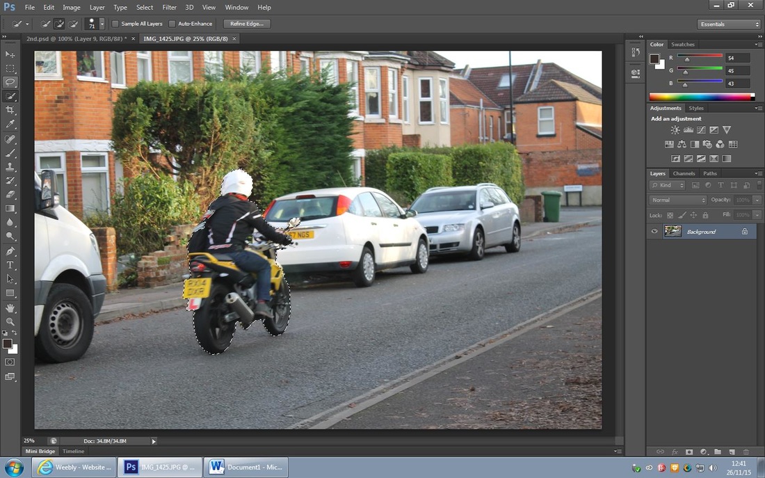
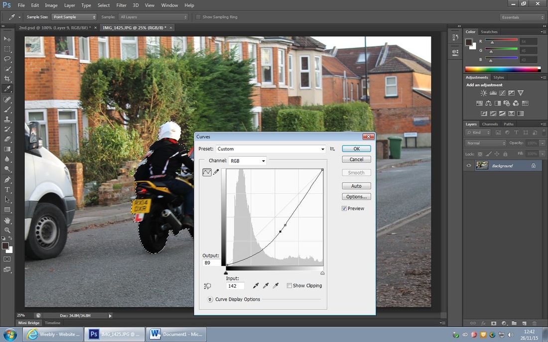
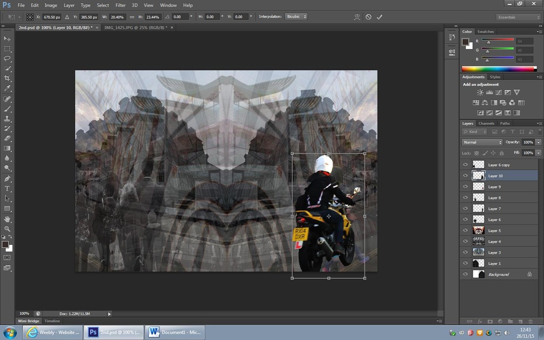
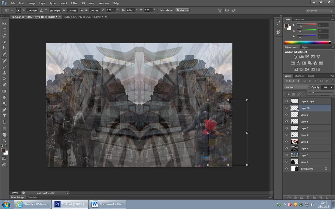
I firstly cut out the motor cyclist and motor bike using the 'select tool', I then used the 'curve tool' to create a defined cut out. I then moved the cut out onto the main layer and experimented on where to place the cut out, I found that placing this motor cyclist behind the other lone layers will create a staggered effect and make it appear that many people are walkinig/ riding alone I then decreased the opacity to 18% to make the ghosting effect more apparent.
I then furthered this edit by 'duplicating' the motor cyclist layer and then increasing the opacity to 30%, I felt that this creates a better layered effect and again contributes to the ghost theme for the piece. I like the way its going so far as I think I've achieved my desired ghost effect.

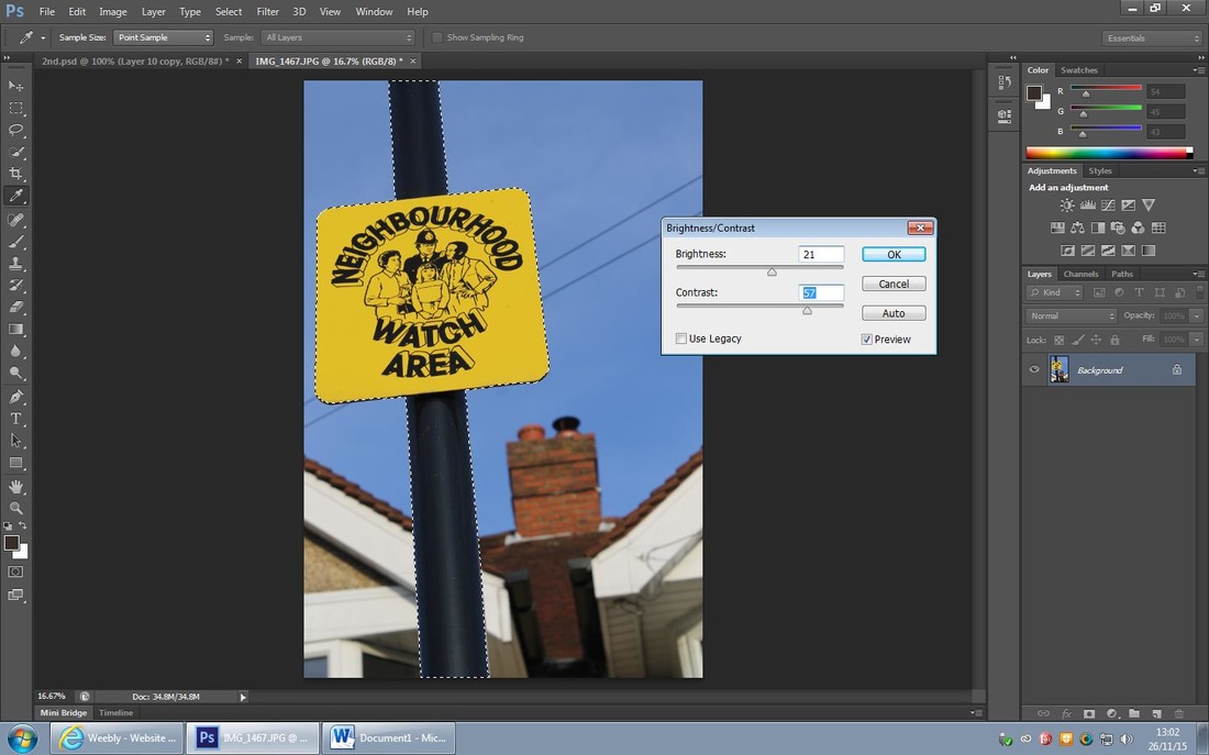
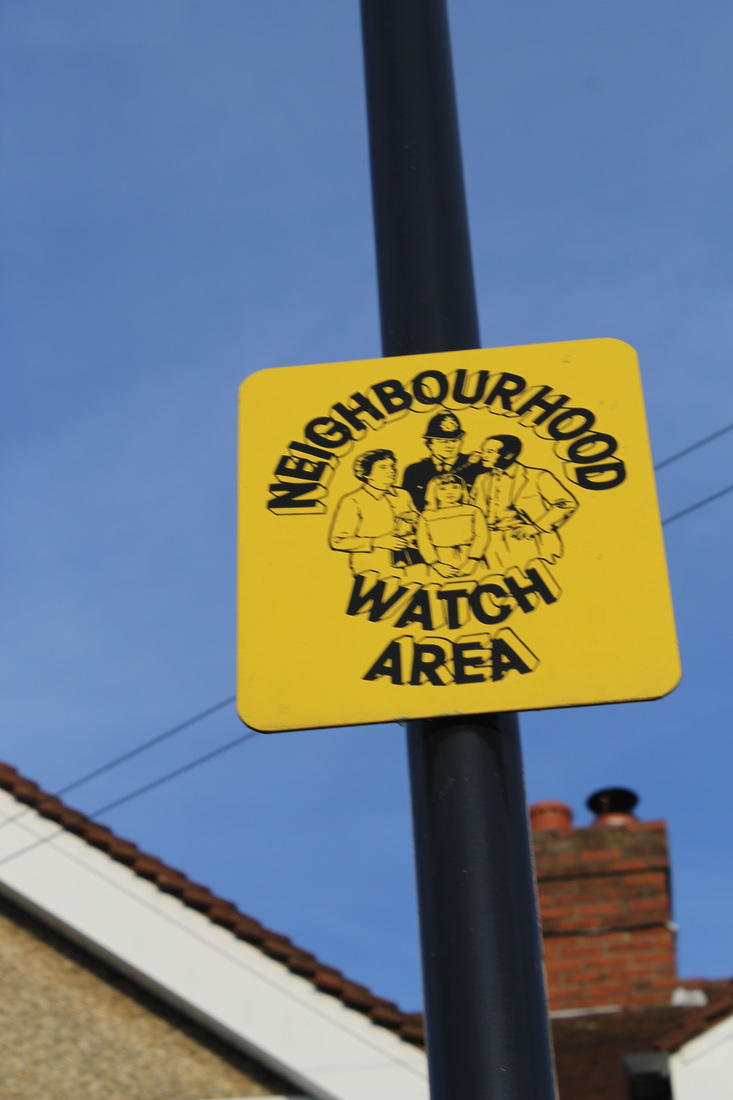
I then decided to use the 'select tool' to cut out this sign as I really like the bright and bold colours, I then increased the brightness to +21 and increased the contrast to +57, this made the deep yellow colour appear more vibrant and it contrasts against the black pole.
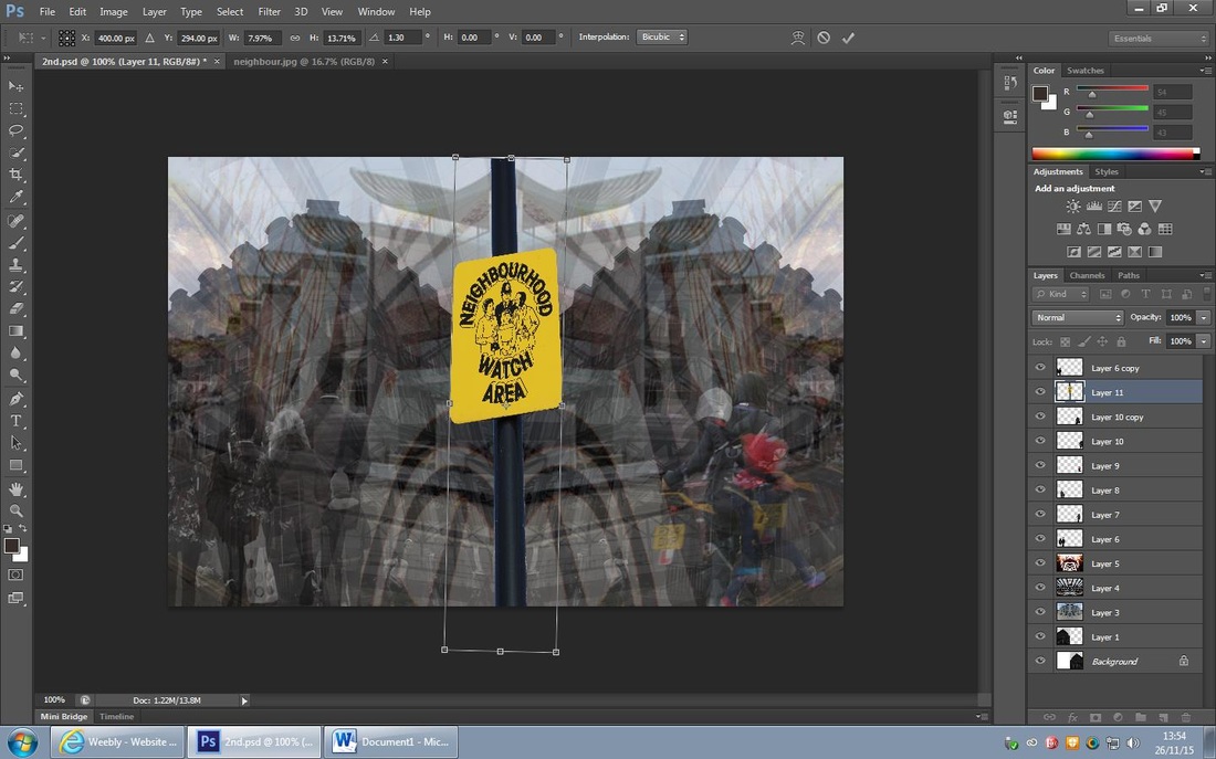
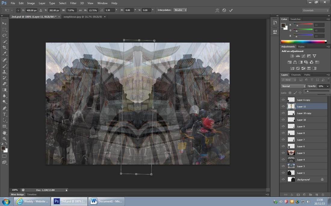
I then used the 'move tool' to place the cut out onto the main layer and I placed it in the middle of the photograph, I then decreased the opacity to 10%, I felt that it was enough for the sign to be noticed but too not much for it not to detract from the background.
I then used the 'move tool' to place the cut out onto the main layer and I placed it in the middle of the photograph, I then decreased the opacity to 10%, I felt that it was enough for the sign to be noticed but too not much for it not to detract from the background.
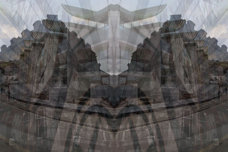
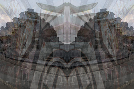
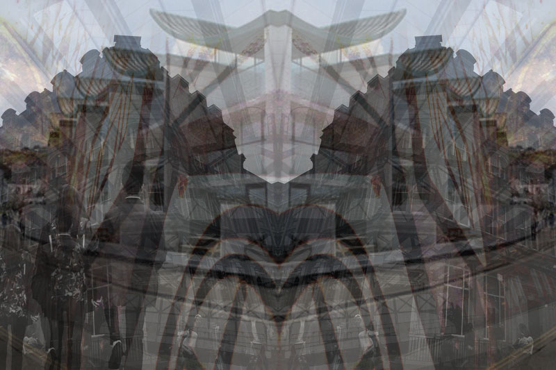
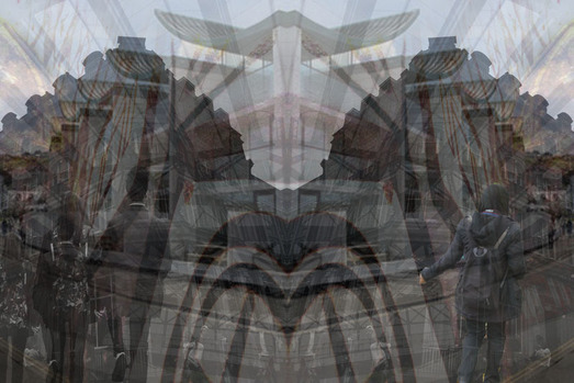
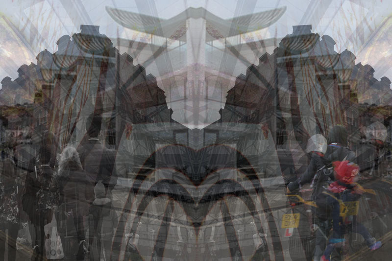
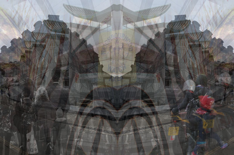
My Final Piece
Evaluation of My Work...
This is my Street Photography Final Piece. I am very pleased with the overall outcome of my final piece and I think it is similar to what I had in mind from the start, I think it shows the style of Alexey Titarenko in a very similar way and I think I've achieved his style of work. I like the mirrors effect on the background and the numerous layers that I've incorporated into my piece; the shapes in particular are my favourite part as they have a lot of depth within the piece and draws the viewer in. I hope that people who see my piece will understand my idea and how I've represented this through my photography. I hope that they see how relationships form and break when conflict hits an area, I also hope they see how I've created the contrast of these two very different relationships within my piece; the left side is people coming together and the right is people departing from each other. Although some people may not see my representation as Street Photography, I hope that they have an understand of how relationships are apparent when conflict occurs.
My final piece has a strong influence on the work of Alexey Titarenko, I believe that my final piece has a large link to his work because of the dark colours and the contrasts that bring the final outcome to life. I believe Titarenko is the biggest influence for my piece again for the ghost effect people within it and how I have layered them have been greatly inspired by his work.
My final piece has a strong influence on the work of Alexey Titarenko, I believe that my final piece has a large link to his work because of the dark colours and the contrasts that bring the final outcome to life. I believe Titarenko is the biggest influence for my piece again for the ghost effect people within it and how I have layered them have been greatly inspired by his work.
