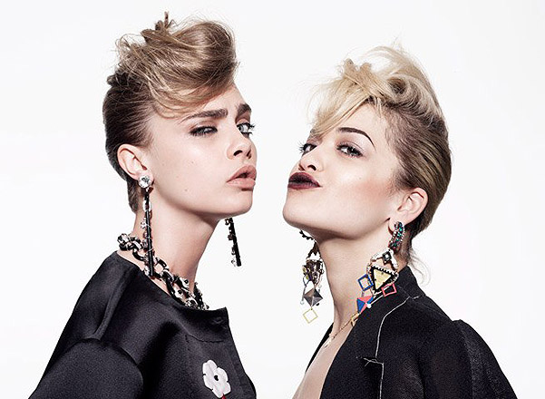
Rankin
Rankin is a famous British portrait and fashion photographer who is also known as John Rankin Waddell. As well as taking portraits he films famous music videos, such as Miley Cyrus' 'Adore You'. Whilst studying accounting at Brighton Polytechnic he realised that his interests were not in this career and soon dropped out. He then studied Photography at Barnfield College, and then went on to London College Of Painting. During this period of time, Rankin met Jefferson Hack, they then built a great working relationship. This then led them to start a magazine together called Dazed & Confused, once they had graduated...
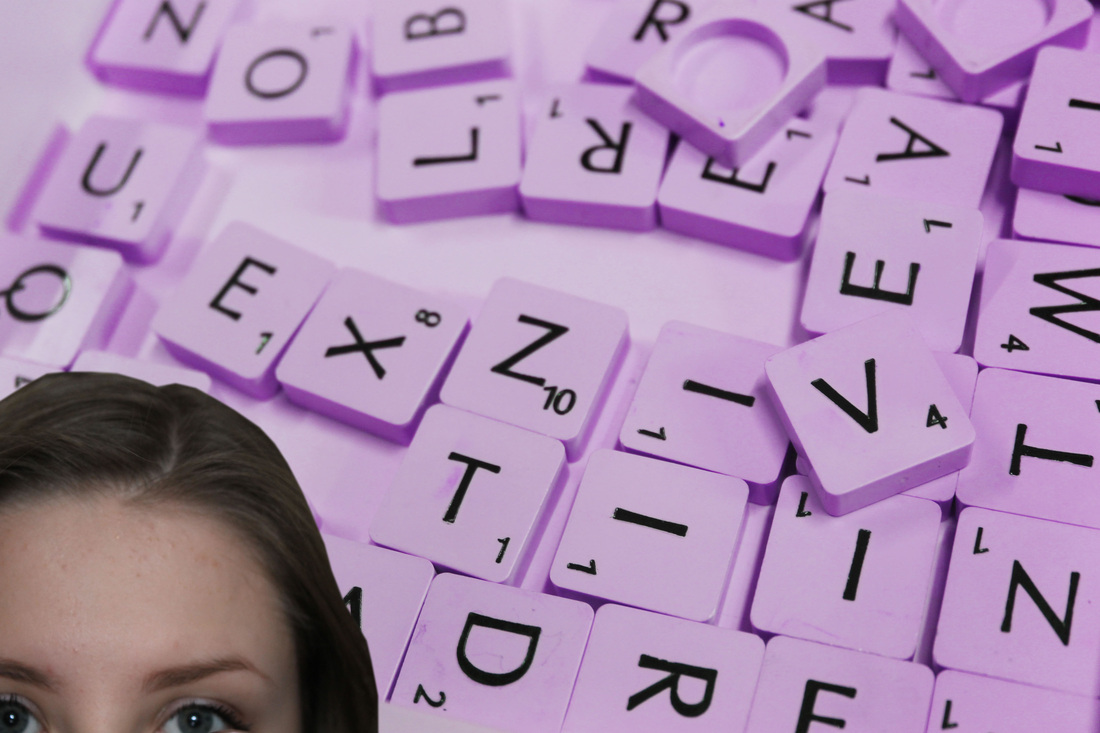
Picture Analysis...
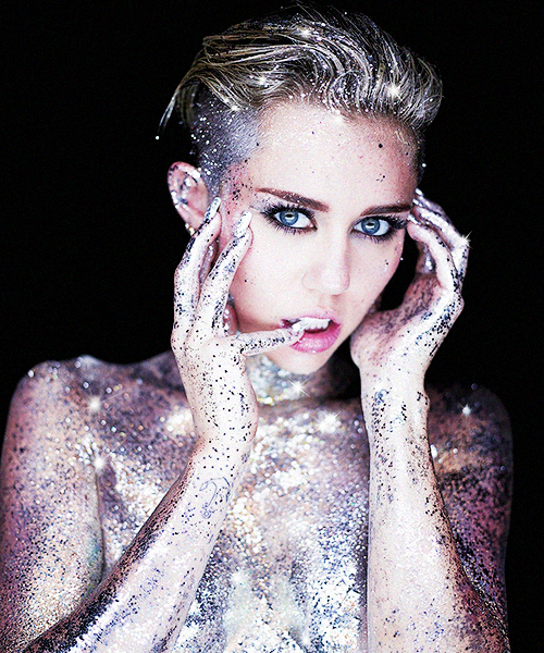
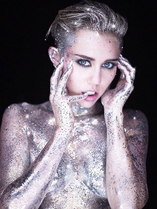
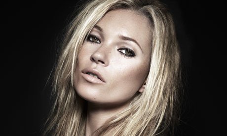
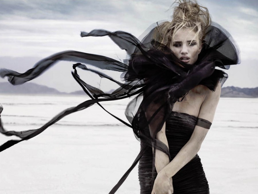
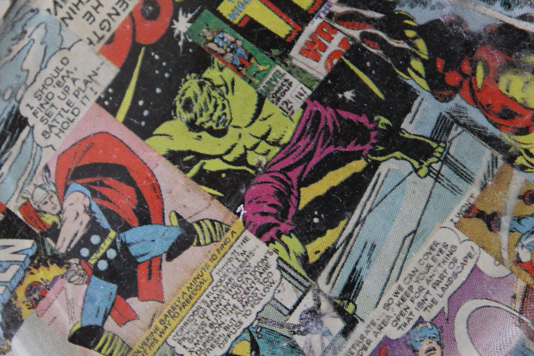
I think this portrait is truly stunning and unique and I have chosen to analyse this photo for many reasons... I think this is one of Rankins best celebrity portraits as he has really portrayed Mileys personality. The serious and daring pose shows her professional side, and the side that sometimes people dont see due to the negativity from the media. However, the glitter layered on to her skin represents her true self that is, crazy and confident. I think the way Rankin has chosen to take he portrait against a black background is really effective, as it contrasts to the bright and dazzling focus of the picture that is, Miley. I feel that this portrait captures her true colours and how she's a confident young women- with a crazy edge. I think that Rankin has focused souly on her face, hands and arms, this attracts the viewer more.
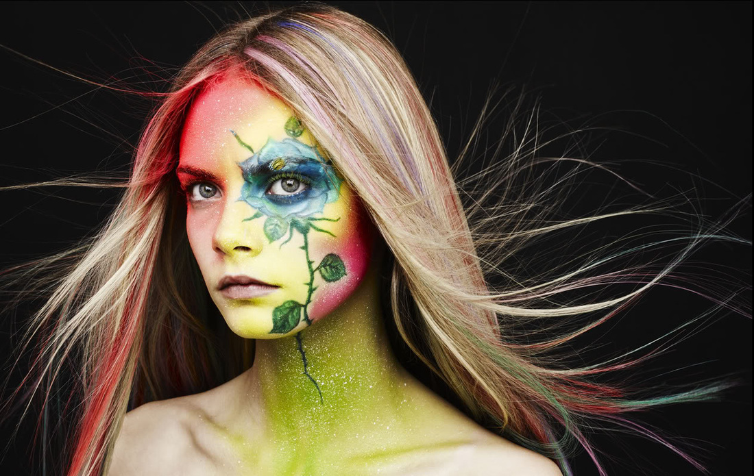
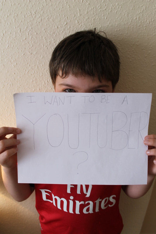
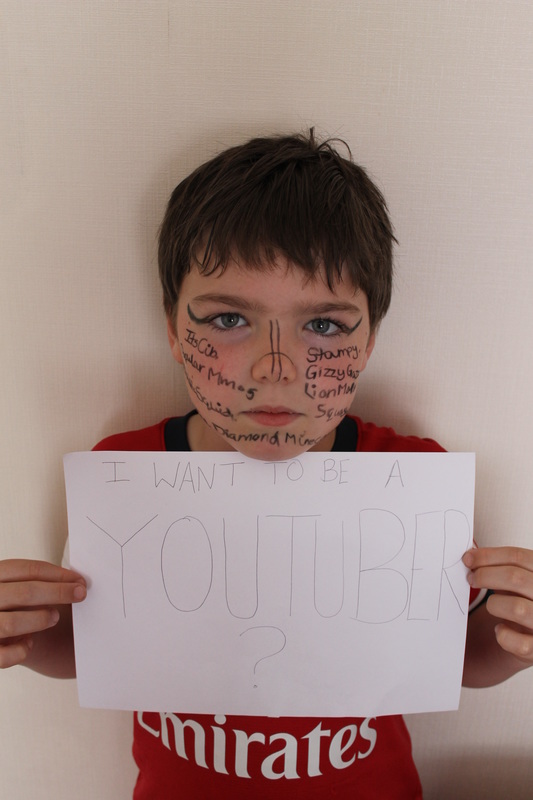
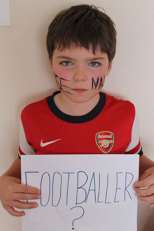
My Rankin Interpretation, My Response...
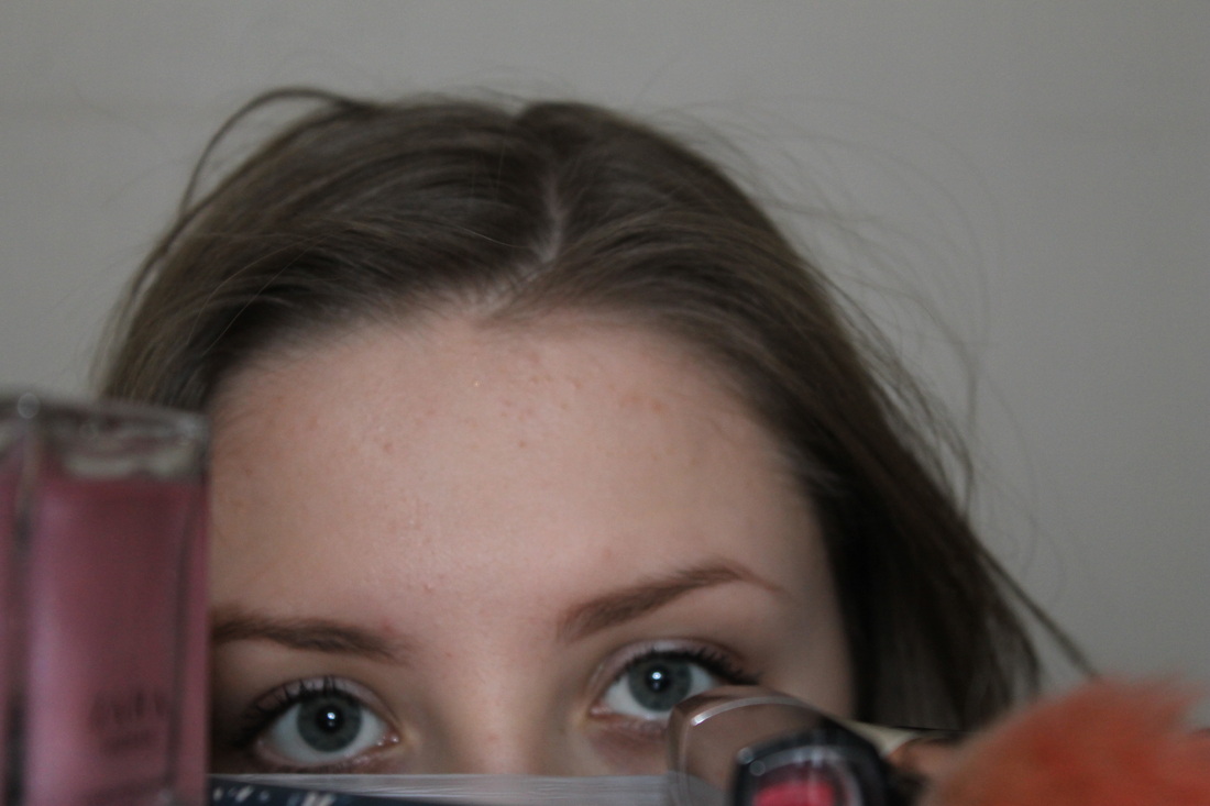
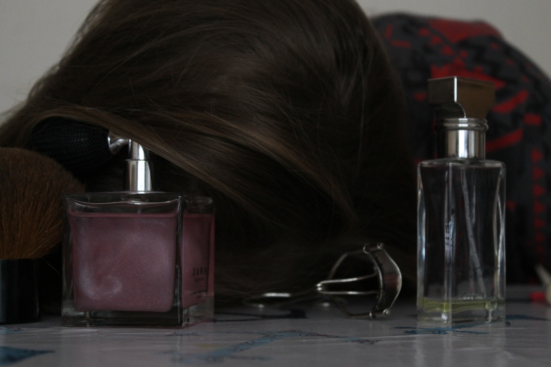
The ideas for my Rankin interpretation were based around
Andy Warhol
Andy Warhol is a famous well known artist, who is an excellent example in photography. He was born in Pennsylvania, also he is known for his artistic expression and for the amazing pop art style he created. also he's known for his celebrity crossover combined with advertising. Within his work he used a range of media such as; painting, printmaking, photography, drawing, sculpture, film and music. During the 1960s he was at his highest moment in his career, as he did many American advertisements including- Campbell’s Soup cans, Marilyn Monroe and Elvis Presley and Coca-Cola bottles.
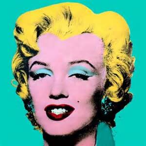
Personally I love Andy Warhols work, the art element of it and the photography aspects of it. In particular I like the use of big bold colours and how they compliment each other. My favourite pieces of his work are these...
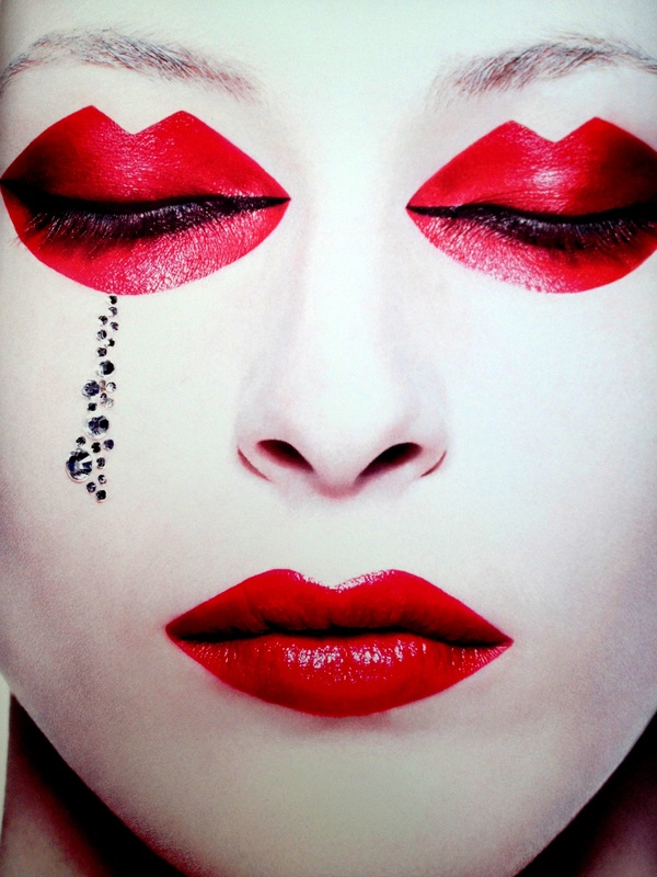
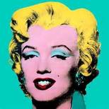
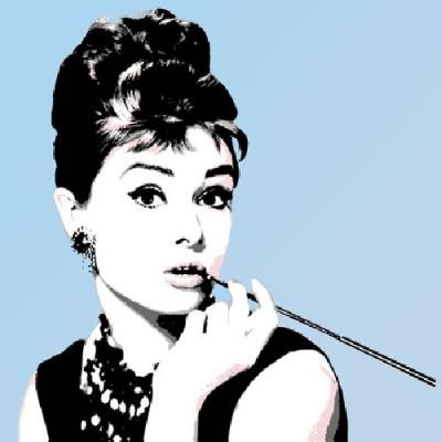
I really love the Marilyn Monroe and Audrey Hepburn ones as they are simplistic yet so interesting.
Personally I love Andy Warhols work, the art element of it and the photography aspects of it. In particular I like the use of big bold colours and how they compliment each other. My favourite pieces of his work are these...
I really love the Marilyn Monroe and Audrey Hepburn ones as they are simplistic yet so interesting.
These are some of my responses to Andy Warhols work...
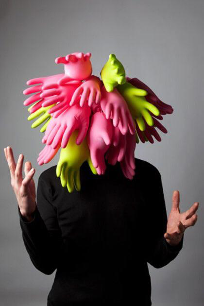
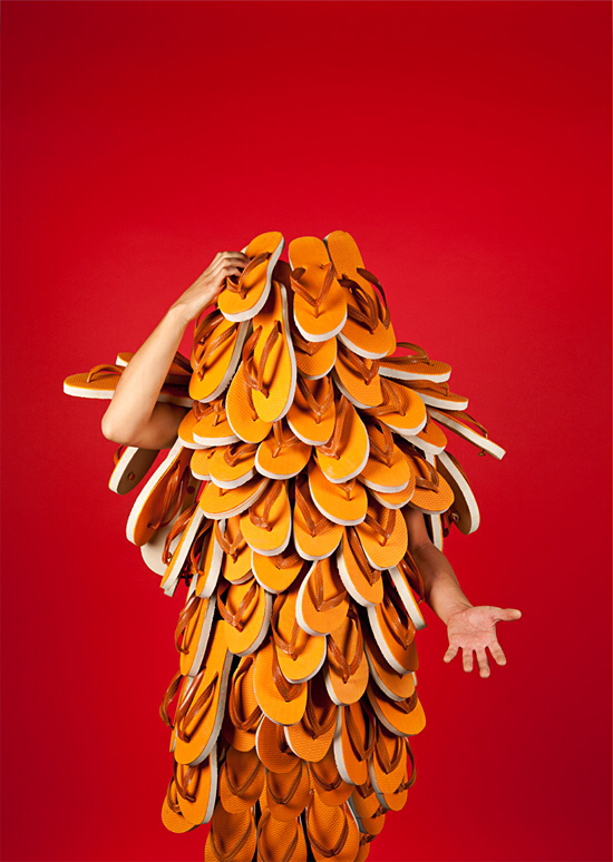
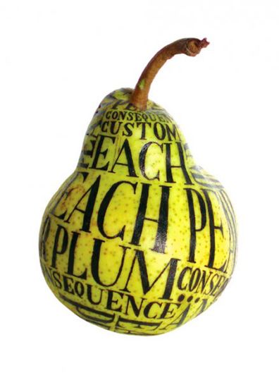
AKATRE
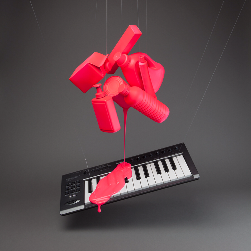
Akatre is a French famous graphic design studio that was formed and founded in 2007 by Julien Dhivert, Valentin Abad and Sebastian Riveron, the trio work in the industry of photography, graphic design, video and typography. They are well known for their photography work that is very unique and unordinary.
I think their work is incredibly original and different, I love how they experiment with random everyday objects and create great works of art and sculptures. I like how they use different materials to represent messages and cultural differences. Their work is very bizarre yet interesting, they combine their graphic design knowledge and their wacky creativity to produce amazing photography...
I find their work inspiring because their not afraid to be random and themselves, they can be as crazy as they want and not get judged for their creativity.
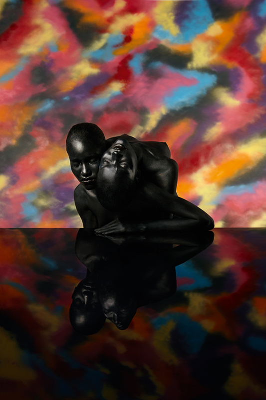

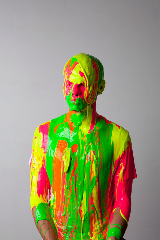
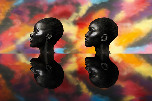
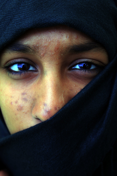
Picture Analysis...
I like this piece of Akatres work as its original and sceptical. The use of the aluminous paint and how its placed on the face really captures the persons facial features and the colour contrast. This photograph stands out from all the others for me because of the use of colours and the simplicity of the piece. I love how the paint drapes down onto the person uncoordinatedly, the colours merge and defines the eyes especially. The contrasts in the colours creates shadow particularly on the back of the head.
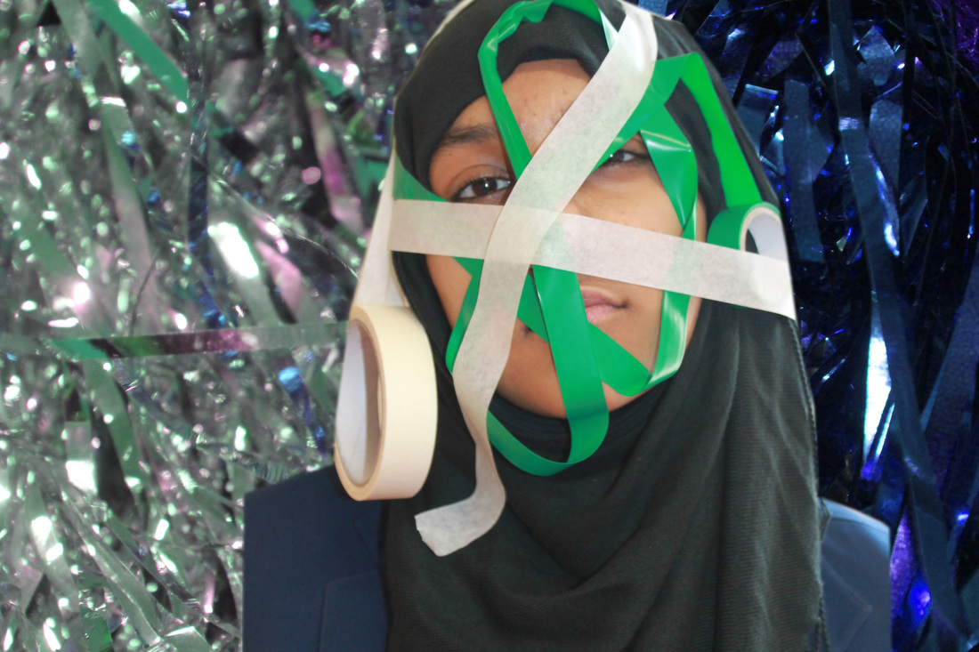
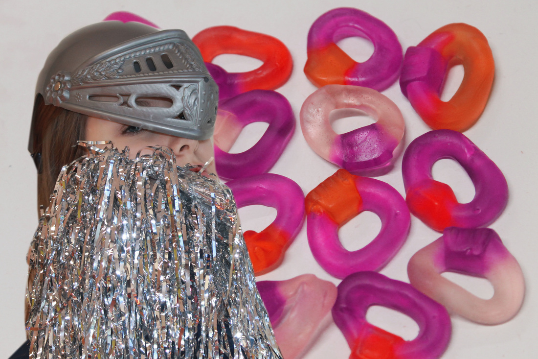
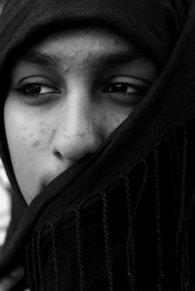
My response to Akatre...


Kliknij tutaj, aby edytować.
Background Image Edits Developing my ideas for Akatre


Recording Ideas- Background Images


Background Edits
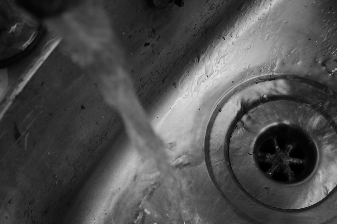
I took more photographs of backgrounds using a range of colour to compliment the photograph that will go on top. I =n order to get these effects I used a variety of tools such as the 'curve tool', 'brightness/contrast', and the 'levels' option. I like the middle photograph in particular due to its focal point and I feel that the eye travels across the entire photo and focuses on the plughole; this shows that I have thought about the photograph and how people will view it.
I then furthered my background edits...
I decided to further my background edit by adding another contrasting layer on top of it, the final outcome is on the far right.
Developing My Ideas Photoshop Edits


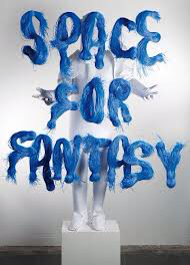
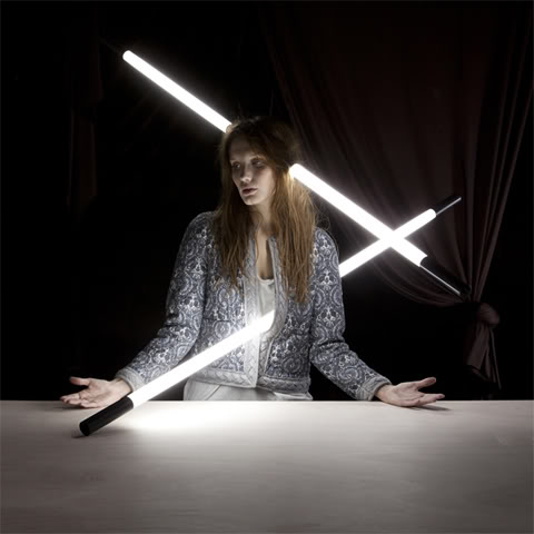
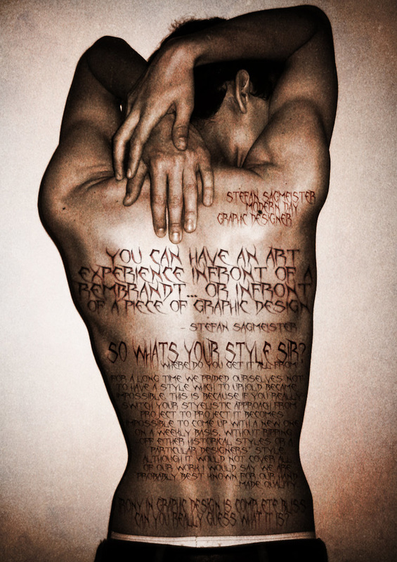
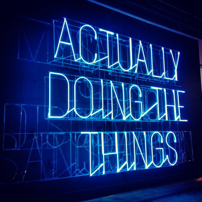
Stefan Sagmeister
Stefan Sagmeister is a New York based graphic designer who also does typography and art. He is well known for his joint partnership in the company 'Sagmeister & Walsh', he works along side Jessica Walsh (a New York designer and artist).
In his early career he created album artworks for big music artists such as Jay-Z, The Rolling Stones, David Byrne and Aerosmith- this enabled him to create art that catered to the musicians personality and style of music. After this phase of his work had passed he soon ventured on to his most well known work, text- based artwork. He chooses to work with people and in the outdoors, he either writes on the people or alternatively uses text on a computer to create the art.
I find his work interesting and eye opening and it seems that there is two sides to the art. I think it is original and unlike anyone else's work, he sends powerful messages throughout his art and is personally an amazing man. The typography he uses draws the viewer in and is attractive to the eye, his work is full of emotions ad personal views and his work is amazing.
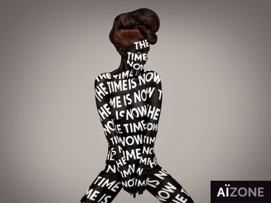
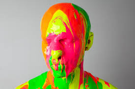
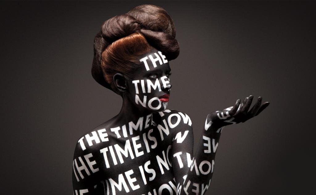
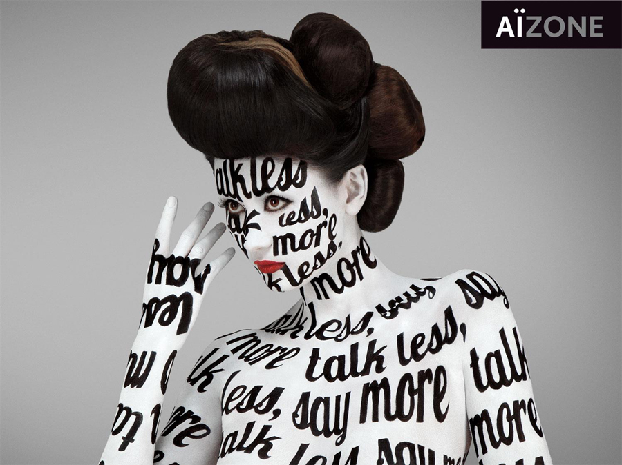
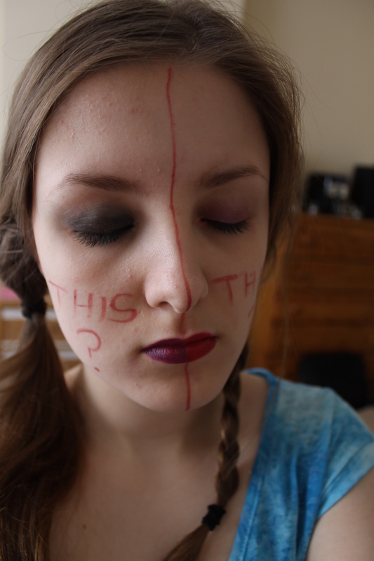
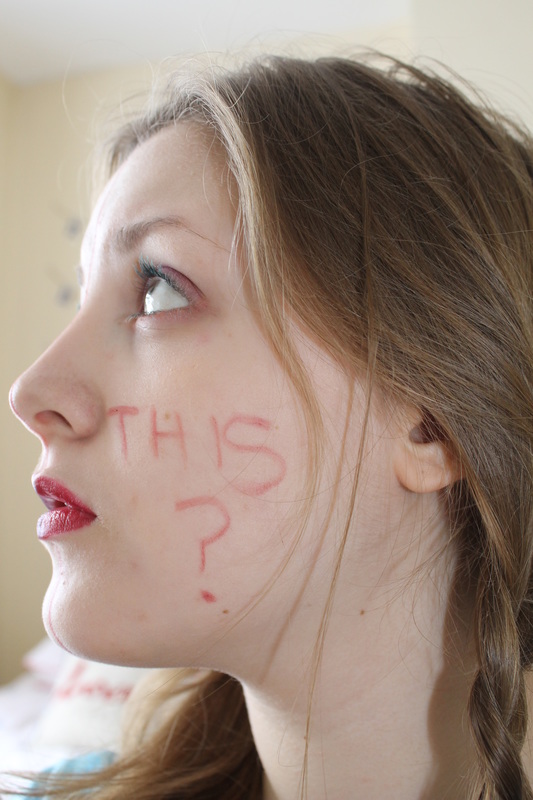
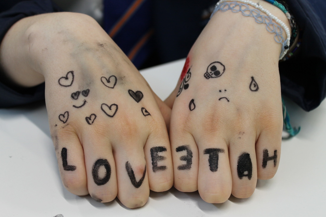
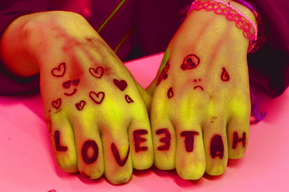
This piece of Segmeisters work stands out to me and I find it brilliant. The words on her body stand out and contrast with the colour her skins painted, this contrast automatically draws the viewer to the words. The wording 'The Time Is Now' is mysterious and leaves it to the viewers interpretation, the model also contrasts with the gradient background. Also, the fact that the model is naked creates a blank canvas for the words to elegantly flow covering her body.


My Interpretation...

Developing Ideas- Edits of my photographs...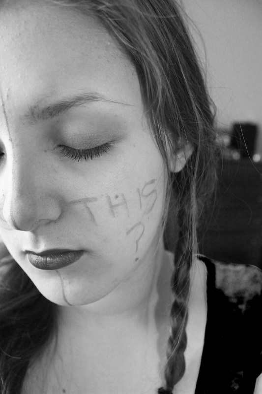  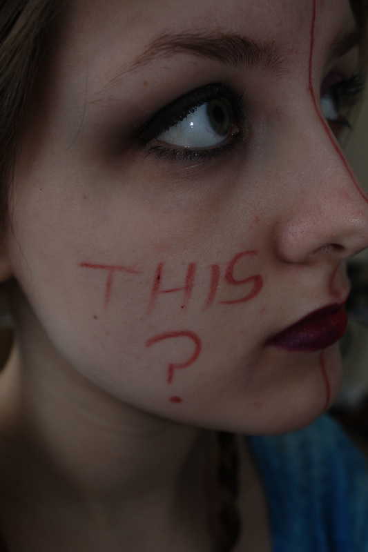 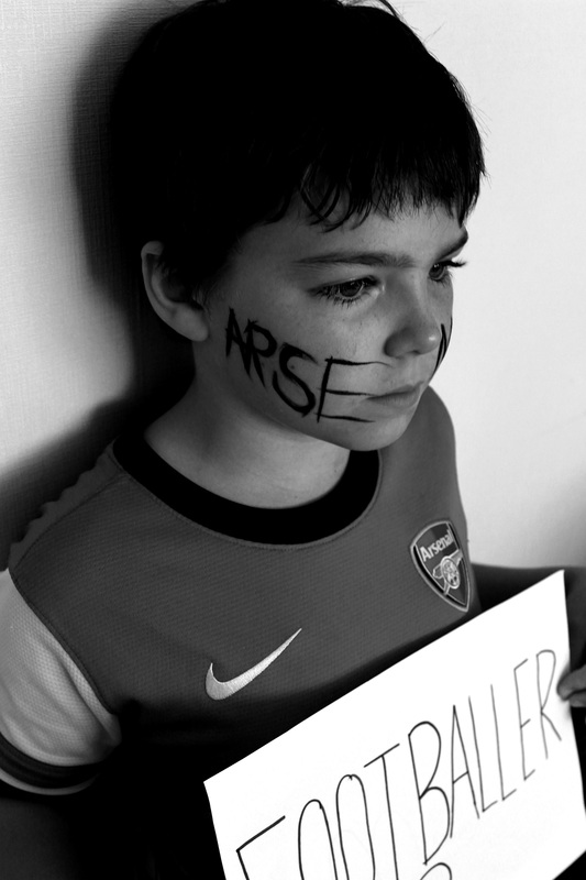  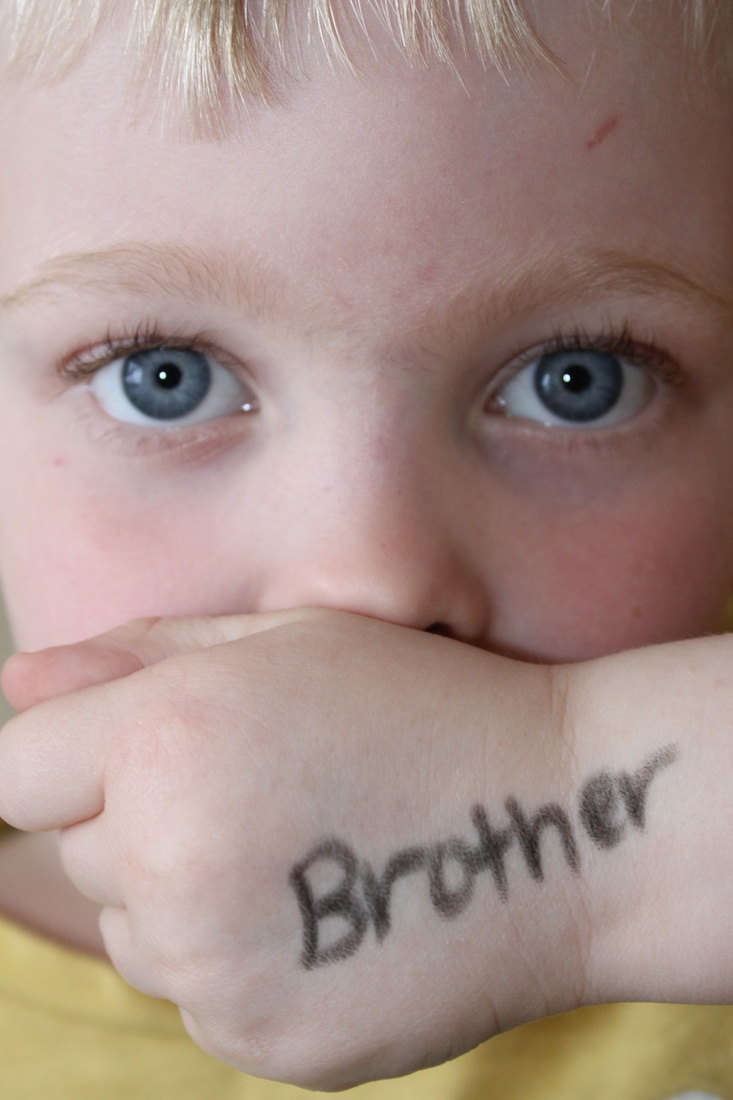 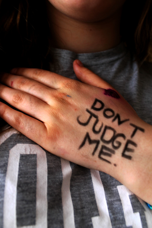 |
|

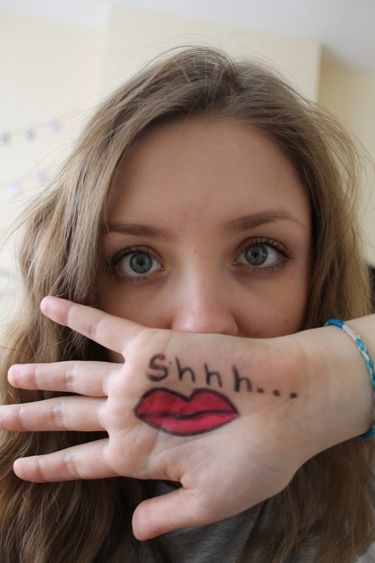
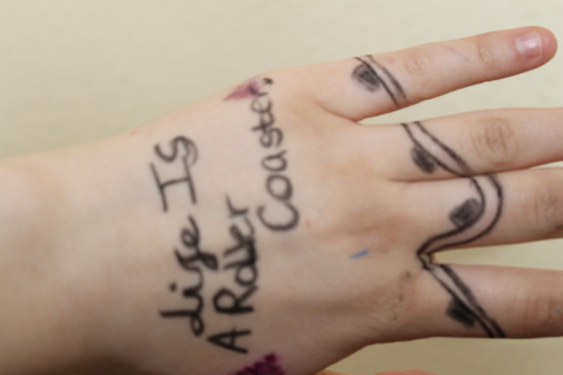
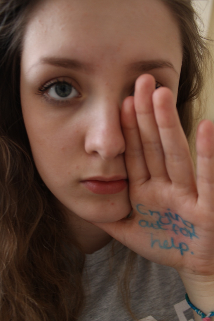
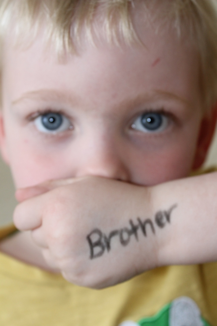
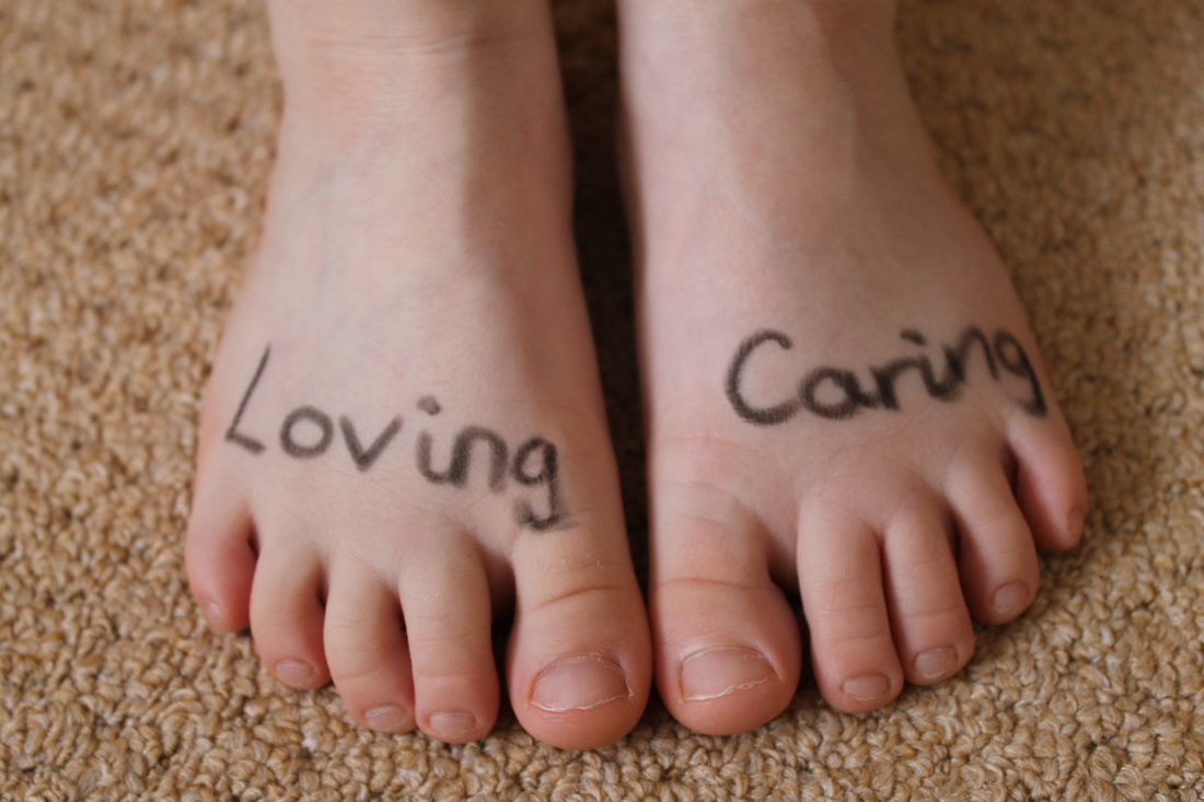
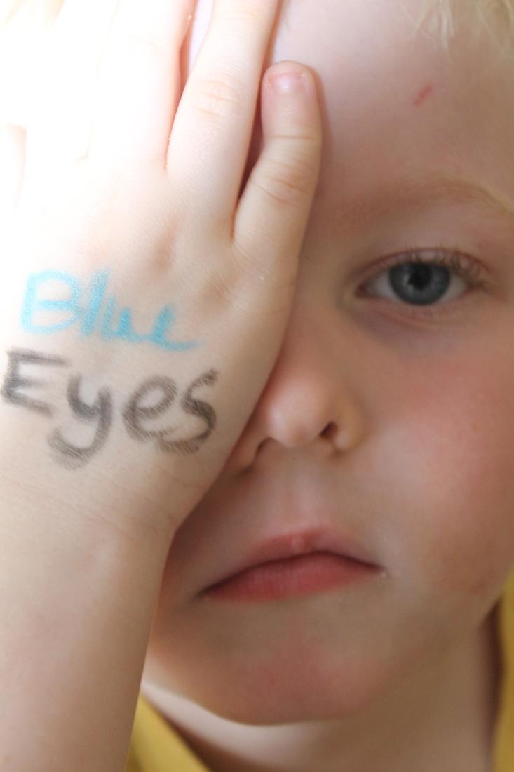
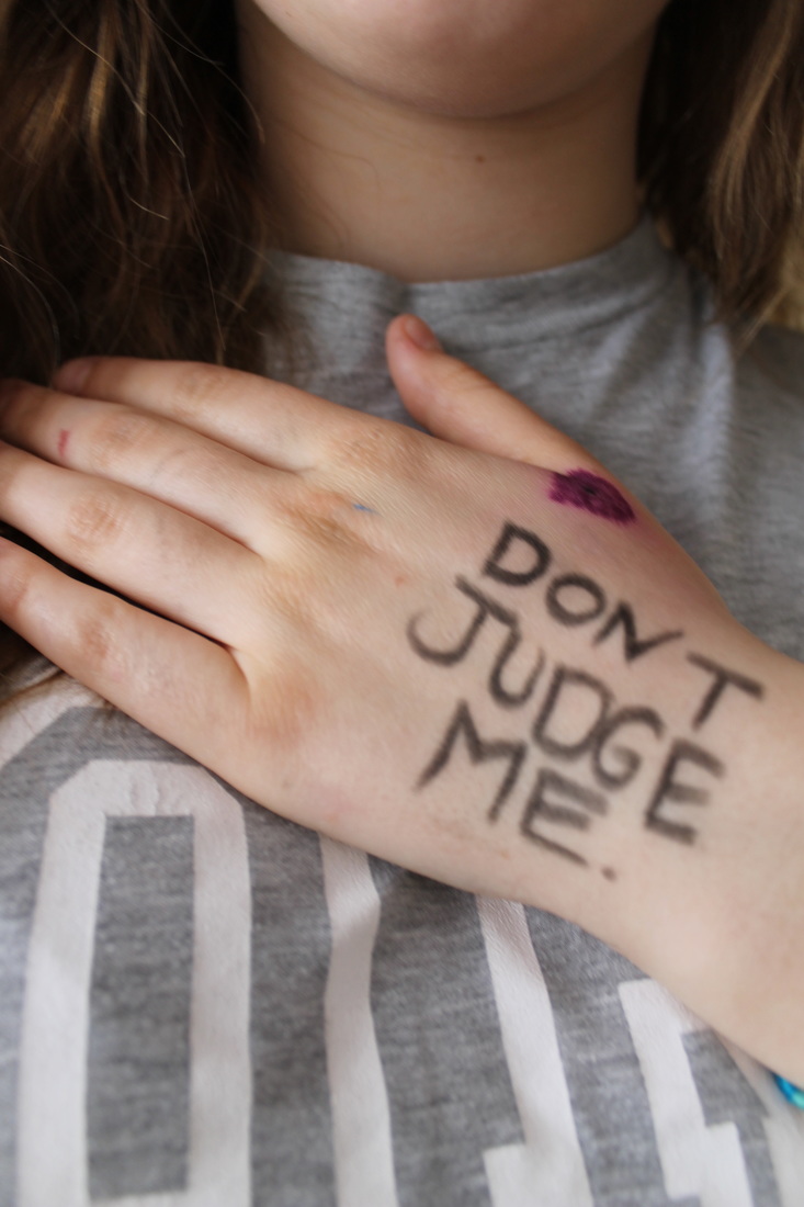
Recording Ideas in response to Sagmeister- Hands and Text photographs..


Hand Edits
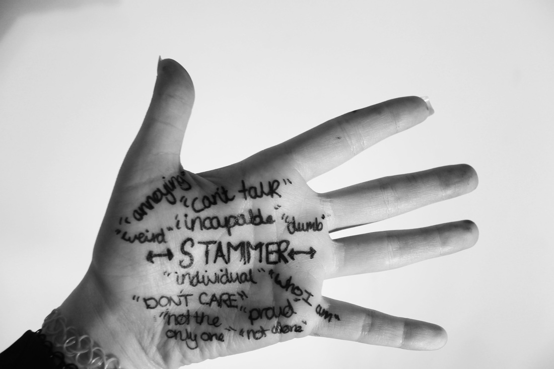

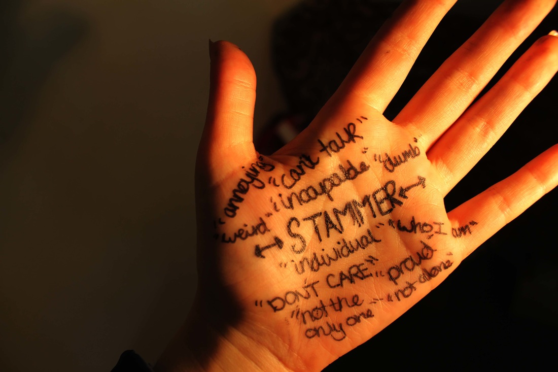
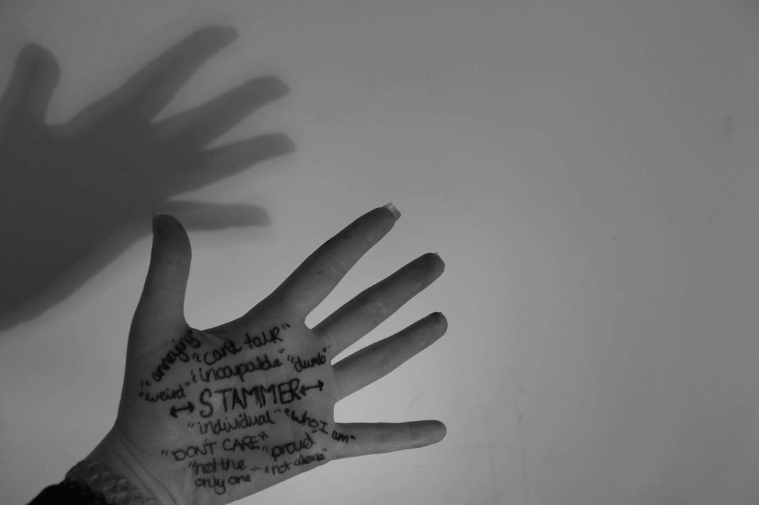

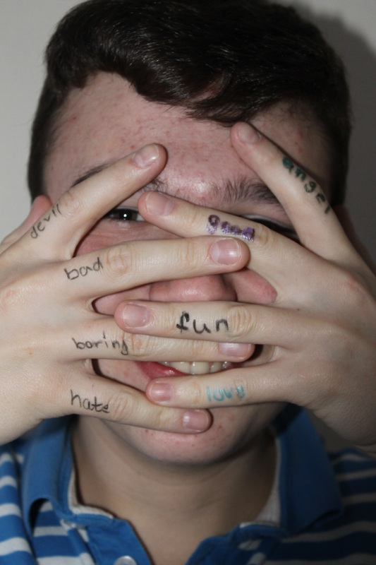
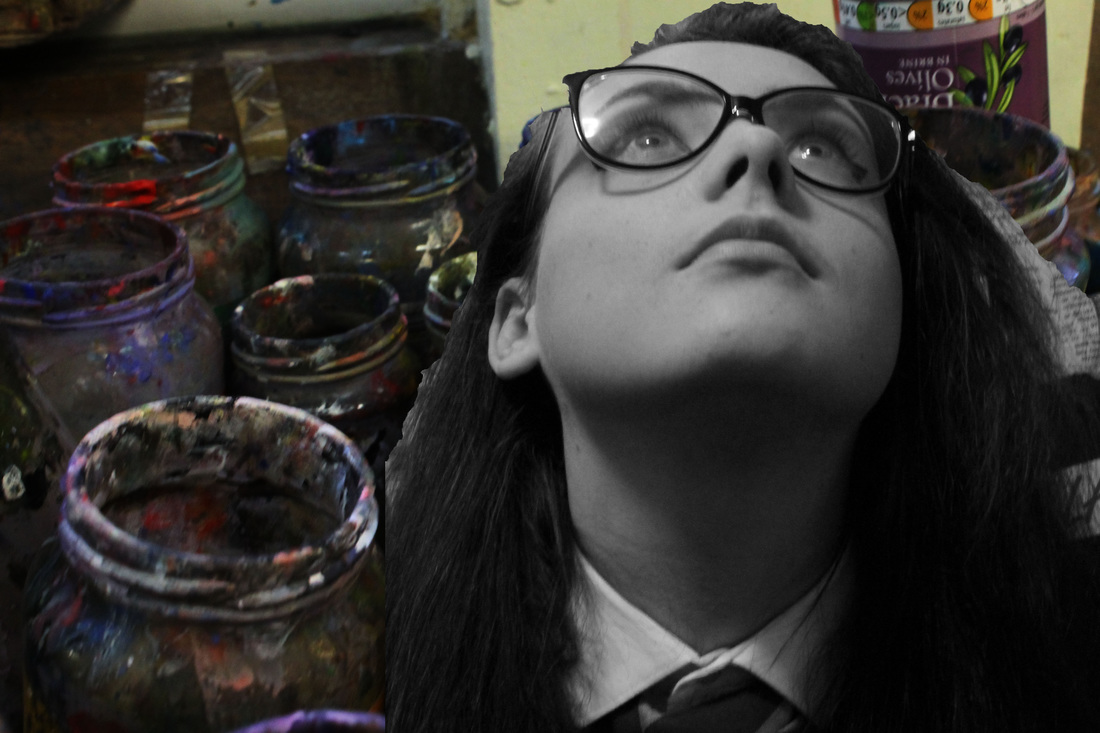
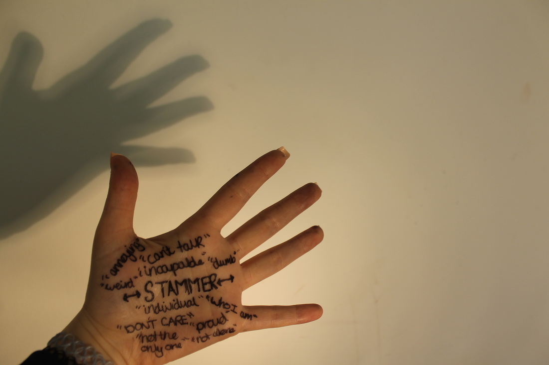
I chose to edit his picture using the 'black and white' tool and then used the 'curve' tool. I chose to apply these tools to the photo to create a dark effect on the picture and also to emphasis the words. I chose to write about my stammer and how there is two sides to it, a positive side and a negative. The top part of my hand has words and phrases like 'I cant talk' and 'annoying', these represent the things that are negative. But at the bottom of the hand are the positive aspects, I wrote words like 'individual' and 'proud' and phrases ' who I am' and 'not the only one'. This photo I think is powerful as its personal to me and it says a lot within it. I chose to take this in front of a light to create a shadow that represented the two sides to having a stammer.
Recording Ideas using hands


Planning my Photo shoot
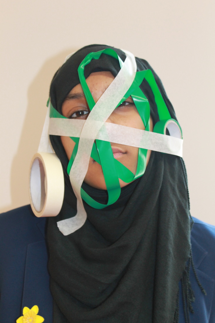
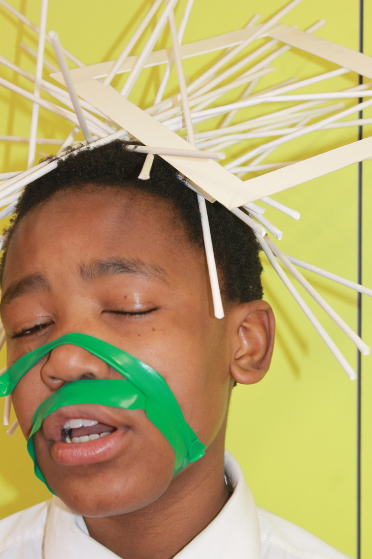
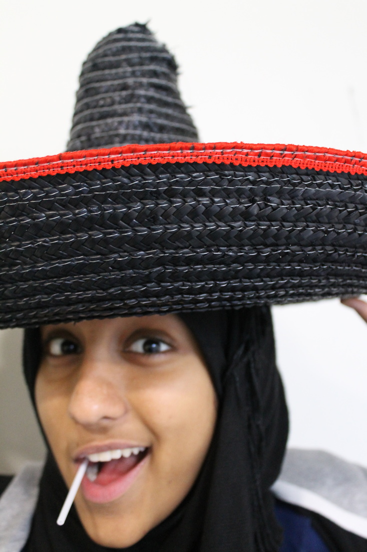
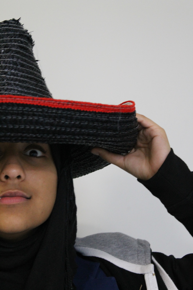
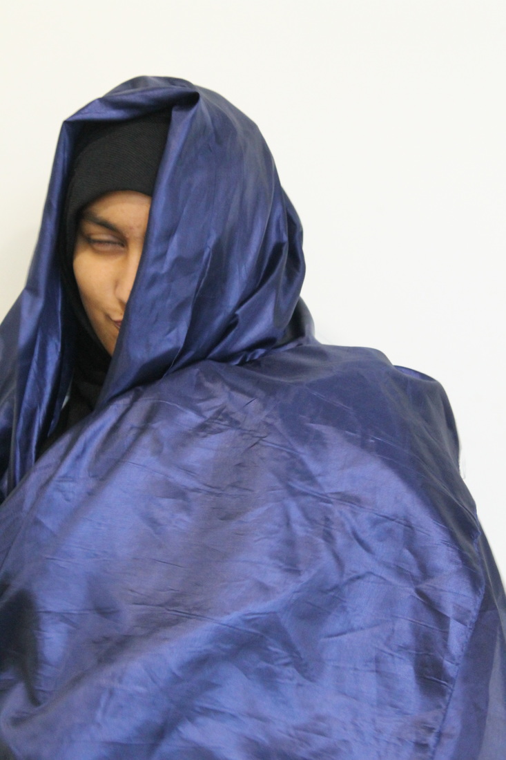
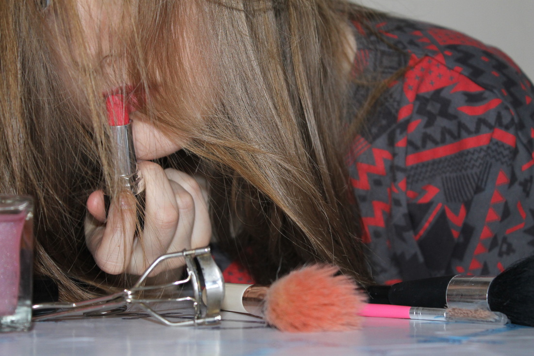
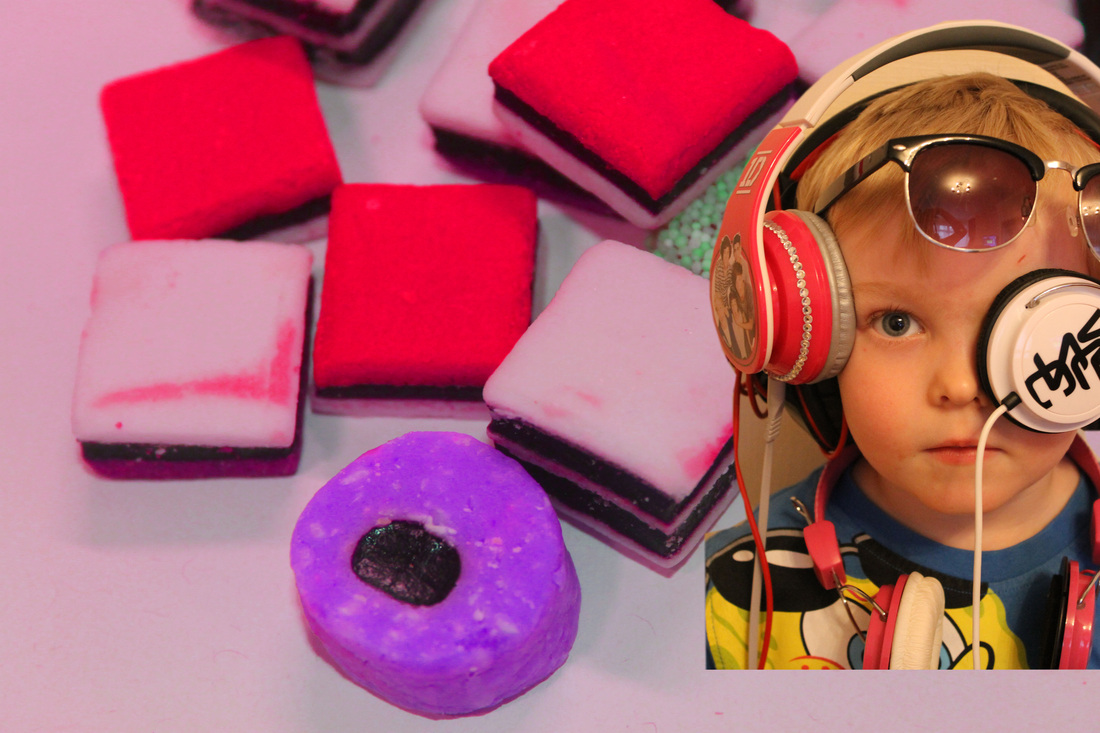
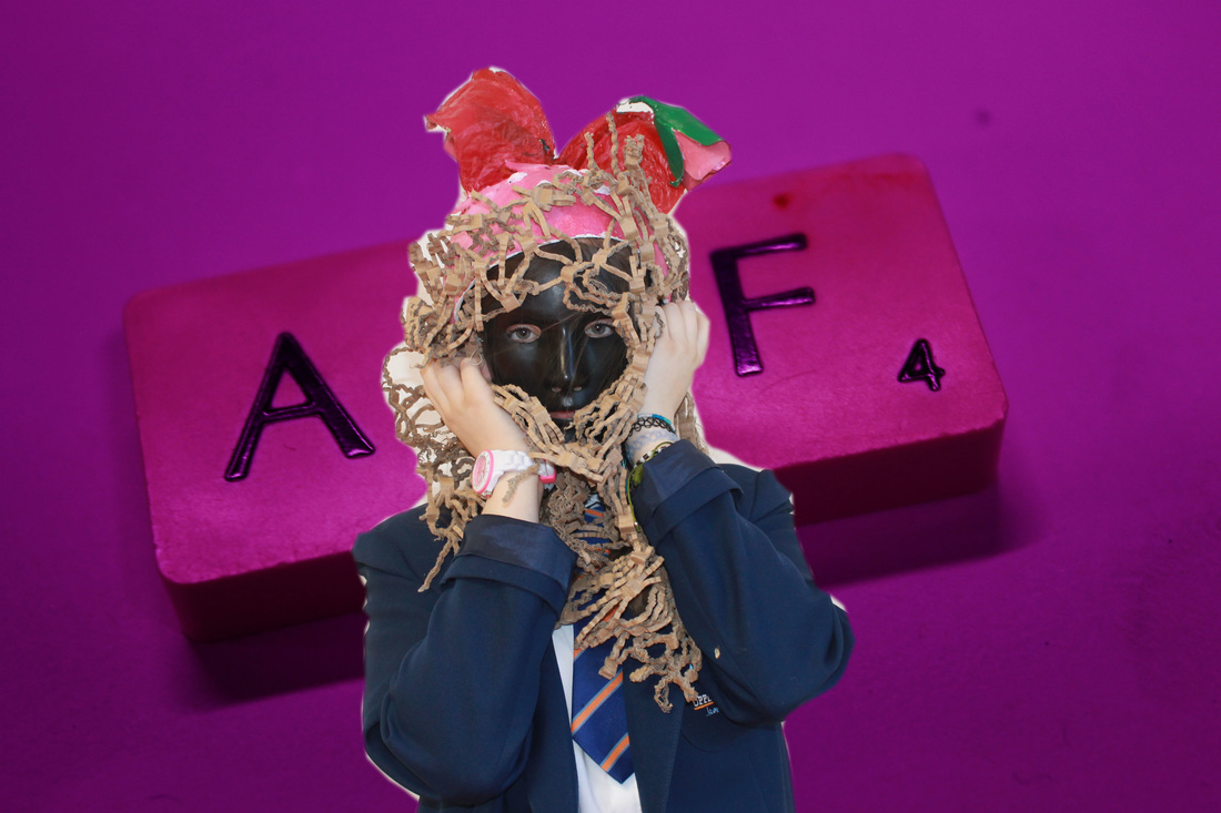
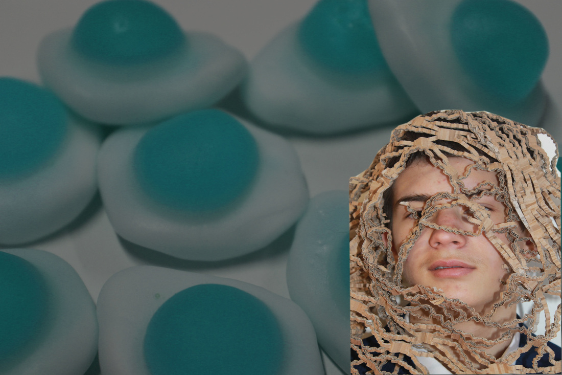
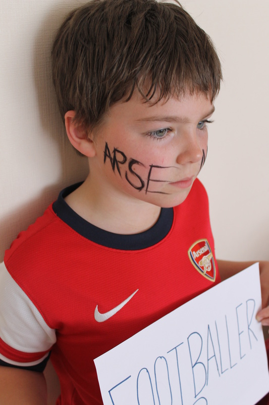
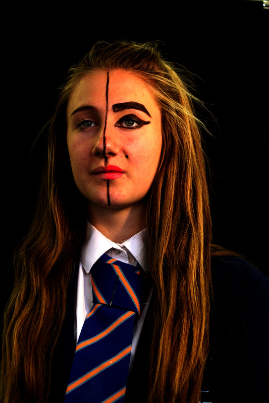
For this project i have chosen 'Disguise'. I feel that this topic will enable me to experiment with makeup and props in order to emphasis peoples identity. I will hopefully be exploring what they wear, the music they listen to, their hobbies and their culture; and link them to disguise to ultimately uncover their true identity. I will use my family and friends to model for this project as I feel that they offer a wide range of styles and personalities, that can show a variety of looks.
I hope to experiment with different lighting and backgrounds to have a variety of themes to my photographs.
The photographers that have inspired me for this topic are 'Rankin', 'Akatre' and others that I have yet to discover.
I hope to experiment with different lighting and backgrounds to have a variety of themes to my photographs.
The photographers that have inspired me for this topic are 'Rankin', 'Akatre' and others that I have yet to discover.
Giovanni Gastel
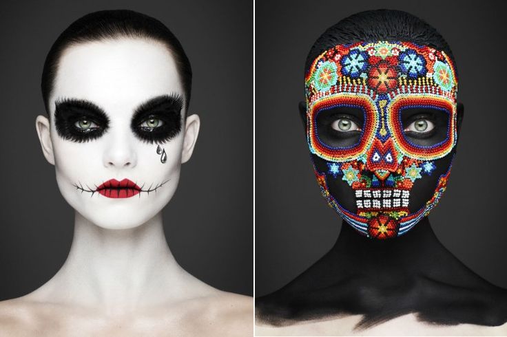
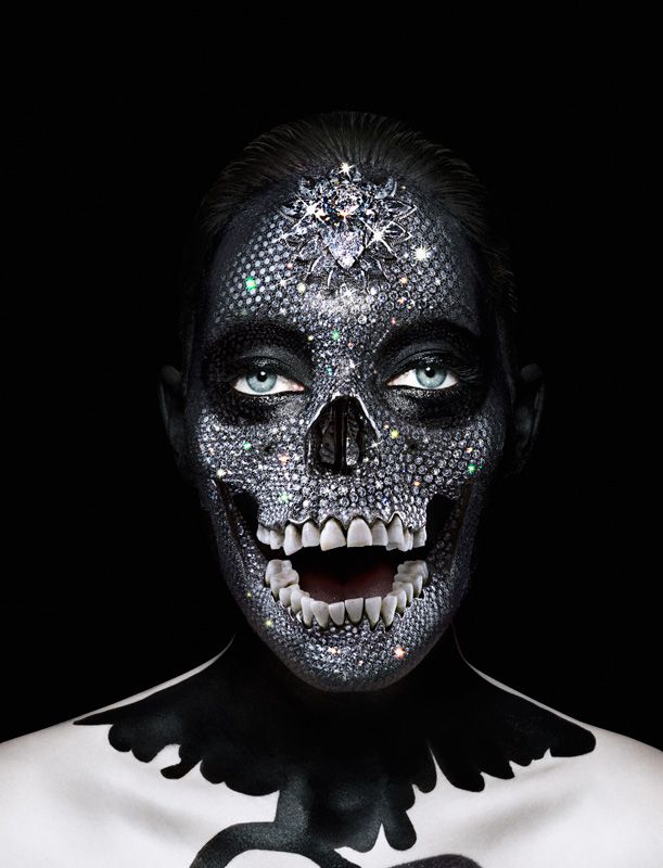
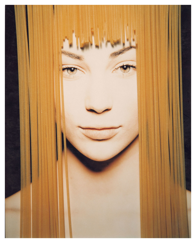
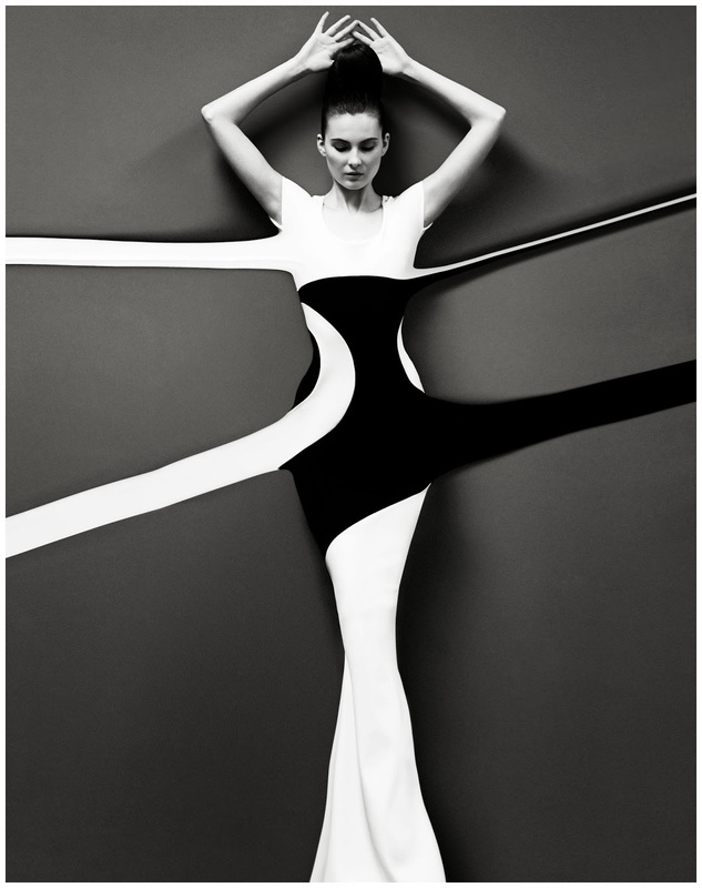
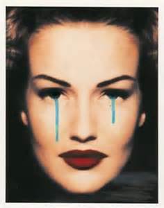
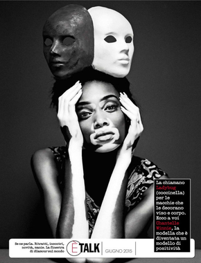
Photo shoot in Response |
I chose these photographs as they are captivating and attractive to the eye. I think that these photographs have a story behind all of them and I hope to take similar photographs in my project. I discovered Giovanni Gastel on Instagram and he did a breath taking photo shoot on a model called 'Winnie Harlow', who has a skin condition that makes her skin black and white. He captured her true identity within it and that is why I researched his work, I admire his artistic skills that he incorporates into his work.
|
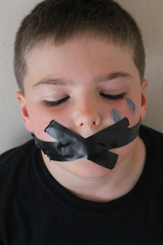
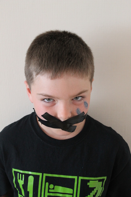
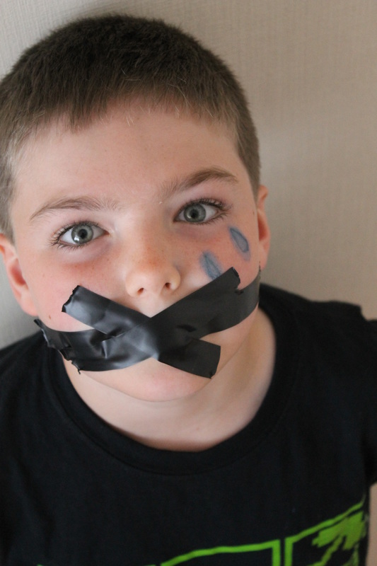
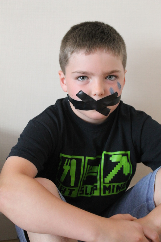
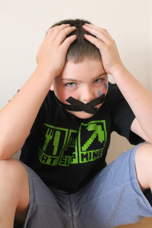
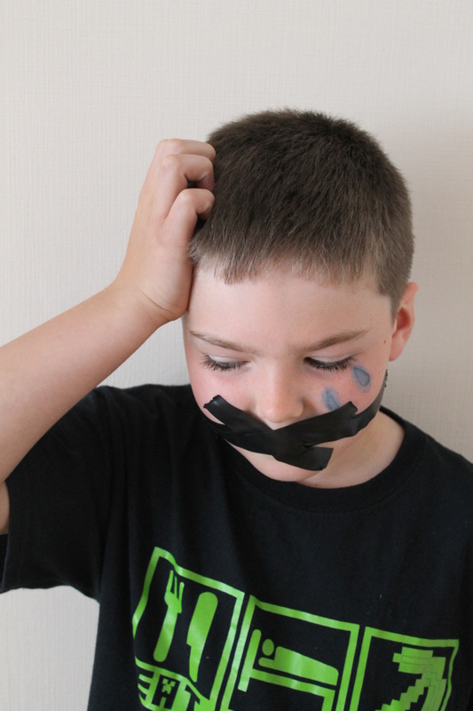
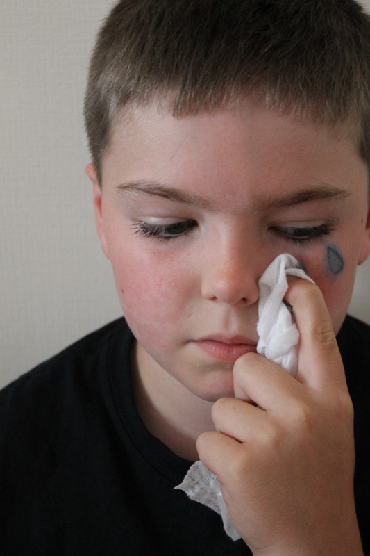
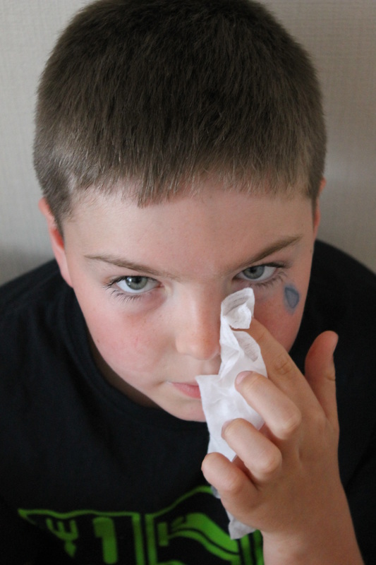
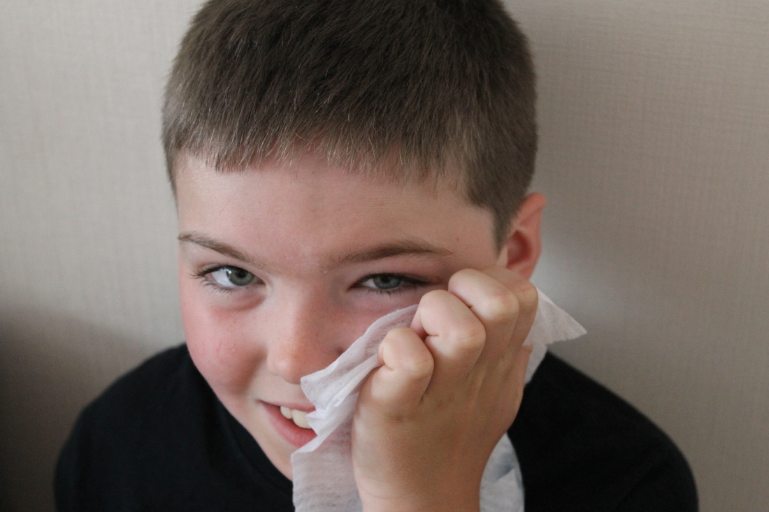
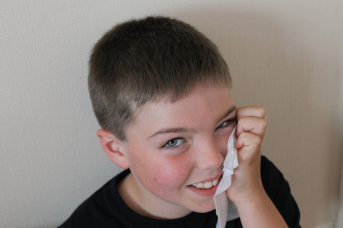
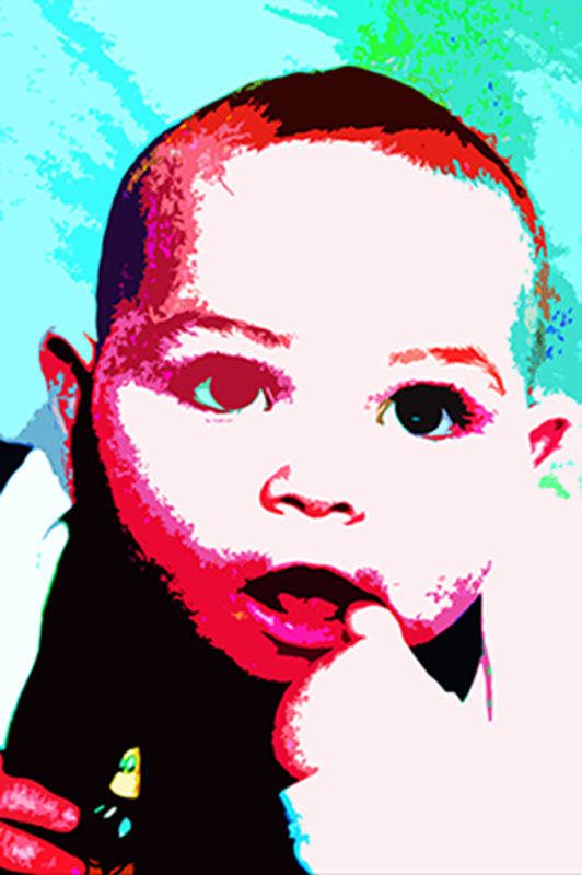
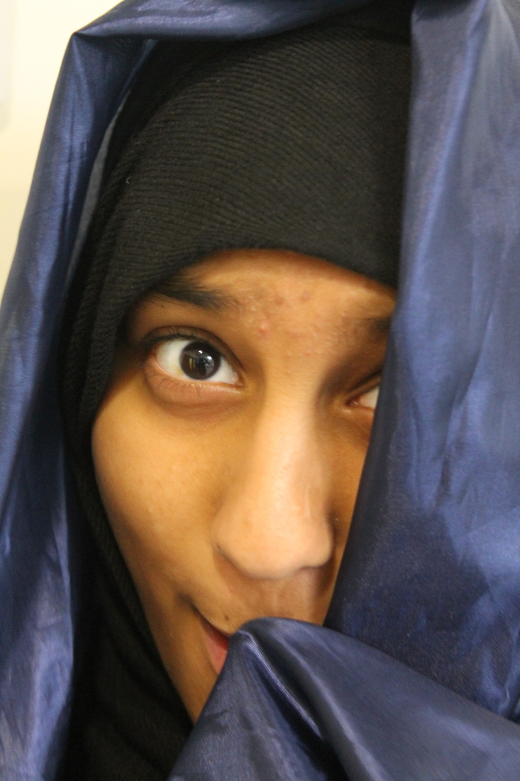
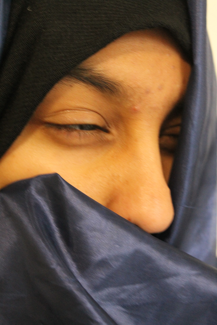
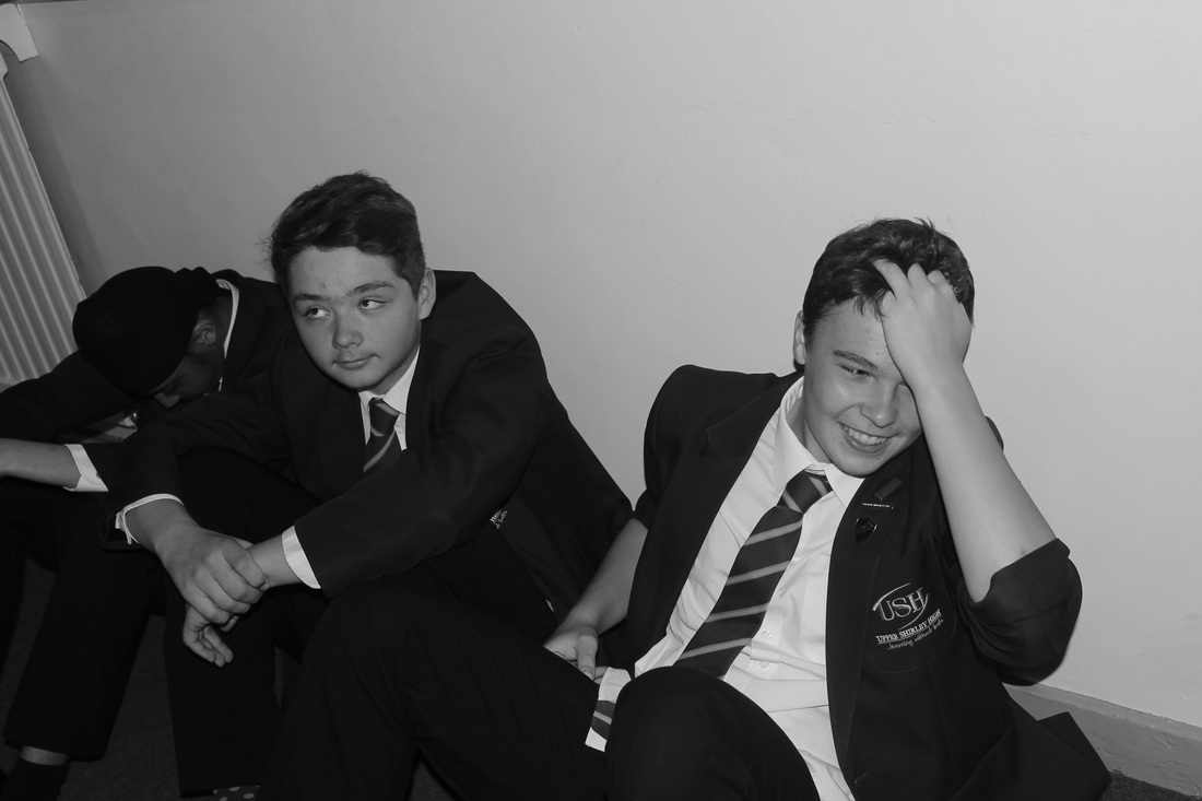
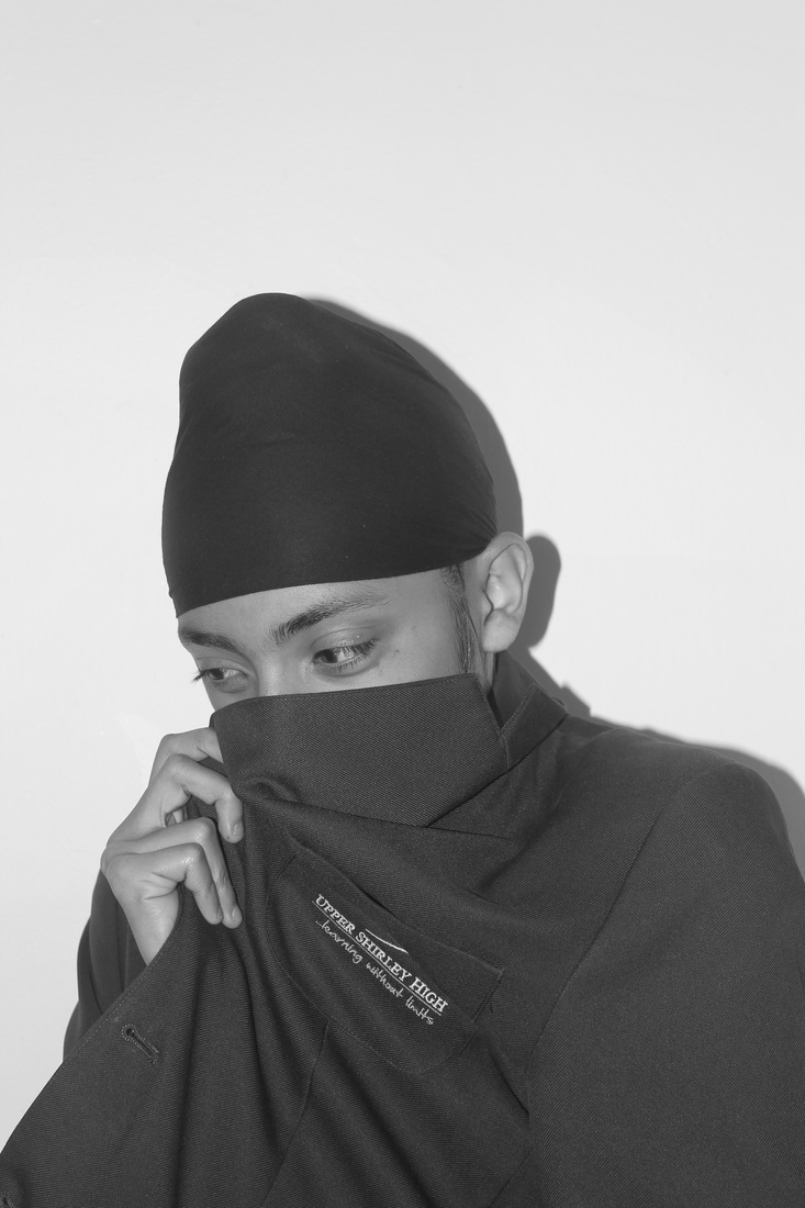
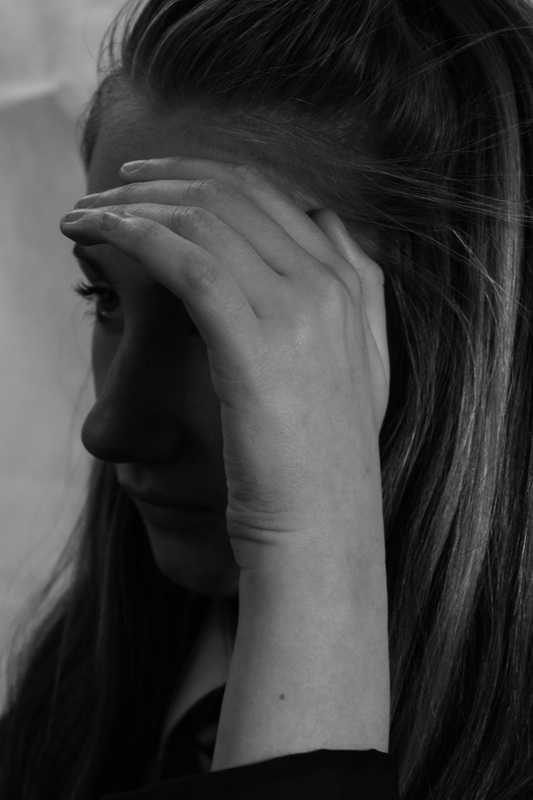
I chose to do this part of my photoshoot about 'disguising sadness'. I chose my brother to model someone being sad and being in silence, i feel that this is what a lot of teenagers growing up do; and this inspired me to choose this topic.
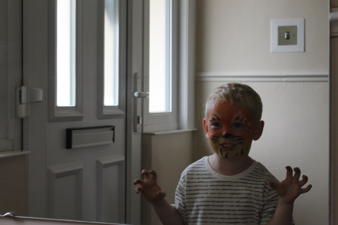
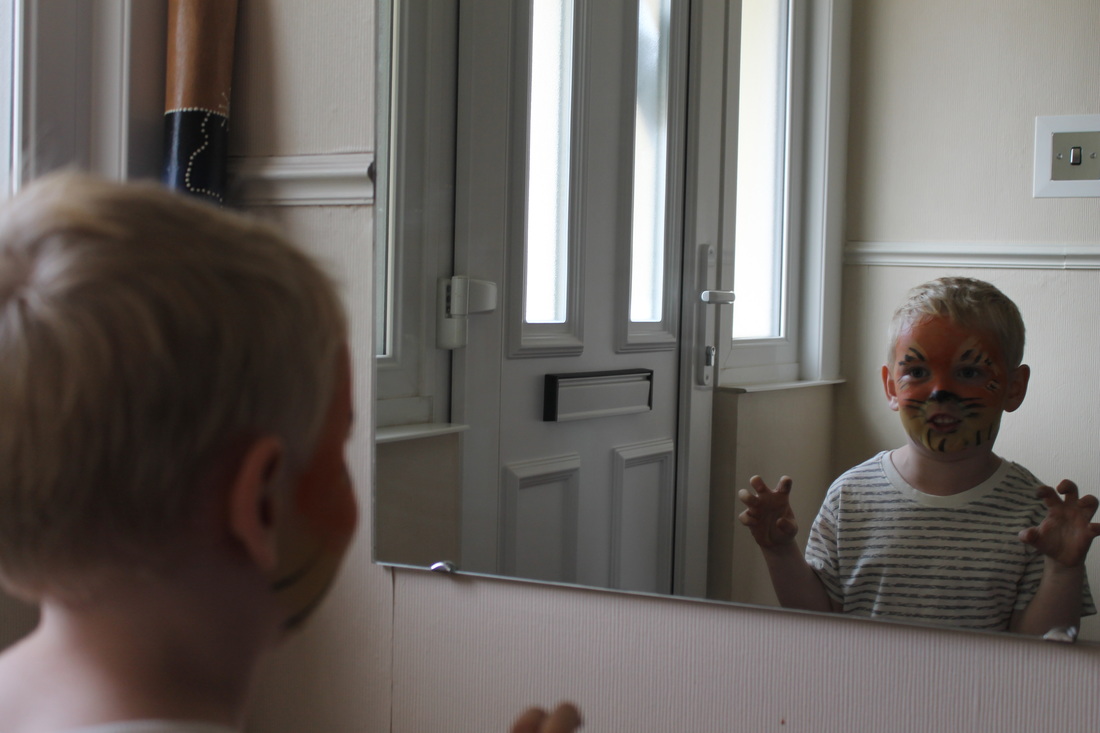
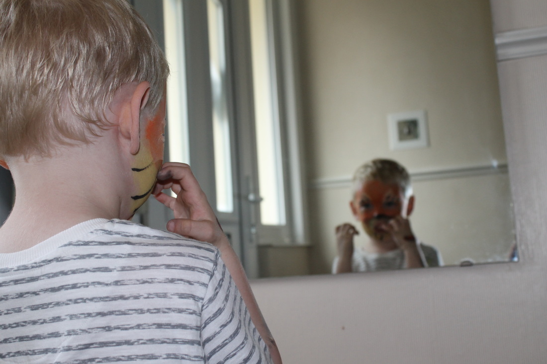
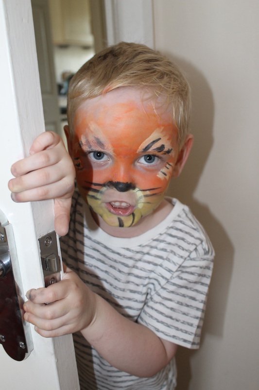
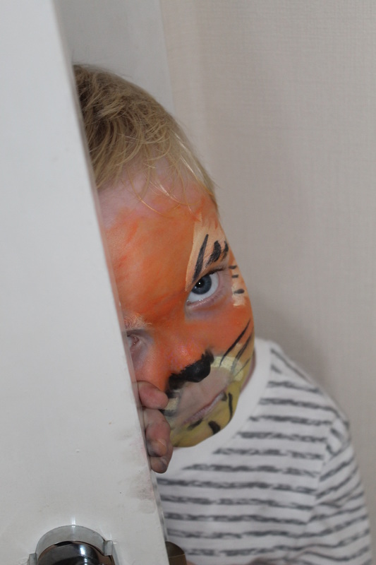
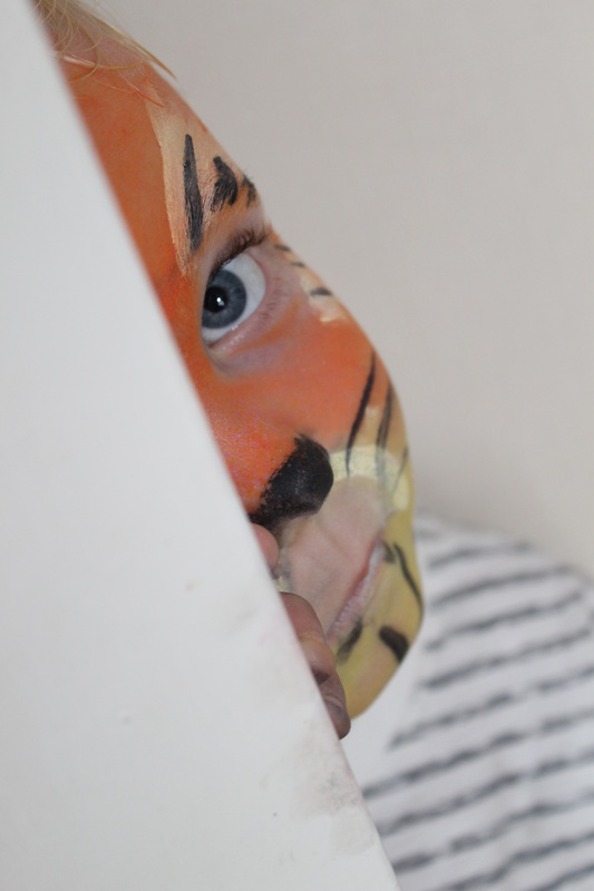
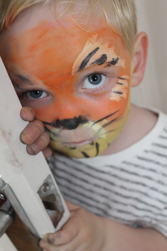
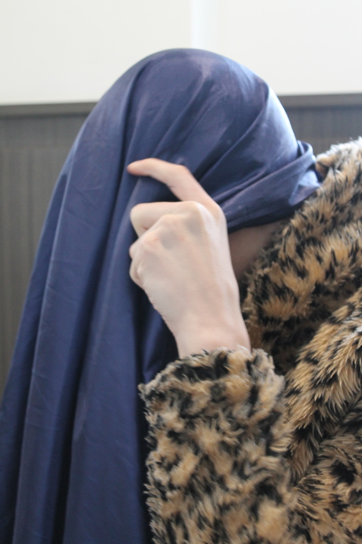
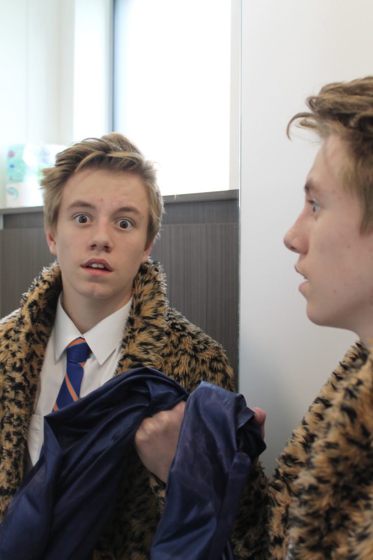
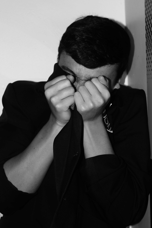
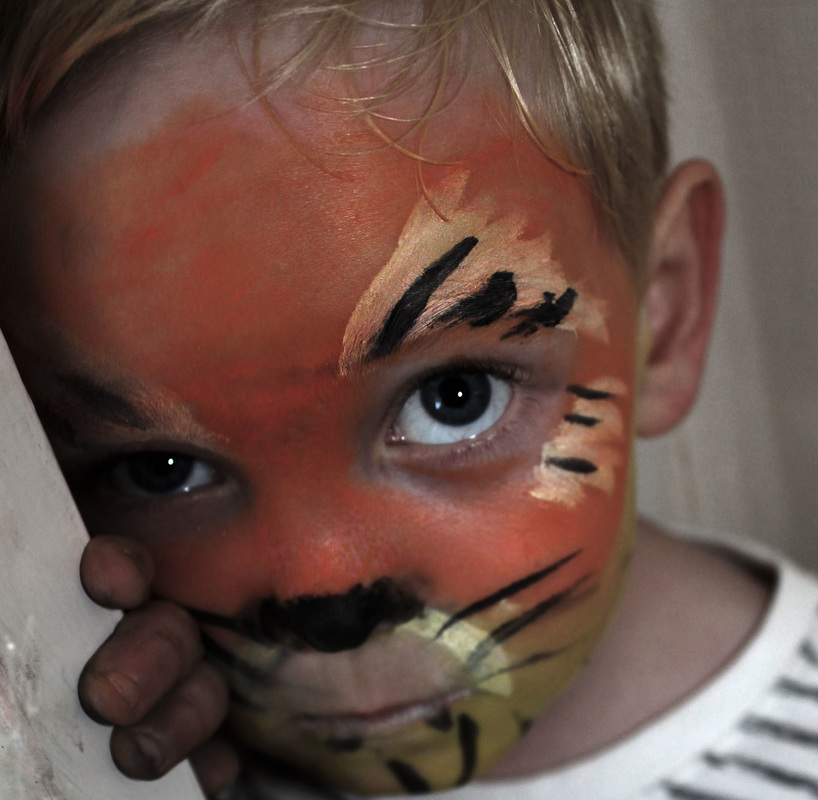
For this part of my photoshoot I decided to use my brother to be a model and coincidently he had his face painted as a tiger, this then gave me the idea of representing 'disguising aggression'. I emphasised this by having my brother pose behind a door, I then chose to take the photo from an angle to create a different perspective. I also chose to have my brother posing in front of a mirror and act like a tiger; I think that by him posing in front of a mirror shows that there is two sides to people and him in a mirror shows his inner aggression.
Body Language to show emotion photo shoot
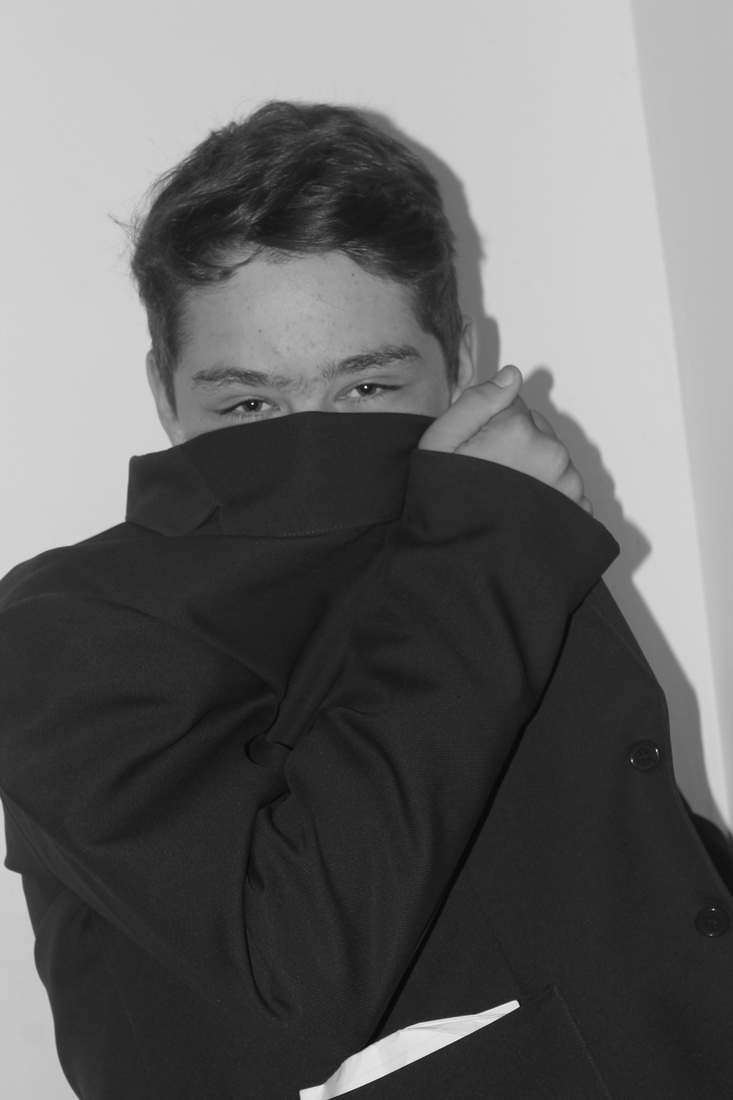
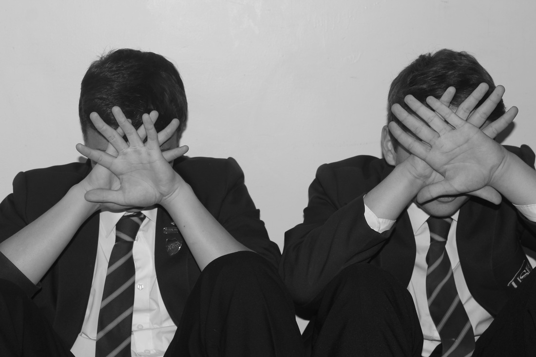
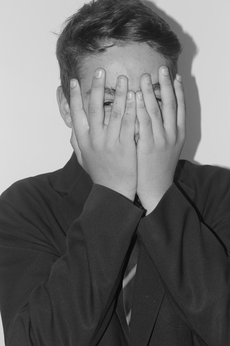

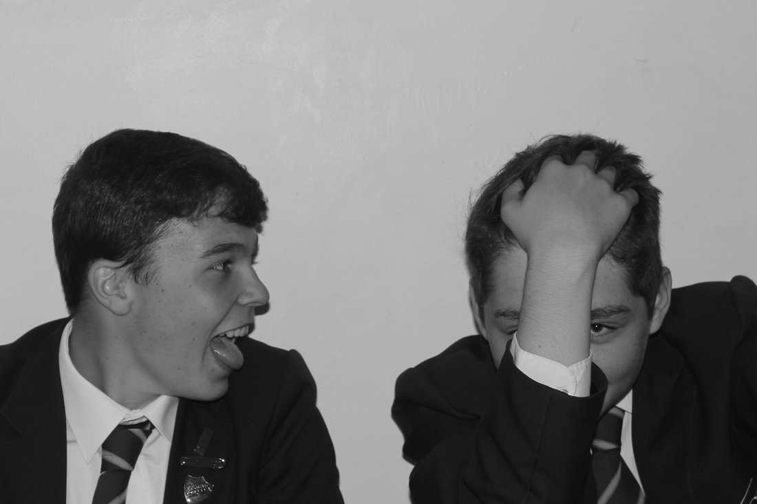
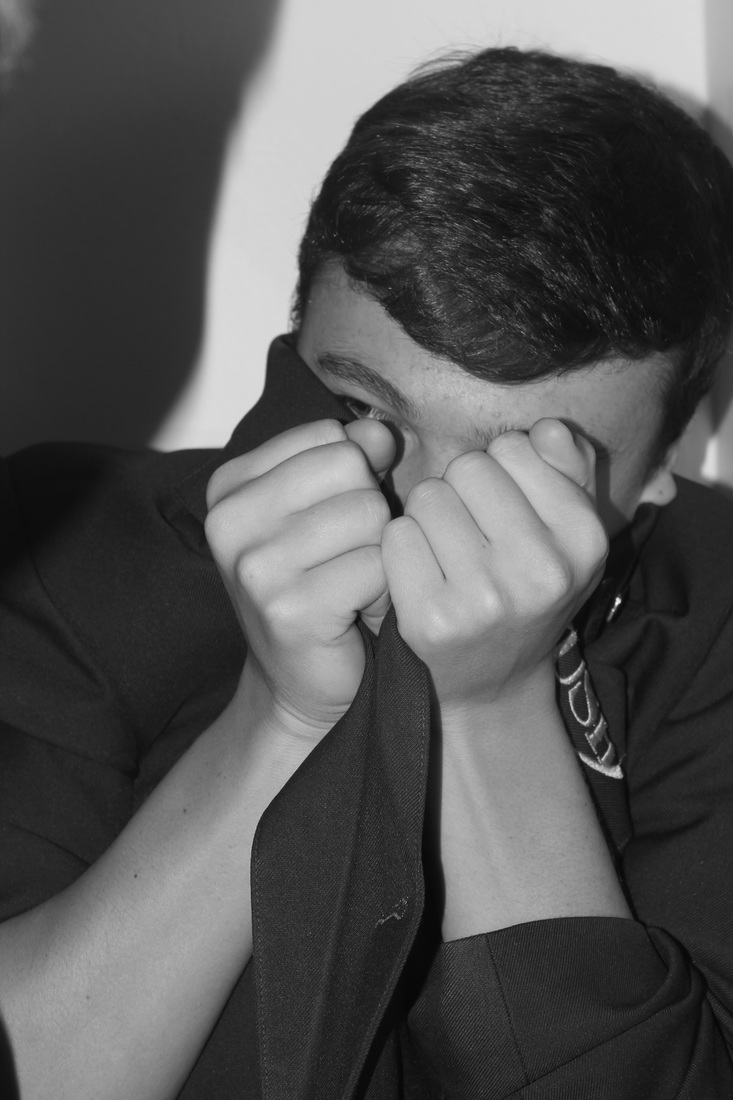
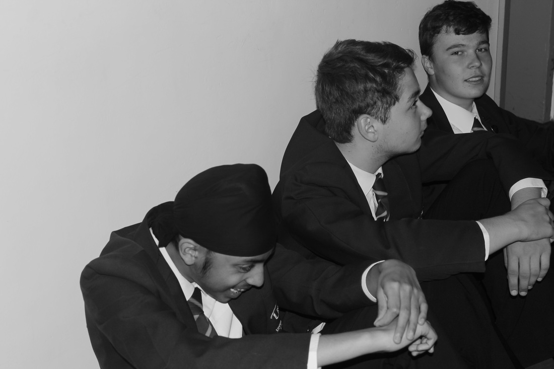
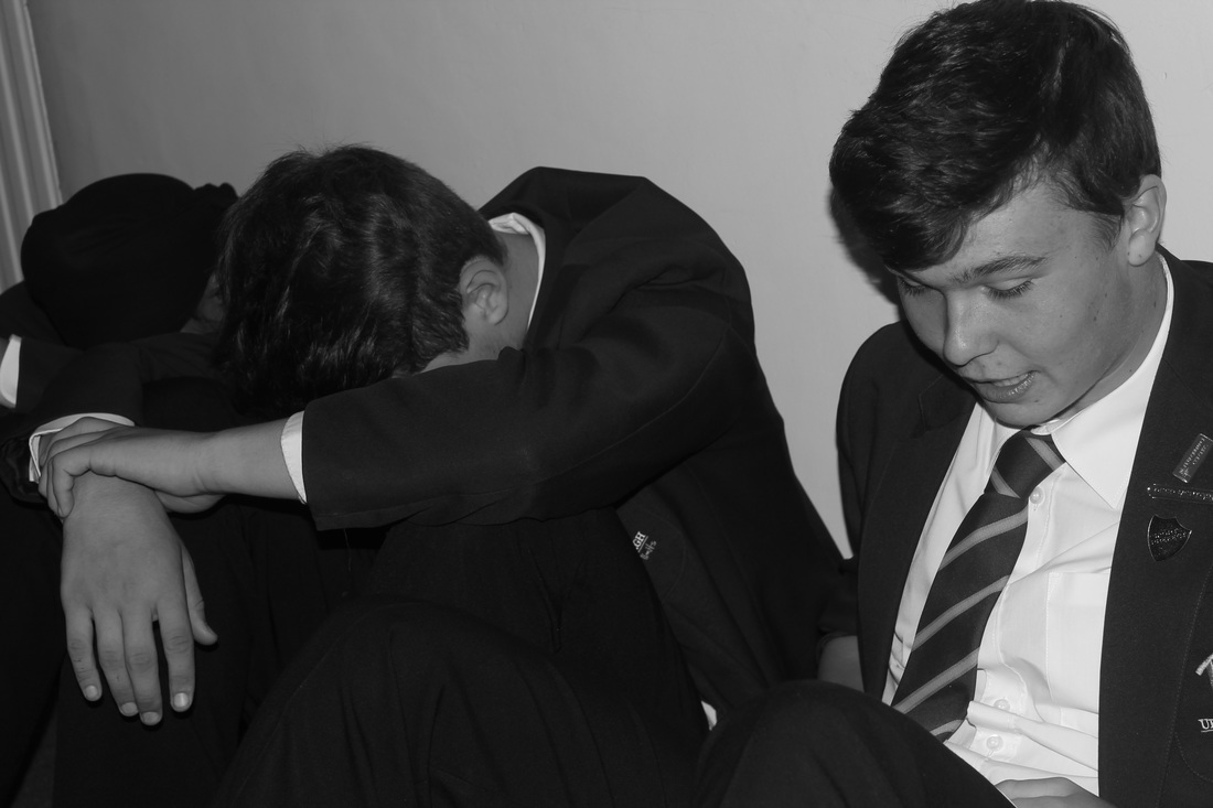
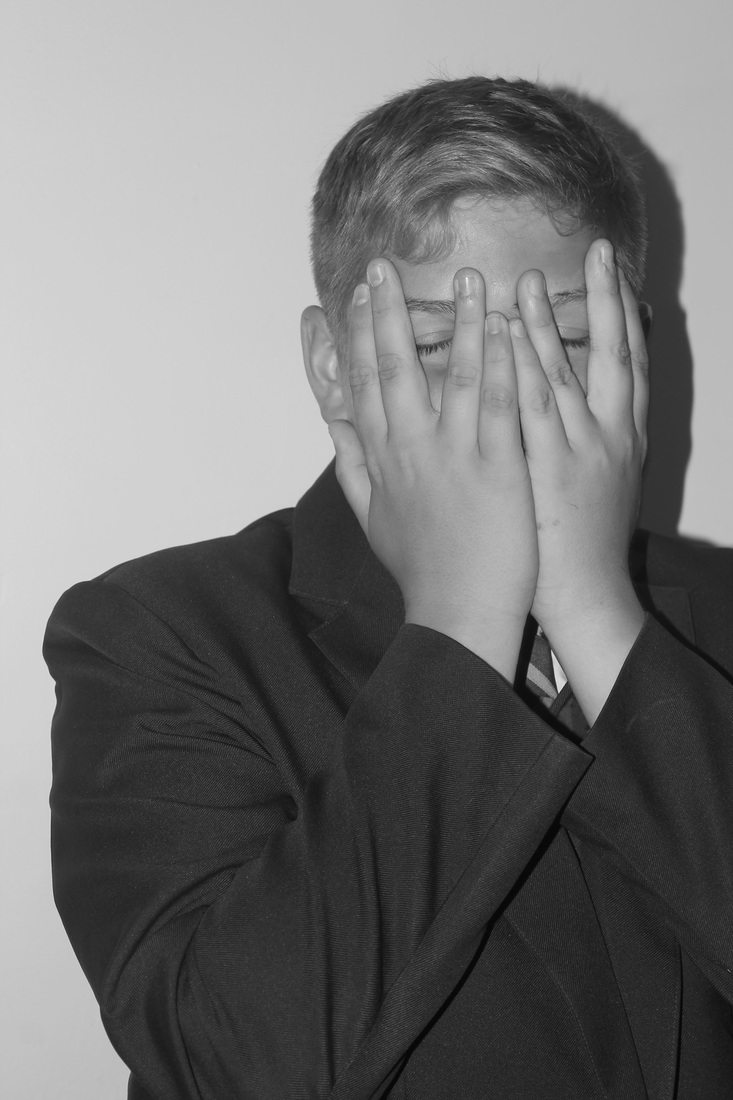
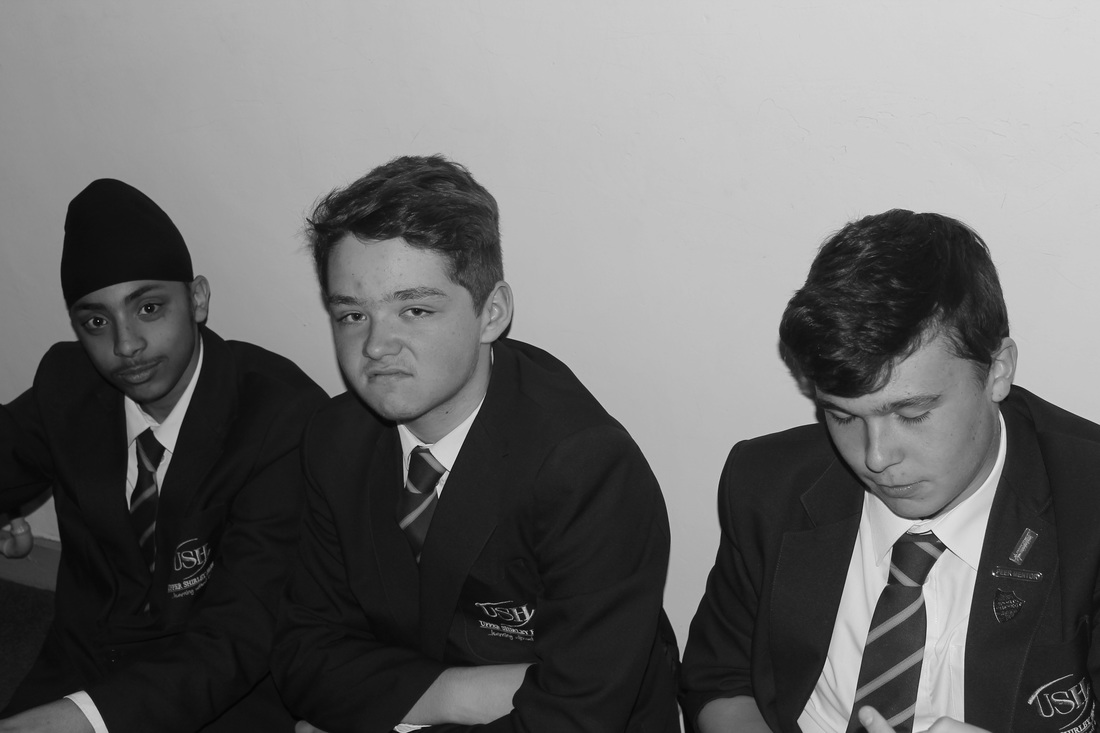
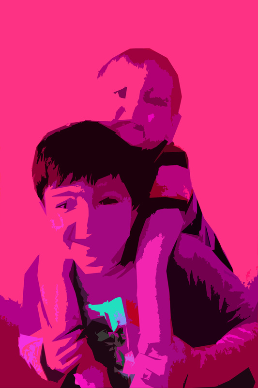
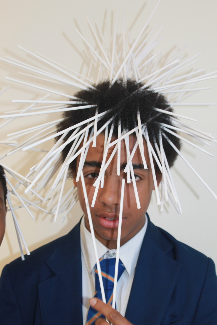
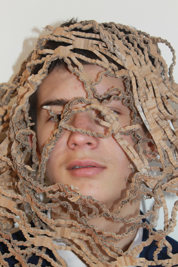
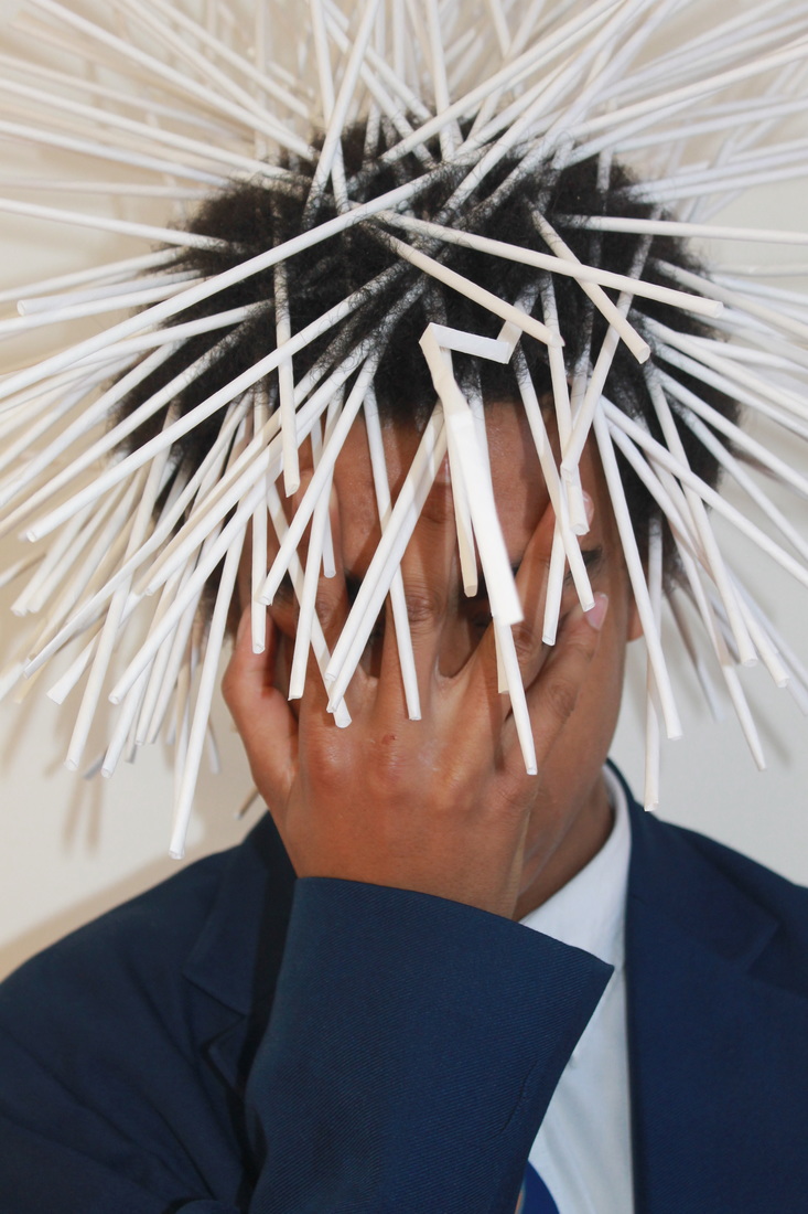
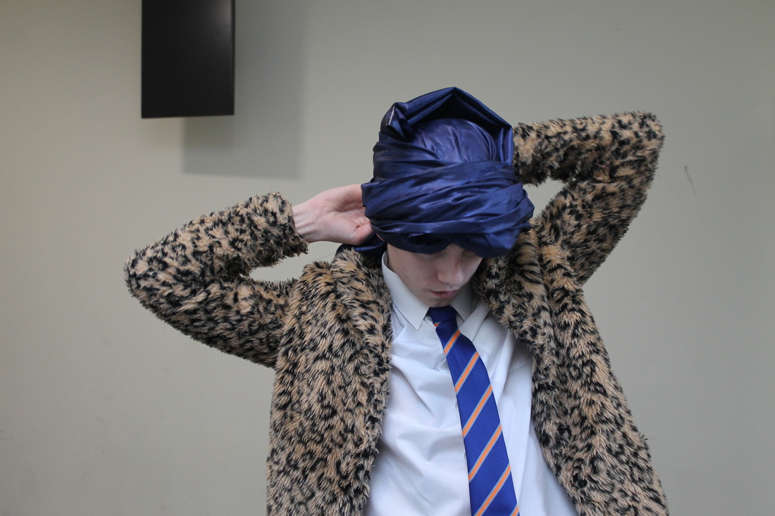
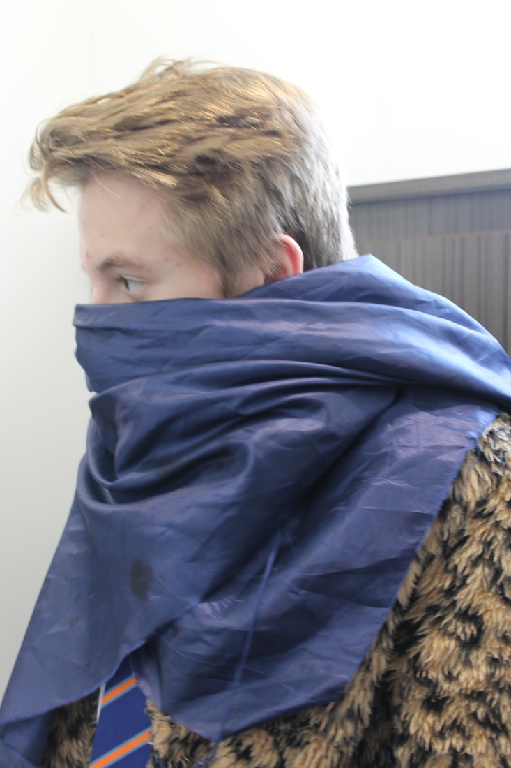
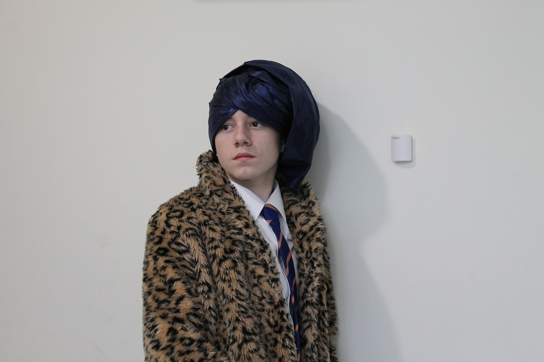
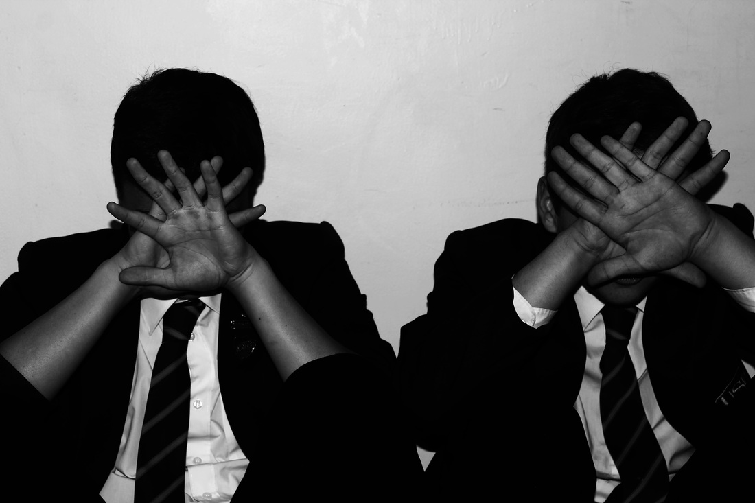
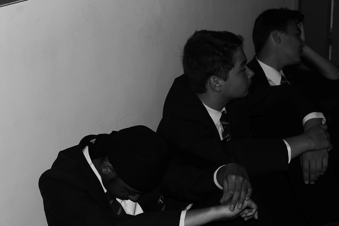
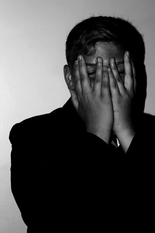
For this part of my photoshoot I chose to have a group of boys that are close friends to disguise themselves in various ways either by covering their faces with their hands of with their clothing. I took these in black and white using the 'monochrome' setting on my DSLR Camera and I feel that it gave the photos contrast and depth by showing the shadows within the background. I took the photos from various angles and I think it gives the viewer more to look at, I got the boys to pose like their embarrassed about their identity and I think their poses show how some people may feel in daily life.
Edits In Preparation for my Final Piece
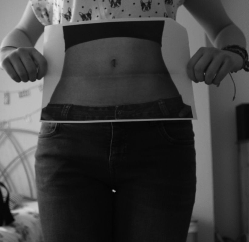


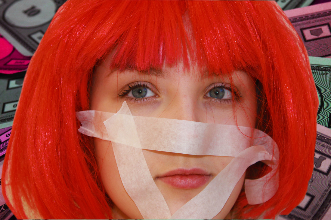
I prepared multiple photos for me to edit; and to select a few for my final piece. The theme of these pictures are 'Disguising Your Identity and Natural Beauty'. I feel that this is an everyday problem within society, I edited these photographs by using the 'curve tool' in nearly all of them and then adjusted the contrast and brightness; I can now narrow these down and choose five as my final piece.
Resolving my ideas-My Final Piece Photographs


I chose these 5 photographs as my final piece as I feel that they represented disguising your identity. I took most of them behind a white background and used lighting to create my ideal photograph, I took one photograph behind a black background,I think this created a contrasting effect; alongside the lighting. I then photoshopped them by using various tools such as; the curve tool, auto tone, and changing the brightness and saturation. Once I had edited, I printed the photographs out onto photographic paper and put them into black card frames; the frame created a sophisticated vibe to my photos and made them stand out. To finish my final piece I used inspiration from Stefan Sagmeister, I wrote inspirational quotes into the photos using biro and fine-liner pens; The bold writing emphasised the true meaning of the photos and overall the message I was trying to get across.
